Tag: moma

  • Robert Rauschenberg: Among Friends, MoMA

    Robert Rauschenberg: Among Friends, MoMA

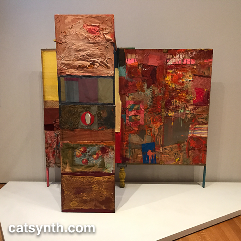
    The Museum of Modern Art in New York recently concluded a large exhibition of works by Robert Rauschenberg, billed as the “first 21st-century retrospective of the artist.” In 1999, I attended what was probably the last major 20th-century retrospective at The Guggenheim, which resulted in mixed and complicated feelings about his work. I was skeptical of the white-on-white paintings and openly detested the pieces that consisted entirely of unfolded cardboard boxes; but there were other works that were captivating, like his sculptural paintings with electrical elements. This new exhibition elevates the entirety of Rauschenberg’s work by placing it in the context of his many collaborators, both in the New York School of the 1950s and 1960s and beyond. The show also demonstrated the importance of place in the development and evolution of his art.


    [Robert Rauschenberg. Grand Black Tie Sperm Glut (1987). Riveted street signs and other metal parts, 60 x 121 x 14″ (152.4 x 307.3 x 35.6 cm), Robert Rauschenberg Foundation, New York]

    The source of his many collaborations can be traced to his time at Black Mountain College. He studied with (and was influenced by) Josef and Anni Albers. It is here that he met John Cage and Merce Cunningham, as well as fellow visual artists Cy Twombly, Susan Weil, and more.

    John Cage 4'33
    [John Cage. 4’33” (In Proportional Notation) [1952/1953]. Ink on paper, page (each): 11 x 8 1/2″ (27.9 x 21.6 cm); sheet (each, unfolded): 11 x 16 15/16″ (27.9 x 43.1 cm). The Museum of Modern Art, New York. Acquired through the generosity of Henry Kravis in honor of Marie-Josée Kravis.]

    Cage’s 4’33” is a piece that I admire greatly. He later claimed that his encounter with Rauschenberg’s white paintings was a major inspiration for the piece. In the context of place and collaboration, the white paintings take on a significance that was lost the first time I saw them. (I still don’t like the cardboard boxes, though.) One can also see in his white (and black) pieces the influence and evolution away from the precise minimalism of Josef Albers.

    The friendships and collaborations formed at Black Mountain continued in his work abroad and then at his studios in downtown Manhattan, first at Fulton Street and then at Pearl Street. One amusing collaboration was a long ink-on-paper piece featuring the tire treads of a car driven by John Cage.


    [Robert Rauschenberg with John Cage. Automobile Tire Print (detail). 1953. Tire-tread mark (front wheel) and tire-tread mark with house paint (rear wheel) made by Cage’s Model A Ford, driven by Cage over twenty sheets of typewriter paper fastened together with library paste, mounted on fabric, 16 1/2 in. × 22 ft. 1/2 in. (41.9 × 671.8 cm). San Francisco Museum of Modern Art. Purchase through a gift of Phyllis C. Wattis. Photo: Don Ross. © 2017 Robert Rauschenberg Foundation]

    Rauschenberg continued to work with simple elements to produce three-dimension works both on and off the wall that would lead to his celebrated “Combines.” Some of these early pieces were quite small and often focused on just one or two elements, such as the piece Untitled (c. 1953) consisting of wooden and linen boxes. As an interesting aside, the original fabric box was destroyed by Rachel Rosenthal’s cat – another example of chance collaboration.


    [Unititled (1953). Wood box with lid and removable balsa wood-and-fabric cube. The Museum of Modern Art, New York. Purchase.]

    During the period of his early Combines and red paintings, Rauschenberg collaborated with Jasper Johns on a large mixed-media set design for Minutiae a dance piece by Cunningham with music by Cage. While red was the principal color of the piece, it also brought in a variety of other textures and materials, including wood, mirrors, newspaper and even a paint color chart.

    Robert Rauschenberg and Jasper Johns. Minutiae
    [Robert Rauschenberg and Jasper Johns. Minutiae (1954). Oil, paper, fabric, newspaper, wood, paint sample color chart, graphite, metal, and plastic, with hanging mirror, on wood supports 84 1/2 x 81 x 30 1/2″ (214.6 x 205.7 x 77.5 cm) Private Collection Switzerland. Courtesy Hauser & Wirth.]

    The music is very sparse, and the dance moves between very slow minimal motion and periods of frenzied activity. These contrasts are reflected in the set’s various materials and textures. Remy Charlip’s costume designs also seem to reflect the colors and patterns of the set.

    In 1960, Rauschenberg participated in Jean Tinguely’s seminal performance piece Homage to New York. Tinguely and his collaborators assembled a large sculptural installation that was designed to self-destruct over the course of the performance, which took place in the sculpture garden of MoMA. Only a few fragments of the original piece remain today.

    Fragment from Homage to New York
    [Jean Tinguely. Fragment from Homage to New York (1960). Painted metal, fabric, tape, wood, and rubber tires. The Museum of Modern Art, New York. Gift of the artist.]

    Rauschenberg’s contributions included “The Money Thrower”, a mechanical contraption with springs, an electric heater, gunpowder, and silver dollars.

    The Money Thrower
    [The Money Thrower for Tinguely’s H.T.N.Y. (Homage to New York) [1960].  Electric heater with gunpowder, metal springs, twine, and silver dollars. 6 3/4 × 22 1/2 × 4″ (17.1 × 57.2 × 10.2 cm) Moderna Museet, Stockholm. Gift of Pontus Hultén]

    One can also see the performative at play in some of his larger Combines, including Gold Standard, a collaborative piece with artist Alex Hay.


    [Robert Rauschenberg and Alex Hay. Gold Standard (1964). Oil, paper, printed reproductions, metal speedometer, cardboard box, metal, fabric, wood, string, pair of men’s leather boots, and Coca-Cola bottles on gold fabric folding Japanese screen with electric light, rope, and ceramic dog on bicycle seat and wire-mesh base 84 1/4 × 142 1/8 × 51 1/4″ (214 × 361 × 130.2 cm) Glenstone.]


    These collaborations and the increased presence of electrical elements and technology in Rauschenberg’s work foreshadowed E.A.T., the “Experiments in Art and Technology”, an organization which he co-founded with Billy Klüver, Robert Whitman and the engineer Fred Waldhauer. Among the works that came out of E.A.T. was Mud Muse, in which a large glass case filled with bentonite and water is excited by a sound recording fed into an air compression system. You can see a bit of the piece in this video:

    Mud Muse. Robert Rauschenberg. #moma #nyc

    A post shared by CatSynth / Amanda C (@catsynth) on

    Mud Muse was a collaboration with Carl Adams, George Carr, Lewis Ellmore, Frank LaHaye and Jim Wilkinson.

    Place is an important element of many pieces. This is perhaps no more apparent than in Tinguely’s Home to New York. But the influence of New York and the artists who coalesced there is apparent in his solo works as well, sometimes visually and sometimes spiritually. Eventually, Rauschenberg moved his home and studio to Captiva Island in Florida, where we worked on a larger scale and in a more solitary manner than during his days in New York. While there are currents that run through his work in both the New York and Captiva periods, the later Captiva works seemed to lack a bit of the edge of the earlier New York work – or perhaps it is simply part of bias towards the city that I always return to.


    [Estate (1963). Oil and silkscreen-ink print on canvas 95 3/4 x 69 3/4″ (243.2 x 177.2 cm) Philadelphia Museum of Art. Gift of the Friends of the Philadelphia Museum of Art, 1967.]

    There was far more in this exhibition of over 250 individual works than I can cover in this article. The continuity and focus on collaboration made it not too overwhelming to take it all in. I quite enjoyed the show, and it has given me a renewed appreciation overall for Robert Rauschenberg’s career and body of work.

  • MoMA: Francis Picabia, Kai Althoff, and more.

    MoMA: Francis Picabia, Kai Althoff, and more.

    For us at CatSynth, coming back to New York almost always means a visit to Museum of Modern Art (MoMA). It’s a place that is always safe, inviting and inspiring. It’s also a change to spend time with some old friends, like Piet Mondrian’s Broadway Boogie Woogie, a painting that for me has an almost religious significance.

    Mondrian Broadway Boogie Woogie

    There are of course, many special exhibitions, and we discuss them below.


    Much of the top floor of the museum was reserved for a retrospective of the work of Francis Picabia, one of the less-well-known of the great modern artists from the first half of the 20th Century. Though known for his association with the Dada movement, his oeuvre includes many other ever-changing styles. Indeed, the exhibition begins with his early works in an impressionist style. Though very well executed, they are not particularly exciting other than the provocative nature (for the time) of using photographs as sources. However, after this initial period, his work explodes with large abstract canvases.

    Picabia,Francis (1879-1953)
    [Francis Picabia. Udnie (Jeune fille américaine; danse) (Udnie [Young American Girl; Dance]). 1913. Oil on canvas, 9′ 6 3/16″ × 9′ 10 1/8″ (290 × 300 cm). Centre Pompidou, Musée national d’art moderne – Centre de création industrielle, Paris. Purchased by the State, 1948. © 2016 Artist Rights Society (ARS), New York/ADAGP, Paris. Photo: © Centre Pompidou, MNAM-CCI/Georges Meguerdtchian/Dist. RMN–Grand Palais/Art Resource, New York.]

    The painting shown above, Udnie (Jeune fille américaine; danse) (Udnie [Young American Girl; Dance]) is exemplary of this period of his work. It is huge, almost 10 feet by 10 feet square, and features bright industrial colors with large curving lines. This painting had a colder and higher-contrast palette than its neighbors, so it particularly attracted me. There is also the fact that the title reminds me of the David Bowie album of similar name.

    Picabia became a leading artist in the Dada movement, producing many paintings and drawings of industrial and manufactured objects, some featuring bits of text that he found from encyclopedias and other sources. They have the sparse, sometimes sad quality of readymades, but also show steady and disciplined hands at work to create these pieces.

    20161122-img_2654

    The centerpiece of the Dada sections of the exhibition was a recreation of one of his Paris exhibitions, with drawings arranged in a linear fashion and rugs along the gallery floor. The pieces were a mixture of Dada, abstraction and figurative images (mostly of Spanish women). These demonstrate the artist’s desire to not be stuck in one style or even just one movement.

    Picabia went through a period of more figurative painting in the years leading up to and during World War II, including a somewhat odd set of photorealistic paintings from soft-porn images that he created while living in under the Vichy regime in southern France. After the war, however, he returned to abstraction until his death in 1953. Many of these late works have a somewhat minimal quality, including a series consist of large dots on a monochromatic background


    The other major exhibition on the top floor featured a full-gallery installation by Kai Althoff entitled and then leave me to the common swifts (und dann überlasst mich den Mauerseglern). The space itself was the artwork in which the viewer was invited to wander.

    00020003
    [Installation view of Kai Althoff: and then leave me to the common swifts (und dann überlasst mich den Mauerseglern). The Museum of Modern Art, New York, September 18, 2016–January 22, 2017. Photograph © Kai Althoff]

    The labyrinthine installation is a seeming clutter of objects, looking more like a messy artists’ studio. However, on closer inspection, one sees that there are a lot of older works from the artist in various states of integrity among found objects like dolls and clothing. The artwork fragments included heads with strange expressions. Overall, it was one of the more confounding exhibitions I have seen. I am not one to necessary require “meaning” from art, but I do tend to look for lines, shapes and patterns. But being challenged by an exhibition is not a bad thing.


    In addition to the hunt for old favorites in the permanent collection, an entire floor was dedicated to works from he 1960s, arranged one room per year. The detailed view shows just how rich and varied the art of that decade was, and how art transformed into what we think of as contemporary in the early 21st Century. Among the works on display was a set of photographs by Bernd and Hilla Becher. We have discussed them before, as their work is very influential for my own art photography.

    20161122-img_2668

    The video work of Nam June Paik has also been a major influence. The exhibition featured a very minimal work of his, essentially reducing analog video to a single line.

    20161122-img_2666

    Yayoi Kusama is enjoying a lot of attention of late. This work, which appeared to be a chair of penises, was featured prominently. The description of the piece confirmed my phallic interpretation.

    20161122-img_2665


    The second floor also featured multiple special exhibitions, including the provocative “architectural” show on displacement and shelter, focusing on migrants and refugees in the modern world. It included a full-size refugee tent shelter, as well as overhead images of a sea of such shelters. There were images from camps that have been in the news lately, such as the large one in Callais, France. There were also some art pieces on the same theme, such as lightboxes with images of war zones by Tiffany Chung.

    tifanychung_lightboxescrop
    [finding one’s shadow in ruins and rubble. Tiffany Chung, 2014. Courtesy of the artist and Tyler Rollins Fine Art]

    There was also a large world map with strings representing patterns of migration, along with sound and visual elements. Not surprisingly, a great many of those lines led to the United States.

    20161122-img_2682

    It’s a reminder that the U.S. has always been a welcoming country for refugees and immigrants, and will hopefully remain so.


    There is always more that I saw and resonated with an I can fit in such an article. Please visit us on Instagram to see more of our latest visit to the MoMA.

  • MoMA: Pollock, Picasso, and Making Music Modern

    MoMA: Pollock, Picasso, and Making Music Modern

    No visit to New York is complete without a stop to the Museum of Modern Art (MoMA). Today we look back at three exhibitions that stood out during my most recent trip.

    7.1968
    [Jackson Pollock (American, 1912-1956). One: Number 31, 1950. 1950. Oil and enamel paint on canvas, 8′ 10″ x 17′ 5 5/8″ (269.5 x 530.8 cm). The Museum of Modern Art, New York. Sidney and Harriet Janis Collection Fund (by exchange), 1968. © 2015 Pollock-Krasner Foundation / Artists Rights Society (ARS), New York]

    Jackson Pollock: A Collection Survey, 1934–1954 is a small but powerful exhibition tracing the artists’ career and development using pieces from MoMA’s extensive collection. There were of course the massive drip paintings such as the iconic One: Number 31, 1950, but also quite of few of his earlier works from the 1930s and 1940s that while abstract made extensive and overt use of mythological and folk elements. Indeed, one can even see figures in some of the earlier pieces.

    428.1980
    [Jackson Pollock (American, 1912-1956). Stenographic Figure. c. 1942. Oil on linen, 40 x 56” (101.6 x 142.2 cm). The Museum of Modern Art, New York. Mr. and Mrs. Walter Bareiss Fund, 1980 © 2015 Pollock-Krasner Foundation / Artists Rights Society (ARS), New York]

    One of the earliest paintings was quite reminiscent of Míro, another favorite of mine.

    Seeing the works side by side in the compact two-room exhibit, it is easier to see the connections between the earlier and later works. Although the techniques and ideas are radically different, some of the shapes and other elements can be similar at times. Densely packed canvases with layered curving forms of color abound throughout his work.

    One of the treats of this exhibition (which I don’t recall from the huge 1999 retrospective) were some of Pollock’s lesser-known drawings, sketches, and prints. Many of them date from the 1930s and 1940s, so have more in common with his paintings of those decades. But seeing Pollock writ small is in itself interesting given his association with paintings of monumental scale.

    12.1958
    [Jackson Pollock (American, 1912-1956). Untitled (Animals and Figures). 1942. Gouache and ink on paper, 22 ½ x 29 7/8” (57.1 x 76 cm). The Museum of Modern Art, New York. Mr. and Mrs. Donald B. Straus Fund, 1958 © 2015 Pollock-Krasner Foundation / Artists Rights Society (ARS), New York]

    Jackson Pollock ink on paper
    [Jackson Pollock. Untitled.1950. Ink on paper. The Joan and Lester Avnet Collection]

    The exhibition was just opening at the time (indeed, we saw it as part of a members’ preview), and will remain on display through March 13, 2016.


    Picasso Sculpture is a large and comprehensive survey of the artists’ sculptural works. While primarily known for his painting, Picasso was quite a prolific sculptor, and his sculptures can be seen as three-dimensional projections of his unique and instantly recognizable style of painting.

    649.1983
    [Pablo Picasso (Spanish, 1881–1973)
    Bull. Cannes, c. 1958.
    Plywood, tree branch, nails, and screws. 46 1/8 x 56 3/4 x 4 1/8″ (117.2 x 144.1 x 10.5 cm).
    The Museum of Modern Art, New York. Gift of Jacqueline Picasso in honor of the Museum’s continuous
    commitment to Pablo Picasso’s art.
    © 2015 Estate of Pablo Picasso / Artists Rights Society (ARS), New York.
    ]

    In pieces like Bull, shown above, one can see the direct analogs to his cubist paintings. His figurative sculptures also often feature bulbous and exaggerated interpretations of the human body. Some of them border on caricature, with others are graceful and almost abstract.

    MoMA - Pablo Picasso Sculpture 2015
    [Installation view of Picasso Sculpture. The Museum of Modern Art, New York, September 14, 2015–February 7, 2016. © 2015 The Museum of Modern Art. Photo: Pablo Enriquez]

    The curving forms in both his human and animal were quite a contrast to the linear forms of the New York City skyline.

    Picasso Sculpture
    [Pablo Picasso, Spanish, 1881–1973
    Maquette for Richard J. Daley Center Sculpture
    1964
    Simulated and oxidized welded steel
    41 1/4 x 27 1/2 x 19″ (104.8 x 69.9 x 48.3 cm)
    The Art Institute of Chicago. Gift of Pablo Picasso
    ]

    There were several pieces that I recognized from my visit to the Musée Picasso in Paris, including this absolutely darling sculpture of a cat.

    Picasso Cat

    The exhibition, which covers all of the fifth floor of the museum, will be on display through February 7, 2016.


    The exhibition on display in the design gallery was particularly appropriate for our interests at CatSynth. Making Music Modern: Design for Ear and Eye brought together a large collection of aesthetically beautiful objects used for both the creation and enjoyment of music.

    Perhaps the simplest way to stage such an exhibit would be a linear progression of designs from earlier record players to iPods, but instead this exhibit branches off in multiple directions at once. We do see several of Dieter Rams’ iconic music players and a particularly beautiful and modernist radio by Michael Rabinowitz released in 1942 – and of course an iPod.

    205.1958
    [Dieter Rams, Hans Gugelot. Radio-Phonograph (model SK 4/10). 1956. Painted metal, wood, and plastic, 9 1/2 x 23 x 11 1/2″ (24.1 x 58.4 x 29.2 cm). Mfr.: Braun AG, Frankfurt, Germany. The Museum of Modern Art, New York. Gift of the manufacturer]

    But we also see more esoteric musical instruments that blend art, design and technology, such as Joe Jones’ Mechanical Flux Orchestra, as well as the more mundane Fender Stratocaster.

    Joe Jones.  Mechanical Flux Orchestra
    [Joe Jones. Mechanical Flux Orchestra. c 1964. The Museum of Modern Art, New York. The Gilbert and Lila Silverman Fluxus Collection Gift 2266.2008]

    Through the exhibit are music posters, showing distinctive designs of different eras. Brightly colored posters of the 1960s are featured along with gritty black-and-white posters for New York City punk shows in the 1970s. There are also objects that are more purely art than functional design. Among those that straddle that divide are the Chamber Works: Architectural Meditations on Themes from Heraclitus from architect Daniel Libeskind.

    2376.2001.4

    [Daniel Libeskind. Sheet from the folio Chamber Works: Architectural Meditations on Themes from Heraclitus. 1983. Ink on paper, 22 3/8 x 30 1/4″ (56.8 x 76.8 cm). The Museum of Modern Art, New York. Andrew Cogan and Rob Beyer Purchase Funds © 2014 Daniel Libeskind]

    I would love to “play” one of these pieces some day.

    One of the more perplexing objects in the exhibit was the Scopitone, a 1950s behemoth that could select, play and rewind up to 36 short films produced for songs by European and American artists. It was in essence a jukebox for the forerunners of modern music videos.

    Scopitone

    [Scopitone 1963 16mm jukebox The Museum of Modern Art, New York. Film Study Center Special Collections F2007.4]

    The Scopitone, never really caught on, but perhaps it was ahead of its time, with a medium more suited to small form factors and Internet distribution, i.e., YouTube.

    There was so much in this exhibit that I would love to post all of it, but I think it’s best to see it in person. It will remain on display through January 18, 2016. And for those who can’t see it, I recommend a visit to the exhibition’s

  • Wordless Wednesday: Vertical (MoMA Sculpture Garden)

    MoMA Sculpture Garden

  • MoMA: Rene Magritte, Isa Genzken, John Cage, Dorothea Rockburne

    MoMA: Rene Magritte, Isa Genzken, John Cage, Dorothea Rockburne

    There is always a lot to see at the Museum of Modern Art (MoMA) whenever I return to New York. This includes major exhibitions as well as smaller surprises tucked away in the labyrinth of galleries on the lower floors.

    Of course, the most featured (and crowded) show was Magritte: The Mystery of the Ordinary, 1926–1938. The exhibition is not a retrospective, but rather concentrated on a period of about ten years during which Rene Magritte developed his surrealist language and techniques. There are the deceptively simple scenes of everyday objects with unexpected or even disturbing details, as well as the early conceptual works that demonstrated his thinking about art, including This Is Not a Pipe.

    moma_magritte_treacheryofimages
    [René Magritte (Belgium, 1898-1967). La trahison des images (Ceci n’est pas une pipe) (The Treachery of Images [This is Not a Pipe]). 1929. Oil on canvas. 23 3/4 x 31 15/16 x 1 in. (60.33 x 81.12 x 2.54 cm). Los Angeles County Museum of Art, Los Angeles, California, U.S.A. © Charly Herscovici -– ADAGP – ARS, 2013. Photograph: Digital Image © 2013 Museum Associates/LACMA,Licensed by Art Resource, NY]

    Magritte, Rene
    [René Magritte (Belgium, 1898-1967). Le portrait (The Portrait). 1935. Oil on canvas. 28 7/8 x 19 7/8″ (73.3 x 50.2 cm). Museum of Modern Art. Gift of Kay Sage Tanguy. © Charly Herscovici -– ADAGP – ARS, 2013]

    While the exhibition doesn’t include some of his works with which I was most familiar (such as Les valeurs personelles), it was an opportunity to see early pieces I had never seen before. One can see in all of these the focus on out-of-cotext objects and repeated motifs such as bowler hats. The use of text and images disconnected from conventional meaning appears through many of the pieces as well. In addition to the paintings, which dominated the exhibition, were also collages and 3D objects from pre-existing elements, popular forms among Magritte’s contemporaries.

    Located across the hall from Magritte, Isa Genzken’s large retrospective exhibition was quite a contrast in terms of its scope and style. Rather than focused on a period of the artist’s career, it covered almost four decades from the 1970s to the present, during which Genzken’s practice changed significantly. Her earliest pieces indirectly incorporated elements of sound, with sculptures representing waveforms linearly or in polar projection (e.g., “ellipsoids”), and photographs of 1970s stereo system advertisements. From there, she moved to themes representing modernism and urban landscape, including in a series of large works made of concrete or other building materials, displayed together in a large room. While the largest suggested modern architecture, some of the concrete pieces suggested urban ruins.

    Isa Genzken: Retrospective
    [Installation view of the exhibition Isa Genzken: Retrospective. November 23, 2013–March 10, 2014. © 2013 The Museum of Modern Art, New York. Photograph: Jonathan Muzikar]

    From the very minimal and geometric, Genzken’s work seems to have taken a turn for the more playful, with a large variety of colorful mixed-media pieces. She also poked fun at artistic conventions with her Fuck the Bauhaus series of assemblages.

    060_IG
    [Isa Genzken. Fuck the Bauhaus #4, 2000. Plywood, Plexiglas, plastic slinky, clipboards, aluminum light shade, flower petals, tape, printed paper, shells, and model tree. 88 3/16 x 30 5/16 x 24″ (224 x 77 x 61 cm). Private Collection, Turin. Courtesy AC Project Room, New York. © Isa Genzken]

    There is a more serious tone, and one simultaneously hopeful and melancholy in her pieces made in response to the September 11, 2001 attacks in New York. The event affected her deeply, as it did many of us, and I found myself lingering with these last pieces to find the emotion along with the lines, shapes and colors.

    It seems like every visit to MoMA includes some show that directly or indirectly includes John Cage. This time, there was a small exhibition There Will Never Be Silence: Scoring John Cage’s 4’33″ built around the museum’s original score of the piece (in proportional notation). Works from the disparate schools such as Fluxus and minimalism and spanning a wide range of artists including Robert Rauchenberg, Josef Albers, Yoko Ono and Dick Higgens are included, and each some way explores the concepts of silence and space exemplified by 4’33”.

    1636.2012 2239.2008

    [John Cage. 4′33″ (In Proportional Notation). 1952/1953. Ink on paper, each page: 11 x 8 1/2″ (27.9 x 21.6 cm). The Museum of Modern Art, New York. Acquired through the generosity of Henry Kravis in honor of Marie-Josée Kravis, 2012. © 2013 John Cage Trust]
    [ Dick Higgins. Graphis No. 19 (Act One of Saint Joan at Beaurevoir). 1959. Felt-tip pen, ink, and pencil on paper, 14 x 16 7/8″ (35.6 x 42.8 cm). The Museum of Modern Art, New York. The Gilbert and Lila Silverman Fluxus Collection Gift, 2008. © 2013 Dick Higgins]

    The minimal and conceptual is also at the heart of Dorothea Rockburne: Drawing Which Makes Itself. The exhibition, which has the same name as one of the artist’s early exhibitions in 1973, focuses on the use of carbon paper and basic drawing processes to realize large-scale works on paper and on the walls and floor. Some, like Triangle, Rectangle, Small Square were self contained and made the simple shapes and curves life-size, while pieces covering entire walls and floors gave the concept of drawing a larger-than-life but nonetheless inviting quality.

    164.2004
    [Dorothea Rockburne. Triangle, Rectangle, Small Square. 1978. Colored pencil on transparentized paper on board. 33 x 43″ (83.8 x 109.2 cm). The Museum of Modern Art, New York. Gift of Sally and Wynn Kramarsky. © 2013 Dorothea Rockburne / Artists Rights Society (ARS), New York]

    There was much more to be seen at MoMA, some of which like the recent photography acquisitions can be difficult to summarize in an article like this. Like many of the places I visit in New York, I really should be going more than once a year.

  • Tokyo 1955-1970: A New Avant-Garde, MoMA

    As usual, my trip to New York included an afternoon at MoMA. I don’t always research the exhibitions in advance, I just show up and sometimes can be happily surprised. And upstairs from much publicized display of Eduard Munch’s The Scream, I found one such surprise. Tokyo 1955-1970: A New Avant-Garde catalogs the art movements that initially rose out of the ruins of post-war Japan, mixed and blended with international avant-garde trends of the 1960s, and ultimately moved more into alignment with Japanese culture at large.


    [Nakamura Hiroshi. Upheaval (Nairanki). 1958. Oil and pencil on plywood. 36 1/4 x 72 7/16″ (92 x 184 cm). Aichi Prefectural Museum of Art, Nagoya. © Nakamura Hiroshi, courtesy Aichi Prefectural Museum of Art, Nagoya]

    As one might expect, many of the 1950s pieces, only a decade after the end of World War II, are a bit bleak, and in some cases quite absurdist. This is consistent with the rise of butoh in the performing arts during the same period. But we also see examples that share characteristics with abstract expressionism that was happening in the United States at the same time.


    [Yamaguchi Katsuhiro. Vitrine: Deep into the Night (Vitorīnu: Yoru no shinkō). 1954. Watercolor on paper, oil on wood, corrugated glass. 25 3/4 x 22 1/4 x 3 9/16″ (65.5 x 56.5 x 9 cm). Museum of Contemporary Art Tokyo. © Yamaguchi Katsuhiro, courtesy Museum of Contemporary Art Tokyo.]

    At the same time, the architectural pieces associated with the Metabolism movement were quite optimistic. Although some were fantastical in their designs such as Tange Kenzo’s A Plan for Tokyo, 1960 , there were a few that were actually built, such as Kurokawa Kisho’s Nakagin Capsule Tower Building.

    The span of the exhibition intersects with Fluxus, and a few of the artists featured in last year’s Fluxus 50th anniversary exhibition made appearances here as well. Many of the Japanese artists that would become associated directly or indirectly with movement crossed paths at the Sogetsu Art Center, including Yoko Ono and Ichiyanagi Toshi. Among the pieces documenting this fertile ground were Ono’s Cough Piece and the graphical score Toshi’s IBM for Merce Cunningham. I still find inspiration in pieces like Toshi’s score four decades later.


    [Ichiyanagi Toshi. IBM for Merce Cunningham. 1960 (Fluxus Edition announced 1963). Score. Master for the Fluxus Edition, typed and drawn by George Maciunas, New York. Ink, typewriting, and graphite on transparentized paper. 8 1/4 x 11 9/16″ (21 x 29.3 cm). The Museum of Modern Art, New York. The Gilbert and Lila Silverman Fluxus Collection Gift. © 2012 Ichiyanagi Toshi. Photograph by Peter Butler]

    I was not at all surprised to see Yoko Ono represented once again in this exhibition. But I was happy to discover Akasegawa Genpei in the exhibition, though his membership in the Hi Red Center.


    [Hi Red Center. Hi Red Center poster (recto). Fluxus Edition, edited by Shigeko Kubota, designed and produced by George Maciunas, New York. Edition announced 1965. Offset printing on paper, double-sided. 22 1/16 x 17″ (56 x 43.2 cm). The Museum of Modern Art, New York. The Gilbert and Lila Silverman Fluxus Collection Gift. © The Estate of Takamatsu Jirō, courtesy Yumiko Chiba Associates, Tokyo.]

    The Hi Red Center again intersected with the world of Fluxus, even appearing in a Fluxus edition and hosting many associated artists as guests. But beyond that, Akasegawa Genpei was involved in original and sometimes controversial conceptual pieces. In his “Anti Art” objects, I could see that start for his work in the 1980s on “hyperart” or “Thomassons”. (Thomassons have been discussed on this site in earlier articles and will undoubtedly come up again.)

    The later section of the exhibition chronicled the transition from the gritty and often monochromatic style of early conceptual art to a brightly colored cartoonish style associated with Japanese Pop Art. It is easy to see the rise of manga and anime in Japanese popular culture in this trend, though the content in these pieces is often more serious and subtle.


    [Tateishi Kōichi (Tiger Tateishi). Samurai, the Watcher (Kōya no Yōjinbō). 1965. Oil on canvas. 51 5/16 x 63 3/4″ (130.3 x 162 cm). The National Museum of Art, Osaka. © Estate of Tiger Tateishi, courtesy The National Museum of Art, Osaka.]

    Although I quite liked Tateishi Kōichi’s painting shown above and others in this part of the exhibition, overall the pop art did not hold my attention in the way the preceding sections on conceptual art did. But overall, this was a great exhibition that I was happy to come across.

  • Fluxus in New York (MoMA and NYU, November 2011)

    Fluxus in New York (MoMA and NYU, November 2011)

    There have been numerous events this year marking the 50th anniversary of the Fluxus, including two exhibitions that I visited while I was in New York last month.

    Fluxus was first named by George Maciunas in 1961, and involved a small network of artists in the United States, Europe and Japan who were already exploring some of the new movement’s ideas. Fluxus art generally involved event scores, or series of text or visual instructions that could be used by other artists to perform the works in the manner of a musical score, and the combination of instructional pieces into “Fluxkits” or “Fluxboxes”, collections of printed cards, games and ideas packed into boxes. Although much of this art was meant to be performed live at Fluxus events that ranged from formal concerts to spontaneous street performances and happenings – Fluxus events “could be performed by anyone, anywhere, at any time” – it also created durable works in the form of films, musical instruments, sculptures, and the Fluxkits themselves.

    These ideas are not unique to the formal Fluxus moment of the 1960s and 1970s. Certainly, many of the ideas were present in Dada several decades earlier, as well as John Cage’s experiments with nondeterminacy in the 1950s. And the elements of Fluxus and its precedents are deeply embedded in contemporary art – the DIY sensibilities are present in many of the exhibitions I attend around San Francisco, for example. As such, the exhibitions are at least as much a historical snapshot of a particular time as they are examples of a particular artistic style and practice.


    Thing/Thought: Fluxus Editions, 1962–1978 at the Museum of Modern Art (MoMA), presents works from the Gilbert and Lila Silverman Fluxus Collection, which was acquired by the museum in 2008. It was one of the largest collections of its kind and contains over 8,000 artworks and artifacts, including Maciunas’ 1963 Fluxus Manifesto.

    [Fluxus Manifesto. 1963. Offset. Edited, designed, and produced by George Maciunas. 8 3/16 x 5 11/16″ (20.8 x 14.5 cm). The Gilbert and Lila Silverman Fluxus Collection Gift, 2008.  Image courtesy of the Museum of Modern Art. (Click image to enlarge.)]

    The manifesto itself contains many of the elements associated with Fluxus, the “do-it-yourself” appearance with combinations of found material, personal notes (typed or handwritten), and declarations of spontaneous activity and a break with the traditional media and practices of art.

    The duality of an object being at once instructions for a spontaneous artistic expression and itself a work of art appeared throughout the exhibition. This can be seen in the event scores as well as the flux kits.

    [Fluxkit. 1965-66, Fluxus Edition announced 1964. Vinyl-covered attaché case containing objects in various mediums. Assembled by George Maciunas. 11 x 44 x 28″ (27.9 x 111.8 x 71.1 cm). The Gilbert and Lila Silverman Fluxus Collection Gift, 2008.  Image courtesy of the Museum of Modern Art.]

    FluxKit 1965-6 is at once a practical and portable collection of objects for generating performances. But the individual pieces, such as the cards with their lettering and geometric shapes, and even the arrangement of the elements into the kit box itself, are quite elegant pieces of design. In particular, the cards seem to embody both the do-it-yourself aesthetic and the prevalent tenets of industrial modernist design in the 1960s.

    The score for Yoriaki Matsudaira’s Co-Action for Cello and Piano is at once a recognizable extension of traditional music notation and a visual piece with great deal of symmetry and geometry. I have not had a chance yet to try out the piano part myself, but will do so at some point.

    [Yoriaki Matsudaira. Co-Action for Cello and Piano I. 1963, Fluxus Edition announced 1963. (Click image to enlarge.)]

    The scores of John Cage fit naturally into this context as well, and were included in some of the displays in the exhibition (indeed, it seems like I always encounter at least one Cage piece during every MoMA visit). How closely Cage was involved in any of the Fluxus productions is unclear. He was however a major inspiration for the movement, and several of the prominent artists including George Brecht and Dick Higgins attended his classes

    Perhaps the most intriguing of all the pieces were the instruments in Joe Jones’ Mechanical Flux Orchestra.

    [Joe Jones. Mechanical Flux Orchestra. c. 1966, Fluxus Edition announced 1966.]

    Each of these instruments, such as the Mechanical Violin and Mechanical Bells incorporate electrical motors and strikers that allow them to be self playing. Although these instruments were created in 1966, they still look contemporary with many of the electromechanical musical installations created today, although the electronic elements have improved. Similarly, Metal Zitar #4 has a striking minimalist appearance that could be part of a contemporary installation.

    The contributions of Nam Jun Paik to the exhibition also explored the musicality of Fluxus, including it in his “essay” The Monthly Review of the University for Avant-Garde Hinduism! (Postmusic). In this piece, typewritten bits of the text are scattered at odd angles with the same DIY aesthetic as Maciunas’ manifesto and begins with the words “I am tired of renewing the form of music. – serial or aleatoric, graphic or five lines, instrumental or bellcanto, screaming or action, tape or live …”. Yet the art for which he is most known, his beautiful analog video compositions, are quite musical, and indeed he was quite directly influenced by Cage and Stockhausen to produce this body of work.

    I primarily know Paik and his video art external to any experience with Fluxus. The same can be said for Yoko Ono, who was not formally a member of the group around Maciunas but was a friend and he admired and promoted her work. Her piece Eyeblink (Fluxfilm no. 9) was part of the Silverman collection and included in the exhibition.

    It’s hard not to notice the way the term “Fluxus” and the prefix “Flux-” permeate so much of the work and any attempt to discuss it. Fluxus spawned, Fluxscores, Fluxkits, Fluxboxes, Fluxfilms (as in the previous piece by Yoko Ono), and even Fluxshops.

    [Willem de Ridder. European Mail-order Warehouse/Fluxshop. Winter 1964-65. Photo: Wim van der Linden/MAI. The Museum of Modern Art. The Gilbert and Lila Silverman Fluxus Collection Gift. Image courtesy of the Museum of Modern Art.]

    Willem de Ridder’s European Mail-order Warehouse/Fluxshop from the winter of 1964-1965 contains a jumbled array of Fluxus editions and kits. A reproduction of the Fluxshop by Jon Hendricks and Larry Miller was featured in the exhibition.

    [Jon Hendricks and Larry Miller.  Construction of European Mail-Order Warehouse/Fluxshop, 1984.  (Click image to enlarge.)]

    As much as any piece of the exhibition, it is a snapshot back into the time that this art was originally made.

    The exhibition will remain on display through January 16, 2012.


    A concurrent exhibition Fluxus and the Essential Questions of Life at the NYU Grey Art Gallery presented still more original works and artifacts, this time arranged as a series of “essential themes of human existence”, including “Happiness”, “Health”, “Who am I?” and “Freedom”.

    The arrangement around the themes rather than chronology, medium or artist, gave the presentation a rich multi-media feel. For example, below we see a variety of works for “Happiness”, including a film by Yoko Ono, her conceptual object piece A Box of Smile in the cabinet, as well as others including Nye Ffarrabas’ rather prescient Rx: Stress Formula, a pill bottle with capsules with photocopied bits of paper.

    [Yoko Ono, A Box of Smile, 1971/1984 ReFlux Edition,plastic box inscribed in gold: “a box of smile y.o. ’71.”Hood Museum of Art, Dartmouth College: AcquisitionsFund; GM.989.12.5.]

    The wry sense of humor permeates much of the work in the exhibition, such as Ben Vautier’s glass bottle with a handwritten label “God” affixed to its side as answer to the question “God?” The arrangement by themes and the particular selections of pieces bring out this quality more than in the presentation at the MoMA, even though many of the same artists and types of work were featured.

    Artists central to Fluxus, including Maciunas and Brecht, were well represented here. In contrast to the musical scores, some of Brecht’s event scores were quite minimalist, with the most extreme example being Exit which consists only of the single-word instruction “exit” and was featured (again with a bit of dry humor) under the theme of “Death?”

    I did also get to see one of Nam Jun Paik’s pieces for modified television set, Zen for TV, which consists of a simple linear pattern crossing the middle of the screen with little or no change.

    Paik’s process of modifying television sets to produce new analog video art is a direct forerunner of the circuit bending that many of us in the electronic-music community do today.

    In addition to this exhibition, the gallery featured both historic and more contemporary works created at NYU and the Downtown art scene in the show Fluxus at NYU: Before and Beyond. On display were more scores from John Cage as well as a rather large score by Earl Browne. Numerous posters, books and photographs rounded out this presentation of work that, like the original Fluxus group, pushed the boundaries of their media. I regret that I wasn’t around a couple of weeks early when Larry Miller presented a special gallery tour in conjunction with Performa 11, but I am glad I got to see both exhibitions at the Grey Art Gallery before they closed on December 3.


    Both exhibitions described above were quite inspiring, and it is interesting to note how much both the concepts of Fluxus and some of the artifacts intersect with my own music and performance work several decades later. I expect to have at least as strong an influence on the new work I am planning for next year. It also opens up an idea of whether or not this website can serve as a source for a piece inspired by Fluxus? Any and all ideas are welcome.


  • MoMA, Miró, Modernism and Theremins

    In addition to my adventures on the F train, I did have a small amount of time to enjoy art and music while was in New York for the Thanksgiving holiday.


    One of the featured exhibitions at the Museum of Modern Art (MoMA) was Joan Miró: Painting and Anti-Painting 1927–1937. Miró often appears in my artistic travels – I have been to multiple retrospectives and visited the Miró Museum in Barcelona. This exhibition was more specific, focusing on a single decade of his career, during which he challenged the definition of “painting.” It opens with his declaration in 1927 “I want to assassinate painting” and features several examples of “non-painting”, including collages (such as Composition with Wire, shown to the right) and wooden sculptures. At the same time, however, many of the works are things we would consider paintings. Some of the canvases are unprimed, and several use new media such as masonite. But there are still primarily two-dimensional works involving paint on a surface. And most of the paintings and non-paintings include Miró’s signature elements in his more famous works such as bulbous abstract figures, curing shapes, stars, and scarabs. In addition to the theme of “anti-painting”, the exhibition follows the events in Europe, and particularly in Spain, in the late 1920s and 1930s, with the impending civil war and rise of Fascism. It ends with the Fascists coming to dominance in 1937 and the painting Still Life with Old Shoe that marks the end of Miró’s period of anti-painting.

    The MoMA’s website includes a detailed online exhibition.

    A few of the smaller exhibits also caught my attention. Dreamland: Architectural Experiments since the 1970s featured experiments in architecture, primarily centered around New York, or the modernist urban ideal of New York, as seen be architects. Some of the ideas, such as those in Rem Koolhaas’s Delirious New York: A Retroactive Manifesto for Manhattan, can be quite fantastic, such as an island oasis in a glass bubble atop a highway. Others were not only more realistic, but also realized, including some impressive homes in the country surrounding New York. It’s always great to see a celebration of modernism as it once was, before contemporary design and architecture took a turn away towards more mundane ideas.

    Keeping with the idea of the 1960s and 1970s as particularly modern decades, the exhibit Looking at Music features visualizations of music from the era. This includes direction visualizations, such as the scores of John Cage, as well as early media works by Nam June Paik, Laurie Anderson, Steven Reich and others.


    I did have a chance to hear some music as well. The weekend after Thanksgiving is often low on opportunities for new music (which is probably why I was able to book an NYC show without much difficulty after Thanksgiving in 2005). But the reliable Issue Project Room in Brooklyn hosted a show sponsored by the New York Theremin Society. The first set featured rather graphic stereo photos from World War I – still a horrific war when viewed a century later – with theremin accompaniment, presented by Robert Munn and Sara Cook. By Munn’s own admittance, this was not a performance for the faint of heart. The second set featured “Master Thereminist” Kip Rosser, who treated us to a series of jazz and pop standards that would be very much at home at a wedding or bar-mitzvah. It is interesting to think about a hybrid program featuring Rosser’s light jazz on theremin against Munn and Cook’s disturbing images from the Great War. But perhaps that would be a bit too ironic.