Tag: moma
-
MoMA 2019, Part 2: Sur Moderno, David Tudor Rainforest V, Contemporary Galleries
We pick up our report from our recent visit to the Museum of Modern in Art where we left off after Part 1. Working my way gradually downstairs, I came to the special exhibition Sur moderno: Journeys of Abstraction―The Patricia Phelps de Cisneros Gift. This is a major exhibition that fills several galleries with modernist works by South American artists through the 20th century.
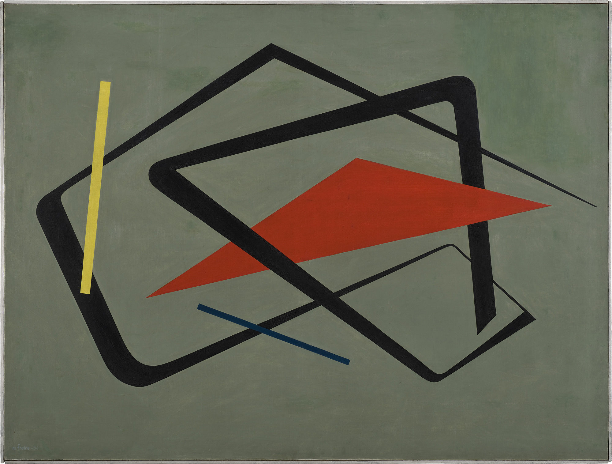
As in other parts of the world, South American artists embraced abstraction in the decades following World War II, with lines shapes of minimal color palettes. In his aptly named Curves and Straight Series, Argentine artist Alfredo Hlito takes this to an extreme with thin lines and curves against an off-white background, while Uruguayan artist María Friere used bolder lines and colors in her Untitled.
Alfredo Hlito. Curves and Straight Series / Curvas y series rectas, 1948. Oil on canvas. 27 3/4 × 27 3/4″ (70.5 × 70.5 cm) María Freire (Uruguayan, 1917–2015). Untitled. 1954. Oil on canvas, 36 1/4 × 48 1/16″ (92 × 122 cm). The Museum of Modern Art, New York. Gift of Patricia Phelps de Cisneros through the Latin American and Caribbean Fund in honor of Gabriel Pérez‑Barreiro Both of these pieces feel like they could have been three-dimensional pieces of design, and in fact, the exhibition does include several striking three-dimensional works. When seen head-on, Jesús Rafael Soto’s Double Transparency appears to be a plat painting or print, but from the side the depth becomes apparent.
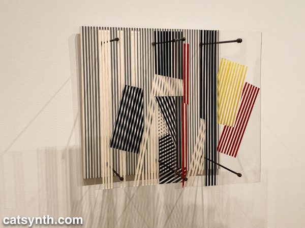
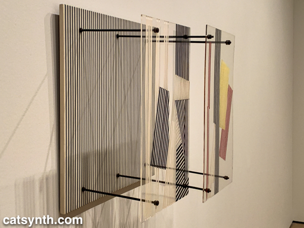
Jesús Rafael Soto. Double Transparency / Doble transparencia, 1956 . Oil on plexiglass and wood with metal rods and bolts. 21 5/8 × 21 5/8 × 12 5/8″ (55 × 55 × 32 cm)The lines-in-space motif is also used in Ocho cuadrados (Eight Squares) by Gertrud Goldschmidt, also known as Gego.
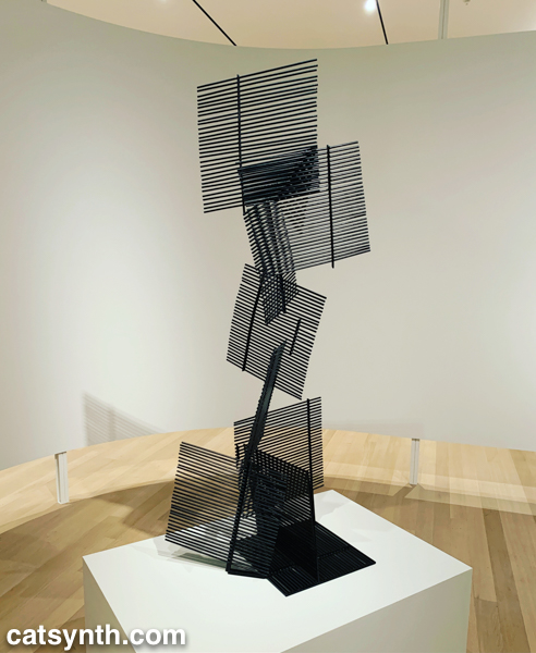
Gego (Gertrud Goldschmidt). Ocho cuadrados / Eight Squares, 1961. Painted iron. 66 15/16 × 25 3/16 × 15 3/4″ (170 × 64 × 40 cm) The recurring motifs in many of the works show the influence of Piet Mondrian, not just the most familiar neoplastic pieces but his earlier and later work as well. Indeed, I was happy to find Broadway Boogie Woogie hanging in this exhibition after not seeing it in the main collection display. As much as any work in MoMA’s permanent collection, I have a regard for this painting as if it were a friend and not just a work of art.
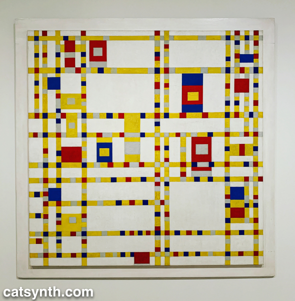
Piet Mondrian. Broadway Boogie Woogie, 1942-43. Oil on canvas. 50 x 50″ (127 x 127 cm) But perhaps the most extreme interpretation of the grid was found in Antonieta Sosa’s Visual Chess.
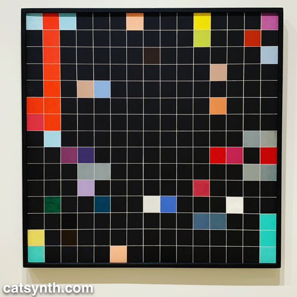
Antonieta Sosa. Visual Chess / Ajedrez visual, 1965. Acrylic on wood
37 1/8 × 37 1/16 × 1 3/16″ (94.3 × 94.2 × 3 cm)
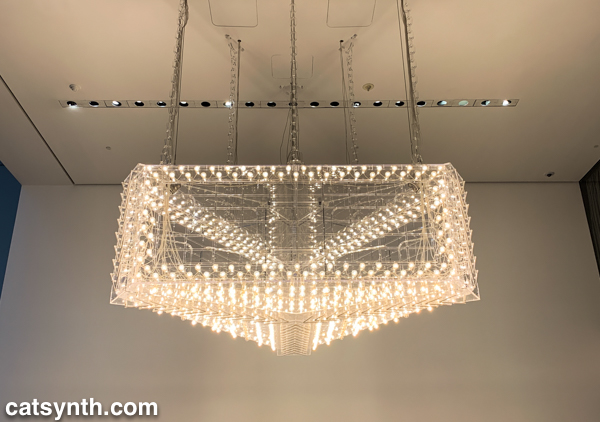
As part of its expansion, MoMA launched a new gallery space called the Marie-Josée and Henry Kravis Studio, or simply “the Studio”, a space dedicated for live, interactive, and multimedia art. The inaugural exhibit was Rainforest V, an evolution of David Tudor’s Rainforest. Originally a score for a collaboration with Merce Cunningham, it evolved into a performance installation. The latest version, realized by Composers Inside Electronics (CIE), is controlled by computer rather than live performers, as visitors wander through the space.
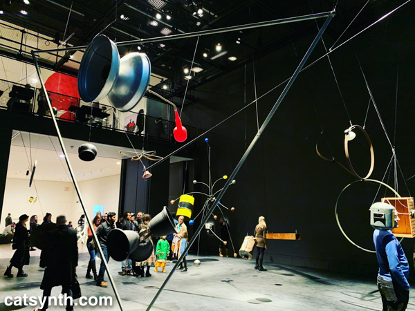
The installation is constructed from everyday objects, such as a metal barrel, a vintage computer hard disc, plastic tubing, wood crates, and more. The objects and materials are fitted with a vast array of speakers and become resonators that shape and amplify the sound.
The best moments are getting close to an object, such as the barrel or balsa-wood box with simulated earphones, and standing for a moment then walking around. I regret that an iPhone in a crowded gallery is not the best way to record and share it with readers – it really music be seen in person.
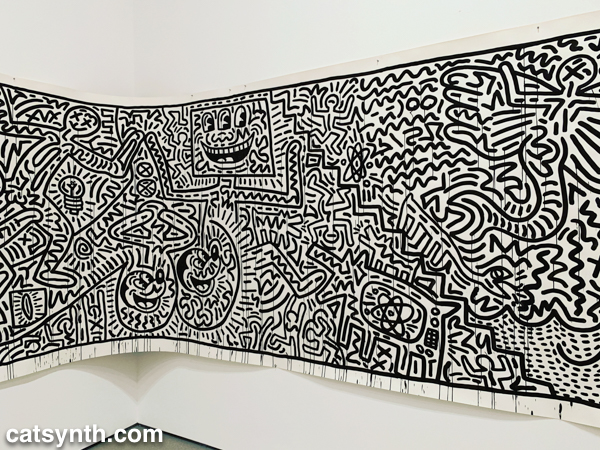
There was still more to see, including the newly expanded second-floor gallery for contemporary (1980s-present) works. This period has traditionally been a more mixed one for me, but there are gems and inspirations to be found. There was a large gallery-spanning work by Keith Haring.
Keith Haring An equally monumental piece by Julie Mehretu called Empirical Construction: Istanbul a fantastic futuristic cityscape radiating in multiple dimensions.
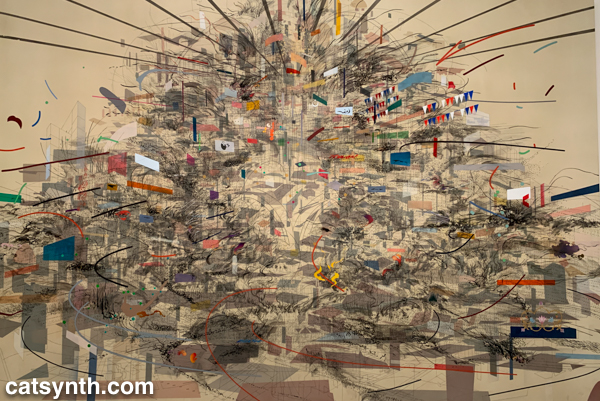
Julie Mehretu. Empirical Construction: instanbul, 2003. Acrylic and ink on Canvas. On the opposite scale is Eduardo Kac’s Reabracadabra, a video piece realized as graphics inside a vintage Minitel terminal.
Eduardo Kac. Reabracadabra, 1985. Minitel terminal and digital poem transferred to video (0:35 min). Kac’s piece reminded me of my interest in vintage electronics finding new life as dynamic art pieces.
We end with one panel from a larger work by the artist Zarina, Home Is A Foreign Place.
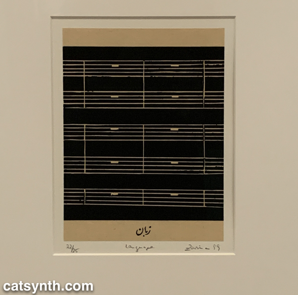
Zarina. Home Is A Foreign Place, 1999. Woodcuts with letterpress additions mounted on paper. There is something bleak about an entire musical score made of rests, but also intriguing, and even curious. It is perhaps a reminder that exploring a museum top to bottom invites one to escape one’s comfort zones even at the same time as seeking comfort and solace. I’m glad this visit afforded opportunities for both.
-
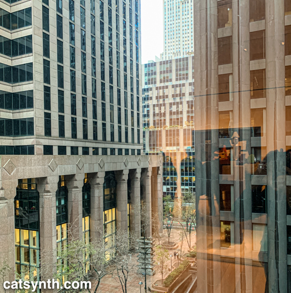
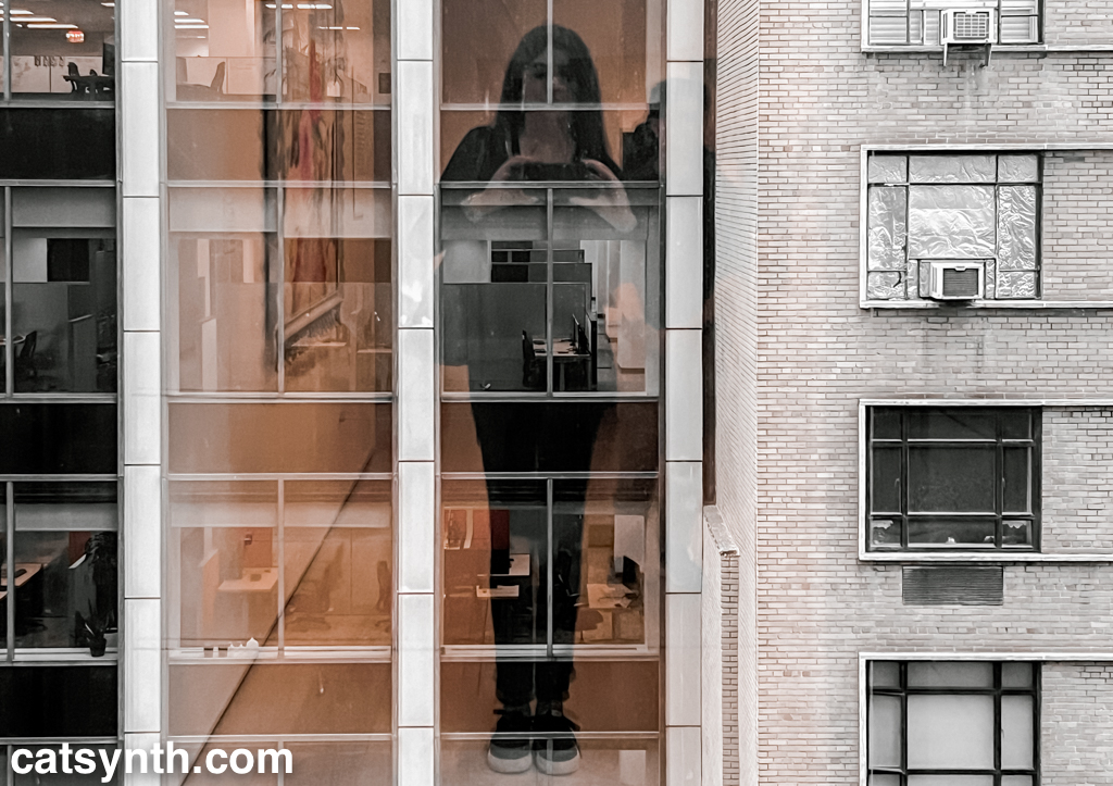
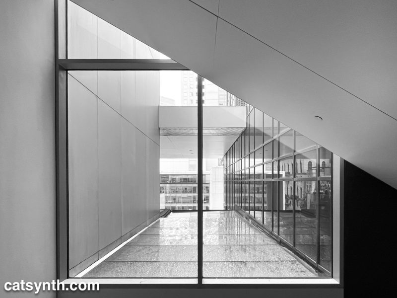
Wordless Wednesday: Art Through the Window
Through this window at the Museum of Modern Art in New York, the city itself becomes a work of art. The partial reflections add texture.
If you haven’t already done so, please check out Part 1 of our report from the newly renovated MoMA.
-
MoMA 2019, Part 1: Surrounds & Permanent Collections
Most visits to New York include a stop at the temple of modernism, the Museum of Modern Art (MoMA). But this was my first visit since the massive multi-year expansion and renovation was completed. In some ways, it seems that not much has changed, but in other ways it has changed considerably, starting the members-only entranceway leading to a larger and more open lobby.
The second=floor atrium remains very much the same as it has been since the expansion in the early 2000s, a cavernous space looking up to all exhibition floors of the museum. It often is used to display monumental pieces or immersive performance works. Handles, a performance and sculptural piece by Haegue Yang combined both.
The name refers to the handles on all of the sculptural elements that allowed them to be slowly moved around the space by the performers. In between these motions, the performers gathered for vocal chanting that brought to mind the work of Pauline Oliveros. The sculptures and wall and floor elements had a simple geometric quality that reminded me of children’s building blocks. They also had bells and other sound elements mounted, again something that brought to mind Oliveros.
From the atrium, I always head immediately to the sixth floor and gradually work my way back down. The top floor featured Surrounds, an exhibition of large-scale installations by a diverse collection of contemporary artists. Some, like Mark Manders‘ Room with Chairs and Factory, were large singular pieces, with a gallery-sized replica of a factory. Others were large compositions of smaller elements. For example, Dayanita Singh‘s Museum of Chance was composed of numerous photograph prints made by the artist, assembled into large modular panels that could be easily rearranged in any number of configurations.
In his installation Architecture Is Everywhere, Sou Fujimoto challenges us to see the “architecture” in everyday objects. His installation is a field of small objects ranging from colored geometric design elements to potato chips placed on an array of pedestals.
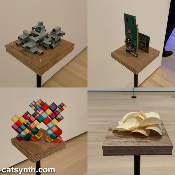
The “architecture” in each object is readily apparent when one is invited to see it. Even the potato chips are curvilinear forms that might be at home in a 1960s futurist public space.
Perhaps the most of fun of all the installations was Sarah Sze’s Triple Point (Pendulum). A colorful collection of everyday objects are arranged, somewhat precariously, around a circle as a pendulum swings freely above, threatening mayhem of destruction. However, that never happens and instead, we end up with an intricate but chaotic dance.
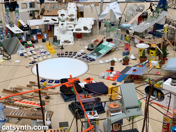
The name of the piece, which derives from the “triple point” where water can exist simultaneously as ice, liquid, and vapor, illustrates the sense mix of chaotic and coexistence in the installation.
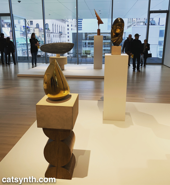
Descending to the fifth floor, some of the changes to the museum became more apparent. The terrace cafe overlooking the sculpture garden had been removed (actually, moved to a new location on the sixth floor), and replaced by an open gallery space showing various sculptures by Constantin Brancusi.
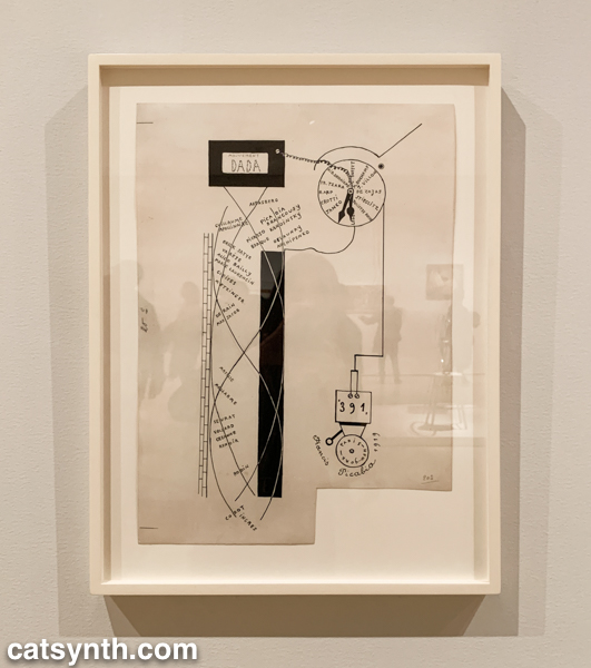
The remainder of the fifth floor and the entirety of the fourth floor housed an expanded and increasingly labyrinthine set of galleries for the permanent collection. The first gallery, which featured the oldest and most traditional works such as Van Gogh and Matisse, was by far the most crowded space in the entire museum. I quickly left to find some more open spaces and truly modern works, which began to appear in the 1910s and 1920s. In addition to Dada favorites, there were works celebrating machines, industry and the break with traditional forms of painting. Francis Picabia’s Dada Movement and Man Ray’s chess set are exemplars of these directions.
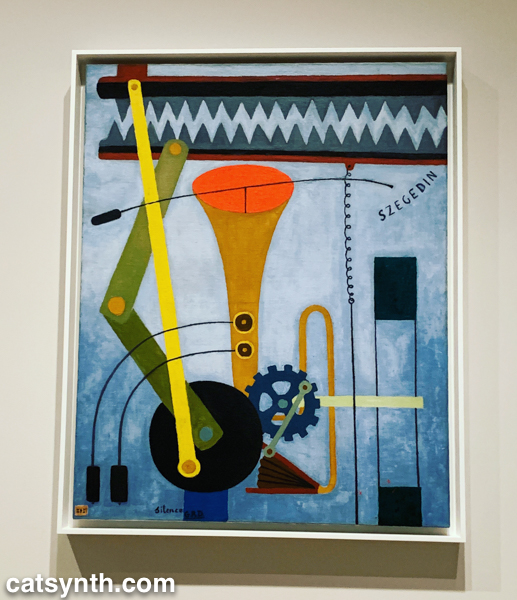
Georges Ribemont-Dessaignes‘ Silence depicts a musical instrument attached to machinery, perhaps speaking to the contradictory nature of music made by machines.
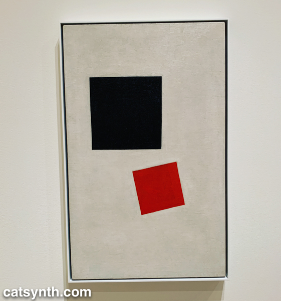
There was also a lively world of modernism and abstraction in Russia before the 1917 revolution, as exemplified by Kazimir Malevich’s minimalist Supremacist Composition: Airplane Flying.
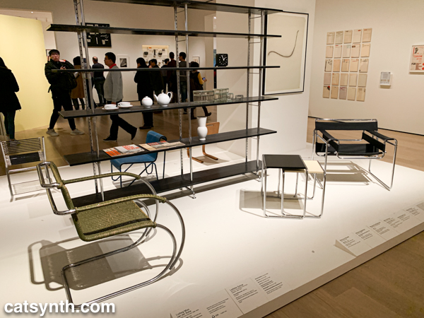
The expanded galleries included a room of design pieces from the interwar period (these were previously displayed in the separate design gallery on a rotating basis).
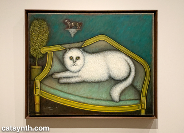
There was also a new space devoted to so-called “outsider artists” of the period, including Morris Hirshfield. I was particularly drawn to his portrait of a white cat titled Angora Cat.
The collection continued on the fourth floor with the period between the end of World War II and the 1970s. This is usually my favorite section to linger in, with many iconic works of the 20th century. The Jackson Pollock’s are of course back on full display, but so is Lee Krasner, who is finally getting her due as a leading abstract expressionist painter.
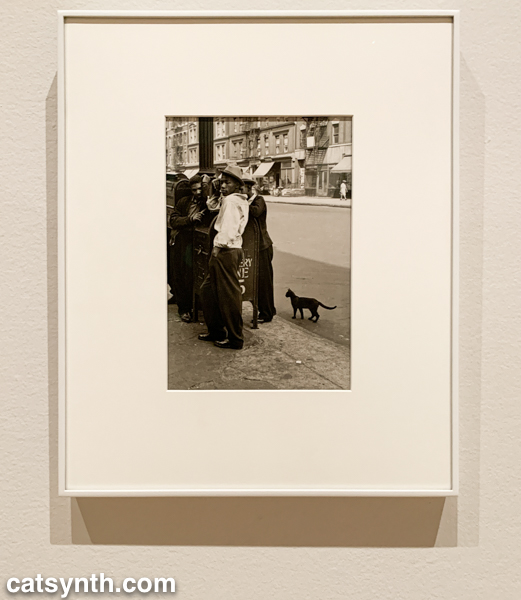
The expanded galleries have given more room for women and other underrepresented artists. The photography of Helen Levitt was featured in a room that also included artists depicting life in Harlem in the 1950s. I particularly liked this photograph of hers with a black cat.
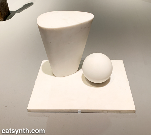
This sculpture by Barbara Hepworth is quite minimal, with the perfection of the sphere balancing with the “squishier” curves of the taller element.
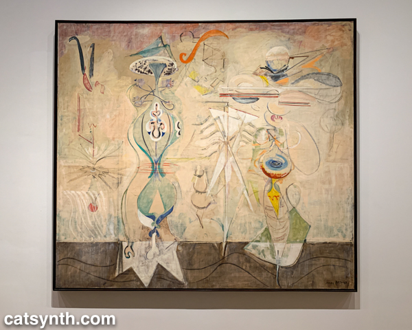
There were also pieces that showed the works of artists beyond their most well-known. I would not have guessed this painting with other-worldly plant-like creatures as the work of Mark Rothko were it not for the title card.
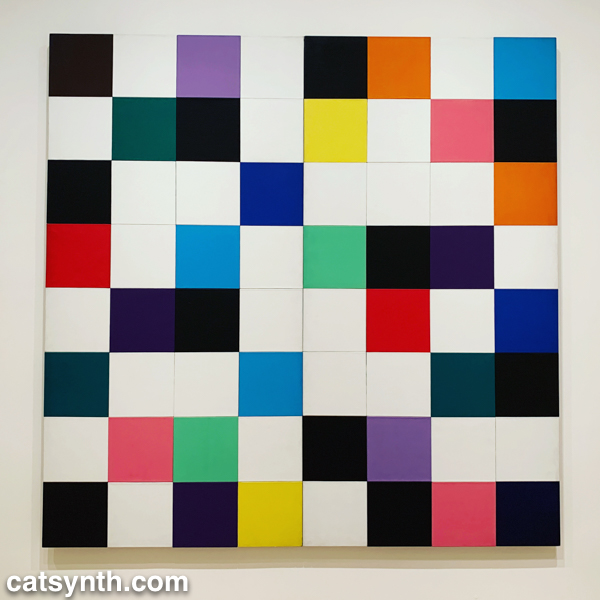
There were of course pieces that did exemplify artists as we know them. Ellsworth Kelly had large geometric blocks of color, as one would expect.
I looked around these galleries in vain for perhaps my favorite work in the collection, Piet Mondrian’s Broadway Boogie Woogie – it’s like visiting an old friend when I see it – but it was nowhere to be found. [Spoiler alert: I did eventually find it and it will be featured in Part 2 of this series.]
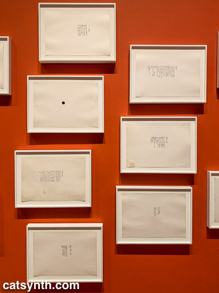
As we move into the late 1950s and the 1960s, abstract expressionism gives way to more conceptual art and works in different media. This was the beginning of Fluxus, with its instructional pieces, happenings, and ephemeral works on cheap materials. There was an entire wall of “scores” for performance works by Yoko Ono. These are always fun – most have clear instructions that one could use to perform them today, though I wonder what was expected from the large black dot.
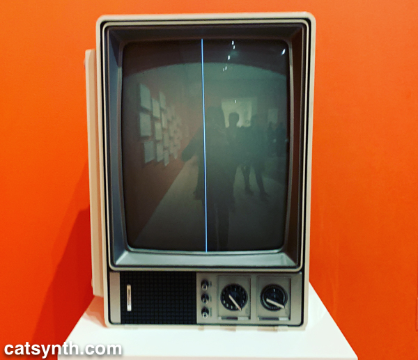
This is also the era of Nam Jun Paik’s experiments with analog video. Zen for Television takes video art to its most minimal, with a single line of a continuous signal on the screen. However, the vintage television set itself becomes a specific idea when viewed in the 21st century.
Abstract designs persist in this period, but also take on an industrial and repetitive nature. Sol Lewitt takes this to the extreme, but others Geraldo de Barros left room for variation, and perhaps to the works on paper from Fluxus.
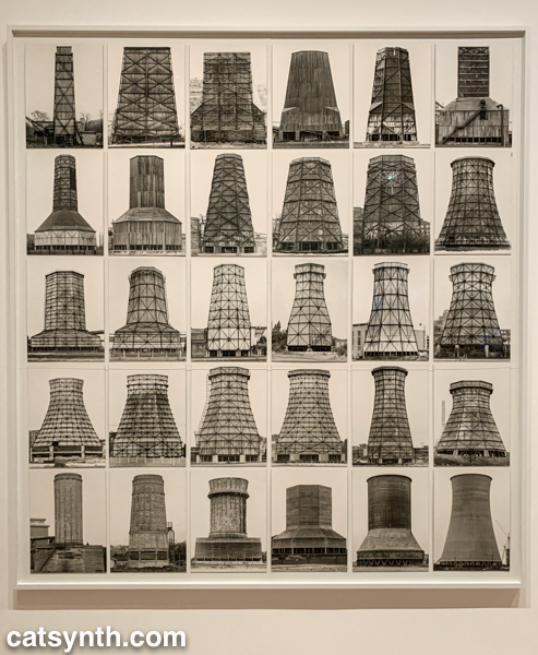
Among my favorite photographers of this period are Hilla and Bernd Becher. There work depicting old industrial buildings and placing them into artistic compositions has been a huge influence on my own photography.
Even after this whirlwind through three floors, seven decades, and multiple exhibits, there was still much of the museum to cover; and I was determined to cover the entirety in one day. In the end, I succeeded, and the remainder of the visit will be covered soon in Part 2 of this series.
-
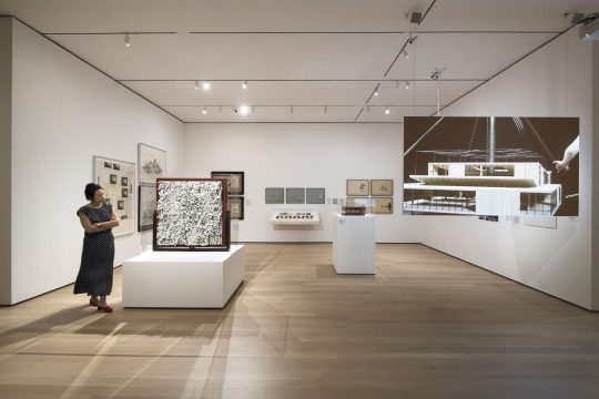
Toward a Concrete Utopia: Yugoslavian Brutalism at MoMA
We at CatSynth are admirers of brutalism, as anyone who follows us on Twitter can attest. We love the geometric forms, how it screams “modern”, and how it makes such an intense break with tradition. And I will admit, I also have a little fun using it to poke fun at the architectural conservatism prevalent in places like San Francisco. But above all, it provides a singular beauty to built spaces.
Brutalism perhaps reached its zenith in the former Yugoslavia during the period between the end of World War II and 1980, a period that is highlighted in a current exhibition at the MoMA, Toward a Concrete Utopia: Architecture in Yugoslavia, 1948–1980. It highlights the work of several Yugoslavian architects in the period and pieces ranging from prosaic apartments to public arenas to monuments. The buildings themselves are, of course, not on display in the museum, but their stories are told through models, photographs, and examples of interior objects.
Installation view of Toward a Concrete Utopia: Architecture in Yugoslavia, 1948–1980, The Museum of Modern Art, New York, July 15, 2018–January 13, 2019. © 2018 The Museum of Modern Art. Photo: Martin SeckA convergence of factors came together which allowed these modernist experiments to flourish. Yugoslavia broke away from the Soviet bloc in 1948 and began to forge its own socialist path and identity. It constituted itself as six republics in a federation in which traditional regional identities were subordinate to a new and modern whole. At the same time, the country was devastated by World War II and needed massive rebuilding. Finally, new ideas in architecture were emerging along with new materials, notably advances in concrete, steel, and glass allowed a new built environment to take shape.
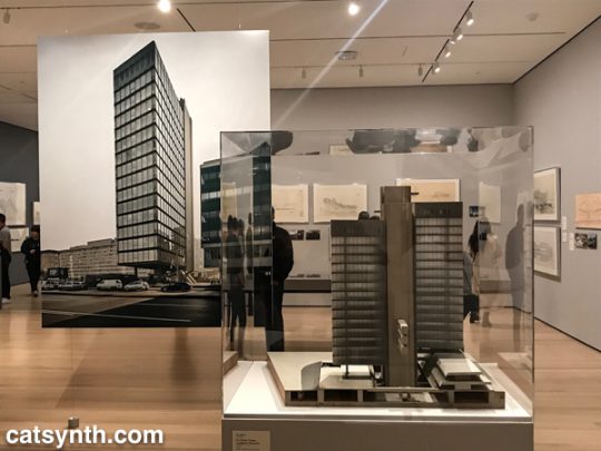
The simple forms and surfaces were used for everyday buildings, such as apartment complexes, schools, and medical facilities. But rather than just one-offs, they become part of a unified cityscape, a grand plan. This was perhaps no more so than in Skopje, the capital of Macedonia, which was devasted by an earthquake in 1963 and largely rebuild using modernist design and principals.
Janko Konstantinov. Telecommunications Center. 1968–81. Skopje, Macedonia. View of the Southwestern Block façade. Photo: Valentin Jeck, commissioned by The Museum of Modern Art, 2016 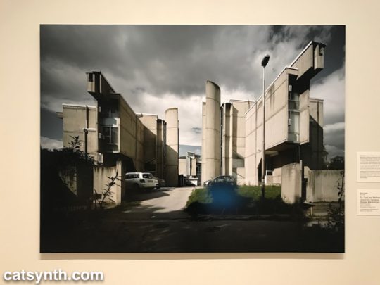
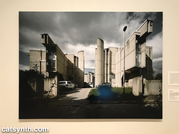
MARKO MUŠIČ. Photograph by VALENTIN JECK
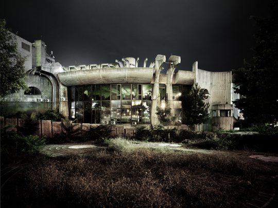
Ss. Cyril and Methodius University Campus, Skopje, Macedonia 1967–1974. (Gotta love an architect named “Music”)There are, of course, numerous rectilinear designs, sometimes in steel and glass, and sometimes dominated by concrete. But concrete also allowed for the exploration of curved structures and organic shapes. We see this in many of the large civic arenas, but also in the brutalist monuments built in the post-war period. This “cell-like” structure in Macedonia takes it to the extreme, looking at once like an organic organism and a spaceship.
Wandering through the exhibition, one cannot help but imagine being the real spaces. For me, the modernist, severe style brings a sense of calm and welcome that more traditional styles don’t always provide.
Ornament can be beautiful, but it is rarely ever calming in the way that simple texture and geometry is. The calming nature of simple forms can extend to the interior spaces as well as the exterior, and the exhibition includes examples of everyday objects and furnishings.
Installation view of Toward a Concrete Utopia: Architecture in Yugoslavia, 1948–1980, The Museum of Modern Art, New York, July 15, 2018–January 13, 2019. © 2018 The Museum of Modern Art. Photo: Martin Seck Sadly, the Yugoslavian experiment ultimately failed, with country breaking apart and the entire region plunging into extreme nationalism and devastating wars in the 1990s. This is a cautionary tale as we watch the plague of nationalism rising around the world, including in the United States. Many of the architectural works in this exhibition did survive the wars. But they do face continued challenges to their survival, including maintenance and a push to return to more “traditional” forms. The “Skopje 2014” initiative, for example, is both farcical and tragic. Despite these challenges, I hope the countries of the region will recognize and preserve the legacy of their modernist period for years to come.
This article only scratches the rough, hardened surface of the wealth in this exhibition. It was truly a wonderful experience, even if so much was in my imagination through the artifacts. Toward a Concrete Utopia: Architecture in Yugoslavia, 1948–1980 will be on display at the Museum of Modern Art in New York through January 13, 2019.
-

MoMA Part 2: Stephen Shore, Thinking Machines, Max Ernst, Is Fashion Modern
Our initial report from MoMA focused on the current exhibition of print and 2D works by Louise Bourgeois. But in November, the entire museum was a trove of intriguing exhibitions – even with the current construction – and today we look at four more of them.
We begin with Max Ernst: Beyond Painting, a survey exhibition built around the celebrated Dada and Surrealist artist’s frequent description of his own practice as “beyond painting.” It does actually include paintings, but also is many early drawings and works on paper as well as his sculptures and early conceptual work.
Ernst first came to prominence as the founder of the Cologne branch of Dada after World War I (in which he served in the German army). Like other in the Dada movement, much of his work was deliberately provocative and low-fi and went outside of traditional artistic practice. One of the seminal works from this early period was the portfolio Let There Be Fashion, Down with Art, which mixes technological drawings, equations and other elements in absurd and non-sensical ways. Despite the tone and organizing concept, some of the individual illustrations are quite beautiful.

In the above page, we see a feminine figure juxtaposed with geometric and architectural elements. It could have easily been one of Louise Bourgeois’ drawings from three decades later! It also reminded me of the composition in some of my photography.
“Beyond Painting” did include paintings, particularly from Ernst’s surrealist period after relocating from Cologne to Paris.

[Max Ernst. The Nymph Echo (La Nymph Écho). 1936. Oil on canvas.]The hard-edged lines have given way to the dreamy organic shapes frequently employed in surrealism. But Ernst’s renderings have more of a biological feel – there is abundant vegetation, and some elements appear as microscopic life forms but on a human scale.
Despite his reputation as a provocateur within the often dark worlds of Dada and surrealism, Ernst’s work often has a very playful quality, even endearing at times. That comes out most in his sculptures, some of which can even be described as “adorable”

[Max Ernst. An Anxious Friend (Un ami empressé). 1944 (cast 1973)]This one, in particular, is worth walking around, as there is another figure on the back side.
The exhibition culminates with 65 Maximiliana, an illustrated book co-created with book-designer Iliazd.
[Max Ernst. Folio 10 from 65 Maximiliana or the Illegal Exercise of Astronomy (65 Maximiliana ou l’exercice illégal de l’astronomie). 1964. Illustrated book with twenty‑eight etchings (nine with aquatint) and six aquatints by Ernst and letterpress typographic designs by Ilia Zdanevich (Iliazd). Page: 16 1/16 × 12 1/16″ (40.8 × 30.7 cm). Publisher: Le Degré 41 (Iliazd), Paris. Printer: Georges Visat. Edition: 65. The Museum of Modern Art, New York. Gift of David S. Orentreich, MD, 2015. Photo: Peter Butler. © 2017 Artists Rights Society (ARS), New York / ADAGP, Paris.]In addition to Ernst’s aquatint illustrations and Iliazd’s fanciful typography, the book also features a completely invented hieroglyphic script by Ernst. It brings his career full circle to those early Dada books from Cologne.
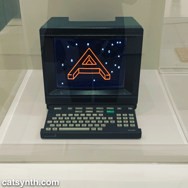
As described above, beauty and artistic interest often originate outside traditional artistic practices. The exhibition Thinking Machines explores the artistic ideas that emerged alongside early computer technologies as well as the beauty of the devices themselves.
It is easy in the age of ubiquitous, distributed, and often invisible computing that the most powerful computers were singular and central elements of many workplaces and institutions. The Thinking Machines CM-2, made in 1987, both fits in the emerging dystopian future imaged in the era but also collapses complexity to beautiful patterns in the red LEDs against the black cubic casing. Apple has always been known for their design, and some of their early offerings were featured, including the Macintosh XL (successor to the infamous Lisa).

While the machines themselves were works of art, artists immediately saw their potential for exploring new ways of creating – we can only imagine what Max Ernst might have done with these technologies! But we don’t have to imagine with others, such as John Cage. Here we see both the score and record for HPSCHD, his collaboration with Lejaren Hiller that featured computed chance elements and computer-generated sounds on tape alongside live harpsichords.

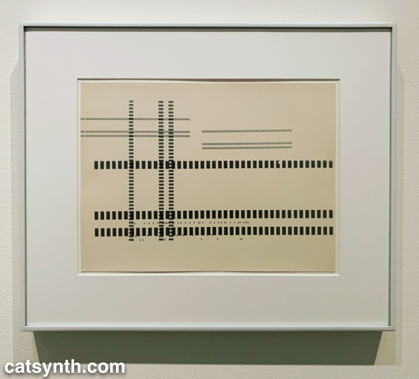
The intersection of music and technology is at the core of what we do at CatSynth, but we have also long been interested in technology in other arts. The exhibition included samples of sonakinatography, a system of notation for motion and sound developed by Channa Horwitz.

The notation system uses numbers and colors arranged in eight-by-eight squares and can be used to represent music, dance, lighting, or other interpretations of motion over time. The notation and a proposed work were submitted by Horwitz for 1971 Art and Technology exhibit at LACMA – although the proposal for the piece with eight beams of light was included in the catalog, it was never fabricated. Horwitz work was buried beneath the work of male artists and she was not invited to speak or meet with industry representatives collaborating on the exhibition. This led to an outcry about the exhibition’s lack of women, a problem that echoes to this day in the world of art and technology. Fortunately, women were recognized in this MoMA exhibition of early technology in art. In addition to Horwitz, we saw work by Vera Molnár, a pioneer of computer art. In the print below, she digitally riffs on a drawing by Paul Klee.

Surprisingly, MoMA has rarely delved deeply into fashion in its exhibitions. For a long time, the biggest major exhibition the museum held for this medium was Bernard Rudofsky’s 1944 exhibition Are Clothes Modern?. But the museum is revisiting the topic in a major way with the current Items: Is Fashion Modern? a deliberate play on Rudofsky’s original title. The exhibition includes 111 garments and accessories and places them in both conceptual and chronological organizations. There are of course mainstays of fashion such as the “little black dress.”

It is hard to look at a fashion exhibition without thinking “Would I or would I not wear this?” In the above example, the dress on the left is something I would wear, while the one on the right is something I would not (except perhaps as a costume for a film, etc.). But side by side they show a range of tastes and styles and how they shape and reflect our images of our own bodies. The most intriguing design in the “I would wear this” category was this dress from Pierre Cardin’s “Cosmos Collection”. Even if this was intended to represent “the future”, I could see it easily working in the present, whether the present is 1967 or 2017.

[Cardin. COSMOS]The exhibition did also touch on new technologies and innovations, such as with this dress that uses 3D printing technology.

[Jessica Rosenkrantz and Jesse Louise-Rosenberg. Kinematics Dress. 2013. Laser-sintered nylon.]Of course, not all fashion is “high fashion”, and the exhibit deliberately covered both. There were the ionic baseball caps of the New York Yankees and their evolution over the years (someone had to design each one of them). And even a display of Jewish kippas, ranging from the simple to the whimsical.

I was particularly amused to see the Yankees-themed kippa. It was two “religions” colliding.
Our final exhibition is the MoMA’s large and comprehensive retrospective of works by photographer Stephen Shore. I have to admit, I was not particularly acquainted with Shore’s work, and after touring the exhibition I realize I should have been. In many ways, Shore’s work is photography writ small, often employing simple camera technologies, including a novelty Disney toy camera from the 1970s and Instagram on an iPhone in his current work. And his subjects range from the foment of 1960s New York and Andy Warhol’s Factory to stark rural landscapes.

[Stephen Shore. New York, New York. 1964. Gelatin silver print, 9 1/8 × 13 1/2″ (23.2 × 34.3 cm). © 2017 Stephen Shore, courtesy 303 Gallery]
[Stephen Shore. U.S. 93, Wikieup, Arizona, December 14, 1976. 1976. Chromogenic color print, printed 2013, 17 × 21 3/4″ (43.2 × 55.2 cm). The Museum of Modern Art, New York. Acquired through the generosity of Thomas and Susan Dunn. © 2017 Stephen Shore]I particularly like the “ordinary” nature of some of the settings, main streets, highways, abandoned booths. The juxtaposition of New York against the small town and rural landscapes feels quintessentially American. Shore was also known for working in color, especially after leaving New York – this was something that wasn’t done so much in the world of art photography at the time. He also deliberately subverted the idea of art photography at times, including in his 1971 exhibition All the Meat You Can Eat, which was composed mostly of found imagery (commercials, postcards, snapshots) in dissonant arrangements that were more theatrical than anthropological.
Shore also did commission work. A few of these took him abroad, including to Israel, where he combined his interests in photography and archaeology. His most recent work fully embraces the modern technology of Instagram sharing – you can follow Shore’s Instagram account – and on-demand printing. The subject matter is varied, often focusing on small-scale or interesting framing of everyday items, but there are also occasional snaps that wouldn’t appear out of place on a tasteful personal account.
It’s not uncommon for me to be inspired to pursue my own work after an exhibition. This was certainly an example, as Shore’s photography mirrors many of own work in the medium, particularly focusing on place and texture, as well as traveling the country to pursue one’s art. Indeed, the inspiration was a bit more poignant because wondering the images I felt that this was exactly what I should be doing. It perhaps that realization that led me to tear up a bit as I left.
-
Louise Bourgeois: An Unfolding Portrait, MoMA
For us at CatSynth, no trip back to New York is complete without a visit to the Museum of Modern Art (MoMA), and this time it was an exceptionally rich one, with interesting exhibitions on every floor even amidst the museum’s massive renovation project. We begin with a look at an exhibition of prints by Louise Bourgeois that focused on her print-making work. Although primarily known for her sculptures, Bourgeois produced a large body of printed works on paper, textiles and other materials, especially at the beginning and end of her career. But the themes and characteristic elements remain similar regardless of medium, and the show placed the printed works in the context of her sculpture. For example, the main atrium of the museum was dominated by one of her large iconic spider sculptures, with late-career prints surrounding it on the walls.

[Louise Bourgeois. Spider (1997)]
[Installation View]The prints in the atrium featured curved, organic forms, in keeping with the same natural focus in the spider and many of her other sculptures. We can see this synergy between print and sculpture throughout the exhibition, with early prints and drawings informing her sculptures of the 1950s and 1960s, which combined geometric and architectural elements with organic shapes and textures.

[Louise Bourgeois. Femme Maison (1947)]
[Louise Bourgeois. Pillar (1949-1950) and Figure (1954)]The vertical nature of the forms enhances the sense of embodiment in the sculptures, while drawings like Femme Maison (shown above) make the connection literal. Bourgeois revisited these same themes in many of her later prints, perhaps even drawing upon the earlier sculptures themselves for inspiration.

[Louise Bourgeois. The Sky’s the Limit, version 2 of 2, only state (1989-2003)]In addition to the intersection of architectural and biological forms, Bourgeois’ work often explores themes of womanhood, fertility, and sexuality. Indeed, the 1947 Femme Maison combines all three themes. On particularly poignant series from the 1990s, late in her life, revisits motherhood embodied in Sainte Sébastienne (presumably a gender switch of the early Christian martyr Saint Sebastien). Childbirth and pain come together in the first more literal series of images, but there is a softer element to the second series, which includes this image combining the maternal figure with a cat.

[Louise Bourgeois. Stamp of Memories II, version 1 of 2, state XII of XII (1994)]Sexuality comes through abstractly in many pieces, but quite literally in some late-career drawings which have a playful, comic-like quality, as in this page from her illustrated book The Laws of Nature.

[Louise Bourgeois and Paulo Herkenhoff. Untitled, plate 2 of 5, state X of X, from the illustrated book, The Laws of Nature (2006)]Bourgeois celebrated both the female and male while turning some of traditional roles and stereotypes on their head. In the above image, it is the woman who appears to be in control in the sexual moment, with the male figure more passive. Another particularly amusing riff on gender stereotypes is her sculpture Arch of Hysteria in which a suspended male torso is used to represent “hysteria”.

[Louise Bourgeois. Arch of Hysteria (1993) and installation view.]Having been on the receiving end of “why are you being so emotional?” comments in the workplace, I rather enjoyed seeing this stereotype turned around.
We conclude with one last piece from the Lullaby series in which a simple red organic form is printed on sheet-music paper.

[Louise Bourgeois. Untitled, no. 11 of 24, only state, from the series, Lullaby (2006)]Like the drawings from The Laws of Nature, these were done towards the end of the career. I thought it was interesting that she chose music paper as the foundation for this series. And for us at CatSynth, it allows us to circle back to music, which permeates our experience of art.
Louise Bourgeois: An Unfolding Portrait will be on display at the Museum of Modern Art in New York through January 28, 2018. You can find out more information here.
-

Projects 107: Lone Wolf Recital Corps and Works from “Travel Ban” Countries, MoMA
Our coverage from our recent visit to the Museum of Modern Art in New York continues with Projects 107: Lone Wolf Recital Corps. The Lone Wolf Recital Corp is a multidisciplinary performance collective founded in 1986 by artist and musician Terry Adkins (1953-2014) and has featured many musicians and visual artists over the years. The performances were as much visual art as performance, with Adkins’ sculptures and other objects. Indeed, the main artist attractions were the many musical-instrument sculptures.

The horns above look like they could be played with enough strength and energy. By contrast, Adkins’ musical sculpture Nenuphar, which consists of two horns fused together seems impossible to play.

[Terry Adkins, Nenuphar (1998). Brass and Copper.]When one is deep in the details of music making – and using electronic gadgets in the process – it is possible to forget the aesthetic beauty of musical instruments as objects and sources of inspiration themselves. Adkins’ sculptures and the work of the ensemble remind us that. The performances, which employ collective improvisation also centered around a diverse set of figures such as John Coltrane, abolitionist John Brown, explorer Matthew Henson, and singer Bessie Smith. Adkins billed the performances and dedications as “an ongoing quest to reinsert the legacies of unheralded immortal figures to their rightful place within the panorama of history.” (it should be noted that here at CatSynth, John Coltrane, in particular, is anything but unheralded.)
Unfortunately, we were not in town to attend either the opening performance or the second performance on September 26, which brought members of the ensemble together in live improvisation around the sculptural elements of the exhibition.

[Opening performance of Projects 107: Lone Wolf Recital Corps at The Museum of Modern Art, August 19, 2017. Photo: Scott Shaw.]It looks like it was a great event, and while we are sad to have missed the performances, we are glad to have found the exhibition. It was one of the happy surprises that one expects when exploring MoMA.
Since February, MoMA has hung artworks galleries by artists from countries affected by the administration’s various travel bans – something which is poignant this week as the latest incarnation of in the ban covering seven countries (six majority-Muslim countries plus North Korea) has been announced. Below is one such work, a beautiful exterior perspective of a proposal for The Peak: Hong Kong by Zaha Hadid, who passed away last year.

[Zaha Hadid. The Peak, Hong Kong (1991). Exterior perspective, synthetic polymer on paper mounted on canvas.]The pieces are scattered among the rotating display of works from the permanent collection in the middle floors, which are otherwise organized in a near-religious temporal and historical progression from early modernism at the turn of the 20th Century to the post-war period. Hadid’s painting stood in high contrast to the early modern works surrounding it. Others, such as The Prophet by Parviz Tanavoli blended more subtly with their surroundings. The following statement was included with each artwork:
This work is by an artist from a nation whose citizens would be denied entry into the United States according to recent presidential executive orders. This is one of several such artworks from the Museum’s collection installed throughout the fifth-floor galleries to affirm the ideals of welcome and freedom as vital to this Museum, as they are to the United States.
We at CatSynth could not agree more, and strongly support MoMA’s action through art.