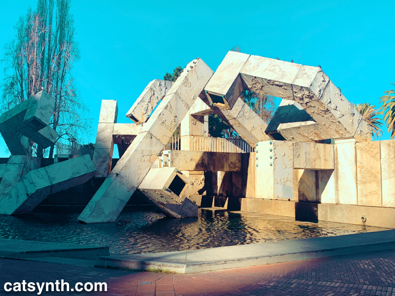
The Vaillancourt Fountain at Embarcadero Center. Another image from the same magical day in San Francisco as our previous two Wordless Wednesdays.
The Vaillancourt Fountain at Embarcadero Center. Another image from the same magical day in San Francisco as our previous two Wordless Wednesdays.
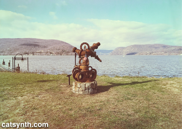
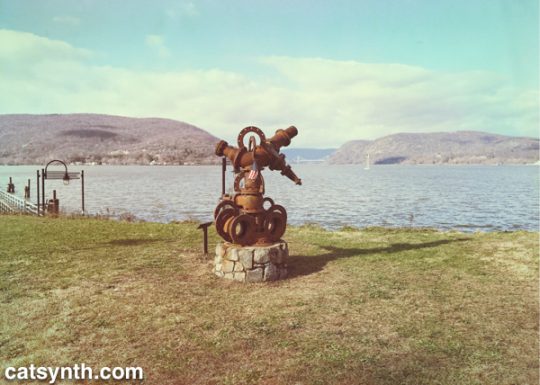
Sculpture at Fleishmann Pier in Peekskill, NY. We see the Hudson River and the Bear Mountain Bridge in the distance.
Last week’s Wordless Wednesday was also taken in Westchester County along the Hudson River.
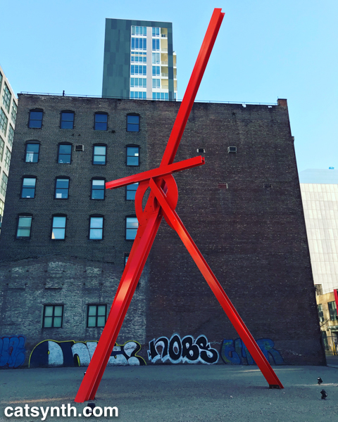

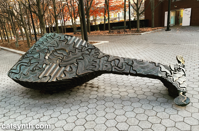
Classic Mark di Suvero sculpture in a lot along 11th Avenue in the Chelsea neighborhood of New York.
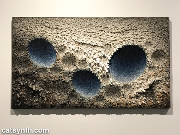
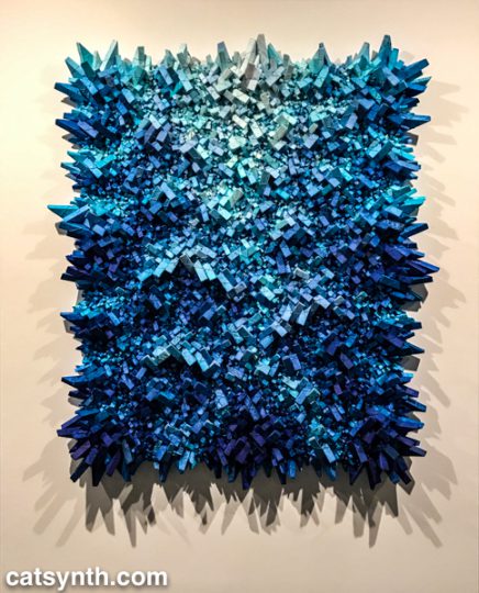
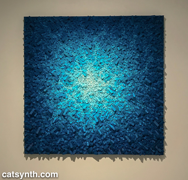
After seeing Kwang Young Chun’s Aggregations at Sundaram Tagore Gallery (read our review of that show), I knew I needed to check out his solo exhibition at the Brooklyn Museum. I expected more of the same style of abstract triangulated paper constructions, but on a larger scale. And I was not disappointed.
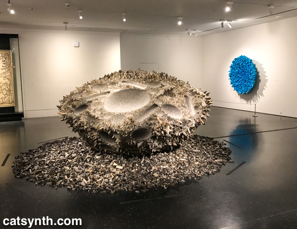
These large other-worldly constructions are formed from small tightly folded prisms of mulberry paper. This thin and delicate paper is prized as an artistic material but also has mundane uses as wrappers. Chun primarily sources his paper from old books.
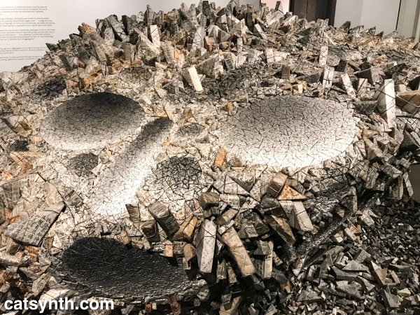
The freestanding central piece, which I believe was Aggregation 15-JL038 (his titles all rather cryptic alphanumeric combinations), was particularly intense and seemed like a cratered surface of a large asteroid. The remaining pieces were wall-mounted, but still combined light and shadow, roughness and smoothness, in a similar way.
There is something I find deeply captivating about Chun’s sculptures. They seem like something I might have generated on the computer, but they are made of paper. They seem solid and heavy, but fragile at the same time. I also liked the juxtaposition of blue with the otherwise grayscale elements. I found myself sitting in the middle of the gallery and contemplating each of them for a long time, longer than I usually sit with individual pieces on a whirlwind trip through a museum.
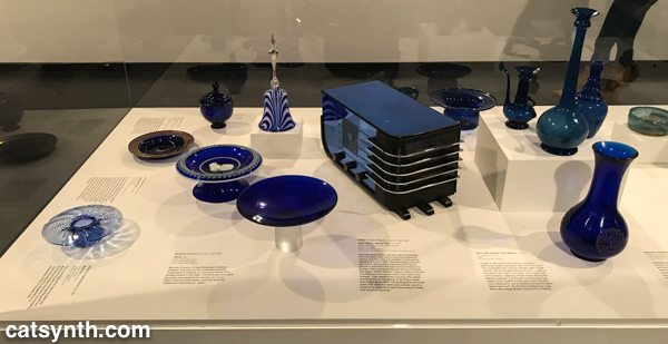
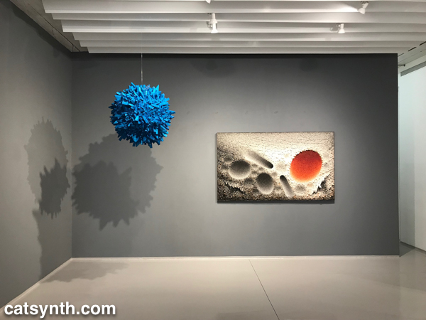
Blue seemed to be the color of the day. Even before reaching Kwang Young Chun’s exhibition, I was greeted by Infinite Blue, a survey of art and design objects from the museum’s collection.
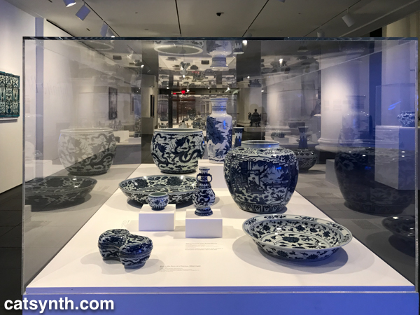
I have long been drawn to blue – along with purple, it is a color I welcome into my own art and design, and one of the few colors that I wear. It’s also historically a rarer color and one that is not often found in nature (other than the blue tint of the sky and water). The exhibition goes through different places and periods of art and craft incorporating blue, often juxtaposing traditional objects with contemporary art. For example, the Chinese porcelain in the image above was paired with contemporary paintings by Chinese artist Su Xiaobai.
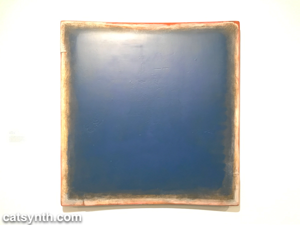
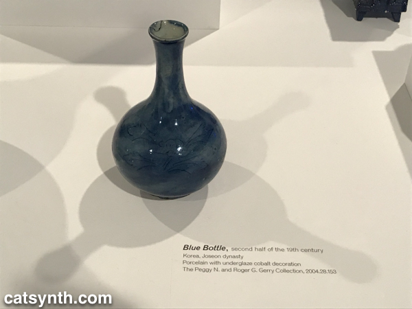
I tend to be most drawn to objects that are more abstract and geometric. As such, the section featuring 19th-century American decorative arts did nothing for me. By contrast, I enjoyed seeing a Korean 19th-century porcelain bottle with 20th-century American designs in blue glass.
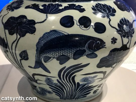
I do, however, have a soft spot for fish.
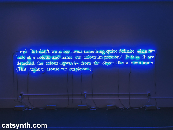
The most powerful element tying the entire exhibition together was the opening piece, one of Joseph Kosuth’s neon text works 276 (On Color Blue).
And this is perhaps a fitting way to close this article. There was more to see and share from this visit to the Brooklyn Museum, but we shall save that for a subsequent article.
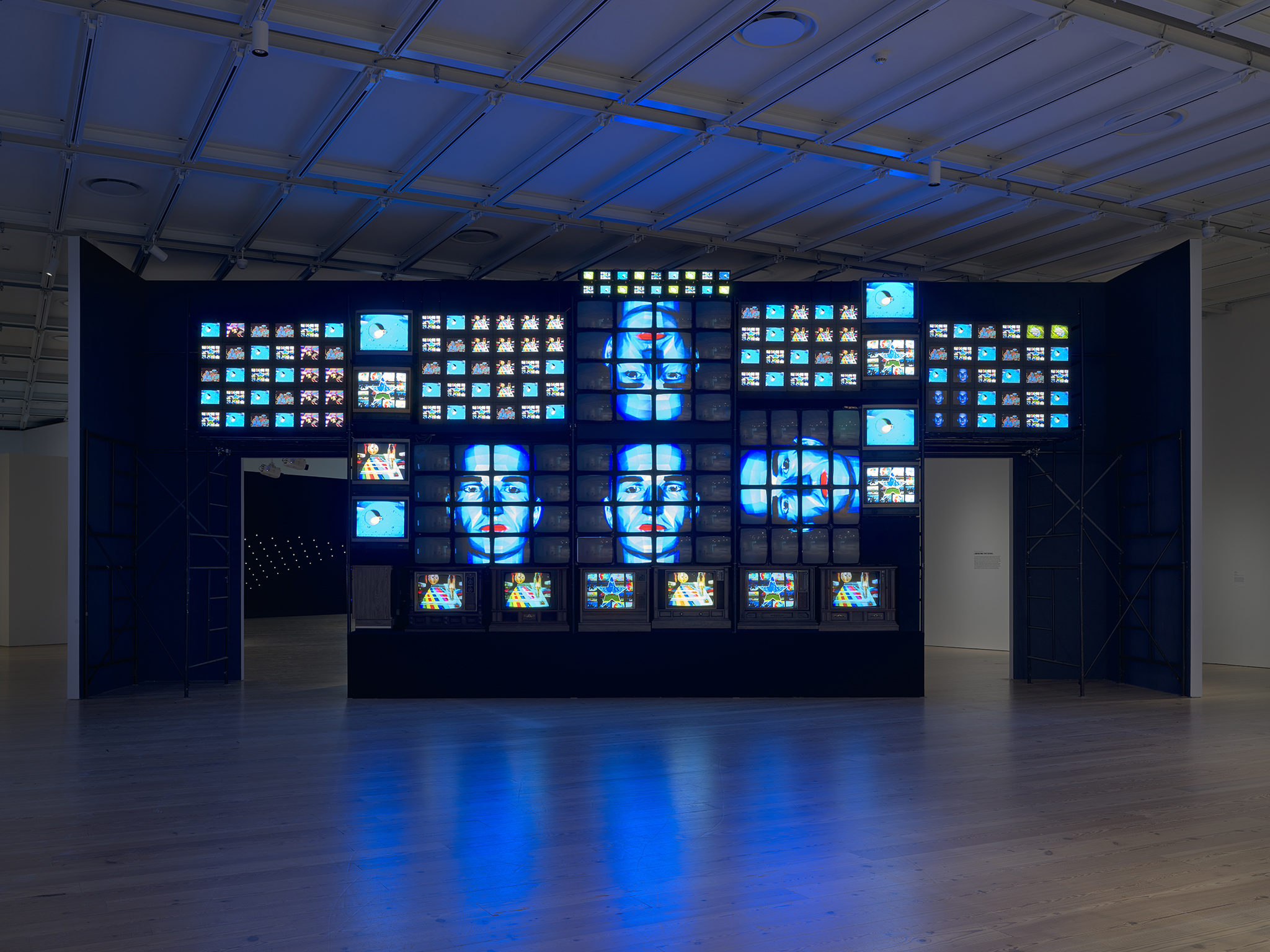
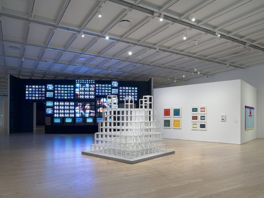
We at CatSynth have long been interested in the intersection of art, technology and conceptual process. Programmed: Rules, Codes, and Choreographies in Art, 1965–2018 surveys over 50 years of video, computational and conceptual art, cleverly weaving them together into a single narrative whole. The three disciplines are united by the concept of a “program” or set of instructions through which the work of art unfolds, whether a computer program, instructions for a performance, or strict concept on a visual object. Video and lights abound, but there is also painting, dance, and more.
One of the artists who
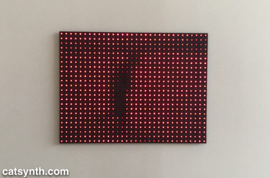
At the opposite end of the video spectrum is his 1965 piece Magnet TV. A black-and-white CRT television set is disrupted by a large magnet, creating a unique but sometimes unpredictable pattern that is in its way rather spare and graceful.
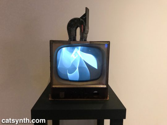
In the first piece, the process is in the composition, arrangement, and looping of the various video clips. In the latter, it is the physics of the magnet and the CRT.
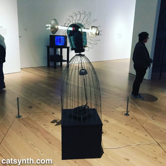
Motion and experiments with electronics are also at the heart of James L. Seawright’s contemporaneous piece, Searcher, which features gradual motion and changes in light. The shadows it casts are also part of the experience of the piece.
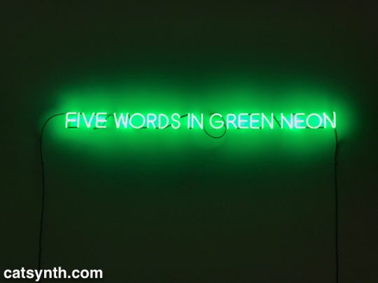
There is an interesting juxtaposition of one Joseph Kosuth’s classic neon text pieces, Five Words in Green Neon, and W. Bradford Paley’s Code Profiles, a Java program that generates images. They bring together the concepts of “text as art” and “code as art” – the message is the medium.
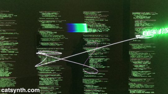
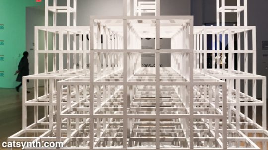
Paley’s code may be one of the most literal examples of the exhibition’s theme, but code need not be computer code as we think of it today. Many works from earlier periods were based on a series of instructions, where the instructions are the work and the performance or visual object are the expressions of said work. One such example is Sol Le Witt’s sculpture Five Towers. The three-dimension grids are assembled by a program with various combinations into a simple but beautiful result. I particularly enjoyed looking through it.
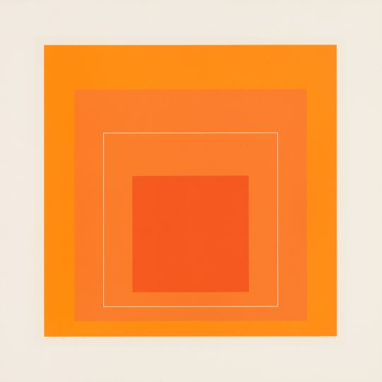
Josef Albers’ color-field rectangles can similarly be generated from a “program”. Like Le Witt’s piece, one could conceive of doing something like this with a computer, but neither artist chose to do so, instead being themselves the interpreters for the code.
The performing arts have long been linked to programs, whether the traditional score or choreography, or more modern uses of algorithms or conceptual instructions.
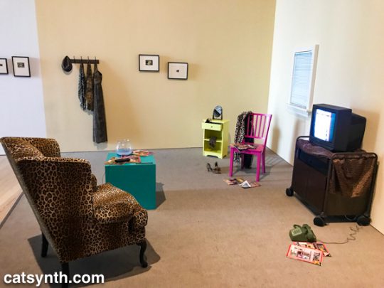
Program, object, video and performance also come together Lynn Hershman Leeson’s Lorna. Lorna is an interactive video story on a laser disc (anyone else remember laser discs?). Users can determine how the story unfolds through one of three endings via a remote control. The screen and control are placed within a simulated apartment decked out entirely in leopard print, and the viewer is invited to sit in a comfy chair while the controlling the story. This self-guided performance is at once programmed, but also immersive in that the viewer becomes part of the piece, both in space and in terms of control.
Video permeates the entire exhibition, popping up directly and indirectly in at least half of the pieces, or not more. But
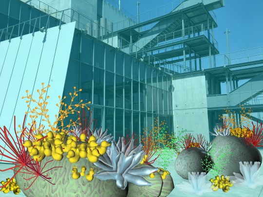
We conclude this survey with a new site-specific commission by Tamiko Thiel. She created an augmented-reality mobile app (in collaboration with developer /p) that overlays organic forms on the angular, geometric space of the museum’s outdoor terrace.
Thiel’s organic growths are beautiful and playful, but also have a darker aspect. Some resemble plastic refuse, and others coral formations. Both are emblematic of the crises facing our seas due to pollution and climate change. At the same time, the algorithmic process she uses, a formal grammar developed in 1968 by the Hungarian biologist and botanist Aristid Lindenmayer, is fascinating.
There were many more works in this exhibition that we can discuss in a single article. Each one had something compelling and different about it. For anyone interested in or curious about these forms of art, I highly recommend checking out this exhibit!
Programmed: Rules, Codes, and Choreographies in Art, 1965–2018 will be on display at the Whitney Museum of American Art through April 14, 2019.
The Art of Paper is a multi-artist exhibition currently on display Sundaram Tagore Gallery at their Chelsea location. The term “works on paper” often refers to drawing and print, but the medium and can be used in so many more ways. Each of the artists in the show uses paper in a very different way, showcasing its breadth and versatility as a raw material for art.
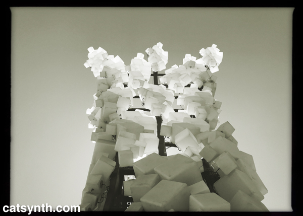
Korean artist Chun Kwang Young creates fantastic three-dimensional sculptures from mulberry paper. This thin and delicate paper is prized as an artistic
Some are flat and wall-mounted while others are freestanding. But in all cases, they are three-dimensional full of complex depth and texture.
The jagged triangular elements seem sharp, even a bit dangerous up close. But at the same time, they seem fragile, like delicate crystals that could fall apart among touch. When viewing closer, they seem soft, especially as the details of the paper come into view, including the original printed text from the source material. There is something almost science-fiction-y and other-worldly about the result that I find captivating.
Chun has a simultaneous solo exhibition from his Aggregations at the Brooklyn Museum, which we will be reviewing in a separate article.
The work of Anila Quayyum Agha also uses paper as a basis for sculpture with a very different set of styles, techniques, and sensibilities. She is best known for her works featuring paper laser-cut into large intricate forms. Many of the paper cuts are assembled into cubes placed in immersive spaces with light.
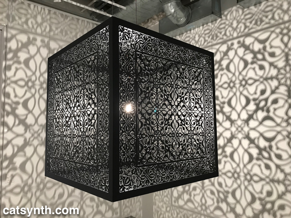
Being in the space of this piece and viewing it from all angles was a captivating experience. It doesn’t seem like paper, but rather intricately carved stone or metal. S
In contrast to Agha’s highly intricate designs, Miya Ando’s work is more subtle and spare. She is known for more abstract work in metal, but she brings that work to paper in her “moonlight” pieces for this show.
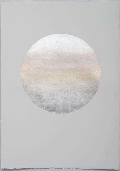
Paper is often white, but it can be many different whites and shades in between those gradations. The subtle changes give the round form a very natural feel in contrast to the stark white background.
There are several more artists in this show, more than we at CatSynth are able to cover in this article. For more information, please visit the gallery’s website. They are located at 547 West 27th Street, and the exhibition will be on display through December 15, 2018.
SQUARED by Charles Gadeken, a 50-foot LED-and-metal sculpture currently on display at Patricia’s Green in the Hayes Valley neighborhood of San Francisco.
A rare self-portrait for Wordless Wednesday. This was taken last September in the SoHo district of lower Manhattan when we espied this large sculpture of a cat.
Greetings, and happy third night of Hannukah! Today we look at the Soundtracks exhibition currently on display at the San Francisco Museum of Modern Art (SFMOMA) through the end of the year. It is also the subject of our most recent CatSynth TV episode.
The exhibition explores the intersection of sound, visualization, and space, and features over 20 artists. There are a variety of interpretations and methods of making sound, from acoustic to mechanical to electronic. None of the sound installations are overpowering, but many do arrest ones attention. Upon arriving at the 7th floor for the exhibition, one is created by Anri Sala’s Moth in B-Flat, which features a mechanically triggered snare drum hanging inverted from the ceiling.

[Anri Sala. Moth in B-Flat (2015_]
The electro-mechanical theme continues with O Grivo’s Cantilena, which includes several motorized sound-making sculptures primary made of wood.

[O Grivo. Cantilena (2017)]
These were fun to watch, and I found myself wanting to make one myself (we shall see if that actually occurs).
Simplicity reigned in Céleste Boursier-Mougenot’s clinamen v.3. A large shallow pool of water contained floating ceramic bowls. The frequent collisions of the bowls created a music that was very captivating.

[Céleste Boursier-Mougenot. clinamen v.3 (2012–ongoing)]
This piece was deeply calming, and I found myself zeroing in on groups of bowls as they collided and separated to form rhythms and harmonies.
Ambient soundscapes were also the heart of an installation by Brian Eno, New Urban Spaces Series #4: “Compact Forest Proposal,”, with a darker tone and more complex technology.

[Brian Eno.New Urban Spaces Series #4: “Compact Forest Proposal” (2001)]
One is free to wander the darkened space amidst the moving columns of LED lights. Every once in a while, the light increases and one gets glimpses of shadowy figures on the wall. The sounds ranged from small percussive synth hits to trumpets to electronic noise.
Electronic noise was also at the heart of Christina Kubisch’s installation Cloud. Kubish’s work explores sonification of data and electricity. The mass of red electrical wires emits electromagnetic radiation, which was interpreted as sound using customized headphone devices.

[Christina Kubisch. Cloud (2011/2017)]
Of all the installations, this was the among the most challenging to take in sensually or to document. I love the concept, and I think it really needs an extended period of time alone to experience fully.
From the large to the small. We had fun with Sphere Packing by Rafael Lozano-Hemmer, which featured several spherical speaker arrays made from those ubiquitous white Apple earbuds.

[Rafael Lozano-Hemmer. Sphere Packing (2013 and 2014)]
Each was playing a different selection of classical music from the 18th, 19th and 20th centuries, rearranged and diffused asynchronously through the speakers. Lozano-Hemmer also had an installation Last Breath that included a recording of breathing by the late Pauline Oliveros.
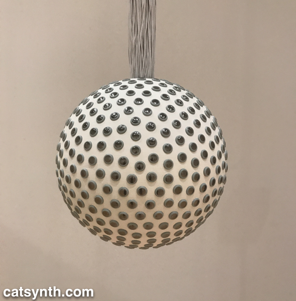
We conclude with another project visualized as a sphere. Lyota Yagi’s Sound sphere featured a sphere wrapped in cassette tape that freely rotated and revolved. Customized pickups rendered the sound from the tape, which is chopped, looped and distorted based on the chaotic motion of the sphere.

[Lyota Yagi. Sound Sphere (2011)]
All of these pieces were inspiring for my own work, as I want to do more sound installation in the coming year. There were more in the main the exhibit and spread around the museum, but beyond what I can cover in this article. We do encourage you to check out our video to hear how some of these pieces sound. And if you are in the Bay Area, we strongly recommend checking the exhibition out before it closes on January 1, 2018.