
Plaza in Sector 17 of Chandigarh, India
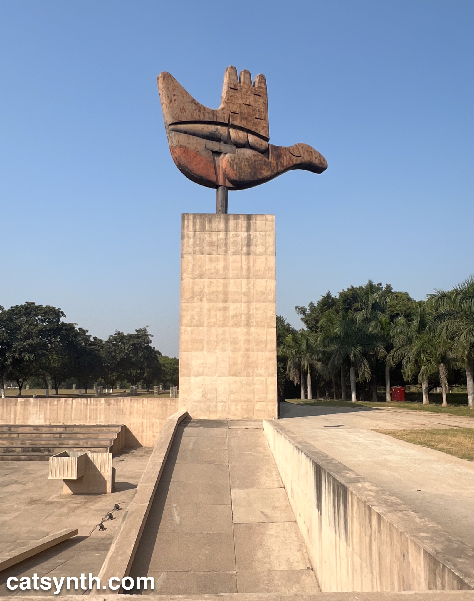

The Open Hand Monument at the Capitol Complex in Chandigarh, India.
For more images from this amazing brutalist complex, as well as others from India, please check out our Instagram.

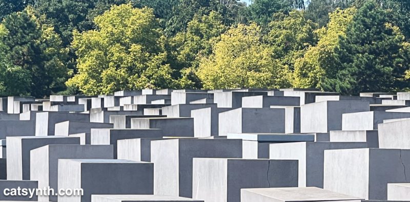
For Yom HaShoa, we share an image from the Memorial to the Murdered Jews of Europe in Berlin taken in August 2024.

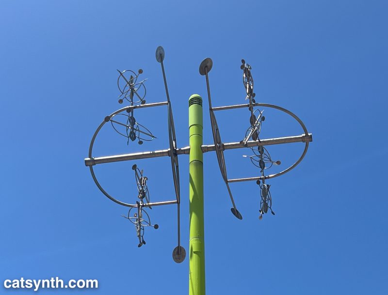
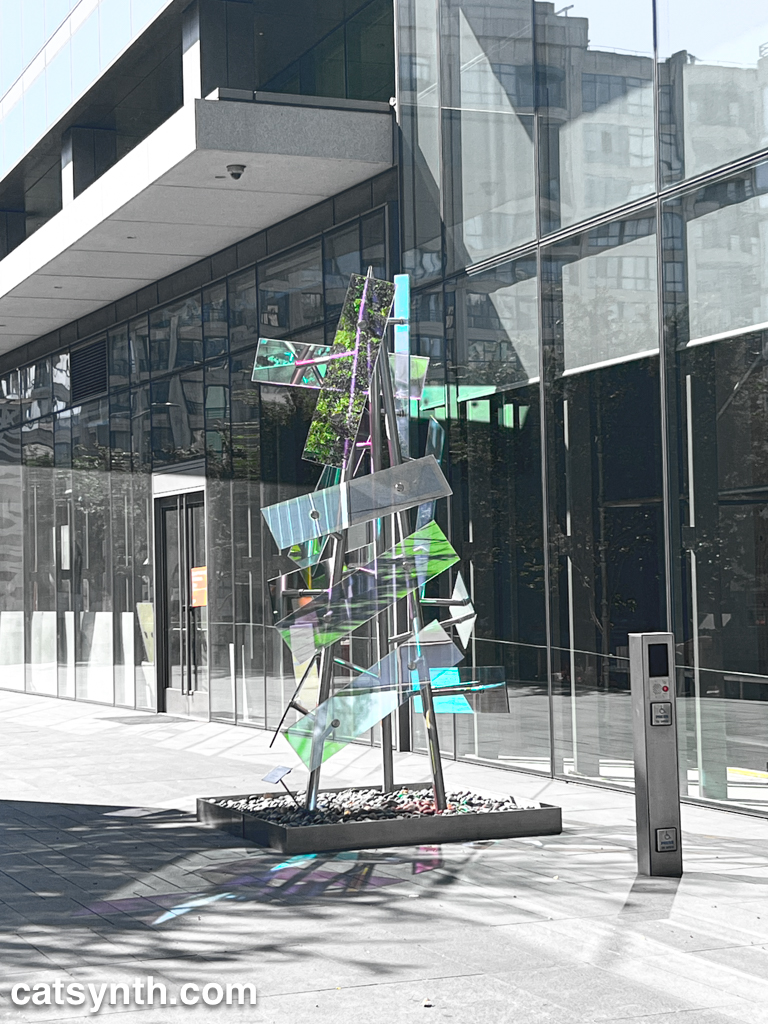
A space-age-looking kinetic sculpture at a station along the new T line extension in San Francisco. The sculpture, titled Microcosmic, was created by Santa-Cruz-based artist Moto Ohtake. Besides being interesting in itself, it’s also cool because I have a commissioned piece by Ohtake here at CatSynth HQ!
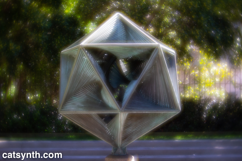
Returning to a favorite subject of mine, the sculpture Icosaspirale by Charles Perry at Maritime Plaza in San Francisco. The “velvet” and bokeh effects were done with the Lensbaby Velvet 56 lens.
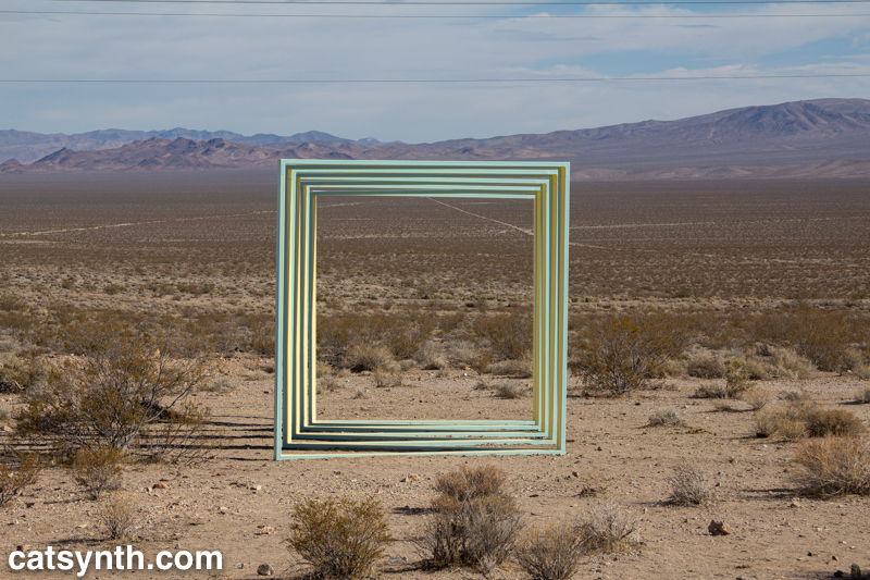

Portone by Amanda Phingbodhipakkiya at the Goldwell Open Air Museum in Nevada. It is the perfect blend of abstract geometry and desert landscape.
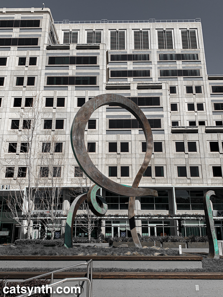
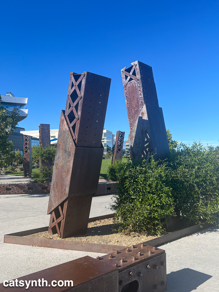
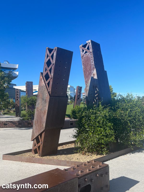
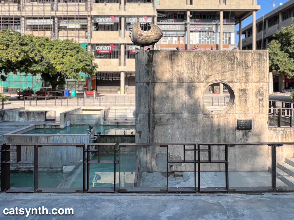
An office building plaza where I used to enjoy stopping and sitting. It felt so…urban. It was good to visit again recently after a long hiatus.