Today we look at the show Broadside Attractions | Vanquished Terrains which is currently on display at Intersection for the Arts.

[Photo by Scott Chernis. Courtesy of Intersection for the Arts.]
This large and ambitious show, curated by Maw Shein Win and Megan Wilson with Kevin Chen of Intersection for the Arts, brings together twelve pairs of visual artists and writers to produce collaborative work centered around the historical broadside medium. A broadside is generally defined as a large sheet of paper printed on one side and designed to be plastered onto walls in public areas. They were historically used to announce events, proclamations or news in a very concise and public manner before the advent of the internet, broadcasting, or even printed newspapers. Like many media that have outlived their original practical purpose, the broadside continues on in more rarified form for artistic exploration, this show being one such example. For this exhibition, the teams followed a very specific process. First, each visual artist provided his or her collaborating writer with three data points based on the theme of “vanquished terrains”: a piece of music, a movie and a location. The writer then created a short piece that was then given back to the artist to create a small visual work in response to the writing. These were combined to form the historic broadsides, which consisted of the visual piece as a black-and-white printed graphic, followed by the text of written piece.

[Photo by Scott Chernis. Courtesy of Intersection for the Arts.]
Finally, each artist-and-writer pair created another piece that embodied the same ideas and concepts as the historic broadside but using any form or media. The final pieces were quite varied, united only by the connections to their respective broadsides and the process of collaboration. Some were very direct reinterpretations, while others were quite distant from a recognizable broadside. The majority were somewhere in between, with flat media of either physical and or digital varieties.

[Photo by Scott Chernis. Courtesy of Intersection for the Arts.]
The above piece, a collaboration of artist Matthew Rogers and writer Maw Shein Win, is typical of the experimentations with media to augment the traditional broadside concept. The piece is primarily a flat panel of mixed media on paper, with a segment of the space presenting a video, in this case an animation by Rogers with music and bits of a reading of the written piece. The overall feel of the both the visual piece and the poem had a very bleak quality. The prompt location was the Inland Empire, with its combination of stark desert landscape and overdevelopment. The latter is apparent in the poem, while the desert is more present in the visual media, with the video bridging the two with rather dystopian imagery.
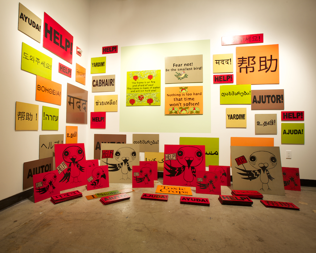
Some pieces derived more directly from the original broadside concept. Indeed, one of the media that most captures the original intent in our particular time and place is the protest sign. In their collaborative piece, Megan Wilson interprets the central figure of Hugh Behm-Steinberg’s poem Ruby-Crowned Kinglets as part of a crowd of protest signs.

[Photo by Scott Chernis. Courtesy of Intersection for the Arts.]
The bright solid colors and simple text and graphics makes this piece stand out, even when just wandering by. At the same time, the image of the cartoon bird crying “Help!” has a fun quality to it. It was interesting way to bridge the contrast between protest art and more personal and descriptive nature of Behm-Steinberg’s poem. During the opening, visitors were invited to take one of the textual protest signs on the floor (but not to take any of the birds).
Video was a frequently used element to bring the broadside concept into the contemporary sphere. One of the most creative uses was by Eliza Barrios with writer Myron Michael. Several asynchronous video streams were projected onto a corner window, transforming the rectangular images into more angular shapes that were aligned perfectly to create the illusion that they were coming out of the window. In the center, a changing set of single words were projected. In watching this piece, I was trying to figure out how the words may relate to the images on either side.

[Installation view with Inaoko/Cortez second to left and Barrios/Michael on the right. Photo by Scott Chernis. Courtesy of Intersection for the Arts.]
Other interesting video pieces included artist Misako Inaoko with writer Jaime Cortez. Their stop-motion animation piece, which included text along with what appeared be live photographic images taken with an app like Instagram or Hipstamatic, created a low-fidelity loop of activity. The piece by Keiko Ishihara and Chaim Bertman revealed the frenetic pace of activity in Tokyo’s complex transit system. It seemed a world away from the location prompt of the South Pole, but quite related to the musical prompt, Brian Eno’s Music for Airports.
At the other end of the spectrum, there were several fully three-dimensional installations. The largest and most dramatic was a two-story installation by artist Karrie Hovey and writer Elise Ficarra that covered the spiral staircase of the gallery in felt representations of deer with stylized antlers and legs. Ascending the staircase to the upper level reveals a dark painted sky with floating text and butterflies. Deer may at first seem an odd choice for a piece whose text and imagery is about the plight of human intervention in nature – having grown up north of New York City, I can attest that deer are doing quite well for themselves – but the message in this piece relates specifically to the controversial killings of deer in Point Reyes national seashore.

[Photo by Scott Chernis. Courtesy of Intersection for the Arts.]
As a bonus, this piece also featured sound art via the work of composer Evelyn Ficarra. The generated sounds were diffused via numerous speakers embedded throughout the installation. The was the only piece to use sound design as an independent element (i.e., not part of a video), and of course I had to try and figure out more about it. The sounds appeared to be manipulated and processed from natural sources which was consistent with the theme. I think they were also multiple streams for the different speakers.

Another interesting large installation was the piece by artist Nathaniel Parsons and writer Ly Nguyen. I have seen several of Parson’s installations before, and this one had a similar home-made construction feel to it. But it was a bit more subtle, with a small hole in the side of the coarse wooden surface to reveal a “piece within a piece” inside.

[Photo by Scott Chernis. Courtesy of Intersection for the Arts.]
So how do pieces like these related at all to the original broadsides? They are still in very concise language “shouting” their point like a Tweet in their own varied proportions and media. And in this sense they retain the “broadside” spirit.
Perhaps the most conceptual take on the theme was Tea + Dialogues presented by writer Jenny Bitner and artist Liz Worthy. They constructed a “tea room” where visitors could sit down, enjoy a cup of tea and participate in dialogues with other visitors. The tea was served in custom ceramics created for the installation, and the walls were decorated with text.

[Photo by Scott Chernis. Courtesy of Intersection for the Arts.]
Visitors choose dialogues from a preselected list, many of which were quite humorous and at least one referenced the installation itself. In additional, visitors were offered a fortune cookie that contained a “miniature broadside.” The dialogues, fortune cookies, and embedded text on the walls all related back to the historic broadside but brought it into a more ubiquitous and interactive realm.

I did participate in a dialogue with another visitor whom I had not previously. It was fun to read, and had the minimalist awkward quality of mid-century experimental theater piece.
In addition to the printed broadside and installation, each piece included links to the source prompts, with QR codes that allowed visitors to access the source music and movies via their mobile devices while exploring the exhibition.
As one can tell from this review, the visual art and installations tended to overpower the written work, especially for those like me who tend to be more visually oriented. To help balance this out, the show included to readings where the writers were front and center, presenting their work in the show as well as related readings of their choice. As with the installations, there was a great variety of work, from short song-like poems to surreal fiction to personal recollections.
The show will remain at Intersection for Arts in San Francisco through May 26.