We recently watched Paul Simon’s 1980 film One Trick Pony here at CatSynth HQ. This was his one and only film, which he wrote and starred in. It follows a folk-rock musician Jonah Levin (Simon) who had several big hits in the late 1960s, including an anti-Vietnam War protest song, but now in the late 1970s, he and his band find themselves touring small venues, often riding in a small van around the Midwest, and opening for up-and-coming acts like The B-52s. At the same time, he is struggling with record executives on producing a new album, and with his estranged wife on their relationship and their son.
The film was a commercial and critical flop, and a bit of an obscure artifact of its time. But we at CatSynth really enjoyed it, and were a little confused as to why it was so panned. For one, it features an all-star band that included Simon, bassist Tony Levin (best known for his work with King Crimson), jazz guitarist Eric Gale, jazz and fusion keyboardist Richard Tee (who also did vocals), and drummer Steve Gadd. The original music was a lot of fun, including the bluesy title track played over a disco beat and the catchy “Ace in the Hole”; the band played live in venues like the Agora Ballroom in Cleveland, Ohio. We were rooting for Jonah and the band in their conflicts with the record company, including Lou Reed in his debut film role as a trendy record producer. And even though the studio sessions didn’t go the way they wanted, it was fun to watch the process of recording to tape, adding in strings and backing vocals, and reviewing the takes together.
And perhaps in this synopsis lies the disconnect with critics and mainstream audiences. It’s really a musicians’ film about musicians’ musicians. There was also the setting and the visuals, including life in New York City in the late 1970s, traveling along freeways, and music clubs on the outskirts of cities, all of which appeal to my own personal aesthetic. It also didn’t follow a traditional story arc, but joined mid-way and ended without a real ending, which again is something that appeals to me – recall my fondness for Michelangelo Antonioni’s “trilogy” (plus Red Desert). So while this film did not resonate with the mainstream, it did with us at CatSynth HQ, human and feline alike. We were the real target audience, 45 years after it was released.
Both the in-film story and the context surrounding it also make one think about one’s own journey, and the challenge of making “the music I want to hear” and the “films and videos I want to see”, and hoping others do as well. Sometimes one succeeds, sometimes a little less so. But hopefully one enjoys the work as it continues.
Sunday Newslettes are also on Substack. You can follow and subscribe to us there.
We pick up our report from our recent visit to the Museum of Modern in Art where we left off after Part 1. Working my way gradually downstairs, I came to the special exhibition Sur moderno: Journeys of Abstraction―The Patricia Phelps de Cisneros Gift.This is a major exhibition that fills several galleries with modernist works by South American artists through the 20th century.
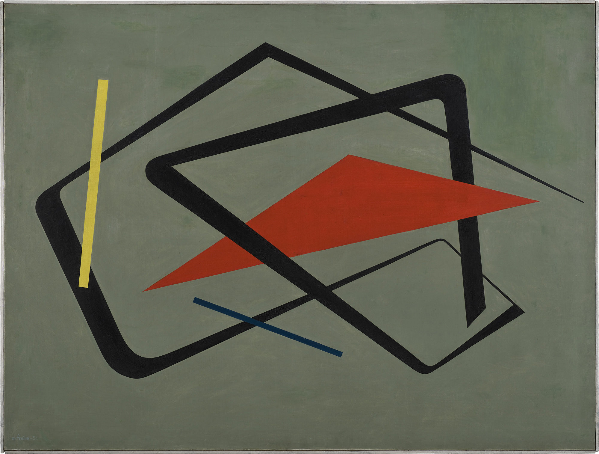
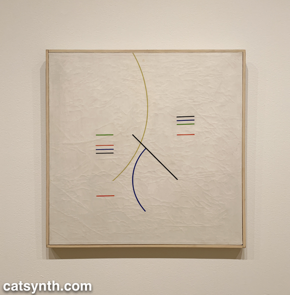
As in other parts of the world, South American artists embraced abstraction in the decades following World War II, with lines shapes of minimal color palettes. In his aptly named Curves and Straight Series, Argentine artist Alfredo Hlito takes this to an extreme with thin lines and curves against an off-white background, while Uruguayan artist María Friere used bolder lines and colors in her Untitled.
Alfredo Hlito. Curves and Straight Series / Curvas y series rectas, 1948. Oil on canvas. 27 3/4 × 27 3/4″ (70.5 × 70.5 cm)
María Freire (Uruguayan, 1917–2015). Untitled. 1954. Oil on canvas, 36 1/4 × 48 1/16″ (92 × 122 cm). The Museum of Modern Art, New York. Gift of Patricia Phelps de Cisneros through the Latin American and Caribbean Fund in honor of Gabriel Pérez‑Barreiro
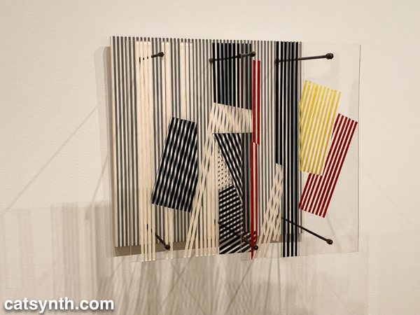
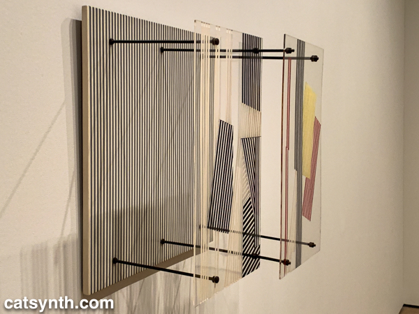
Both of these pieces feel like they could have been three-dimensional pieces of design, and in fact, the exhibition does include several striking three-dimensional works. When seen head-on, Jesús Rafael Soto’sDouble Transparency appears to be a plat painting or print, but from the side the depth becomes apparent.
Jesús Rafael Soto. Double Transparency / Doble transparencia, 1956 . Oil on plexiglass and wood with metal rods and bolts. 21 5/8 × 21 5/8 × 12 5/8″ (55 × 55 × 32 cm)
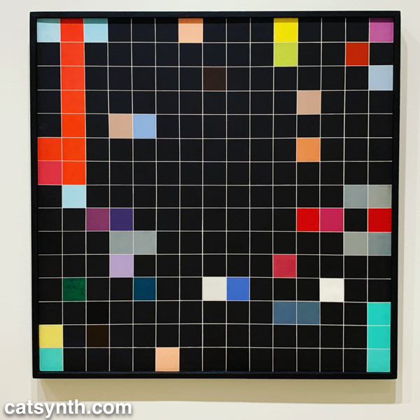
The lines-in-space motif is also used in Ocho cuadrados(Eight Squares) by Gertrud Goldschmidt, also known as Gego.
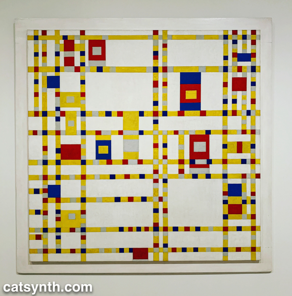
The recurring motifs in many of the works show the influence of Piet Mondrian, not just the most familiar neoplastic pieces but his earlier and later work as well. Indeed, I was happy to find Broadway Boogie Woogie hanging in this exhibition after not seeing it in the main collection display. As much as any work in MoMA’s permanent collection, I have a regard for this painting as if it were a friend and not just a work of art.
Piet Mondrian. Broadway Boogie Woogie, 1942-43. Oil on canvas. 50 x 50″ (127 x 127 cm)
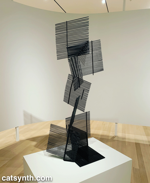
But perhaps the most extreme interpretation of the grid was found in Antonieta Sosa’s Visual Chess.
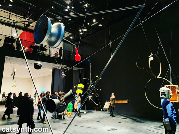
As part of its expansion, MoMA launched a new gallery space called the Marie-Josée and Henry Kravis Studio, or simply “the Studio”, a space dedicated for live, interactive, and multimedia art. The inaugural exhibit was Rainforest V, an evolution of David Tudor’sRainforest. Originally a score for a collaboration with Merce Cunningham, it evolved into a performance installation. The latest version, realized by Composers Inside Electronics (CIE), is controlled by computer rather than live performers, as visitors wander through the space.
The installation is constructed from everyday objects, such as a metal barrel, a vintage computer hard disc, plastic tubing, wood crates, and more. The objects and materials are fitted with a vast array of speakers and become resonators that shape and amplify the sound.
The best moments are getting close to an object, such as the barrel or balsa-wood box with simulated earphones, and standing for a moment then walking around. I regret that an iPhone in a crowded gallery is not the best way to record and share it with readers – it really music be seen in person.
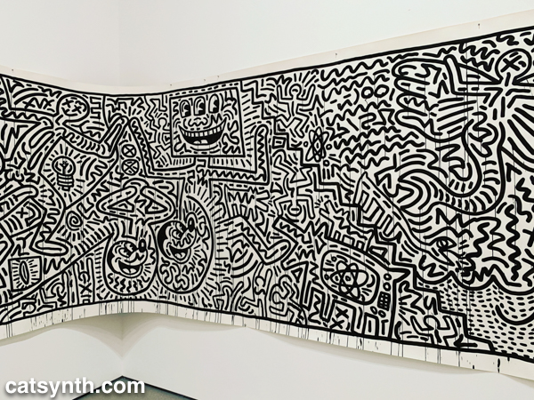
There was still more to see, including the newly expanded second-floor gallery for contemporary (1980s-present) works. This period has traditionally been a more mixed one for me, but there are gems and inspirations to be found. There was a large gallery-spanning work by Keith Haring.
Keith Haring
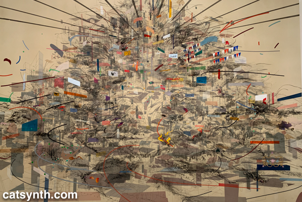
An equally monumental piece by Julie Mehretu called Empirical Construction: Istanbul a fantastic futuristic cityscape radiating in multiple dimensions.
Julie Mehretu. Empirical Construction: instanbul, 2003. Acrylic and ink on Canvas.
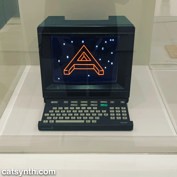
On the opposite scale is Eduardo Kac’sReabracadabra, a video piece realized as graphics inside a vintage Minitel terminal.
Eduardo Kac. Reabracadabra, 1985. Minitel terminal and digital poem transferred to video (0:35 min).
Kac’s piece reminded me of my interest in vintage electronics finding new life as dynamic art pieces.
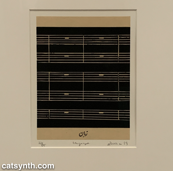
We end with one panel from a larger work by the artist Zarina, HomeIs A Foreign Place.
Zarina. Home Is A Foreign Place, 1999. Woodcuts with letterpress additions mounted on paper.
There is something bleak about an entire musical score made of rests, but also intriguing, and even curious. It is perhaps a reminder that exploring a museum top to bottom invites one to escape one’s comfort zones even at the same time as seeking comfort and solace. I’m glad this visit afforded opportunities for both.
Most visits to New York include a stop at the temple of modernism, the Museum of Modern Art (MoMA). But this was my first visit since the massive multi-year expansion and renovation was completed. In some ways, it seems that not much has changed, but in other ways it has changed considerably, starting the members-only entranceway leading to a larger and more open lobby.
The second=floor atrium remains very much the same as it has been since the expansion in the early 2000s, a cavernous space looking up to all exhibition floors of the museum. It often is used to display monumental pieces or immersive performance works. Handles, a performance and sculptural piece by Haegue Yang combined both.
The name refers to the handles on all of the sculptural elements that allowed them to be slowly moved around the space by the performers. In between these motions, the performers gathered for vocal chanting that brought to mind the work of Pauline Oliveros. The sculptures and wall and floor elements had a simple geometric quality that reminded me of children’s building blocks. They also had bells and other sound elements mounted, again something that brought to mind Oliveros.
From the atrium, I always head immediately to the sixth floor and gradually work my way back down. The top floor featured Surrounds, an exhibition of large-scale installations by a diverse collection of contemporary artists. Some, like Mark Manders‘ Room with Chairs and Factory, were large singular pieces, with a gallery-sized replica of a factory. Others were large compositions of smaller elements. For example, Dayanita Singh‘sMuseum of Chance was composed of numerous photograph prints made by the artist, assembled into large modular panels that could be easily rearranged in any number of configurations.
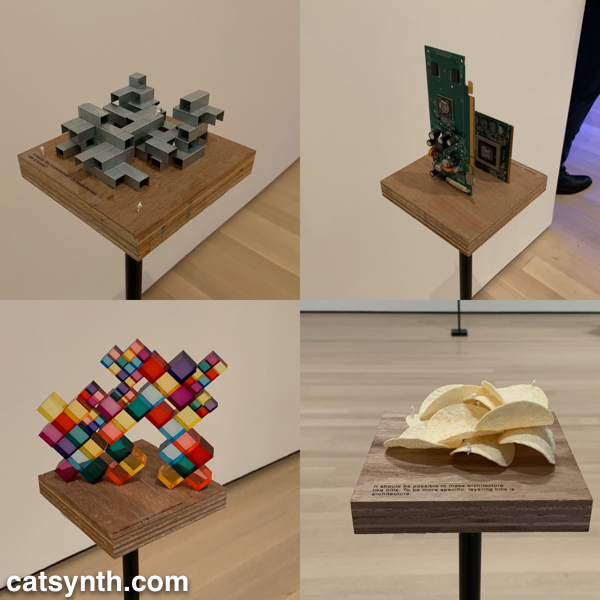
In his installation Architecture Is Everywhere, Sou Fujimoto challenges us to see the “architecture” in everyday objects. His installation is a field of small objects ranging from colored geometric design elements to potato chips placed on an array of pedestals.
The “architecture” in each object is readily apparent when one is invited to see it. Even the potato chips are curvilinear forms that might be at home in a 1960s futurist public space.
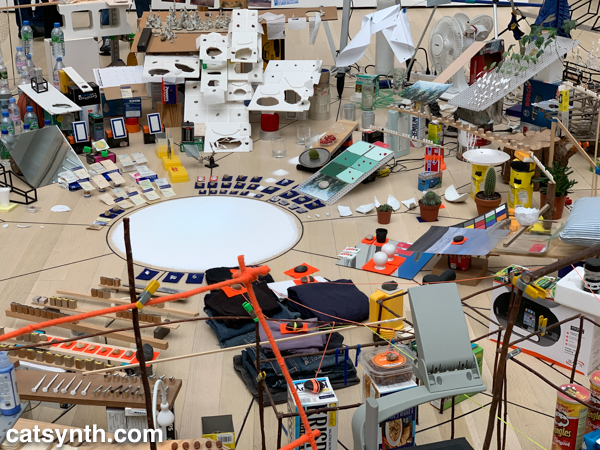
Perhaps the most of fun of all the installations was Sarah Sze’sTriple Point (Pendulum). A colorful collection of everyday objects are arranged, somewhat precariously, around a circle as a pendulum swings freely above, threatening mayhem of destruction. However, that never happens and instead, we end up with an intricate but chaotic dance.
The name of the piece, which derives from the “triple point” where water can exist simultaneously as ice, liquid, and vapor, illustrates the sense mix of chaotic and coexistence in the installation.
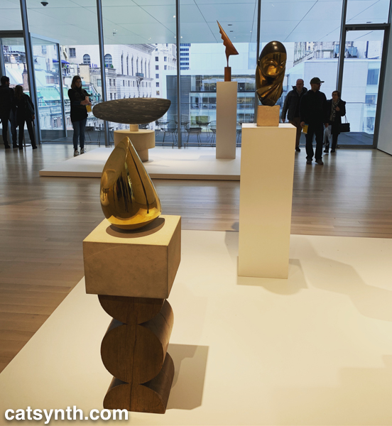
Descending to the fifth floor, some of the changes to the museum became more apparent. The terrace cafe overlooking the sculpture garden had been removed (actually, moved to a new location on the sixth floor), and replaced by an open gallery space showing various sculptures by Constantin Brancusi.
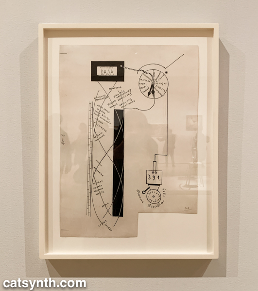
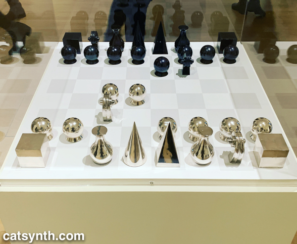
The remainder of the fifth floor and the entirety of the fourth floor housed an expanded and increasingly labyrinthine set of galleries for the permanent collection. The first gallery, which featured the oldest and most traditional works such as Van Gogh and Matisse, was by far the most crowded space in the entire museum. I quickly left to find some more open spaces and truly modern works, which began to appear in the 1910s and 1920s. In addition to Dada favorites, there were works celebrating machines, industry and the break with traditional forms of painting. Francis Picabia’sDada Movement and Man Ray’s chess set are exemplars of these directions.
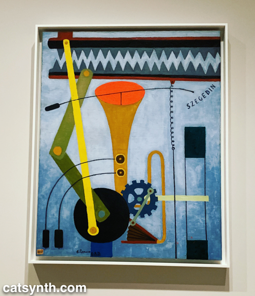
Georges Ribemont-Dessaignes‘ Silence depicts a musical instrument attached to machinery, perhaps speaking to the contradictory nature of music made by machines.
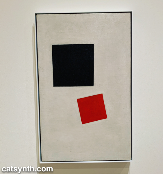
There was also a lively world of modernism and abstraction in Russia before the 1917 revolution, as exemplified by Kazimir Malevich’s minimalist Supremacist Composition: Airplane Flying.
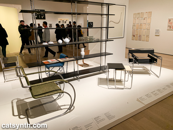
The expanded galleries included a room of design pieces from the interwar period (these were previously displayed in the separate design gallery on a rotating basis).
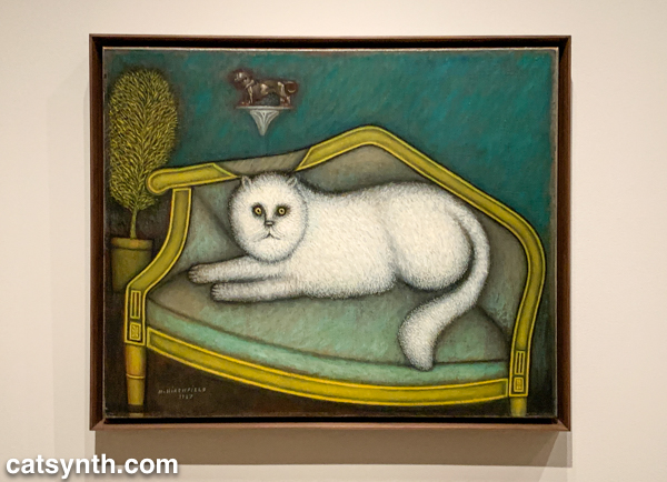
There was also a new space devoted to so-called “outsider artists” of the period, including Morris Hirshfield. I was particularly drawn to his portrait of a white cat titled Angora Cat.
The collection continued on the fourth floor with the period between the end of World War II and the 1970s. This is usually my favorite section to linger in, with many iconic works of the 20th century. The Jackson Pollock’s are of course back on full display, but so is Lee Krasner, who is finally getting her due as a leading abstract expressionist painter.
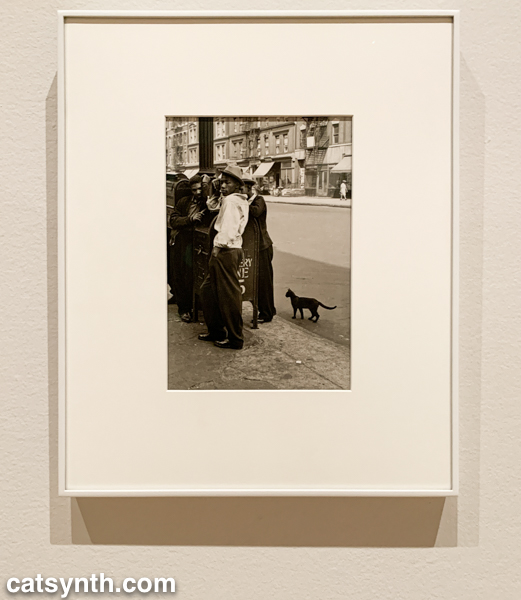
The expanded galleries have given more room for women and other underrepresented artists. The photography of Helen Levitt was featured in a room that also included artists depicting life in Harlem in the 1950s. I particularly liked this photograph of hers with a black cat.
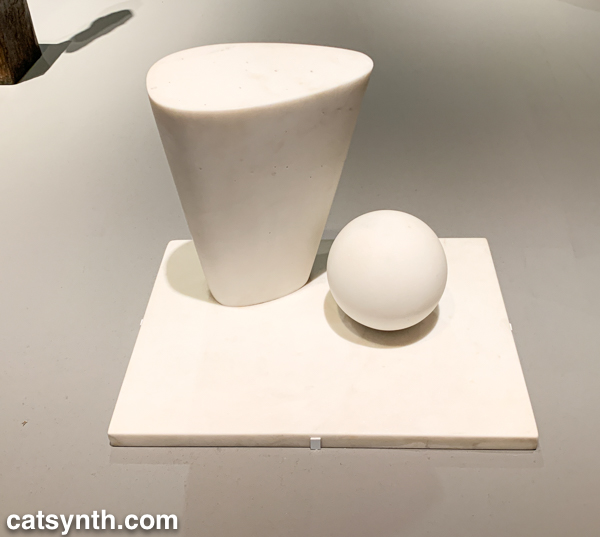
This sculpture by Barbara Hepworth is quite minimal, with the perfection of the sphere balancing with the “squishier” curves of the taller element.
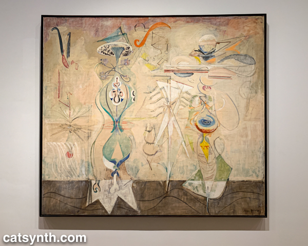
There were also pieces that showed the works of artists beyond their most well-known. I would not have guessed this painting with other-worldly plant-like creatures as the work of Mark Rothko were it not for the title card.
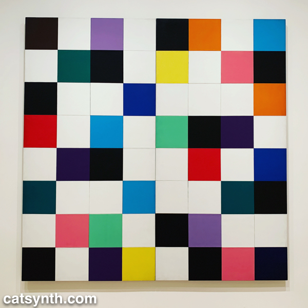
There were of course pieces that did exemplify artists as we know them. Ellsworth Kelly had large geometric blocks of color, as one would expect.
I looked around these galleries in vain for perhaps my favorite work in the collection, Piet Mondrian’s Broadway Boogie Woogie – it’s like visiting an old friend when I see it – but it was nowhere to be found. [Spoiler alert: I did eventually find it and it will be featured in Part 2 of this series.]
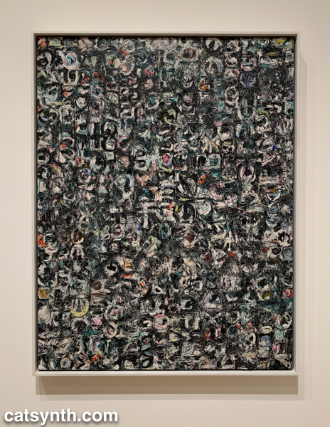
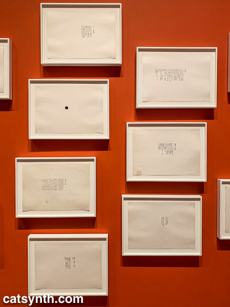
As we move into the late 1950s and the 1960s, abstract expressionism gives way to more conceptual art and works in different media. This was the beginning of Fluxus, with its instructional pieces, happenings, and ephemeral works on cheap materials. There was an entire wall of “scores” for performance works by Yoko Ono. These are always fun – most have clear instructions that one could use to perform them today, though I wonder what was expected from the large black dot.
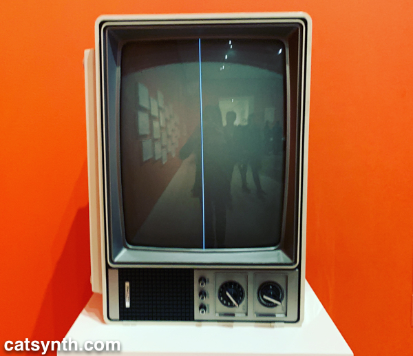
This is also the era of Nam Jun Paik’s experiments with analog video. Zen for Television takes video art to its most minimal, with a single line of a continuous signal on the screen. However, the vintage television set itself becomes a specific idea when viewed in the 21st century.
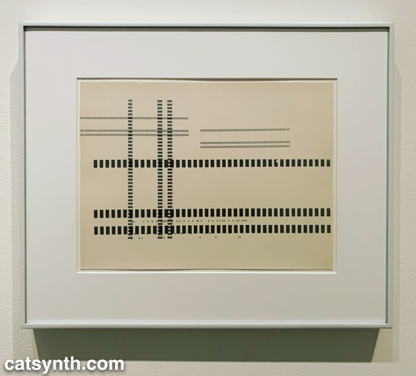
Abstract designs persist in this period, but also take on an industrial and repetitive nature. Sol Lewitt takes this to the extreme, but others Geraldo de Barros left room for variation, and perhaps to the works on paper from Fluxus.
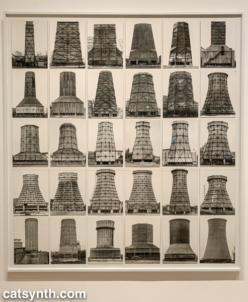
Among my favorite photographers of this period are Hilla and Bernd Becher. There work depicting old industrial buildings and placing them into artistic compositions has been a huge influence on my own photography.
Even after this whirlwind through three floors, seven decades, and multiple exhibits, there was still much of the museum to cover; and I was determined to cover the entirety in one day. In the end, I succeeded, and the remainder of the visit will be covered soon in Part 2 of this series.
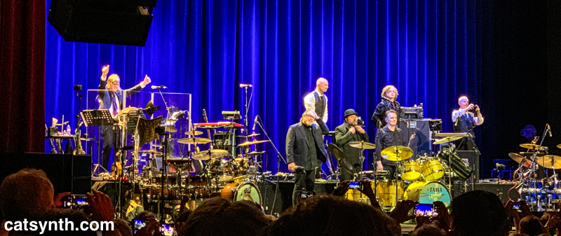
Our incredibly musical two weeks that began with Herbie Hancock concluded with King Crimson’s return to the Fox Theater in Oakland. We at CatSynth saw their last visit in 2017 and were excited to hear what the brought this time around.
It was a pleasure to see King Crimson back in action again, albeit with another lineup change. This time around, Bill Reiflin was not with the group, and so there was no full-time keyboardist. His duties were taken over by drummer Jeremy Stacey, and, at times, winds player Mel Collins. Of course, Robert Fripp was there, holding court seated stage left next to his tower of gear, as were longtime members Tony Levin on bass and Chapman stickand Jakko Jakszyk on lead vocals and guitar. Rounding out the trio of drummers were Gavin Harrison and Pat Mastelotto.
The group once again made a great overview of their 50-year history. I was particularly pleased to hear “Cat Food” from the 1970 album In the Wake of Poseidon played. “Cat Food Cat Food…again!” The music is malleable and adaptable to the current band’s instrumentation and abilities. Choruses are reharmonized, as was the case with “Cat Food”; vocal numbers are re-arranged into extended instrumental pieces, as in “The Construction of Light”; new melodies were added, as in “Indiscipline”; and so on. There were also new lyrics to the chorus of “Easy Money”. The combination of the three drumsets was even tighter than the previous tour, and more nuanced as well with each playing entirely different parts in a three-voice counterpoint that occasionally coalesced into a massive syncopated thunder. It should also be noted that the drums were a bit lighter because of Stacey’s keyboard duties.
The sound in the first set was a bit challenging at times; the winds and vocals in particular suffered. Thankfully, this was all corrected going into the second set. And just when it seemed they were going to get through the entire night without playing “21st Century Schizoid Man”, they returned with the tune as their encore, with extended abstract solos and instrumental sections.
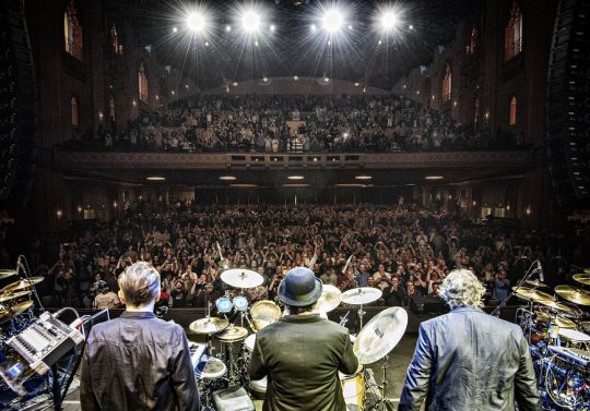
As always, King Crimson is very strict about photography during their concerts, but at the very end, they ritualistically share a moment taking pictures of the audience while we picture them. This time both Tony Levin and Robert Fripp snapped pictures of the audience as we returned the favor.
King Crimson photographs us photographing them
Here is a photo of the audience from Tony Levin’s blog. We are somewhere in the lower left of the orchestra.
The second of our remembrances focuses on the architect I.M. Pei, who passed away this week. A true champion of modernism worldwide, I have admired his work both from afar and close up.
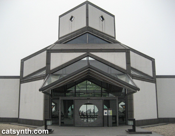
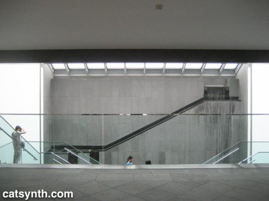
Perhaps the most vivid memory with his work was from the Suzhou Museum in Suzhou, China. It may not be his best known work, but it is a masterpiece in itself and a love letter to his hometown.
The exterior facade combines Pei’s trademark geometry and minimalism with more the more traditional designs and tropes of an adjacent palace and Suzhou’s famous gardens. It also makes extensive use of water as an architectural element both inside and outside the building.
The simple geometric shapes, as well as the use of water, stone, and glass, gave the entire complex a very warm and welcoming feeling, even as the rain came down around me. Inside, the simplicity of the galleries left ample mental space to enjoy the exhibits and artifacts, while the atrium was a work of art itself.
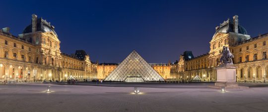
I admire the way he often brought modernist aesthetics and principles to traditional spaces. This is perhaps most dramatically seen in his glass pyramid that anchors the Louvre Museum in Paris.
Napoleon courtyard of the Louvre museum at night time, with Ieoh Ming Pei’s pyramid in the middle. Benh LIEU SONG [CC BY-SA 3.0], via Wikimedia Commons
The pyramid is perfect, a stark contrast to the severe facades around it, and perfectly balanced in size and space. While I know many traditionalists have hated on this addition over the years, I for one love it. I am an unapologetic modernist and often find myself sparring with traditionalists even here in San Francisco.
Pei’s modernism was intended to integrate with its surroundings, even as it stood in contrast to it. For example, he wanted his stark geometric design for the Mesa Laboratory at the National Center for Atmospheric Research (U.S.A.) to look “as if it were carved out of the mountain”.
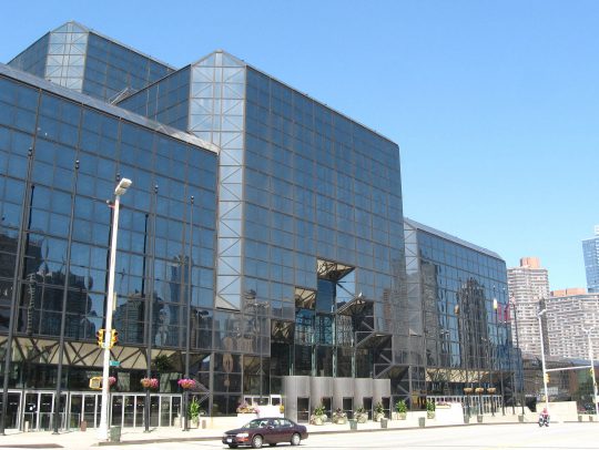
Until reading others’ tributes and remembrances, I had forgotten about his role in the Javits Center in New York, a building I am quite familiar with both inside and out. It is a massive and imposing structure but crisscrossed with triangular details that remind me of the Suzhou Museum (built 20 years later). The project was plagued by challenges and controversies, and “during the inauguration ceremonies, however, neither [James] Freed nor Pei was recognized for their role in the project.” [source]
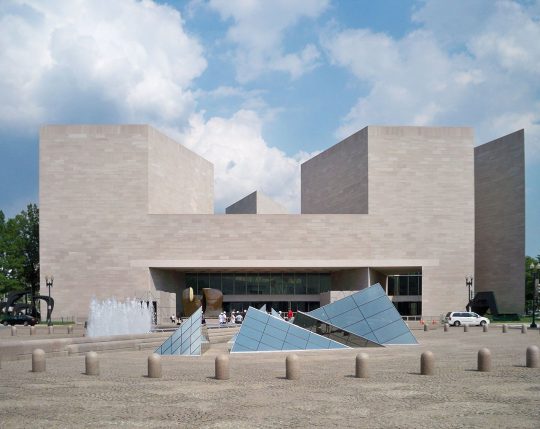
Triangles do seem to be a major recurring theme in his work, and perhaps part of why it appeals to me even within the scope of other modernists. Triangles are powerful and strong, and the often stand out in Western spaces dominated by rectangles. These elements also played a role East Building for the National Gallery in Washington, D.C., a project is loved by many, but similar to the Louvre, criticized by some traditionalists.
The building is a masterpiece of minimalism. Even some of those traditionalist critics have grown to love it in the years since it opened in 1978. And it serves its purpose, both as a home to art and a work of art itself.
The growing popularity of art museums presented unique challenges to the architecture. Mellon and Pei both expected large crowds of people to visit the new building, and they planned accordingly. To this end, he designed a large lobby roofed with enormous skylights. Individual galleries are located along the periphery, allowing visitors to return after viewing each exhibit to the spacious main room. A large mobile sculpture by American artist Alexander Calder was later added to the lobby.[93] Pei hoped the lobby would be exciting to the public in the same way as the central room of the Guggenheim Museum in New York. The modern museum, he said later, “must pay greater attention to its educational responsibility, especially to the young.”[94]
Defending modernism, even after a century, remains a tireless job. As we lose champions like I.M. Pei, it falls to those of us in later generations to make sure this beauty is preserved and celebrated.
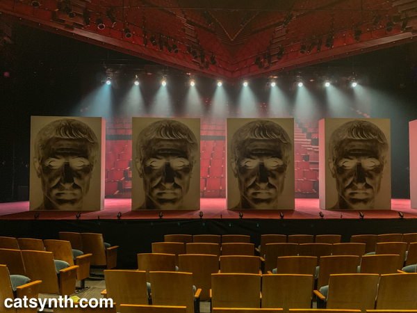
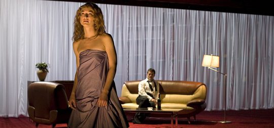
Today we look back at Théâtre National de Bretagne’s unusual production of Shakespeare’s Julius Caesar. We at CatSynth had the opportunity to see it at Zellerbach Hall in Berkeley, California a couple of weeks ago.
It is a play we know well, having read the original and recently revisited Joseph L. Mankiewicz’s epic 1953 film version starring Marlon Brando, James Mason, and John Gielgud. In contrast to that version which places the play in a grand realization of ancient Rome with large sets and hundreds of extras, this production directed by Arthur Nauzyciel with set design Scott Zielinski, was abstract and spare: a mostly empty stage surrounded by a backdrop of empty theater seats. The cast was stripped down to a small set of players, some pulling multiple roles – both Portia and Calpurnia were played by Sara Kathryn Bakker, for example. Their costumes (by James Schuette) were inspired by the 1960s, as were the furniture. We see the characters as mostly upper-class individuals in suits and dresses in spare rooms with modernist furniture, something directly out of Mad Men. We first see Brutus (James Waterson), Cassius (Mark Montgomery), and Julius Caesar (Dylan Kyussman) in simple tuxedos, with Mark Antony (Daniel Pettrow) bounding in wearing an Adidas tracksuit – a nice touch that harkened back to Brando’s jockish first scene as Antony in the 1953 film. One cannot consider these things anachronistic, seeing as how the Shakespeare play in itself is an anachronism, with its mentioning of clocks, doublets, etc., not to leave out the fact that it was written and generally performed in English. The drama is what is most important in the play, the interaction of the characters, and the mechanics of politics and public opinion.
Theatre is fundamentally about illusion and representation. Sometimes, perhaps most of the time, in older forms of theatre, minimalism accentuates the essence of what a dramatic piece is trying to convey. All of the information is conveyed through the words and actions, with the dressing secondary. As I believe it should be with Shakespeare. So I felt the right tone was taken with the way the visual aspect was handled.
Sara Kathryn Bakker as Portia. Photo by Frédéric Nauczyciel.
Of course, the central element of such a play is the acting and interpretation of the text. Kyussman’s portrayal of Caesar brought the right mixture of pomp and gravitas to his character. Waterson’s Brutus came across as conflicted in his feelings, ultimately choosing reason over loyalty. And Montgomery’s Cassius was a thoughtful but odd fellow. Bakker’s double-duty as Portia and Calpurnia was beautifully played but also served to highlight the overall lack of women characters in the play. Something I was ambivalent about was the decision to excise the scene with Cinna the Poet, and his being swept up by the angry mob and killed, having been confused with Cinna of the conspirators. This scene is excised from many stage productions and most films of the play, for purposes of pacing, which is unfortunate. I feel it is a crucial scene which shows the madness of crowds, the way opinio publica can be twisted by those who seek to further their own ends = “The abuse of greatness is when it disjoins remorse from power”, indeed.
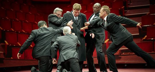
The lighting was also a major player in this production. For most of the early scenes, the stage was shrouded in a mixture of darkness and low lighting. It is only when we get to the Capitol and the chamber of the Senate that the lights become bright, drawing us to a very stylized and choreographed assassination of Caesar. This continues into the speeches of Brutus and Antony before changing again into an eerie fog-filled atmosphere for the war scenes of the final act.
The assassination of Caesar. Photo by Yann Peucat.
Perhaps the most unusual aspect of this production was the use of a live jazz trio, who performed between acts, and occasionally between scenes. The musicians (Marianne Solivan on vocals, Dmitry Ishenko on bass, and Leandro Pelligrino on guitar) were all top-notch and performed extremely well. But we were anticipating original music. What was presented was a selection of standards. In itself, this was not disappointing – and the joining in by Bakker as Portia and Montgomery as Cassius was fun. However, the selection of pieces – which, lyrically, commented upon the action with a winking, postmodern irony – in some ways undercut the otherwise serious and austere quality of the production and interpretation of the play. After the scene between Brutus and Portia, we were given “You’ve Changed”. In the entr’acte, we heard “Is That All There Is?” I felt by the end of the performance, it had become something close to a parody.
This sense that the music played against the other dimensions was highlighted in the final song-and-dance number, set to some recently recorded, faceless, autotuned pop song (I’m pretty sure it was a Lady Gaga song, but I can’t confirm). It really seemed to be negating much of what I feel is at the core of this play, very serious ideas about morality, duty, and civic responsibility.
This may be the director’s intention, I don’t know for sure, and I can’t say. The director took many chances with the production and created a fairly unique take on a work which has been performed so many times, in different ways. “How many ages hence shall this, our lofty scene, be acted over in states unborn and accents yet unknown”, indeed.
Overall we enjoyed the performance, the design, and the acting. And I like to see productions of Shakespeare’s plays take chances with new directions rather than simply redoing the same thing over and over again. But with any experiment, sometimes things work and sometimes things do not. The end result here was mixed and ambiguous. But perhaps that was the point.
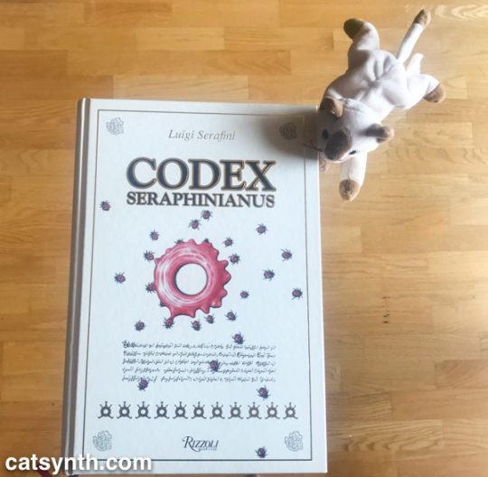
We at CatSynth have been fascinated with the Codex Seraphinianus long before this beautiful edition made its way to CatSynth HQ.
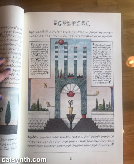
The Codex is a masterpiece of book art by Italian artist, architect and industrial designer Luigi Serafini. It is an illustrated encyclopedia as a handwritten manuscript with hand-drawn color illustrations depicting a surreal imaginary universe of objects, creatures and concepts.
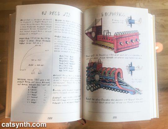
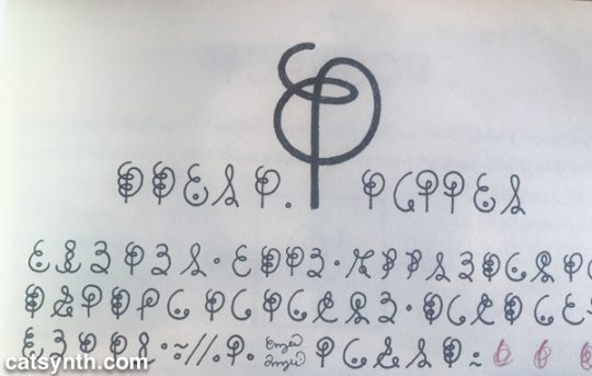
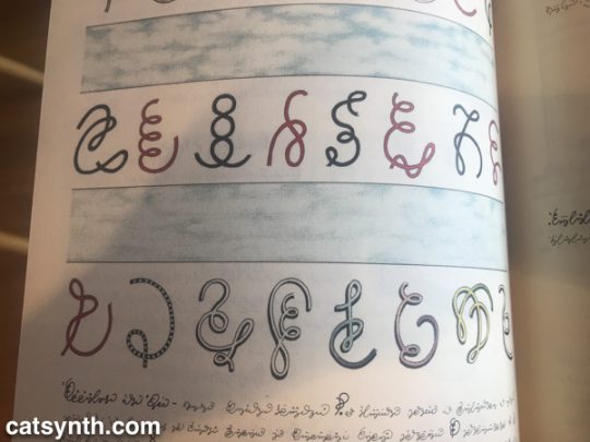
Most interesting of all, it is written in a completely invented script.
The script, consisting of squiggles and dots, sometimes detached and sometimes cursive, resemble a Western, Semitic or South Asian script, but one entirely of Serafini’s own imagination. It is easy to pick out repeated letters, such as the “E-like” character with one dot in its lower section; and curve-on-a-stem that appears to serve as a singular character in many portions of the first book.
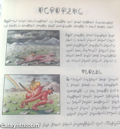
Even without knowing the full meaning of the script or the illustrations, one can start to discern meaning. For example, on this page it is pretty clear that this creature tends to wilt (perhaps even suffer) in rain, but thrives in sunshine. (This is something I can sympathize with.)
Serafini himself has declared the writing in the Codex to be asemic, without a specific structure or meaning. And while I take him at his word, one cannot help but construct meaning from both the images and the writing. I have long been fascinated by other alphabets and writing systems and been able to find patterns (and even learn them to some degree) independent of the languages they represent. For example, I was able to learn a bit of the Tamil script when traveling in South India in my youth, though I never learned the sounds or the language. Similarly, I began to pick up Sinographic characters in my time in China but with no knowledge of how to pronounce most of them.
It is in this vein that I have begun to read the Codex from its start, treating it as a pure work of art with text and illustration as its medium. It’s actually a pleasurable and captivating experience to pour over the text and spot the patterns without being confined by the need for meaning. I made it through the first book (plants and anthropomorphic flora) and a bit into the second (animals). It is the fourth book (physics, chemistry) and the fifth (machines) that I most curious to “read” in depth, but I will take my time to get there.
We at CatSynth are fans of 2hp, and not just The Cat. They’ve given us so many things to put in those pesky little spaces left in our modular systems, from highly useful VCAs (you can never have too many VCAs), to more exotic offerings like physical modeling.
At this year’s NAMM show, the debuted four new modules covering both utilitarian and creative terrain. The one that most intrigued me was the Bell, a physical modeling voice that brings metallophone sounds. It can do vibraphone-like sounds, wine glasses, bowls, and of course, bells. With the main mallet and bar parameters (indicating that is likely based on modal synthesis), one can get a variety of combinations with CV modulation. This looks like a lot of fun – I already on the Pluck – and look forward to its release.
At the other end of the spectrum is the DC module. It offers three different DC offsets along a -5v, +5v, and 10v scale. These are useful utilities when crafting specific CV signals. I could see this pairing nicely with a Make Noise Maths for more precise control, or for tuning 1v/Oct controls.
Next up is the Sine, which is more than a simple sinewave generator. It does have a pure sine wave, but also a sub that allows blending of the fundamental, one octave below, and half an octave above. It also includes a wave folder function for rich harmonics. Essentially, this is another harmonic oscillator.
Finally, there is the Grain, a granular processor that buffers incoming signals and allows them to be output using granular synthesis. This is a bit different from a sample-based granular module like the original Nebulae from Qu-bit which works on stored samples (the v2 of the Nebulae does allow processing of live input). The buffers can then be mangled and stretched by setting the density and periodicity of grains, along with the overall pitch. The demo we saw had this hooked up to The Cat.
The result of the new modules plus the Cat and percussion made for a delightful demo as you can see and hear from our video.
For more information about these upcoming modules from 2hp, including estimated release dates, please visit http://www.twohp.com/soon/.
We can always count on something new from Korg these days. Sometimes it’s completely new, but this year it was new incarnations of existing lines. We introduced them in a recent CatSynth TV episode and describe them in more detail below.
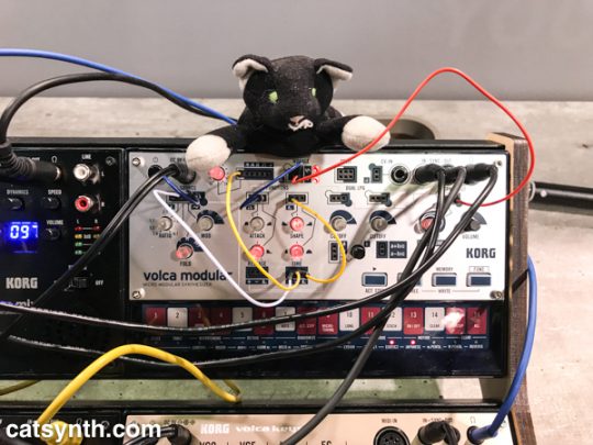
The Volca series continues to grow with its newest offering, the Volca Modular.
The Volca Modular is a self-contained semi-modular synthesizer in a tiny volca-sized package. It has a VCO and modulator for complex waveforms, a function section with envelopes and an LFO, a sequencer, and various patch points for splitting and mixing. Its novel element is the LPG, a low pass gate that can be used as an amp, a filter, or something completely different a la west-coast synthesis. It puts quite a lot in a little box for just $199.
It reminds a bit of some other “tiny tabletop semi-modular synthesizers” such as the Moog Werkstatt or the newer Bastl Instruments Softpop (my CDP bandmate Tom Djll uses one of these and thus I want one, too). Like those, the Volca Modular has tiny little patch points and chords, which are adorable. But unlike those, I found it difficult to patch. The wire tips were a bit flimsy and I bent at least one of them trying to create a new patch on the fly. Otherwise, though, I think this is a fine little instrument, and could end up in my Volca collection.
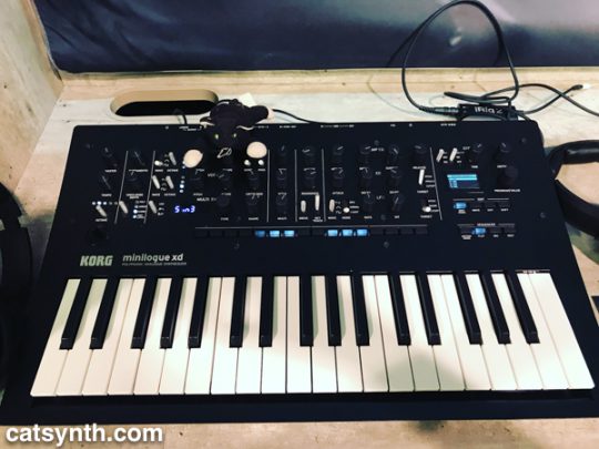
The other new instrument was the revamped Minilogue XD. The original Minilogue made quite a splash a couple of years ago as an affordable polyphonic analog synthesizer. In addition to a nice, darker finish, the XD adds their expandable digital wavetable technology from last year’s Prologue. The digital engine has several different oscillator types and functions, and is essentially a “third sound source” for the instrument. It’s not clear to me whether this includes the same open API that the Prologue has, which would be an unfortunate omission for us at CatSynth, though probably not an issue for most users. It also has microtonal capabilities, something which is missing from many structured MIDI-analog combinations.
Both of these instruments are interesting, incremental changes, with Korg seemingly defending the turf it established in the synthesizer resurgence. Neither is a top priority for us at CatSynth, but I would be surprised if they find their way to us at some point.
We at CatSynth have long been interested in the intersection of art, technology and conceptual process. Programmed: Rules, Codes, and Choreographies in Art, 1965–2018 surveys over 50 years of video, computational and conceptual art, cleverly weaving them together into a single narrative whole. The three disciplines are united by the concept of a “program” or set of instructions through which the work of art unfolds, whether a computer program, instructions for a performance, or strict concept on a visual object. Video and lights abound, but there is also painting, dance, and more.
Installation view. Photograph by Ron Amstutz.
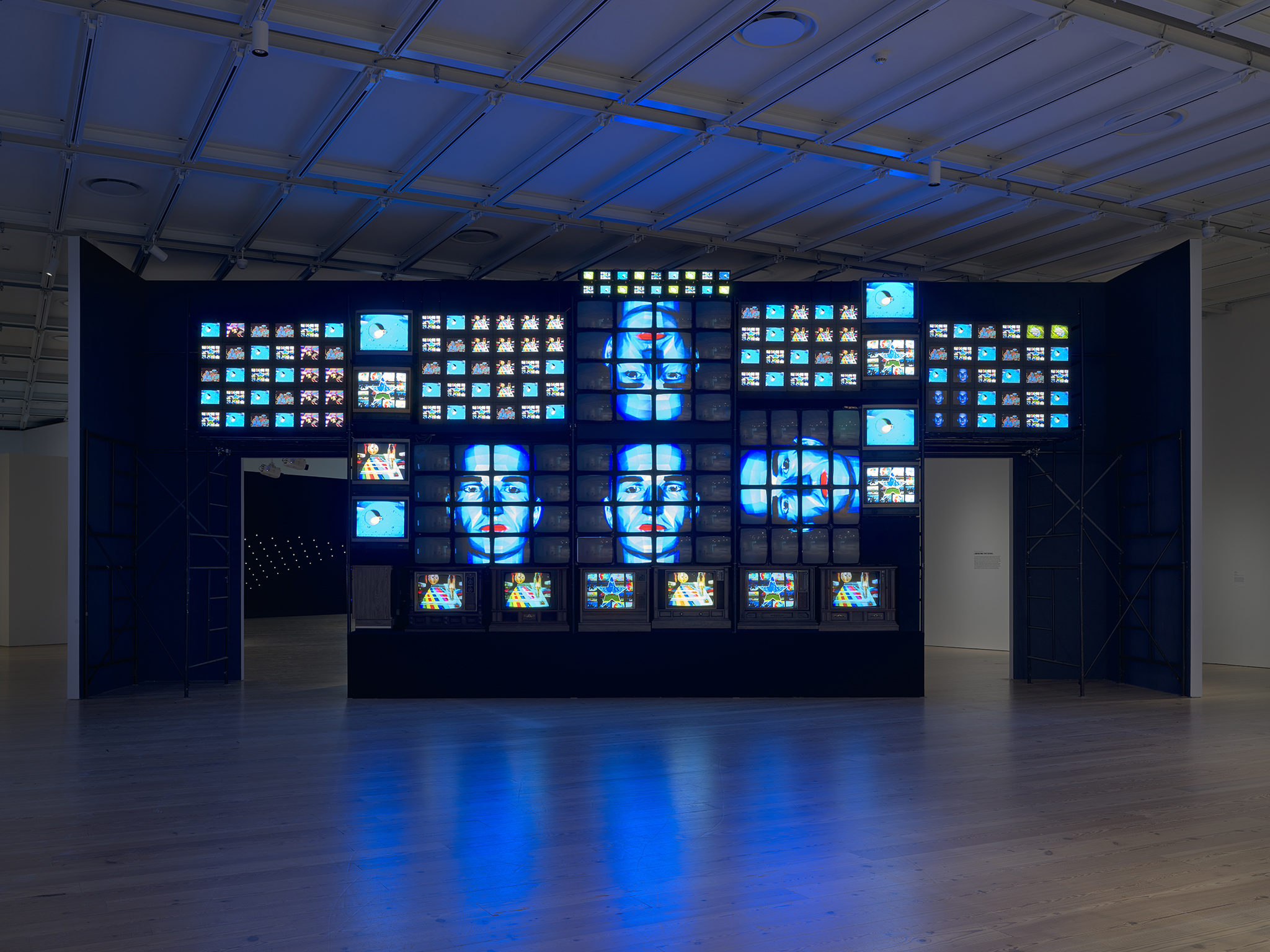
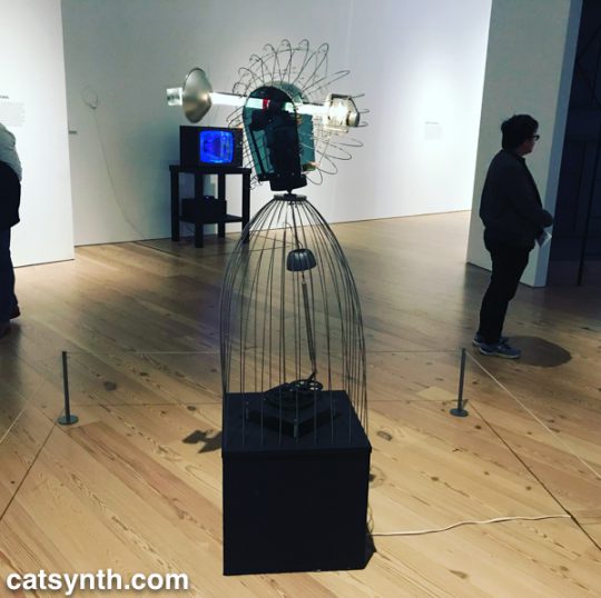
One of the artists who embodies the range of works is Nam June Paik. Immediately on entry to the gallery, we are bombarded with his massive installation Fin de Siècle II. Originally made in 1989, it has been beautifully restored for this exhibition. It contains numerous clips from broadcast video and art video taken out of context and turned into a moving collage on a grand scale.
https://www.instagram.com/p/BqYA_d3BGHz/
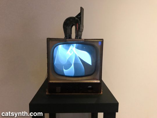
At the opposite end of the video spectrum is his 1965 piece Magnet TV. A black-and-white CRT television set is disrupted by a large magnet, creating a unique but sometimes unpredictable pattern that is in its way rather spare and graceful.
Nam June Paik. Magnet TV, 1965. Modified black-and-white television with magnet.
In the first piece, the process is in the composition, arrangement, and looping of the various video clips. In the latter, it is the physics of the magnet and the CRT.
Motion and experiments with electronics are also at the heart of James L. Seawright’s contemporaneous piece, Searcher, which features gradual motion and changes in light. The shadows it casts are also part of the experience of the piece.
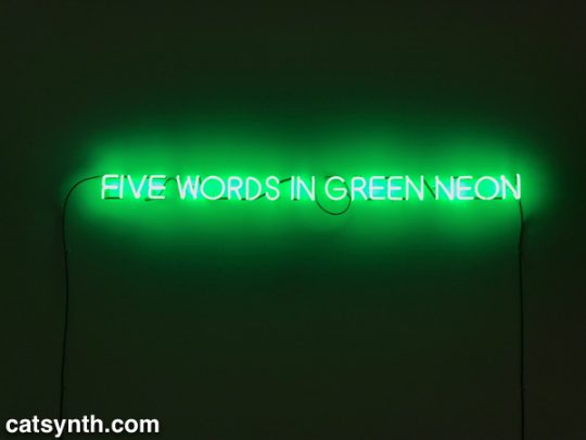
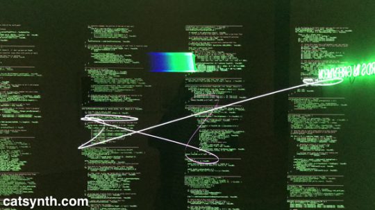
There is an interesting juxtaposition of one Joseph Kosuth’s classic neon text pieces, Five Words in Green Neon, and W. Bradford Paley’sCode Profiles, a Java program that generates images. They bring together the concepts of “text as art” and “code as art” – the message is the medium.
Joseph Kosuth. Five Words in Green Neon, 1965. Neon
W. Bradford Paley. Code Profiles, 2002 and 2018. Java applet.
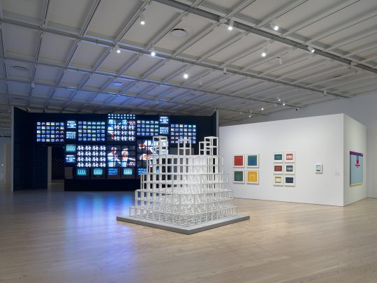
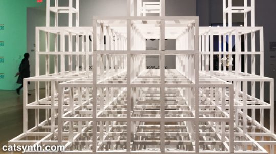
Paley’s code may be one of the most literal examples of the exhibition’s theme, but code need not be computer code as we think of it today. Many works from earlier periods were based on a series of instructions, where the instructions are the work and the performance or visual object are the expressions of said work. One such example is Sol Le Witt’s sculpture Five Towers. The three-dimension grids are assembled by a program with various combinations into a simple but beautiful result. I particularly enjoyed looking through it.
Sol LeWitt. Five Towers, 1968. Basswood with alkyd enamel paint.
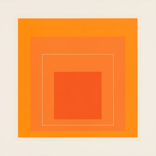
Josef Albers’ color-field rectangles can similarly be generated from a “program”. Like Le Witt’s piece, one could conceive of doing something like this with a computer, but neither artist chose to do so, instead being themselves the interpreters for the code.
Josef Albers. White Line Square VI, 1966. Screenprints on board
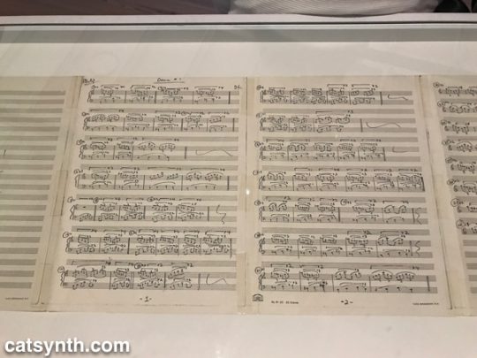
The performing arts have long been linked to programs, whether the traditional score or choreography, or more modern uses of algorithms or conceptual instructions. Performance was most strongly represented in the exhibition by Lucinda Childs’ Dance, done in collaboration with Sol LeWitt and Philip Glass. Childs, who is known for a precise and almost algorithmic approach to dance, choreographed a series of 5 pieces to a score by Glass. She made drawings in different colors for the different movements and projected these onto the floor. During the dance segments, the colors of her drawing were also used for the lighting. Finally, LeWitt filmed the dancers, and the film was then projected behind live performers. The documentation of this complex counterpoint was on display in the gallery, including the film, score, and drawings.
Philip Glass. Score for Dance #1, 1979. Photocopy with ballpoint pen.
https://www.instagram.com/p/BqX_IEFhkQC/
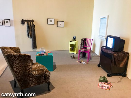
Program, object, video and performance also come together Lynn Hershman Leeson’sLorna. Lorna is an interactive video story on a laser disc (anyone else remember laser discs?). Users can determine how the story unfolds through one of three endings via a remote control. The screen and control are placed within a simulated apartment decked out entirely in leopard print, and the viewer is invited to sit in a comfy chair while the controlling the story. This self-guided performance is at once programmed, but also immersive in that the viewer becomes part of the piece, both in space and in terms of control.
Lynn Hershman Leeson. Lorna, 1979-84. Video, color, sound; with television, interactive laser disc shown as DVD, modified remote control, television cabinet, night table, end table, wood chair, upholstered chair, mirror, fishbowl with plastic goldfish, clothing, wallet, belt, shoes, watch, telephone, magazines, framed storyboards, and framed art
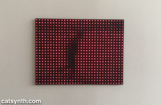
Video permeates the entire exhibition, popping up directly and indirectly in at least half of the pieces, or not more. But video has many different aspects. Is not a collection of discrete LEDs programmed to represent a moving image, as in Jim Campbell’sAmbiguous Icon #5 (Running, Falling), a video? It is certainly a low resolution one, but this low resolution and discrete electronics allow us to see the individual elements that simulate movement in our perception.
Jim Campbell. Ambiguous Icon #5 (Running, Falling), 2000. LED lights and custom electronics.
We conclude this survey with a new site-specific commission by Tamiko Thiel. She created an augmented-reality mobile app (in collaboration with developer /p) that overlays organic forms on the angular, geometric space of the museum’s outdoor terrace.
Thiel’s organic growths are beautiful and playful, but also have a darker aspect. Some resemble plastic refuse, and others coral formations. Both are emblematic of the crises facing our seas due to pollution and climate change. At the same time, the algorithmic process she uses, a formal grammar developed in 1968 by the Hungarian biologist and botanist Aristid Lindenmayer, is fascinating.
Tamiko Thiel (with /p), Unexpected Growth, 2018. Augmented reality installation, healthy phase. Commissioned by the Whitney Museum of American Art
There were many more works in this exhibition that we can discuss in a single article. Each one had something compelling and different about it. For anyone interested in or curious about these forms of art, I highly recommend checking out this exhibit!
Programmed: Rules, Codes, and Choreographies in Art, 1965–2018 will be on display at the Whitney Museum of American Art through April 14, 2019.


