Programmed: Rules, Codes, and Choreographies in Art, Whitney Museum

We at CatSynth have long been interested in the intersection of art, technology and conceptual process.  Programmed: Rules, Codes, and Choreographies in Art, 1965–2018 surveys over 50 years of video, computational and conceptual art, cleverly weaving them together into a single narrative whole.  The three disciplines are united by the concept of a “program” or set of instructions through which the work of art unfolds, whether a computer program, instructions for a performance, or strict concept on a visual object.  Video and lights abound, but there is also painting, dance, and more.
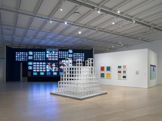
Installation view.   Photograph by Ron Amstutz.

One of the artists who embodies the range of works is Nam June Paik.  Immediately on entry to the gallery, we are bombarded with his massive installation Fin de Siècle II.  Originally made in 1989, it has been beautifully restored for this exhibition.  It contains numerous clips from broadcast video and art video taken out of context and turned into a moving collage on a grand scale.

https://www.instagram.com/p/BqYA_d3BGHz/

At the opposite end of the video spectrum is his 1965 piece Magnet TV.  A black-and-white CRT television set is disrupted by a large magnet, creating a unique but sometimes unpredictable pattern that is in its way rather spare and graceful.
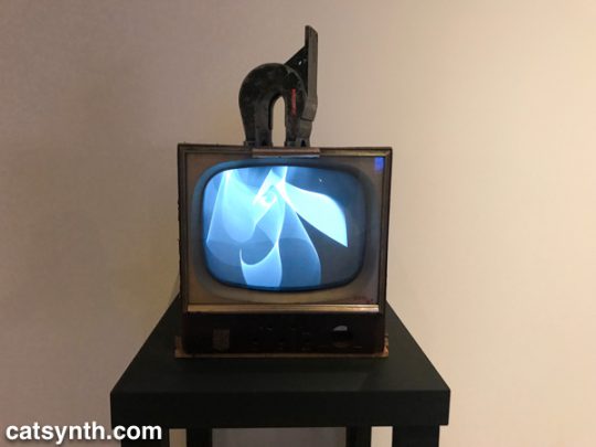
Nam June Paik. Magnet TV, 1965. Modified black-and-white television with magnet.

In the first piece, the process is in the composition, arrangement, and looping of the various video clips.  In the latter, it is the physics of the magnet and the CRT.

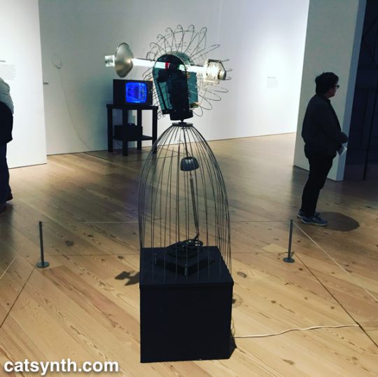
Motion and experiments with electronics are also at the heart of James L. Seawright’s contemporaneous piece, Searcher, which features gradual motion and changes in light.  The shadows it casts are also part of the experience of the piece.
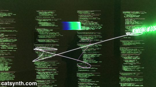
There is an interesting juxtaposition of one Joseph Kosuth’s classic neon text pieces, Five Words in Green Neon, and W. Bradford Paley’s Code Profiles, a Java program that generates images.  They bring together the concepts of “text as art” and “code as art” – the message is the medium.
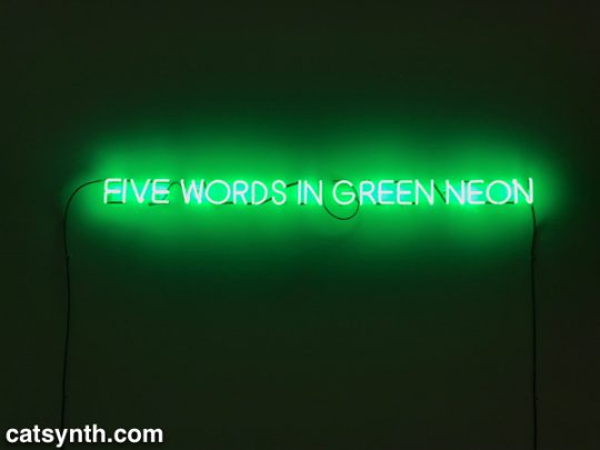
Joseph Kosuth.  Five Words in Green Neon, 1965.  Neon
W. Bradford Paley.  Code Profiles, 2002 and 2018.  Java applet.

Paley’s code may be one of the most literal examples of the exhibition’s theme, but code need not be computer code as we think of it today.  Many works from earlier periods were based on a series of instructions, where the instructions are the work and the performance or visual object are the expressions of said work.  One such example is Sol Le Witt’s sculpture Five Towers.  The three-dimension grids are assembled by a program with various combinations into a simple but beautiful result.  I particularly enjoyed looking through it.
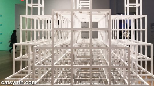
Sol LeWitt.  Five Towers, 1968.  Basswood with alkyd enamel paint.

Josef Albers’ color-field rectangles can similarly be generated from a “program”.  Like Le Witt’s piece, one could conceive of doing something like this with a computer, but neither artist chose to do so, instead being themselves the interpreters for the code.
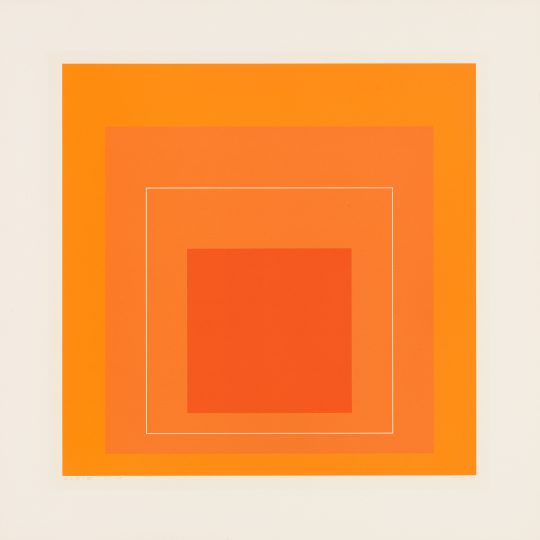
Josef Albers.  White Line Square VI, 1966. Screenprints on board

The performing arts have long been linked to programs, whether the traditional score or choreography, or more modern uses of algorithms or conceptual instructions.  Performance was most strongly represented in the exhibition by Lucinda Childs’ Dance, done in collaboration with Sol LeWitt and Philip Glass.  Childs, who is known for a precise and almost algorithmic approach to dance, choreographed a series of 5 pieces to a score by Glass.   She made drawings in different colors for the different movements and projected these onto the floor.  During the dance segments, the colors of her drawing were also used for the lighting.  Finally, LeWitt filmed the dancers, and the film was then projected behind live performers.  The documentation of this complex counterpoint was on display in the gallery, including the film, score, and drawings.
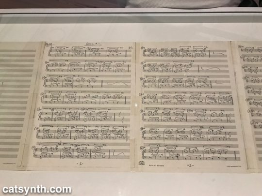
Philip Glass.  Score for Dance #1, 1979.  Photocopy with ballpoint pen.
https://www.instagram.com/p/BqX_IEFhkQC/

Program, object, video and performance also come together Lynn Hershman Leeson’s Lorna.  Lorna is an interactive video story on a laser disc (anyone else remember laser discs?).  Users can determine how the story unfolds through one of three endings via a remote control.  The screen and control are placed within a simulated apartment decked out entirely in leopard print, and the viewer is invited to sit in a comfy chair while the controlling the story.  This self-guided performance is at once programmed, but also immersive in that the viewer becomes part of the piece, both in space and in terms of control.
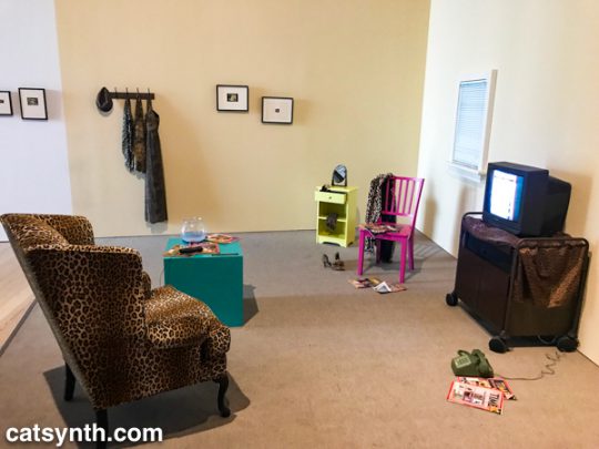
Lynn Hershman Leeson.  Lorna, 1979-84. Video, color, sound; with television, interactive laser disc shown as DVD, modified remote control, television cabinet, night table, end table, wood chair, upholstered chair, mirror, fishbowl with plastic goldfish, clothing, wallet, belt, shoes, watch, telephone, magazines, framed storyboards, and framed art

Video permeates the entire exhibition, popping up directly and indirectly in at least half of the pieces, or not more.  But video has many different aspects.  Is not a collection of discrete LEDs programmed to represent a moving image, as in Jim Campbell’s Ambiguous Icon #5 (Running, Falling), a video?  It is certainly a low resolution one, but this low resolution and discrete electronics allow us to see the individual elements that simulate movement in our perception.
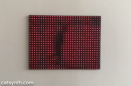
Jim Campbell.  Ambiguous Icon #5 (Running, Falling), 2000.  LED lights and custom electronics.

We conclude this survey with a new site-specific commission by Tamiko Thiel.  She created an augmented-reality mobile app (in collaboration with developer /p) that overlays organic forms on the angular, geometric space of the museum’s outdoor terrace.  

Thiel’s organic growths are beautiful and playful, but also have a darker aspect.  Some resemble plastic refuse, and others coral formations.  Both are emblematic of the crises facing our seas due to pollution and climate change.  At the same time, the algorithmic process she uses, a formal grammar developed in 1968 by the Hungarian biologist and botanist Aristid Lindenmayer, is fascinating.
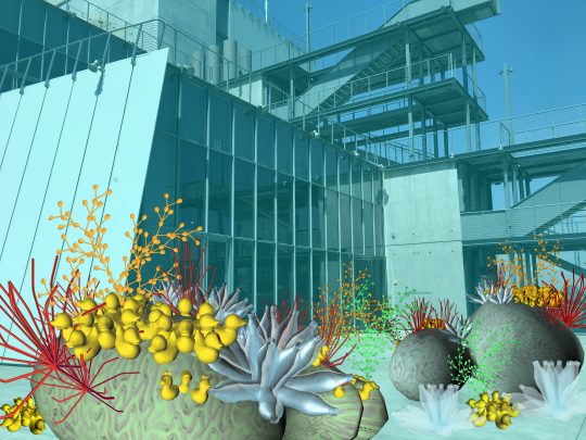
Tamiko Thiel  (with /p),  Unexpected Growth, 2018. Augmented reality installation, healthy phase. Commissioned by the Whitney Museum of American Art

There were many more works in this exhibition that we can discuss in a single article.  Each one had something compelling and different about it.  For anyone interested in or curious about these forms of art, I highly recommend checking out this exhibit! 

Programmed: Rules, Codes, and Choreographies in Art, 1965–2018 will be on display at the Whitney Museum of American Art through April 14, 2019.

Robert Rauschenberg: Among Friends, MoMA

The Museum of Modern Art in New York recently concluded a large exhibition of works by Robert Rauschenberg, billed as the “first 21st-century retrospective of the artist.” In 1999, I attended what was probably the last major 20th-century retrospective at The Guggenheim, which resulted in mixed and complicated feelings about his work. I was skeptical of the white-on-white paintings and openly detested the pieces that consisted entirely of unfolded cardboard boxes; but there were other works that were captivating, like his sculptural paintings with electrical elements. This new exhibition elevates the entirety of Rauschenberg’s work by placing it in the context of his many collaborators, both in the New York School of the 1950s and 1960s and beyond. The show also demonstrated the importance of place in the development and evolution of his art.


[Robert Rauschenberg. Grand Black Tie Sperm Glut (1987). Riveted street signs and other metal parts, 60 x 121 x 14″ (152.4 x 307.3 x 35.6 cm), Robert Rauschenberg Foundation, New York]

The source of his many collaborations can be traced to his time at Black Mountain College. He studied with (and was influenced by) Josef and Anni Albers. It is here that he met John Cage and Merce Cunningham, as well as fellow visual artists Cy Twombly, Susan Weil, and more.

John Cage 4'33
[John Cage. 4’33” (In Proportional Notation) [1952/1953]. Ink on paper, page (each): 11 x 8 1/2″ (27.9 x 21.6 cm); sheet (each, unfolded): 11 x 16 15/16″ (27.9 x 43.1 cm). The Museum of Modern Art, New York. Acquired through the generosity of Henry Kravis in honor of Marie-Josée Kravis.]

Cage’s 4’33” is a piece that I admire greatly. He later claimed that his encounter with Rauschenberg’s white paintings was a major inspiration for the piece. In the context of place and collaboration, the white paintings take on a significance that was lost the first time I saw them. (I still don’t like the cardboard boxes, though.) One can also see in his white (and black) pieces the influence and evolution away from the precise minimalism of Josef Albers.

The friendships and collaborations formed at Black Mountain continued in his work abroad and then at his studios in downtown Manhattan, first at Fulton Street and then at Pearl Street. One amusing collaboration was a long ink-on-paper piece featuring the tire treads of a car driven by John Cage.


[Robert Rauschenberg with John Cage. Automobile Tire Print (detail). 1953. Tire-tread mark (front wheel) and tire-tread mark with house paint (rear wheel) made by Cage’s Model A Ford, driven by Cage over twenty sheets of typewriter paper fastened together with library paste, mounted on fabric, 16 1/2 in. × 22 ft. 1/2 in. (41.9 × 671.8 cm). San Francisco Museum of Modern Art. Purchase through a gift of Phyllis C. Wattis. Photo: Don Ross. © 2017 Robert Rauschenberg Foundation]

Rauschenberg continued to work with simple elements to produce three-dimension works both on and off the wall that would lead to his celebrated “Combines.” Some of these early pieces were quite small and often focused on just one or two elements, such as the piece Untitled (c. 1953) consisting of wooden and linen boxes. As an interesting aside, the original fabric box was destroyed by Rachel Rosenthal’s cat – another example of chance collaboration.


[Unititled (1953). Wood box with lid and removable balsa wood-and-fabric cube. The Museum of Modern Art, New York. Purchase.]

During the period of his early Combines and red paintings, Rauschenberg collaborated with Jasper Johns on a large mixed-media set design for Minutiae a dance piece by Cunningham with music by Cage. While red was the principal color of the piece, it also brought in a variety of other textures and materials, including wood, mirrors, newspaper and even a paint color chart.

Robert Rauschenberg and Jasper Johns. Minutiae
[Robert Rauschenberg and Jasper Johns. Minutiae (1954). Oil, paper, fabric, newspaper, wood, paint sample color chart, graphite, metal, and plastic, with hanging mirror, on wood supports 84 1/2 x 81 x 30 1/2″ (214.6 x 205.7 x 77.5 cm) Private Collection Switzerland. Courtesy Hauser & Wirth.]

The music is very sparse, and the dance moves between very slow minimal motion and periods of frenzied activity. These contrasts are reflected in the set’s various materials and textures. Remy Charlip’s costume designs also seem to reflect the colors and patterns of the set.

In 1960, Rauschenberg participated in Jean Tinguely’s seminal performance piece Homage to New York. Tinguely and his collaborators assembled a large sculptural installation that was designed to self-destruct over the course of the performance, which took place in the sculpture garden of MoMA. Only a few fragments of the original piece remain today.

Fragment from Homage to New York
[Jean Tinguely. Fragment from Homage to New York (1960). Painted metal, fabric, tape, wood, and rubber tires. The Museum of Modern Art, New York. Gift of the artist.]

Rauschenberg’s contributions included “The Money Thrower”, a mechanical contraption with springs, an electric heater, gunpowder, and silver dollars.

The Money Thrower
[The Money Thrower for Tinguely’s H.T.N.Y. (Homage to New York) [1960].  Electric heater with gunpowder, metal springs, twine, and silver dollars. 6 3/4 × 22 1/2 × 4″ (17.1 × 57.2 × 10.2 cm) Moderna Museet, Stockholm. Gift of Pontus Hultén]

One can also see the performative at play in some of his larger Combines, including Gold Standard, a collaborative piece with artist Alex Hay.


[Robert Rauschenberg and Alex Hay. Gold Standard (1964). Oil, paper, printed reproductions, metal speedometer, cardboard box, metal, fabric, wood, string, pair of men’s leather boots, and Coca-Cola bottles on gold fabric folding Japanese screen with electric light, rope, and ceramic dog on bicycle seat and wire-mesh base 84 1/4 × 142 1/8 × 51 1/4″ (214 × 361 × 130.2 cm) Glenstone.]


These collaborations and the increased presence of electrical elements and technology in Rauschenberg’s work foreshadowed E.A.T., the “Experiments in Art and Technology”, an organization which he co-founded with Billy Klüver, Robert Whitman and the engineer Fred Waldhauer. Among the works that came out of E.A.T. was Mud Muse, in which a large glass case filled with bentonite and water is excited by a sound recording fed into an air compression system. You can see a bit of the piece in this video:

Mud Muse. Robert Rauschenberg. #moma #nyc

A post shared by CatSynth / Amanda C (@catsynth) on

Mud Muse was a collaboration with Carl Adams, George Carr, Lewis Ellmore, Frank LaHaye and Jim Wilkinson.

Place is an important element of many pieces. This is perhaps no more apparent than in Tinguely’s Home to New York. But the influence of New York and the artists who coalesced there is apparent in his solo works as well, sometimes visually and sometimes spiritually. Eventually, Rauschenberg moved his home and studio to Captiva Island in Florida, where we worked on a larger scale and in a more solitary manner than during his days in New York. While there are currents that run through his work in both the New York and Captiva periods, the later Captiva works seemed to lack a bit of the edge of the earlier New York work – or perhaps it is simply part of bias towards the city that I always return to.


[Estate (1963). Oil and silkscreen-ink print on canvas 95 3/4 x 69 3/4″ (243.2 x 177.2 cm) Philadelphia Museum of Art. Gift of the Friends of the Philadelphia Museum of Art, 1967.]

There was far more in this exhibition of over 250 individual works than I can cover in this article. The continuity and focus on collaboration made it not too overwhelming to take it all in. I quite enjoyed the show, and it has given me a renewed appreciation overall for Robert Rauschenberg’s career and body of work.