
Category: Modernism
-
Weekend Cat Blogging with Luna: Modernist Poses

Luna has long been comfortable in her modernist surroundings, at it is a common subject of her weekend visits to CatSynth. In the photo above, she is striking one of her attention-getting cute poses against the circular geometry of the rug and the angular lines of the glass table.

In those photo, she has a more elegant pose, the classic “reclining cat” from many works of art. But she also has a little bit of attitude and disdain her expression, probably directed towards me for snapping pictures.
The Carnival of the Cats will be hosted by Ritzi iInfidel.
And the Friday Ark is at the modulator.
-

Fun with Highways: Northern California along I-5
As summer winds down, we start to look back the many little road adventures that dotted the season. The largest and last of these trips, of course, was to Portland, which included a large stretch of northern California.
We begin on I-505, which heads north from I-80, bypassing Sacramento.

.png) I-505 is a completely straight, flat, stretch of highway. This is pretty much true of the surrounding landscape as well, but the texture and details against this blank canvas can make for some interesting photos.
I-505 is a completely straight, flat, stretch of highway. This is pretty much true of the surrounding landscape as well, but the texture and details against this blank canvas can make for some interesting photos.
 I-505 merges into I-5, which continues northward through more of the relatively flat landscape, repeatedly crossing the Sacramento River in the process. Eventually we come to the city of Redding at the northern end of the Sacramento Valley. On my return trip from Portland, I finally had a chance to stop in Redding and visit the Sundial Bridge. This modernist architectural gem spans a wooded section of the Sacramento River completely, a world apart from the town of Redding itself or the strip malls and shopping centers that line the highways. Here, clean modern lines contrast with the natural forms of trees and running water.

The Sundial Bridge turned out to be a great subject for abstract photography (you can see another shot in an earlier Wordless Wednesday). It was also quite crowded with families and groups, something to keep in mind should I ever want to use it as a setting for a more formal photo shoot.
North of Redding, I-5 climbs into the southern Cascades towards Mount Shasta. The highway here is quite scenic, but also narrow, winding, and treacherous. Eventually it opens up as one passes Mount Shasta and approaches Black Butte.

Black Butte is a satellite cone of Mount Shasta. It has a distinctive pointy shape and largely barren rocky texture, both of which make it quite prominent in the landscape. The highway curves around its edge, providing a close-up view.


 After passing Mount Shasta and Black Butte, I-5 descends into a wide valley, passing by the town of Weed, whose welcome sign is a popular backdrop for photographs. This is the start of US 97, which heads northeast towards Klamath Falls and central Oregon as I-5 continues due north through the Cascades towards Portland. The main street in Weed is also Historic US 99. The part of the historic route which returns to I-5 is now California Highway 265, one of the shortest in the system.

From here, the valley descends and opens further, and the landscape becomes surprisingly desert-like. We pass the town of Yreka, where I did not get a chance to stop, but might on a future trip because of some idiosyncratic road-geek things. Finally, the highway climbs upwards again towards Siskiyou Summit, just north of the Oregon-California border and the highest point on all of I-5 at 4,310 feet (1,310 meters).
-
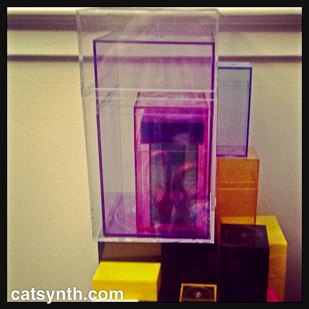
CatSynth pic: Cat vs Modular Synth

From Peter Gorges on flickr, via matrixsynth.
Modular synth aside, that chair would be perfect at CatSynth HQ 🙂
-
Weekend Cat Blogging: Luna, Modernist Cat

For Weekend Cat Blogging, we have a photo of Luna once again posing with our modernist decor at CatSynth HQ. Don’t you think she would make a great model for Dwell?
As with most shots of Luna, this one was by chance. She sat down on the corner of the Le Corbusier-knockoff sofa and I managed to grab the iPad and snap a photo of her. No effects or processing, just a straight photo.
Luna also gave us a bit of a scare last weekend. I got home from one of my performances to find her quite sick with some sort of stomach problem, scary enough that we went to the emergency vet for the first time. (Whenever one sees red associated with one’s cat, it’s a major warning sign.) Fortunately, she seems to have recovered well and is back to her normal self. I still don’t know what happened, but I am grateful that she is fine now.
Weekend Cat Blogging will be hosted by Kashim, Othello and Salome at PaulChens FoodBlog?!
The Carnival of the Cats will be up this Sunday at iInfidel.
And the Friday Ark is at the modulator
-
John Cage, The Music of ChAnGEs: Variation VIII
Today we review The Music of ChAnGEs: Variation VIII, a concert in a yearlong series by sfSound celebrating John Cage’s centennial. This particular concert, which took place at The Lab, featured some of Cage’s more adventurous and experimental compositions, including works involving electronics and noise elements. These more conceptual pieces involved use of simple electronics, household objects, or unexpected musical sources. The scores are mostly based on sequences of instructions with absolute or relative time scales. In addition to 4’33” (which was not on the program), these are among the most celebrated examples of Cage’s music, but also among the more misunderstood and even reviled. I fall unequivocally on the side of celebration of these more radical and pioneering works, and thus I was privileged to be able to participate in this concert myself as well.
The pre-concert and intermission music featured an interpretation of One3 by John Leidecker (aka Wobbly). The piece contains the instruction to “arrange the soundsystem so that the whole hall is on the edge of feedback, without feeding back. The result is an abstract texture that goes from silent to occasionally quite loud at the unstable boundary, but the sound was also blended with the ambience of the conversations and commotion in the hall.
The formal concert opened with Radio Music. In this piece, each performer is given a written part with a sequence of AM radio frequencies to which to tune his or her radio (traditional analog broadcast AM/FM radios are required to perform this piece, no internet or digital-broadcast radios allowed). What, if anything, is audible on those particular frequencies is of course up to chance – sometimes it is just static, while other times one tunes into an actual station. Additionally, the performers were free to walk around the hall and to interpret the flow of time among positions in their part. The result was a spatialized electronic music texture with the radios playing the part of synthesizers with noise generators, distorted sine waves, and the occasional sampled recording. Particular combinations of sportscasts, music and tuning noise could be quite humorous.
This was followed by Music for Amplified Toy Pianos. Cage is often credited with bringing the toy piano into the realm of serious music with his 1948 Suite for Toy Piano. In Music for Amplified Toy Pianos, he pushes the instrument further with the use of contract microphones, amplification, and more percussive interactions with the instrument itself. Like Radio Music, the score involves a series of instructions, indicating the pitches to be played by each performer, when to perform a “sound effect” on the instrument, and when to change the level on the associated amplifier – but in this piece, the times are given in absolute units. This was my station for the performance, with my own toy piano that was rescued from curbside dumping in New York. It has certainly had a better life at CatSynth HQ, and then the opportunity to appear in a concert like this!

Performing this piece accurately requires concentration – one must pay attention to the cues on his or her own part without being distracted by the other sounds. Nonetheless, like all ensemble music one is listening to overall sound. The texture of the piece is quite sparse, with individual disjoint notes punctuated by percussive sounds (hits, scrapes, etc.). The amplification changes add a strange sort of dynamic expression especially as the ear inevitably tries to pull together disparate parts into short phrases. There was not as much empty space in this performance as I heard on earlier recordings of the piece, in part due to our interpretation of the noise elements, which included longer-duration sounds like scraping a comb on the piano and the interaction of the amplifiers with ambient and electrical noises. It was a delight to play and to be able to at least partially listen to. The other performers for the piece included Kyle Bruckmann, Daniel Cullen, Tom Djll, Sivan Eldar, Matt Ingalls, and Hadley McCarroll.
The only piece on the program not written by Cage himself was a tribute by Christopher Burns entitled Unlit Cigarettes (for John Cage). Ostensibly a multi-movement chamber piece with voices, winds, and strings, it followed the theme of other pieces in the concert with unusual patterns and instructions for the performers. Among the most interesting were the instructions for one or more performers to play on another performer’s main instrument. For example, multiple performers attempted to make sounds from Burns’ guitar while he held it. There was also a recitation of a familiar-sounding text by Gertrude Stein in one movement. Her writing often involves repeated words and phrases, which made for very contrapuntal and rhythmic music. Burns was joined in the performance by Kyle Bruckmann on oboe, Tom Dambly on trumpet, Tara Flandreau on violin, Matt Ingalls on clarinet, John Ingle on saxophone, and Hadley McCarroll on voice. You can hear a bit of the performance in this video:
This was followed by one of Cage’s most conceptual pieces, 0’00”. The score of the piece consists of the single statement “In a situation provided with maximum amplification (no feedback), perform a disciplined action.” It is often subtitled 4’33” no. 2, and although it has very little in common with the original 4’33”, it does represent another extreme of what can be considered music. The “deliberate action” in this particular performance involved Matt Ingalls’ sitting at a desk and writing checks to pay the musicians. A contact microphone picked up the sound of the writing and it was amplified into the hall. It wasn’t the most pleasant sound even when judged in comparison to the other extreme sounds of the evening, but it was a faithful rendition and the action was a humorous and appropriate choice for this concert. (And it’s nice to get paid for playing experimental music.)
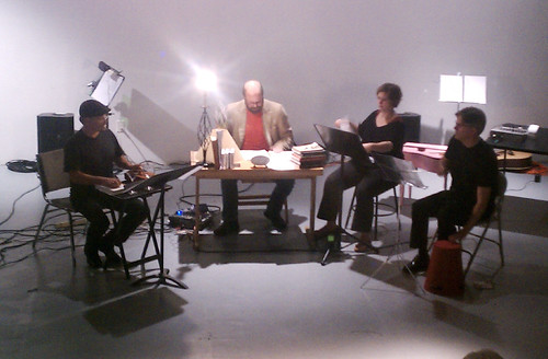
[Photo by Tom Djll.]
The final piece before the intermission was Living Room Music. Dating back to 1940, this was one of Cage’s earlier pieces and explores the use of household objects as percussion instruments. Ingalls was again seated behind the desk from 0’00” with the other performers (Matthew Goodheart, Tom Dambly, and Hadley McCarroll) arranged to either side. Despite what was radical instrumentation for a concert setting at the time, the rhythmic work seemed rather conventional, with repeated polyrhythms and other patterns from idiomatic music. It was the combination of the staging, to look more like a room in a house with the desk and books, and the timbres of the “instruments” that allowed the concept of the piece to enter the listening experience. Once one accepted the setting, then focus shifts to the rhythms.
The concert resumed with Music for Six, a performance of Cage’s modular piece Music for _____ by six musicians, essentially the same ensemble that played Christopher Burns’ piece minus Burns. This is one the most flexible and reconfigurable pieces, even more of a “composition generating kit” than the others. Although the instrumentation for this performance was traditional chamber instruments, the piece calls for extensive use of microtones that push the instruments into different sonic territory.
The most unusual instrumentation of the evening was in Inlets (Improvisation III). The piece called for three amplified water-filled conch shells, one conch shell played like a trumpet, and pre-recorded sounds of fire. The honor of playing the conch shells fell to Matt Ingalls, Tom Dambly and Tom Djll.

There was much of the expected splashing and gurgling sounds that one would expect from the conch shells, but also surprising details such as short percussive sequences from the action of the water. These instruments were quite difficult for the performers to control, which makes the resulting music more unpredictable. At times it was also difficult to tell what was generated by the water in the shells and the fire in the recording, adding an aspect of “elemental ambiguity” to one’s enjoyment of the piece.
The concert concluded with a performance of Cartridge Music. The piece has a similar structure to Music for Amplified Toy Pianos and Inlets, but distills the concept further to just modified phonograph cartridges – realized for this performance using contact microphones – and found objects. The piece unfolded with each performer rubbing his or her respective found objects against the microphones according to the timed instructions in the score. The resulting music was once again quite sparse, but with a wide dynamic and timbral range from the array of objects used, including Matthew Goodheart’s cymbals (a miniature version of the system he presented a few weeks earlier at the Outsound Music Summit), metal objects in a bowl played by Kyle Bruckmann, and many others. By following the changes in texture, density and volume, one can start to hear phrasing and form in the music.
In listening to (and in some cases performing) the works in this concert with their emphasis on generative techniques, “compositional tools” and indeterminacy, I could not help but think of Fluxus, for which Cage was an important influence (though not technically a member). The connection to Fluxus provides a strong conceptual context as well as connection to visuals of the time and place where Cage created these works. Nonetheless, they all still stand out as excellent on a purely musical level in the concert setting, with sounds and textures that were quite enjoyable to listen to despite Cage’s undeserved reputation of writing impenetrable music. The concert was also well attended, with a full house packed into The Lab. A very successful night all around.


