Category: Modernism
-
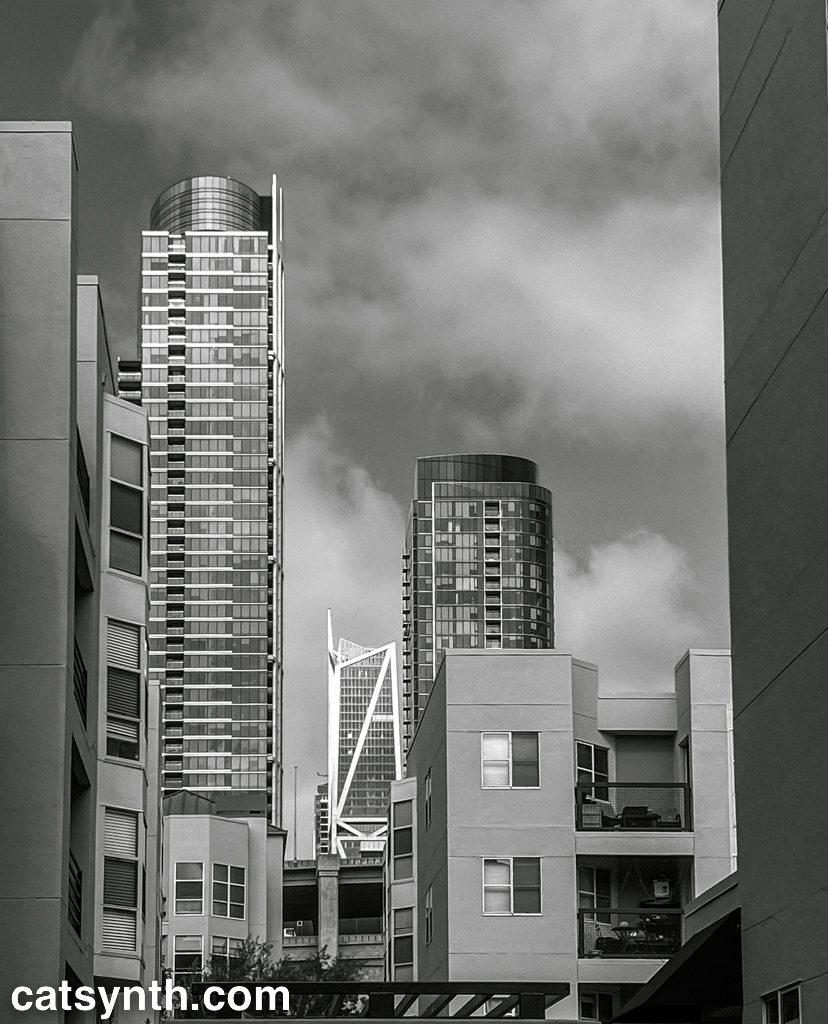
Wordless Wednesday: Into the Future
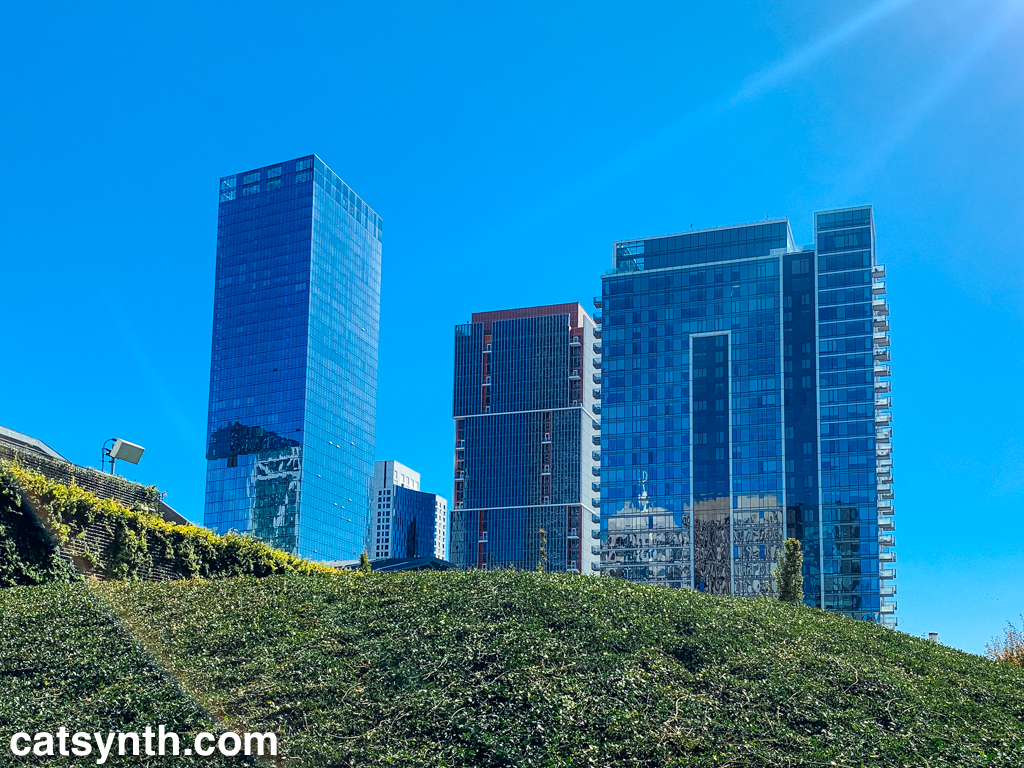
We close out the year with a bright, optimistic photo from Salesforce Park (atop the transit center) in San Francisco.
We close out the year with a bright, optimistic photo from Salesforce Park (atop the transit center) in San Francisco.