Mission Bay, San Francisco. Taken with Lensbaby Edge 35 lens.
We pick up our report from our recent visit to the Museum of Modern in Art where we left off after Part 1. Working my way gradually downstairs, I came to the special exhibition Sur moderno: Journeys of Abstraction―The Patricia Phelps de Cisneros Gift. This is a major exhibition that fills several galleries with modernist works by South American artists through the 20th century.
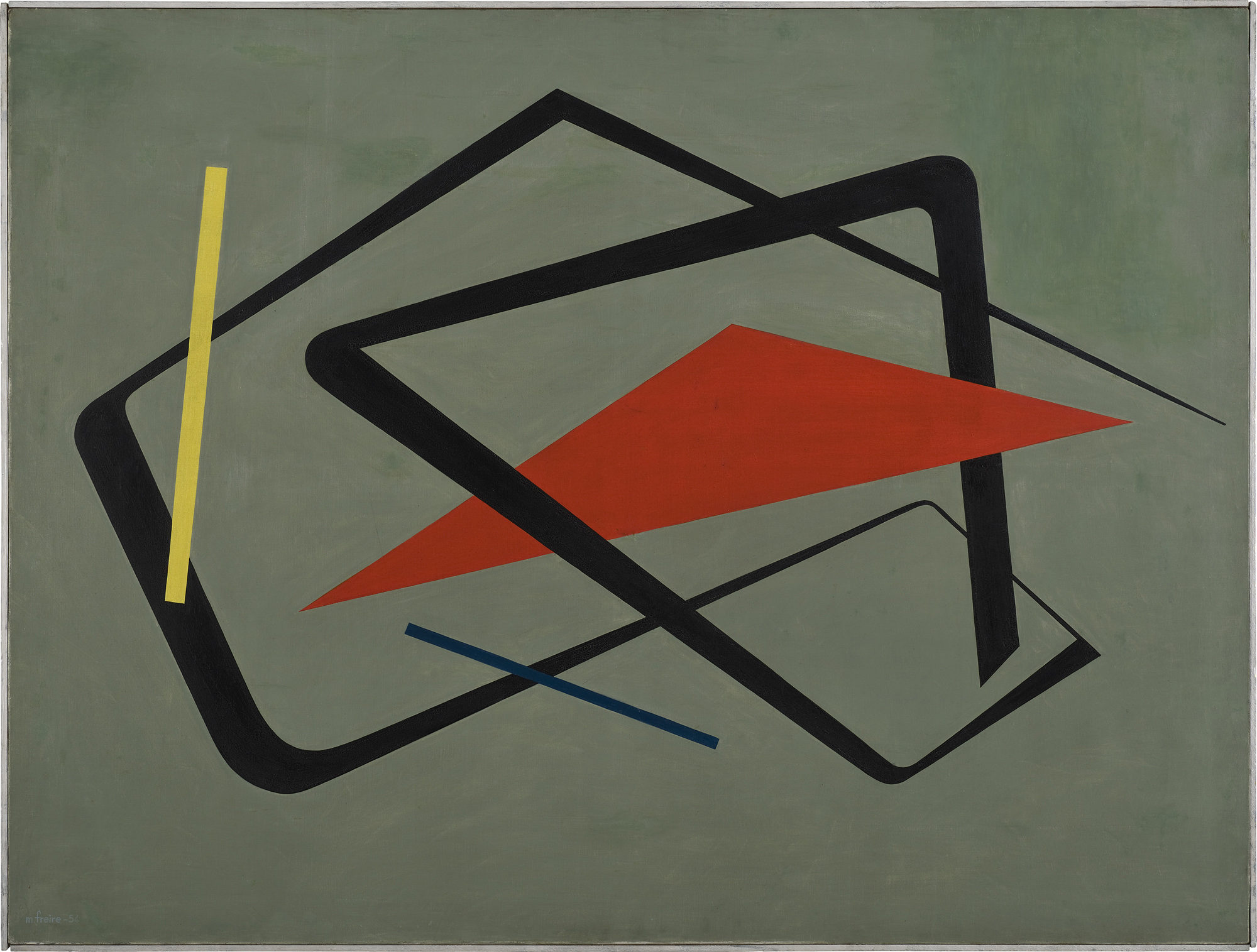
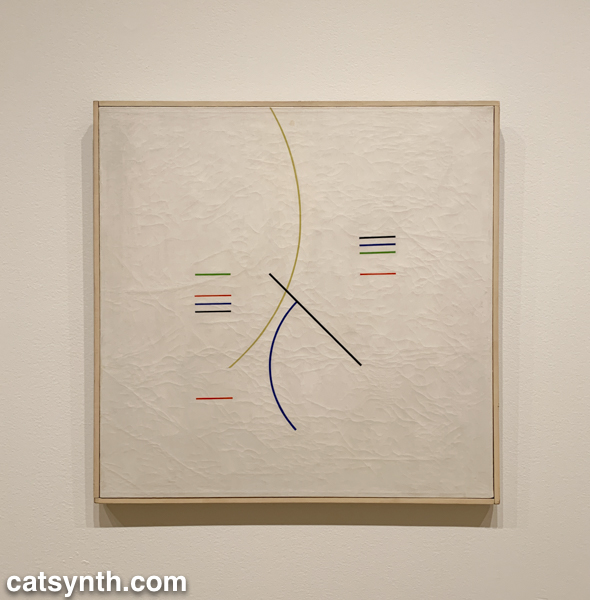
As in other parts of the world, South American artists embraced abstraction in the decades following World War II, with lines shapes of minimal color palettes. In his aptly named Curves and Straight Series, Argentine artist Alfredo Hlito takes this to an extreme with thin lines and curves against an off-white background, while Uruguayan artist María Friere used bolder lines and colors in her Untitled.
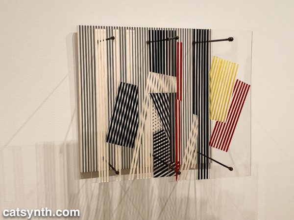
Both of these pieces feel like they could have been three-dimensional pieces of design, and in fact, the exhibition does include several striking three-dimensional works. When seen head-on, Jesús Rafael Soto’s Double Transparency appears to be a plat painting or print, but from the side the depth becomes apparent.
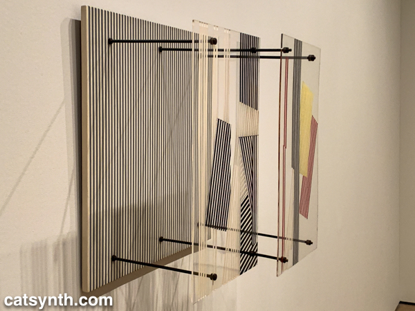
The lines-in-space motif is also used in Ocho cuadrados (Eight Squares) by Gertrud Goldschmidt, also known as Gego.
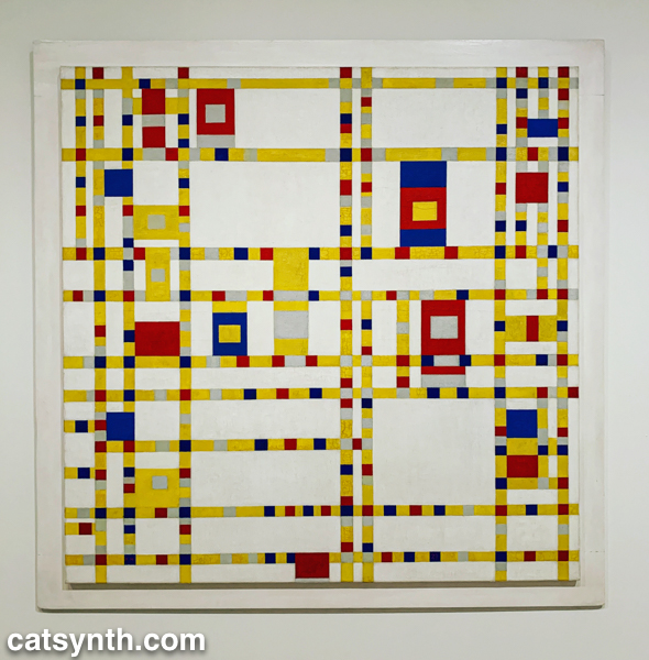
The recurring motifs in many of the works show the influence of Piet Mondrian, not just the most familiar neoplastic pieces but his earlier and later work as well. Indeed, I was happy to find Broadway Boogie Woogie hanging in this exhibition after not seeing it in the main collection display. As much as any work in MoMA’s permanent collection, I have a regard for this painting as if it were a friend and not just a work of art.
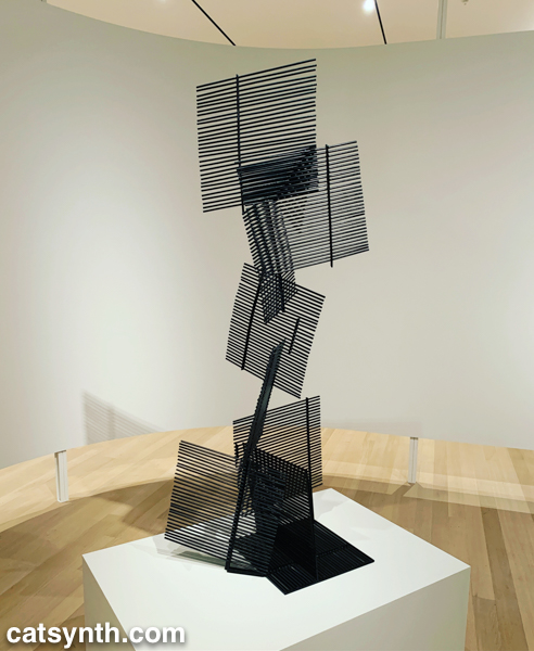
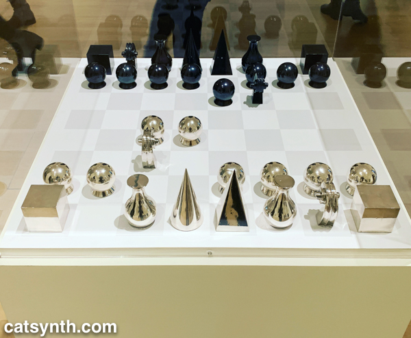
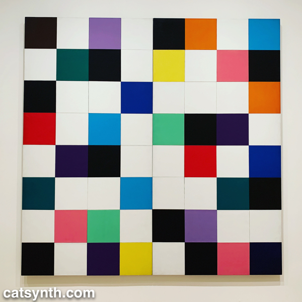
But perhaps the most extreme interpretation of the grid was found in Antonieta Sosa’s Visual Chess.
As part of its expansion, MoMA launched a new gallery space called the Marie-Josée and Henry Kravis Studio, or simply “the Studio”, a space dedicated for live, interactive, and multimedia art. The inaugural exhibit was Rainforest V, an evolution of David Tudor’s Rainforest. Originally a score for a collaboration with Merce Cunningham, it evolved into a performance installation. The latest version, realized by Composers Inside Electronics (CIE), is controlled by computer rather than live performers, as visitors wander through the space.
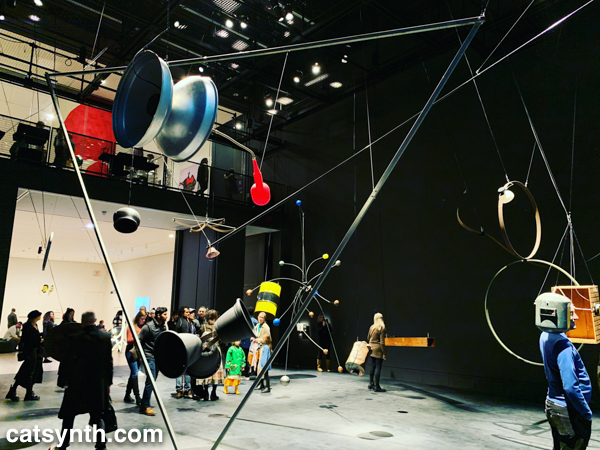
The installation is constructed from everyday objects, such as a metal barrel, a vintage computer hard disc, plastic tubing, wood crates, and more. The objects and materials are fitted with a vast array of speakers and become resonators that shape and amplify the sound.
The best moments are getting close to an object, such as the barrel or balsa-wood box with simulated earphones, and standing for a moment then walking around. I regret that an iPhone in a crowded gallery is not the best way to record and share it with readers – it really music be seen in person.
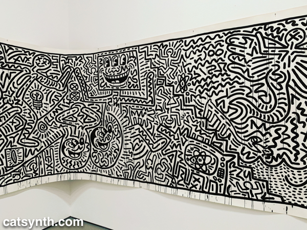
There was still more to see, including the newly expanded second-floor gallery for contemporary (1980s-present) works. This period has traditionally been a more mixed one for me, but there are gems and inspirations to be found. There was a large gallery-spanning work by Keith Haring.
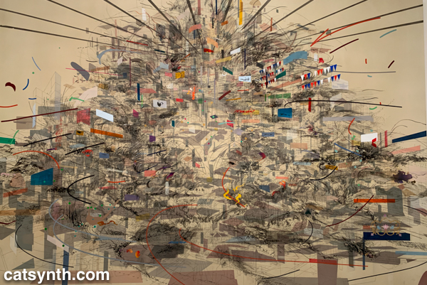
An equally monumental piece by Julie Mehretu called Empirical Construction: Istanbul a fantastic futuristic cityscape radiating in multiple dimensions.
On the opposite scale is Eduardo Kac’s Reabracadabra, a video piece realized as graphics inside a vintage Minitel terminal.
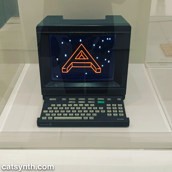
Kac’s piece reminded me of my interest in vintage electronics finding new life as dynamic art pieces.
We end with one panel from a larger work by the artist Zarina, Home Is A Foreign Place.
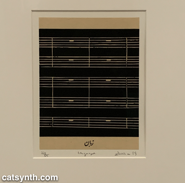
There is something bleak about an entire musical score made of rests, but also intriguing, and even curious. It is perhaps a reminder that exploring a museum top to bottom invites one to escape one’s comfort zones even at the same time as seeking comfort and solace. I’m glad this visit afforded opportunities for both.
Most visits to New York include a stop at the temple of modernism, the Museum of Modern Art (MoMA). But this was my first visit since the massive multi-year expansion and renovation was completed. In some ways, it seems that not much has changed, but in other ways it has changed considerably, starting the members-only entranceway leading to a larger and more open lobby.
The second=floor atrium remains very much the same as it has been since the expansion in the early 2000s, a cavernous space looking up to all exhibition floors of the museum. It often is used to display monumental pieces or immersive performance works. Handles, a performance and sculptural piece by Haegue Yang combined both.
The name refers to the handles on all of the sculptural elements that allowed them to be slowly moved around the space by the performers. In between these motions, the performers gathered for vocal chanting that brought to mind the work of Pauline Oliveros. The sculptures and wall and floor elements had a simple geometric quality that reminded me of children’s building blocks. They also had bells and other sound elements mounted, again something that brought to mind Oliveros.
From the atrium, I always head immediately to the sixth floor and gradually work my way back down. The top floor featured Surrounds, an exhibition of large-scale installations by a diverse collection of contemporary artists. Some, like Mark Manders‘ Room with Chairs and Factory, were large singular pieces, with a gallery-sized replica of a factory. Others were large compositions of smaller elements. For example, Dayanita Singh‘s Museum of Chance was composed of numerous photograph prints made by the artist, assembled into large modular panels that could be easily rearranged in any number of configurations.
In his installation Architecture Is Everywhere, Sou Fujimoto challenges us to see the “architecture” in everyday objects. His installation is a field of small objects ranging from colored geometric design elements to potato chips placed on an array of pedestals.
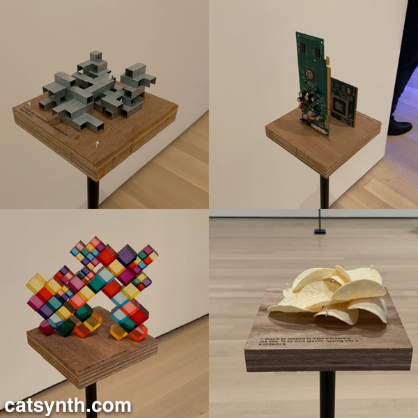
The “architecture” in each object is readily apparent when one is invited to see it. Even the potato chips are curvilinear forms that might be at home in a 1960s futurist public space.
Perhaps the most of fun of all the installations was Sarah Sze’s Triple Point (Pendulum). A colorful collection of everyday objects are arranged, somewhat precariously, around a circle as a pendulum swings freely above, threatening mayhem of destruction. However, that never happens and instead, we end up with an intricate but chaotic dance.
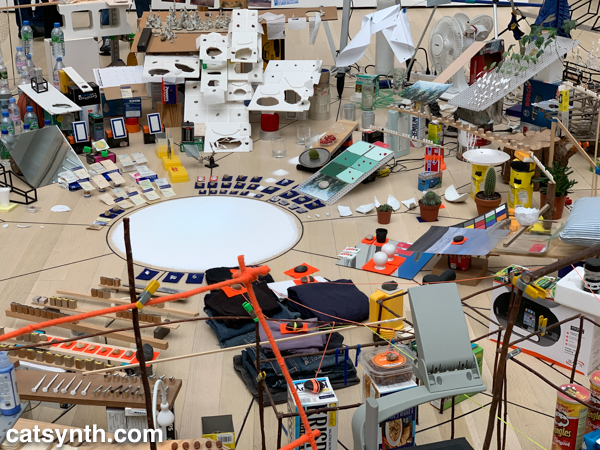
The name of the piece, which derives from the “triple point” where water can exist simultaneously as ice, liquid, and vapor, illustrates the sense mix of chaotic and coexistence in the installation.
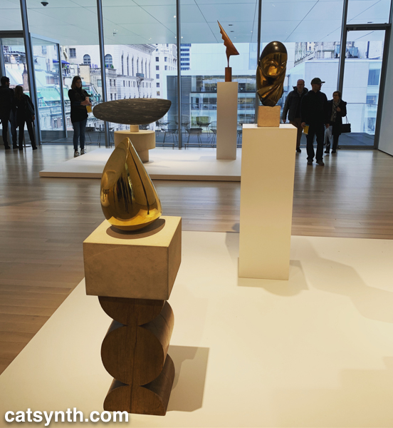
Descending to the fifth floor, some of the changes to the museum became more apparent. The terrace cafe overlooking the sculpture garden had been removed (actually, moved to a new location on the sixth floor), and replaced by an open gallery space showing various sculptures by Constantin Brancusi.
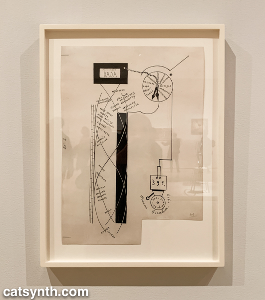
The remainder of the fifth floor and the entirety of the fourth floor housed an expanded and increasingly labyrinthine set of galleries for the permanent collection. The first gallery, which featured the oldest and most traditional works such as Van Gogh and Matisse, was by far the most crowded space in the entire museum. I quickly left to find some more open spaces and truly modern works, which began to appear in the 1910s and 1920s. In addition to Dada favorites, there were works celebrating machines, industry and the break with traditional forms of painting. Francis Picabia’s Dada Movement and Man Ray’s chess set are exemplars of these directions.
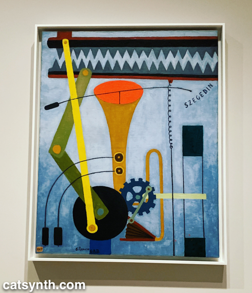
Georges Ribemont-Dessaignes‘ Silence depicts a musical instrument attached to machinery, perhaps speaking to the contradictory nature of music made by machines.
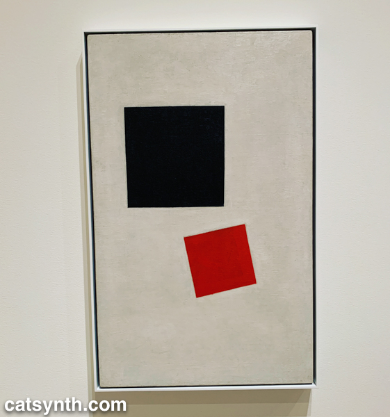
There was also a lively world of modernism and abstraction in Russia before the 1917 revolution, as exemplified by Kazimir Malevich’s minimalist Supremacist Composition: Airplane Flying.
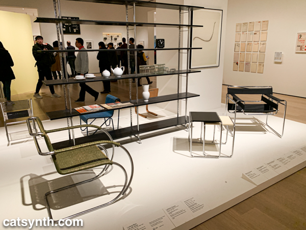
The expanded galleries included a room of design pieces from the interwar period (these were previously displayed in the separate design gallery on a rotating basis).
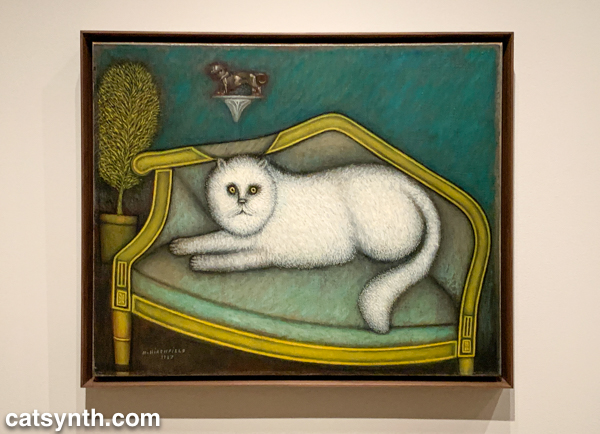
There was also a new space devoted to so-called “outsider artists” of the period, including Morris Hirshfield. I was particularly drawn to his portrait of a white cat titled Angora Cat.
The collection continued on the fourth floor with the period between the end of World War II and the 1970s. This is usually my favorite section to linger in, with many iconic works of the 20th century. The Jackson Pollock’s are of course back on full display, but so is Lee Krasner, who is finally getting her due as a leading abstract expressionist painter.
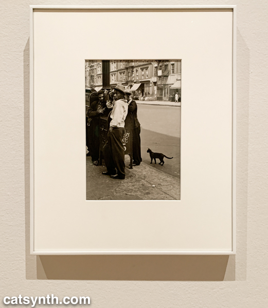
The expanded galleries have given more room for women and other underrepresented artists. The photography of Helen Levitt was featured in a room that also included artists depicting life in Harlem in the 1950s. I particularly liked this photograph of hers with a black cat.
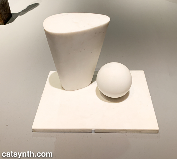
This sculpture by Barbara Hepworth is quite minimal, with the perfection of the sphere balancing with the “squishier” curves of the taller element.
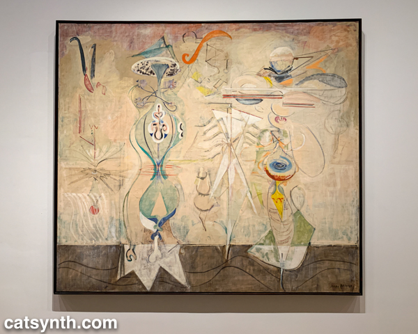
There were also pieces that showed the works of artists beyond their most well-known. I would not have guessed this painting with other-worldly plant-like creatures as the work of Mark Rothko were it not for the title card.
There were of course pieces that did exemplify artists as we know them. Ellsworth Kelly had large geometric blocks of color, as one would expect.
I looked around these galleries in vain for perhaps my favorite work in the collection, Piet Mondrian’s Broadway Boogie Woogie – it’s like visiting an old friend when I see it – but it was nowhere to be found. [Spoiler alert: I did eventually find it and it will be featured in Part 2 of this series.]
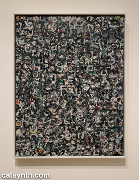
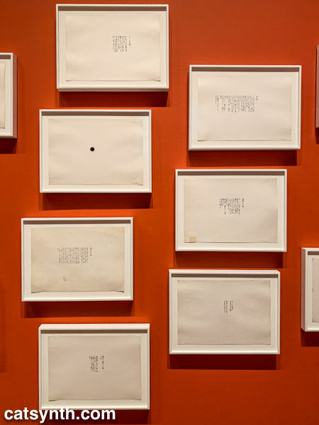
As we move into the late 1950s and the 1960s, abstract expressionism gives way to more conceptual art and works in different media. This was the beginning of Fluxus, with its instructional pieces, happenings, and ephemeral works on cheap materials. There was an entire wall of “scores” for performance works by Yoko Ono. These are always fun – most have clear instructions that one could use to perform them today, though I wonder what was expected from the large black dot.
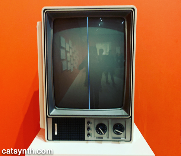
This is also the era of Nam Jun Paik’s experiments with analog video. Zen for Television takes video art to its most minimal, with a single line of a continuous signal on the screen. However, the vintage television set itself becomes a specific idea when viewed in the 21st century.
Abstract designs persist in this period, but also take on an industrial and repetitive nature. Sol Lewitt takes this to the extreme, but others Geraldo de Barros left room for variation, and perhaps to the works on paper from Fluxus.
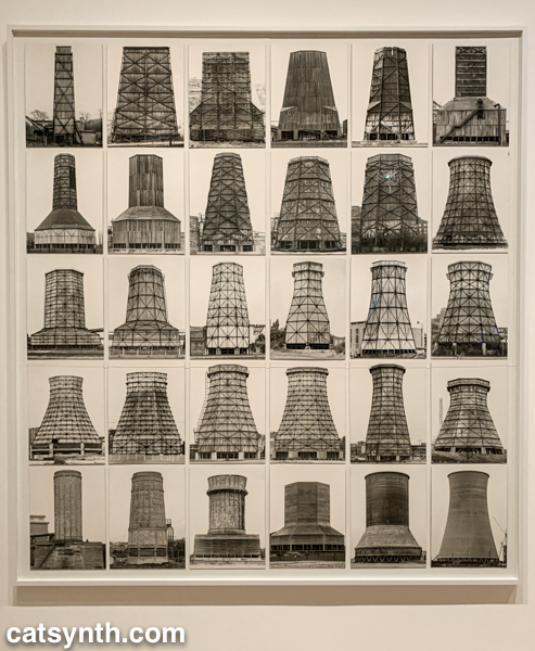
Among my favorite photographers of this period are Hilla and Bernd Becher. There work depicting old industrial buildings and placing them into artistic compositions has been a huge influence on my own photography.
Even after this whirlwind through three floors, seven decades, and multiple exhibits, there was still much of the museum to cover; and I was determined to cover the entirety in one day. In the end, I succeeded, and the remainder of the visit will be covered soon in Part 2 of this series.
Scene featuring two art pieces in a niche at the Hilton Anaheim while running around between parties and other social gatherings on the last night of NAMM. It was a quiet and arresting tableau amidst the chaos and cacophony.
Some may be quick to deride “hotel art”, but these two pieces would look very much at home at CatSynth HQ regardless of provenance.
For more “wordless” fun, please check out our completely wordless latest video.
For us at CatSynth, no trip back to New York is complete without a visit to the Museum of Modern Art (MoMA), and this time it was an exceptionally rich one, with interesting exhibitions on every floor even amidst the museum’s massive renovation project. We begin with a look at an exhibition of prints by Louise Bourgeois that focused on her print-making work. Although primarily known for her sculptures, Bourgeois produced a large body of printed works on paper, textiles and other materials, especially at the beginning and end of her career. But the themes and characteristic elements remain similar regardless of medium, and the show placed the printed works in the context of her sculpture. For example, the main atrium of the museum was dominated by one of her large iconic spider sculptures, with late-career prints surrounding it on the walls.

[Louise Bourgeois. Spider (1997)]

[Installation View]
The prints in the atrium featured curved, organic forms, in keeping with the same natural focus in the spider and many of her other sculptures. We can see this synergy between print and sculpture throughout the exhibition, with early prints and drawings informing her sculptures of the 1950s and 1960s, which combined geometric and architectural elements with organic shapes and textures.

[Louise Bourgeois. Femme Maison (1947)]

[Louise Bourgeois. Pillar (1949-1950) and Figure (1954)]
The vertical nature of the forms enhances the sense of embodiment in the sculptures, while drawings like Femme Maison (shown above) make the connection literal. Bourgeois revisited these same themes in many of her later prints, perhaps even drawing upon the earlier sculptures themselves for inspiration.

[Louise Bourgeois. The Sky’s the Limit, version 2 of 2, only state (1989-2003)]
In addition to the intersection of architectural and biological forms, Bourgeois’ work often explores themes of womanhood, fertility, and sexuality. Indeed, the 1947 Femme Maison combines all three themes. On particularly poignant series from the 1990s, late in her life, revisits motherhood embodied in Sainte Sébastienne (presumably a gender switch of the early Christian martyr Saint Sebastien). Childbirth and pain come together in the first more literal series of images, but there is a softer element to the second series, which includes this image combining the maternal figure with a cat.

[Louise Bourgeois. Stamp of Memories II, version 1 of 2, state XII of XII (1994)]
Sexuality comes through abstractly in many pieces, but quite literally in some late-career drawings which have a playful, comic-like quality, as in this page from her illustrated book The Laws of Nature.

[Louise Bourgeois and Paulo Herkenhoff. Untitled, plate 2 of 5, state X of X, from the illustrated book, The Laws of Nature (2006)]
Bourgeois celebrated both the female and male while turning some of traditional roles and stereotypes on their head. In the above image, it is the woman who appears to be in control in the sexual moment, with the male figure more passive. Another particularly amusing riff on gender stereotypes is her sculpture Arch of Hysteria in which a suspended male torso is used to represent “hysteria”.

[Louise Bourgeois. Arch of Hysteria (1993) and installation view.]
Having been on the receiving end of “why are you being so emotional?” comments in the workplace, I rather enjoyed seeing this stereotype turned around.
We conclude with one last piece from the Lullaby series in which a simple red organic form is printed on sheet-music paper.

[Louise Bourgeois. Untitled, no. 11 of 24, only state, from the series, Lullaby (2006)]
Like the drawings from The Laws of Nature, these were done towards the end of the career. I thought it was interesting that she chose music paper as the foundation for this series. And for us at CatSynth, it allows us to circle back to music, which permeates our experience of art.
Louise Bourgeois: An Unfolding Portrait will be on display at the Museum of Modern Art in New York through January 28, 2018. You can find out more information here.

Our coverage from our recent visit to the Museum of Modern Art in New York continues with Projects 107: Lone Wolf Recital Corps. The Lone Wolf Recital Corp is a multidisciplinary performance collective founded in 1986 by artist and musician Terry Adkins (1953-2014) and has featured many musicians and visual artists over the years. The performances were as much visual art as performance, with Adkins’ sculptures and other objects. Indeed, the main artist attractions were the many musical-instrument sculptures.

The horns above look like they could be played with enough strength and energy. By contrast, Adkins’ musical sculpture Nenuphar, which consists of two horns fused together seems impossible to play.

[Terry Adkins, Nenuphar (1998). Brass and Copper.]
When one is deep in the details of music making – and using electronic gadgets in the process – it is possible to forget the aesthetic beauty of musical instruments as objects and sources of inspiration themselves. Adkins’ sculptures and the work of the ensemble remind us that. The performances, which employ collective improvisation also centered around a diverse set of figures such as John Coltrane, abolitionist John Brown, explorer Matthew Henson, and singer Bessie Smith. Adkins billed the performances and dedications as “an ongoing quest to reinsert the legacies of unheralded immortal figures to their rightful place within the panorama of history.” (it should be noted that here at CatSynth, John Coltrane, in particular, is anything but unheralded.)
Unfortunately, we were not in town to attend either the opening performance or the second performance on September 26, which brought members of the ensemble together in live improvisation around the sculptural elements of the exhibition.

[Opening performance of Projects 107: Lone Wolf Recital Corps at The Museum of Modern Art, August 19, 2017. Photo: Scott Shaw.]
It looks like it was a great event, and while we are sad to have missed the performances, we are glad to have found the exhibition. It was one of the happy surprises that one expects when exploring MoMA.
Since February, MoMA has hung artworks galleries by artists from countries affected by the administration’s various travel bans – something which is poignant this week as the latest incarnation of in the ban covering seven countries (six majority-Muslim countries plus North Korea) has been announced. Below is one such work, a beautiful exterior perspective of a proposal for The Peak: Hong Kong by Zaha Hadid, who passed away last year.

[Zaha Hadid. The Peak, Hong Kong (1991). Exterior perspective, synthetic polymer on paper mounted on canvas.]
The pieces are scattered among the rotating display of works from the permanent collection in the middle floors, which are otherwise organized in a near-religious temporal and historical progression from early modernism at the turn of the 20th Century to the post-war period. Hadid’s painting stood in high contrast to the early modern works surrounding it. Others, such as The Prophet by Parviz Tanavoli blended more subtly with their surroundings. The following statement was included with each artwork:
This work is by an artist from a nation whose citizens would be denied entry into the United States according to recent presidential executive orders. This is one of several such artworks from the Museum’s collection installed throughout the fifth-floor galleries to affirm the ideals of welcome and freedom as vital to this Museum, as they are to the United States.
We at CatSynth could not agree more, and strongly support MoMA’s action through art.
For us at CatSynth, coming back to New York almost always means a visit to Museum of Modern Art (MoMA). It’s a place that is always safe, inviting and inspiring. It’s also a change to spend time with some old friends, like Piet Mondrian’s Broadway Boogie Woogie, a painting that for me has an almost religious significance.

There are of course, many special exhibitions, and we discuss them below.
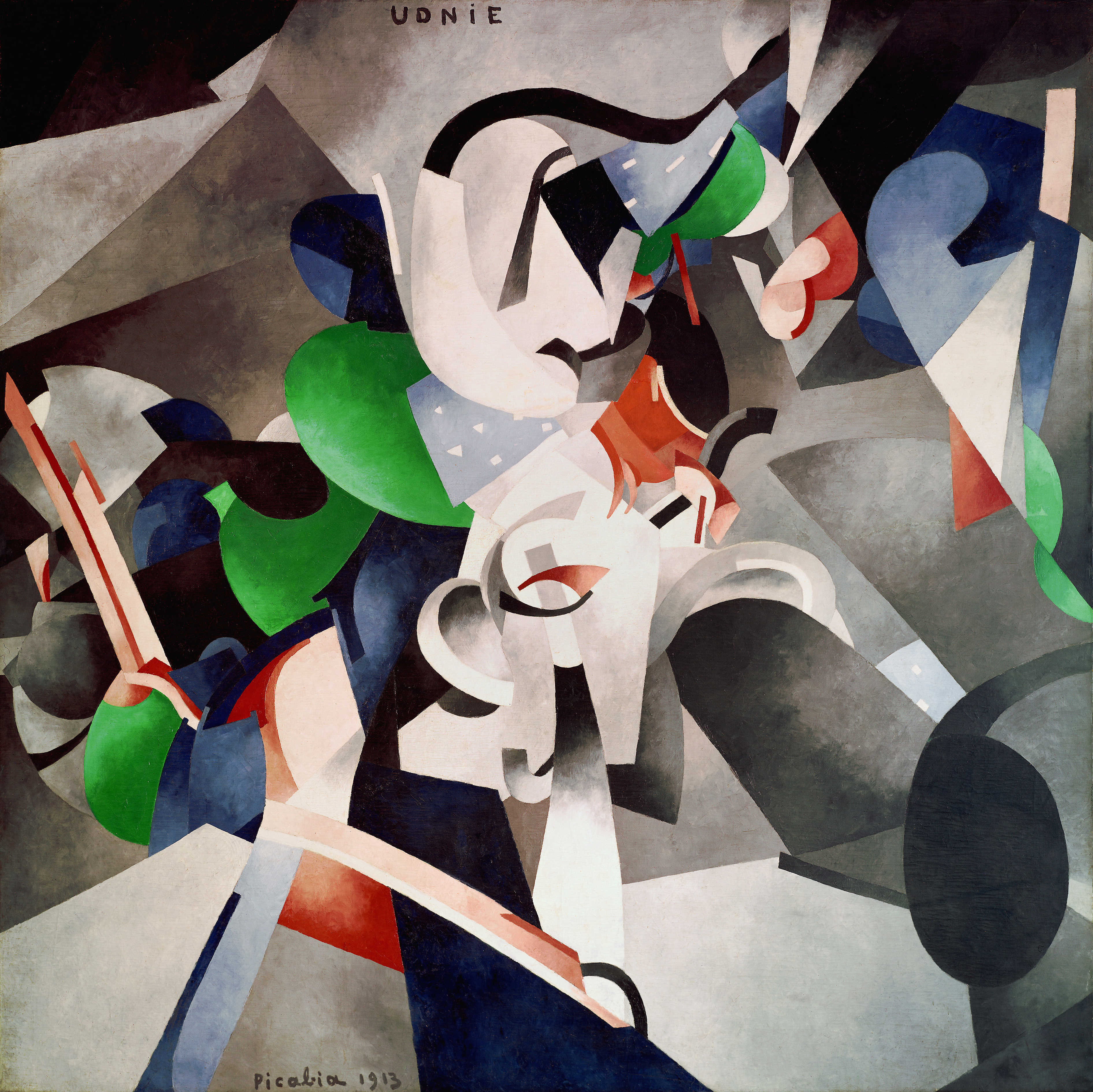
Much of the top floor of the museum was reserved for a retrospective of the work of Francis Picabia, one of the less-well-known of the great modern artists from the first half of the 20th Century. Though known for his association with the Dada movement, his oeuvre includes many other ever-changing styles. Indeed, the exhibition begins with his early works in an impressionist style. Though very well executed, they are not particularly exciting other than the provocative nature (for the time) of using photographs as sources. However, after this initial period, his work explodes with large abstract canvases.

[Francis Picabia. Udnie (Jeune fille américaine; danse) (Udnie [Young American Girl; Dance]). 1913. Oil on canvas, 9′ 6 3/16″ × 9′ 10 1/8″ (290 × 300 cm). Centre Pompidou, Musée national d’art moderne – Centre de création industrielle, Paris. Purchased by the State, 1948. © 2016 Artist Rights Society (ARS), New York/ADAGP, Paris. Photo: © Centre Pompidou, MNAM-CCI/Georges Meguerdtchian/Dist. RMN–Grand Palais/Art Resource, New York.]
The painting shown above, Udnie (Jeune fille américaine; danse) (Udnie [Young American Girl; Dance]) is exemplary of this period of his work. It is huge, almost 10 feet by 10 feet square, and features bright industrial colors with large curving lines. This painting had a colder and higher-contrast palette than its neighbors, so it particularly attracted me. There is also the fact that the title reminds me of the David Bowie album of similar name.
Picabia became a leading artist in the Dada movement, producing many paintings and drawings of industrial and manufactured objects, some featuring bits of text that he found from encyclopedias and other sources. They have the sparse, sometimes sad quality of readymades, but also show steady and disciplined hands at work to create these pieces.

The centerpiece of the Dada sections of the exhibition was a recreation of one of his Paris exhibitions, with drawings arranged in a linear fashion and rugs along the gallery floor. The pieces were a mixture of Dada, abstraction and figurative images (mostly of Spanish women). These demonstrate the artist’s desire to not be stuck in one style or even just one movement.
Picabia went through a period of more figurative painting in the years leading up to and during World War II, including a somewhat odd set of photorealistic paintings from soft-porn images that he created while living in under the Vichy regime in southern France. After the war, however, he returned to abstraction until his death in 1953. Many of these late works have a somewhat minimal quality, including a series consist of large dots on a monochromatic background
The other major exhibition on the top floor featured a full-gallery installation by Kai Althoff entitled and then leave me to the common swifts (und dann überlasst mich den Mauerseglern). The space itself was the artwork in which the viewer was invited to wander.

[Installation view of Kai Althoff: and then leave me to the common swifts (und dann überlasst mich den Mauerseglern). The Museum of Modern Art, New York, September 18, 2016–January 22, 2017. Photograph © Kai Althoff]
The labyrinthine installation is a seeming clutter of objects, looking more like a messy artists’ studio. However, on closer inspection, one sees that there are a lot of older works from the artist in various states of integrity among found objects like dolls and clothing. The artwork fragments included heads with strange expressions. Overall, it was one of the more confounding exhibitions I have seen. I am not one to necessary require “meaning” from art, but I do tend to look for lines, shapes and patterns. But being challenged by an exhibition is not a bad thing.
In addition to the hunt for old favorites in the permanent collection, an entire floor was dedicated to works from he 1960s, arranged one room per year. The detailed view shows just how rich and varied the art of that decade was, and how art transformed into what we think of as contemporary in the early 21st Century. Among the works on display was a set of photographs by Bernd and Hilla Becher. We have discussed them before, as their work is very influential for my own art photography.

The video work of Nam June Paik has also been a major influence. The exhibition featured a very minimal work of his, essentially reducing analog video to a single line.

Yayoi Kusama is enjoying a lot of attention of late. This work, which appeared to be a chair of penises, was featured prominently. The description of the piece confirmed my phallic interpretation.

The second floor also featured multiple special exhibitions, including the provocative “architectural” show on displacement and shelter, focusing on migrants and refugees in the modern world. It included a full-size refugee tent shelter, as well as overhead images of a sea of such shelters. There were images from camps that have been in the news lately, such as the large one in Callais, France. There were also some art pieces on the same theme, such as lightboxes with images of war zones by Tiffany Chung.

[finding one’s shadow in ruins and rubble. Tiffany Chung, 2014. Courtesy of the artist and Tyler Rollins Fine Art]
There was also a large world map with strings representing patterns of migration, along with sound and visual elements. Not surprisingly, a great many of those lines led to the United States.

It’s a reminder that the U.S. has always been a welcoming country for refugees and immigrants, and will hopefully remain so.
There is always more that I saw and resonated with an I can fit in such an article. Please visit us on Instagram to see more of our latest visit to the MoMA.
At the end of my trip to NAMM, I always try to leave time for a museum visit in Los Angeles, more often than not to LACMA. This is a somewhat belated review of this year’s visit.
Since seeing the film on the Levitated Mass, it was an absolute priority to experience the giant sculpture by Michael Heizner in person. For those unfamiliar, it is a 340-ton boulder mounted above a concrete trench. The space underneath is open and thus viewers can walk under the boulder.

It is an impressive feat of engineering (as documented in minute detail in the film), and a visually interesting conceptual piece. It is definitely one has to experience in person to understand.

One of the main special exhibitions at LACMA in January was a retrospective on the work of Frank Gehry. While none of his actual buildings were on display (though it would have been appropriate in the context of Levitated Mass), there were many drawings and models, group into conceptual and chronological phases of his career.

Many of his most famous pieces, such as Disney Hall and Guggenheim Bilbao, were on display. But also large lesser-known buildings an smaller designs, some of which were never built. In the photo above, we see a building that combines the undulating organic structures for which Gehry is famous with a more traditionally modernist linear outer structure. The model in front is quite different, and more geometric and colorful that one sees in his iconic works.
It is also fun to see the small structures and private homes. I am envious of those who could have a Gehry-designed home like this one.

By sheer coincidence, Frank Gehry was present that afternoon to give a talk and Q&A session. I managed to get into the overflow audience to catch part of it.

The wide-ranging discussion including a bit of his personal history, his interest in biology and particularly in fish, and his disdain for computer modeling – he agreed that it was an amazing tool, but not for visually understanding a piece of architecture. On the topic of fish, they reviewed a few purely sculptural pieces of his that were meant to represent the swimming motion of a single fish or an entire school. Though he perhaps his voice sounded a bit gruff – something which bothers me not at all – he was very much engaged with the questioners and supportive.
In the modern pavilion, it did stop to see a few familiar large installations. I enjoy walking inside of this large-scale Richard Serra sculpture and find it quite meditative. It was also interesting to contemplate its curving structure in terms of what I had just seen and heard from Frank Gehry.

From the curving structure I then moved on to straight lines. This familiar light installation reflects onto the window facing Wilshire Blvd and makes for great self-portraits.

I also had a bit of fun with self portraiture in the retrospective exhibition for Diana Thater, which featured several room-sized pieces with multiple projections of moving images.

Though that was fun, the piece itself was dead serious, looking at the aftermath of war through ruined buildings.

There were some pieces in the exhibition that were less dark, as in Butterflies that features both lights and video bathed in red ambient lighting.

[Diana Thater, Untitled Videowall (Butterflies), 2008. Six video monitors, player, one fluorescent light fixture, and Lee filters . Installation Photograph, Diana Thater: The Sympathetic Imagination, Los Angeles County Museum of Art. © Diana Thater]
One doesn’t always know what to expect on a on-afternoon trip whose date is not timed to a particular exhibit, but I am never disappointed with what I encounter at LACMA, and that was true again this year.
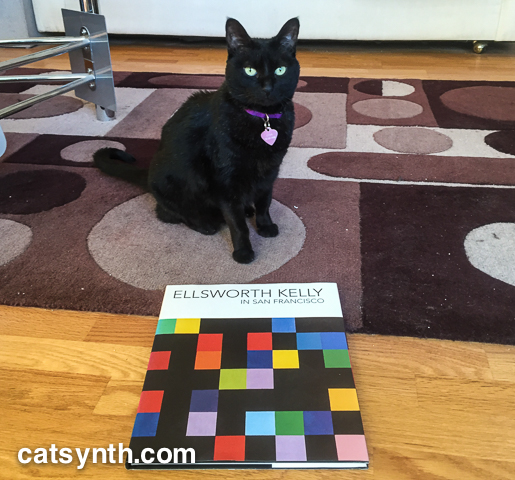
We lost another of our art heroes yesterday. Ellsworth Kelly, known for his iconic works composed of color fields, passed away.

The above photo features the catalog from his large-scale solo show at SFMOMA in 2002-2003. The exhibition was a bright spot, both aesthetically and emotionally, in an otherwise depressing period of time and made quite an impression. I kept intersecting with his work during my numerous art adventures in California. His paintings featured large color fields, sometimes combined together into a single whole, while other times separated, as in Blue Green Black Red (1996) on display as part of the Fisher Collection at SFMOMA. I had the opportunity to see a large retrospective of his prints and paintings at LACMA in Los Angeles a couple of years ago. This, too, was revelatory as it showed other aspects of his work, including black-and-white pieces and connections of his abstract style to nature.

[Installation view. Ellsworth Kelly: Prints and Paintings. January 22-April 22, 2012. Los Angeles County Museum of Art. Photo (c) 2012 Museum Associates/LACMA]

[Installation view. Ellsworth Kelly: Prints and Paintings. January 22-April 22, 2012. Los Angeles County Museum of Art. Photo (c) 2012 Museum Associates/LACMA]
It is still, however, the color fields that I most instantly recognized as his.

[Installation view. Ellsworth Kelly: Prints and Paintings. January 22-April 22, 2012. Los Angeles County Museum of Art. Photo (c) 2012 Museum Associates/LACMA]
Kelly himself resisted being described as “abstract” or “minimal” or any other label that intersected with his career. But I think this statement quoted in the New York Times obituary describes his art very well, and is a fitting conclusion.
“My paintings don’t represent objects,” he said in 1996. “They are objects themselves and fragmented perceptions of things.”

Since my last visit to New York, the Whitney Museum opened its new building in the Chelsea neighborhood of Manhattan, and so it was of course a high-priority stop on this visit.
The first work of art on encounters is the building itself. The overall style neither attempts to mimic the warehouses of the Meatpacking District nor projects the dissonance of some of the other intriguing buildings along the High Line. But it does open up to the neighborhood and the city, making that part of the show along with the formal art.

The main exhibition was a massive retrospective of works by Frank Stella which took up the entire 5th floor of the museum and featured his iconic large and colorful paintings as well as more recent works that veered towards the sculptural. One of the major themes is how over his long career he has shifted his focus and come up with new ways of working in the medium he still refers to as “painting.”

His most recognizable works are the large-scale colorful cutout paintings. The earlier examples contain elements of abstract expressionism and the emerging minimalism, but then modified by cutting out the shapes to make irregular canvases, freeing panting from being simply “colors spread onto a rectangular surface”. Nonetheless, my favorite examples of this phase are still geometric and stark.

[Frank Stella. Chocorua IV]
From straight lines, we move to curves, which further modify the boundaries of a painting. And then came the radical step of taking a painting outside of the flat plane by cutting, bending, and layering pieces.

[Frank Stella. Gobba, zoppa e collotorto]
While the placement and combinations of shapes may be complex, the shapes themselves remain simple and the whole composition abstract. I found this phase of Stella’s work to achieve its most refined form in La penna di hu.

[Frank Stella. La penna di hu, 1987-2009. Mixed media on etched magnesium, aluminum and fiberglass.]
It seems natural to ask whether such works are paintings or sculptures. Stella himself comes down squarely on the side of viewing them as paintings. This is true even for his most recent series of work that feature large metal constructions without color.

Stella has also embraced technology throughout his career including new materials and machines. Most recently that includes 3D printing.
It was great to see both his most famous paintings alongside the more surprising elements of his constantly evolving work in this large exhibition. As Stella is still alive, there may be more to come.
The top floor of the museum features a retrospective of works by Archibald Motley. Motley was a prolific and influential painter who came to prominence in the first half of the 20th century. The exhibition focuses on his works portraying African Americans in serious portraits and lively cultural scenes from the Jazz Age and Harlem Renaissance in the 1920s and 1930s. While the portraits are detailed and striking, it was his scenes of colorful musical spaces that most resonated with me.

[Archibald J. Motley Jr. (1891–1981), Blues, 1929. Oil on canvas, 36 × 42 in. (91.4 × 106.7 cm). Collection of Mara Motley, MD, and Valerie Gerrard Browne. Image courtesy the Chicago History Museum, Chicago, Illinois. © Valerie Gerrard Browne]
Motley was well known in his time, but faded later compared to other painters of American life and scenes (think Edward Hopper). Because his work depicts an American community often overlooked and his style is more modern and pushing away from realism, it is great to see him getting reintroduced through exhibitions such as this.
The galleries featuring pieces from the permanent collection were also “new” in the new space. Among the themes that permeates the museum’s collection are scenes of the city and industry. There is Joseph Stella’s Brooklyn Bridge (a poster of which hangs at CatSynth HQ) but also John Marin’s less-well known Region of Brooklyn Bridge Fantasy with a very different take on the same subject.

[Joseph Stella. Brooklyn Bridge]

[John Marin. Region of Brooklyn Bridge Fantasy, 1932.]
In terms of industrial imagery, among the strongest were Kay Sage’s surrealist piece and Elsie Driggs’ Pittsburgh. Both pieces, at least to me, have a very optimistic view of the city and progress even if others of our current time would see them as bleak.

[Kay Sage. No Passing, 1954]

[Elsie Driggs. Pittsburgh, 1927]
It’s also worth noting that some of the strongest images of these themes were done by women, something that inspires me in my own work into this subject.
The 6th floor featured works from the collection of Thea Westreich Wagner and Ethan Wagner, some of which will be come part of the Whitney’s permanent collection and some of which will go to the Centre Pompidou. It focuses American and international art from the 1960s to the present, and demonstrates the wide variety of media and concepts employed during this period. Minimalist works abound, such as Sean Paul’s series featuring arrangements of black shapes on a white background with implied complexity.

[Sean Paul. Arrangement 17, 2011]
There are also many works featuring technology. Some are the obligatory works with the light (that I do quite enjoy), but one of the more confounding pieces was by Aaron Flint Jamison. It featured two wooden boxes with multiple computers and a shelf of printed sheets. Were the computers the art, or were they just functional elements to support the concept?

[Aaron Flint Jamison. Half Matrix Vessel (part of “Manifold to Half Matrix” installation), 2013]
There was of course more traditional modernist painting, such as Charline von Heyl’s piece Boogey.

[Charline von Heyl (b. 1960), Boogey, 2004. Acrylic, oil, and charcoal on canvas. 82 1/16 × 78 1/8 (208.4 × 198.4)
Promised gift of Thea Westreich Wagner and Ethan Wagner P.2011.472. Courtesy of the artist and Petzel, New York]

Overall, this was a great visit and a chance to see a new museum in a favorite neighborhood of mine. One question that I had was what would be the fate of the old midtown Brutalist building that housed the museum for decades. Fortunately, it appears that it will survive, and the Metropolitan Museum of Art plans to use it for some special exhibitions. I hope to be able to see one in the future.
[Images without “catsynth.com” watermark courtesy of the Whitney Museum of American Art.]