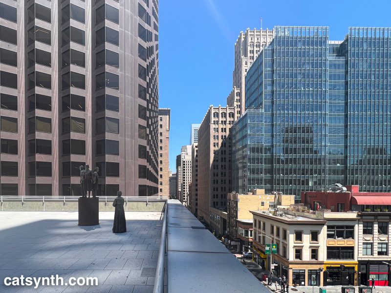
View eastward from the extended St. Mary’s Square Park in San Francisco, looking over Kearney Street. In the lower left, we see the Comfort Women Memorial. More info about the memorial can be found here.


View eastward from the extended St. Mary’s Square Park in San Francisco, looking over Kearney Street. In the lower left, we see the Comfort Women Memorial. More info about the memorial can be found here.
In this article, we follow the #OccupySF march in San Francisco yesterday through some Hipstamatic photos, with nods to some of the city’s architecture and icons that we passed along the way.
We began at the base of Market Street, the main thoroughfare of the city. It runs diagonally and separates two separate street grids that run at 45-degree angles to one another, some thing confuses not only visitors but many locals as well.

An impressive line of police ran parallel to the march. This was primarily to separate the marchers from traffic, which continued on the other side of Market Street. The interactions my group had with the police were quite cordial. One even helped us with info from the announcements at the front of the march which we could barely hear from our position.

For those who criticize the Occupy movement for not having any sort of focus, it should be noted that yesterday’s march and events were squarely focused on the banking industry and the largest banks in particular. It coincided with “Bank Transfer Day” in which large numbers of people moved their accounts from the large banks to either credit unions or community banks. San Francisco remains a large banking center. Wells Fargo still has its headquarters at the corner of Montgomery and California. We had a demonstration in front of the building.

Bank of America used to have its headquarters in San Francisco as well, at 555 California Street. 555 California is the second tallest building in San Francisco, a large imposing structure of brown granite. It is often derided, but I kind of like it as an example of modernism in an architecturally conservative city. It has a large plaza above street level common for commercial buildings from the 1970s. The march stopped here for an extended sit in.

From there we continued up California Street towards Chinatown. Here you can see the marchers passing one of our iconic cable cars.

We then turned north on Grant Avenue, the main street through the center of Chinatown.

Grant Avenue always feels a bit touristy, though it does have some great dive bars hidden away. For good inexpensive Chinese food go one block over to Stockton Street. We did, however, briefly chant in Cantonese, with the majority of us non-speakers responding with the word “Unite!”, which translates to 团结 (tuan jie in Mandarin, but I can’t find a written pronunciation for Cantonese).
At the informal boundary of Chinatown and North Beach, we turned east onto Broadway. Broadway in North Beach is about as close to a traditional red-light district as we have in San Francisco. As Broadway heads down the hill towards the Embarcadero, the neighborhoods feel a bit more ambiguous and nondescript. I have walked in the area countless times, it’s usually quiet with small buildings and lots and the shadows of the financial district and Telegraph Hill to either side.
On reaching the Embarcadero, we headed south along the wide palm-tree lined boulevard.

It is interesting to note that 25 years ago, this location was the underside of a somewhat industrial double-decker freeway, the Embarcadero Freeway, that ran from the Bay Bridge to Broadway. It was torn down after the 1989 earthquake.
And ended up back at the official #OccupySF camp at Justin Herman Plaza. The camp is at the south end of the plaza. The north side is another iconic modernist space that many people in the city love to hate – but I am quite fond of it. It includes the
[Manuscript of Nature V by Cui Fei. Courtesy of CCC online gallery. Click image to enlarge.]
In keeping with the exhibition title of “Chinese Character”, several works dealt with plays on language. For example, the New-York-based artist Cui Fei’s Manuscript of Nature V was a large wall installation composed of plant tendrils resembling Chinese calligraphy. It was immediately reminiscent of handwritten Chinese characters (as I had seen many times in my recent visits); however, this was an entirely made-up character set.
Tamara Albaitis presented an audio and sculptural installation, with two planar arrays of speakers. Each speaker played a human voice uttering sounds (not strictly phonemes, but vowels, consonants, diphthongs, etc.) from various languages. On one side were sounds from languages arranged strictly horizontally (e.g., English and other Indo-European languages) while on the other were languages that could be written vertically, such as several East Asian languages. One could walk through the middle of the installation, with each bank as a “wall” of linguistic sounds, or around the outside. Out of context, it was not easy to distinguish the sounds from one language or another. One could use directional cues to determine whether a language was “horizontal” or “vertical”, but that served more to demonstrate similarities or “confusion” among languages.
In addition to the plays on language, these pieces were in the minority that I would consider to be “modern art” (rather than more loosely defined “contemporary art”). Another was Larry Lee’s Endless column takes a simple and familiar object, the traditional porcelain rice bowl,and arranges them in an “endless column” of spheres that extend from the base to the ceiling of the gallery. From a distance, it appears as a large piece of modernist abstract art, and the rice bowls are purely there for their shape and texture, rather than their function. However, the detail and functional context of the bowls are an interesting contrast to some of Lee’s other abstract sculptures (some of which can be seen at the CCC online gallery) with the simple geometry and solid colors that are the norm for abstract art.
Among my favorite photographs in the exhibition were Thomas Chang’s images of a Chinese-government-sponsored project in the United States that did not go so well. Spendid China was a theme park in Orlando, Florida (where else could it be?) that featured to-scale models of great Chinese monuments, including the Great Wall and others. The park closed in 2003, after which it became a frequent target of vandalism and fell into disrepair. Chang’s photographs document the ruins. I have a long-standing interest in ruined buildings, particularly as they appear in the context of a modern city, so I was intrigued by these photos even without knowing the full context. I think it would actually be interesting to visit this park in its current state.

Other photograph sets explored the concept of “Chinese identity” as well as the intersection with American identity. Whitespace by David Yun presents portraits of an extended Chinese-American family (presumably taken around Christmas time). There are individuals we conventionally think of as “Asian”, a young blonde girl, and others who look vaguely Latino or Mediteranean, yet these are all blood relatives in the same family. I can certainly identify with a family whose composition defies traditional expectations, with relatives who appear to be from different parts of the world. Yet both my own family and the family presented in Whitespace are quintessentially American, i.e., this is what many American families look like when you get everyone together. Another take on family is presented in Sean Marc Lee’s portraits of his father. We see the typical “American Dad” in the Los Angeles area. But we also a man who seemed to have an exceptionally fun and playful attitude towards life even while raising children; and someone who knew how to “ham it up” for the camera. We see him blowing out candles with his children, posing like a TV still in a 1970s leisure suit in front of a sports car, going for a swim in a mountain lake. We also see him later in life, aging, resting, and receiving medical treatment. There are similarly familiar and intimate portraits of Lee’s father on his flickr site.
Kenneth Lo combines commentary on Asian identity in the United States with a lifelong dream to be a basketball star, in one of the shows more entertaining pieces Happy Feet Lucky Shoes. This conceptual work centers around a new brand of athletic shoes marketed as the AZN INVZN (i.e., the “Asian Invasion”) with their own superstar “K Lo.” There was a commercial, in which a young man is getting crushed on a basketball court. But once he receives the “magic touch” from K Lo along with a pair of “Yellow Fever” shoes, he magically acquires unstoppable basketball prowess (along with straight black hair), overpowering his opponents and winning the admiration of attractive cheongsam-clad young women. In addition to the video, and themed t-shirts for sale, the piece also included a Chinatown storefront made into a shoe store that specialized in the AZN INVZN, and even actual reviews on Yelp.


[Kenneth Lo Happy Feet Luck Shoes storefront. Photos by CatSynth. Click to enlarge images.]
This was one of several installations scattered in the nearby blocks of Chinatown, beyond the boundaries of the standard gallery. Another was Imin Yeh’s storefront of household objects wrapped in the Chinese patterned fabric often used for gift boxes. Among the wrapped objects were dolls, fans, TVs, even an Apple Macbook:

[Imin Yeh. 710 Kearny Street. Photo by CatSynth. Click image to enlarge.]
Charlene Tan’s The Good Life incorporating “wrappings” of a very different sort. The piece was entirely made of photocopied fast-food wrappers from various locations in Asia. Several were clearly recognizable as McDonald’s wrappers, but for unfamiliar items. There was one that caught my in particular. It featured an Asian cartoon cat making the universal facial expression for “yummy!” surrounded by fish, and was presumably a wrapper for a fish sandwich or snack. I wish I could find a picture of that wrapper somewhere online.
We close with another of the neighborhood storefronts, a text-based work by Tucker Nichols in the Chinese for Affirmative Action window, declaring “YES WE ARE”, a riff of Barack Obama’s “Yes we can!” slogan. It faces inward, as if for the occupants of the office to affirm themselves while looking out at the world.

[Window installation by Tucker Nichols. Photo from the Kearny Street Workshop blog.]
A special thanks to Ellen Oh, Executive Director of the Kearny Street Workshop and co-curator of the exhibition, for hosting our tour.
The Kearny Street Workshop will be hosting their annual APAture festival, showcasing Asian Pacific American art. We at CatSynth look forward to attending at least a few of the events.