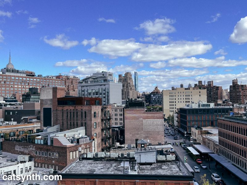
View of the Meatpacking District on surrounding parts of Manhattan

We at CatSynth spent the better portion of a recent afternoon at the Whitney Museum of American Art, taking in the entire museum top to bottom. In the first of our reports, we start at the top with a survey of the work of artist Mary Corse.
The exhibition – Corse’s first solo survey at a major institution – focuses on her work in the mid-to-late 1960s as part of the West Coast Light and Space movement. Like many of her contemporaries, Corse was very interested in the use of light as a medium in itself, but her output of light works was almost entirely focused on flat art, i.e., the kind you can hang on walls. This made her a bit of an outlier in the movement.
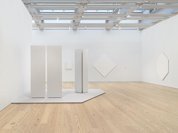
At first glance, it might be tempting to dismiss her work as “another round of white-on-white paintings from the 1960s.” But what makes it interesting is that light is at the center, rather than texture or pigment; and that she delved into emerging technologies and media to move beyond painting.
The most intriguing pieces in the exhibition were those that used plexiglass and lighting technologies. Corse studied physics and engineering in preparation for this body of work. We see this in her series where custom Plexiglass elements of different depths are juxtaposed next to one another allowing different amounts of light to pass through.
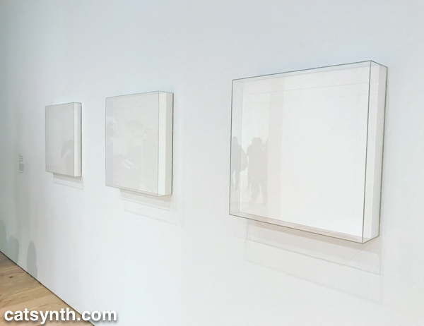
It is a subtle but fascinating set, and I found myself moving back and forth and looking from either side in my own exploration.
Corse also made her own light elements with a variety of technologies, including this piece from 1968 which employed an argon light and frequency generator, once again with her own custom plexiglass. I would have loved to have seen it in
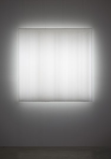
Looking at the bands within the light, I immediately found myself thinking of the amplitudes in a time-varying sound wave, or perhaps a frequency-domain spectrum. It would have been quite interesting to “hear” it.
The final set of work in the exhibition takes an abrupt turn, making the end of this period in Corse’s career. In 1970, she moved from Los Angeles to Topanga Canyon and embarked on her Black Earth Series of paintings.
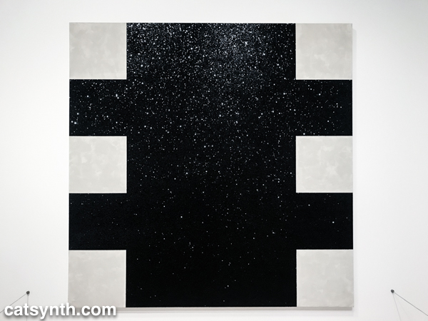
Beyond the obvious switch from white to black, there is a break from technology and a return to working with more traditional materials and textures. The “black” in the Black Earth Series are ceramics made in her own kilns. The glossy material is reflective, but also thick and covered in bumps and curves. This is in stark contrast to the plexiglass surfaces of her earlier work and makes a fitting bookend for the survey.
Unfortunately, the exhibition is closing this weekend, but if you happen to be in New York I recommend checking it out. It makes a fine escape from the overwhelm and sensory overload of holiday season.
Since my last visit to New York, the Whitney Museum opened its new building in the Chelsea neighborhood of Manhattan, and so it was of course a high-priority stop on this visit.
The first work of art on encounters is the building itself. The overall style neither attempts to mimic the warehouses of the Meatpacking District nor projects the dissonance of some of the other intriguing buildings along the High Line. But it does open up to the neighborhood and the city, making that part of the show along with the formal art.

The main exhibition was a massive retrospective of works by Frank Stella which took up the entire 5th floor of the museum and featured his iconic large and colorful paintings as well as more recent works that veered towards the sculptural. One of the major themes is how over his long career he has shifted his focus and come up with new ways of working in the medium he still refers to as “painting.”

His most recognizable works are the large-scale colorful cutout paintings. The earlier examples contain elements of abstract expressionism and the emerging minimalism, but then modified by cutting out the shapes to make irregular canvases, freeing panting from being simply “colors spread onto a rectangular surface”. Nonetheless, my favorite examples of this phase are still geometric and stark.

[Frank Stella. Chocorua IV]
From straight lines, we move to curves, which further modify the boundaries of a painting. And then came the radical step of taking a painting outside of the flat plane by cutting, bending, and layering pieces.

[Frank Stella. Gobba, zoppa e collotorto]
While the placement and combinations of shapes may be complex, the shapes themselves remain simple and the whole composition abstract. I found this phase of Stella’s work to achieve its most refined form in La penna di hu.

[Frank Stella. La penna di hu, 1987-2009. Mixed media on etched magnesium, aluminum and fiberglass.]
It seems natural to ask whether such works are paintings or sculptures. Stella himself comes down squarely on the side of viewing them as paintings. This is true even for his most recent series of work that feature large metal constructions without color.

Stella has also embraced technology throughout his career including new materials and machines. Most recently that includes 3D printing.
It was great to see both his most famous paintings alongside the more surprising elements of his constantly evolving work in this large exhibition. As Stella is still alive, there may be more to come.
The top floor of the museum features a retrospective of works by Archibald Motley. Motley was a prolific and influential painter who came to prominence in the first half of the 20th century. The exhibition focuses on his works portraying African Americans in serious portraits and lively cultural scenes from the Jazz Age and Harlem Renaissance in the 1920s and 1930s. While the portraits are detailed and striking, it was his scenes of colorful musical spaces that most resonated with me.

[Archibald J. Motley Jr. (1891–1981), Blues, 1929. Oil on canvas, 36 × 42 in. (91.4 × 106.7 cm). Collection of Mara Motley, MD, and Valerie Gerrard Browne. Image courtesy the Chicago History Museum, Chicago, Illinois. © Valerie Gerrard Browne]
Motley was well known in his time, but faded later compared to other painters of American life and scenes (think Edward Hopper). Because his work depicts an American community often overlooked and his style is more modern and pushing away from realism, it is great to see him getting reintroduced through exhibitions such as this.
The galleries featuring pieces from the permanent collection were also “new” in the new space. Among the themes that permeates the museum’s collection are scenes of the city and industry. There is Joseph Stella’s Brooklyn Bridge (a poster of which hangs at CatSynth HQ) but also John Marin’s less-well known Region of Brooklyn Bridge Fantasy with a very different take on the same subject.

[Joseph Stella. Brooklyn Bridge]

[John Marin. Region of Brooklyn Bridge Fantasy, 1932.]
In terms of industrial imagery, among the strongest were Kay Sage’s surrealist piece and Elsie Driggs’ Pittsburgh. Both pieces, at least to me, have a very optimistic view of the city and progress even if others of our current time would see them as bleak.

[Kay Sage. No Passing, 1954]

[Elsie Driggs. Pittsburgh, 1927]
It’s also worth noting that some of the strongest images of these themes were done by women, something that inspires me in my own work into this subject.
The 6th floor featured works from the collection of Thea Westreich Wagner and Ethan Wagner, some of which will be come part of the Whitney’s permanent collection and some of which will go to the Centre Pompidou. It focuses American and international art from the 1960s to the present, and demonstrates the wide variety of media and concepts employed during this period. Minimalist works abound, such as Sean Paul’s series featuring arrangements of black shapes on a white background with implied complexity.

[Sean Paul. Arrangement 17, 2011]
There are also many works featuring technology. Some are the obligatory works with the light (that I do quite enjoy), but one of the more confounding pieces was by Aaron Flint Jamison. It featured two wooden boxes with multiple computers and a shelf of printed sheets. Were the computers the art, or were they just functional elements to support the concept?

[Aaron Flint Jamison. Half Matrix Vessel (part of “Manifold to Half Matrix” installation), 2013]
There was of course more traditional modernist painting, such as Charline von Heyl’s piece Boogey.

[Charline von Heyl (b. 1960), Boogey, 2004. Acrylic, oil, and charcoal on canvas. 82 1/16 × 78 1/8 (208.4 × 198.4)
Promised gift of Thea Westreich Wagner and Ethan Wagner P.2011.472. Courtesy of the artist and Petzel, New York]

Overall, this was a great visit and a chance to see a new museum in a favorite neighborhood of mine. One question that I had was what would be the fate of the old midtown Brutalist building that housed the museum for decades. Fortunately, it appears that it will survive, and the Metropolitan Museum of Art plans to use it for some special exhibitions. I hope to be able to see one in the future.
[Images without “catsynth.com” watermark courtesy of the Whitney Museum of American Art.]