René Magritte: The Fifth Season at SFMOMA

We at CatSynth have been extraordinarily busy since the start of summer with work, music, and other obligations.  As a result, our explorations of visual art have suffered a bit.  But we start correcting that today with a report from the blockbuster René Magritte: The Fifth Season exhibition at SFMOMA.  I’m glad I was able to get in to see it before it closes in two weeks!

The exhibition focuses on his later works, from World War II through the late 1960s.  It is billed as “If you think you know Magritte (1898–1967), think again.”  Yet, this period includes many of his most iconic works – other than perhaps his most famous La Trahison des images (aka “this is not a pipe”), including many of my favorites from the broader Magritte retrospective I had seen at SFMOMA in the early 2000s.

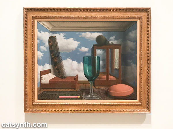
Les valeurs personnelles
Les valeurs personnelles (1952)

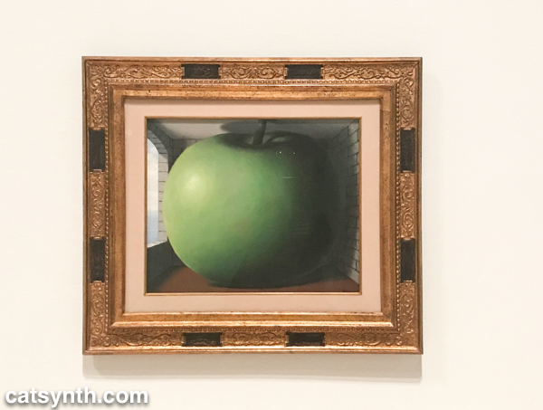
The work depicted above,  Les valeurs personnelles, is perhaps my favorite of all.  I find myself drawn to it not just because of the stark juxtaposition of larger-than-human-sized objects in a smaller-than-human-sized space, but for the various textures that defy painting.  The objects themselves have the hyperrealistic sheen of graphics from the 1990s (we were all proud of our ability to render glass) with the more pedestrian room space and strangely realistic sky on the wall.  These are the characteristics of many of Magritte’s pieces during his Hypertrophy period in the 1950s.  It’s taken to an extreme in a piece that features one of his iconic green apples swelling to gargantuan proportions and pushing against the walls of a modest room.

The Listening Room
The Listening Room (1952)

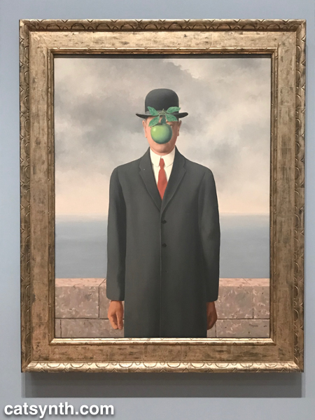
And of course, there were many bowler-hatted gentlemen, some with green apples, some without.

The Son of Man
The Son of Man (1964)

The image of the bowler hat and the bowler-hatted man has appeared throughout Magritte’s career, but it was more closely associated with the artist himself in his later works, a form of self-portraiture.

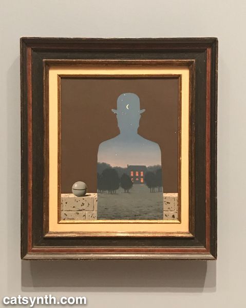
The Happy Donor
The Happy Donor (1966)

In addition to the green apple, we see many objects and concepts that appear in other works from this period applied to the bowler-hatted man, such as the small round stone, birds, and negative spaces.

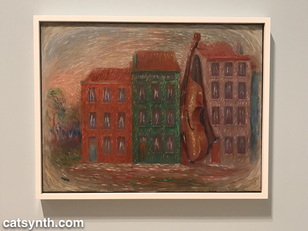
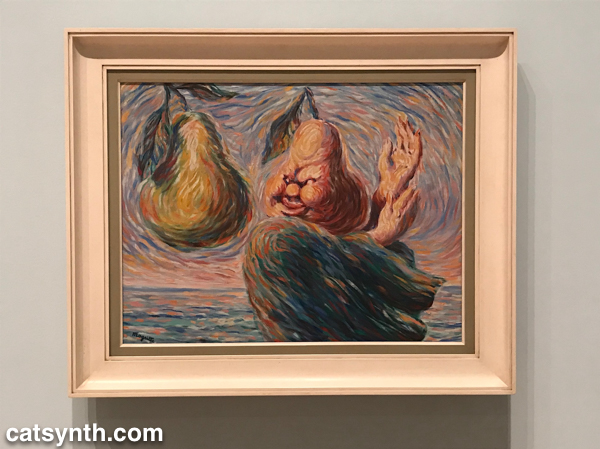
In both sets of works, we see the discrete juxtaposition of elements that may or may not fit with real-life experience.  I see this is as “quintessentially Magritte” and consistent throughout most of his career.  In that sense, I disagree a bit with the thesis of the exhibition that this later period was a break with surrealism, but rather a reimagining of it with different subjects and techniques and without the heaviness of the movement’s manifesto.  If there was one section of the exhibit that truly represented a break from what I know of the artist, it was the first section that featured his vache period immediately following World War II.

Lyricism (Le Lyrisme) 1947

I would never have guessed these grotesque parodies of van-Gogh-style impressionism were his work if they were not presented and explained.  At the same time, it is not surprising that the experience of the war (Magritte remained in his native Belgium during the Nazi occupation).  It feels like his weakest and least memorable work, but one theory suggests that his retrograde style during this period helped avoid Nazi attention and persecution.  We are certainly glad he returned to form in his later years.

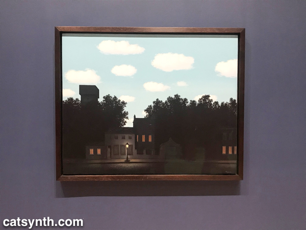
One of late series, collectively called The Dominion of Light, brings together a nighttime city streetscape with a daytime sky. 

The Dominion of Light

It takes a moment of adjustment to realize the confounding of night and day in the image, as our eyes are so used to assumptions about the passing of time and light.  The series is at once playful, but also a bit melancholy, pointing to the later years of a life and life’s work.   Fortunately, there was one more chapter to come that was both more curious and more uplifting.

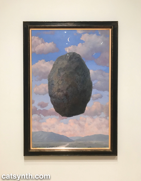
A Sense of Reality (1963)

This bizarre series of boulders floating in space or sitting isolated on an apartment terrace is a return to form, but also an exploration of time and gravity and even more fundamental assumptions that we make in everyday life.  Their lightness and starkness also make an interesting statement at the end of a career that spanned several decades and saw the massive changes of the 20th century.  We should note that the bowler-hat portraits featured in this article were done during the same late period, and are stronger both as works in themselves and as a career-spanning statement. 

The exhibit was overall a delight to experience.  It was hung in a minimalist but also warm style without too much crowding or overwhelm, and it weaved a narrative even as I took in the works as individuals.  It also marked a return a place of solace, the museum, after a long period of intensity and focus on other practices.  I won’t stay away as long again.

If you are in San Francisco over the next couple of weeks, I strongly recommend checking this exhibition out before it closes on October 28.  For more information, please visit https://www.sfmoma.org/exhibition/rene-magritte/.

Soundtracks at SFMOMA

Greetings, and happy third night of Hannukah! Today we look at the Soundtracks exhibition currently on display at the San Francisco Museum of Modern Art (SFMOMA) through the end of the year. It is also the subject of our most recent CatSynth TV episode.

The exhibition explores the intersection of sound, visualization, and space, and features over 20 artists. There are a variety of interpretations and methods of making sound, from acoustic to mechanical to electronic. None of the sound installations are overpowering, but many do arrest ones attention. Upon arriving at the 7th floor for the exhibition, one is created by Anri Sala’s Moth in B-Flat, which features a mechanically triggered snare drum hanging inverted from the ceiling.

Anri Sala - Moth in B-Flat, 2015
[Anri Sala. Moth in B-Flat (2015_]

The electro-mechanical theme continues with O Grivo’s Cantilena, which includes several motorized sound-making sculptures primary made of wood.

O Grivo - Cantilena, 2017
[O Grivo. Cantilena (2017)]

These were fun to watch, and I found myself wanting to make one myself (we shall see if that actually occurs).

Simplicity reigned in Céleste Boursier-Mougenot’s clinamen v.3. A large shallow pool of water contained floating ceramic bowls. The frequent collisions of the bowls created a music that was very captivating.

Céleste Boursier-Mougenot - clinamen v.3, 2012–ongoing
[Céleste Boursier-Mougenot. clinamen v.3 (2012–ongoing)]

This piece was deeply calming, and I found myself zeroing in on groups of bowls as they collided and separated to form rhythms and harmonies.

Ambient soundscapes were also the heart of an installation by Brian Eno, New Urban Spaces Series #4: “Compact Forest Proposal,”, with a darker tone and more complex technology.

Brian Eno - New Urban Spaces Series #4: “Compact Forest Proposal,” 2001
[Brian Eno.New Urban Spaces Series #4: “Compact Forest Proposal” (2001)]

One is free to wander the darkened space amidst the moving columns of LED lights. Every once in a while, the light increases and one gets glimpses of shadowy figures on the wall. The sounds ranged from small percussive synth hits to trumpets to electronic noise.

Electronic noise was also at the heart of Christina Kubisch’s installation Cloud. Kubish’s work explores sonification of data and electricity. The mass of red electrical wires emits electromagnetic radiation, which was interpreted as sound using customized headphone devices.


[Christina Kubisch. Cloud (2011/2017)]

Of all the installations, this was the among the most challenging to take in sensually or to document. I love the concept, and I think it really needs an extended period of time alone to experience fully.

From the large to the small. We had fun with Sphere Packing by Rafael Lozano-Hemmer, which featured several spherical speaker arrays made from those ubiquitous white Apple earbuds.

Rafael Lozano-Hemmer - Sphere Packing, 2013 and 2014
[Rafael Lozano-Hemmer. Sphere Packing (2013 and 2014)]

Each was playing a different selection of classical music from the 18th, 19th and 20th centuries, rearranged and diffused asynchronously through the speakers. Lozano-Hemmer also had an installation Last Breath that included a recording of breathing by the late Pauline Oliveros.

We conclude with another project visualized as a sphere. Lyota Yagi’s Sound sphere featured a sphere wrapped in cassette tape that freely rotated and revolved. Customized pickups rendered the sound from the tape, which is chopped, looped and distorted based on the chaotic motion of the sphere.

Lyota Yagi - Sound Sphere, 2011
[Lyota Yagi. Sound Sphere (2011)]

All of these pieces were inspiring for my own work, as I want to do more sound installation in the coming year. There were more in the main the exhibit and spread around the museum, but beyond what I can cover in this article. We do encourage you to check out our video to hear how some of these pieces sound. And if you are in the Bay Area, we strongly recommend checking the exhibition out before it closes on January 1, 2018.

Ellsworth Kelly (1923-2015)

We lost another of our art heroes yesterday. Ellsworth Kelly, known for his iconic works composed of color fields, passed away.

Luna with Ellsworth Kelly book

The above photo features the catalog from his large-scale solo show at SFMOMA in 2002-2003. The exhibition was a bright spot, both aesthetically and emotionally, in an otherwise depressing period of time and made quite an impression. I kept intersecting with his work during my numerous art adventures in California. His paintings featured large color fields, sometimes combined together into a single whole, while other times separated, as in Blue Green Black Red (1996) on display as part of the Fisher Collection at SFMOMA. I had the opportunity to see a large retrospective of his prints and paintings at LACMA in Los Angeles a couple of years ago. This, too, was revelatory as it showed other aspects of his work, including black-and-white pieces and connections of his abstract style to nature.


[Installation view. Ellsworth Kelly: Prints and Paintings. January 22-April 22, 2012. Los Angeles County Museum of Art. Photo (c) 2012 Museum Associates/LACMA]


[Installation view. Ellsworth Kelly: Prints and Paintings. January 22-April 22, 2012. Los Angeles County Museum of Art. Photo (c) 2012 Museum Associates/LACMA]


It is still, however, the color fields that I most instantly recognized as his.


[Installation view. Ellsworth Kelly: Prints and Paintings. January 22-April 22, 2012. Los Angeles County Museum of Art. Photo (c) 2012 Museum Associates/LACMA]

Kelly himself resisted being described as “abstract” or “minimal” or any other label that intersected with his career.  But I think this statement quoted in the New York Times obituary describes his art very well, and is a fitting conclusion.

“My paintings don’t represent objects,” he said in 1996. “They are objects themselves and fragmented perceptions of things.”


SFMOMA Closing Celebration

20130601-IMG_7739

Last weekend, SFMOMA (San Francisco Museum of Modern Art) remained open all night Saturday into Sunday, ahead of its three year closure and renovation. Thousands turned out for this event, and plenty has already been written about it. But here are a few words and photos from my own experience.

lebbeus_woods_c

I finally had the opportunity to see the Lebbeus Woods exhibit. I am glad I did. Woods’ architectural sketches were fantastic and whimsical, but still had a sense of modernism to them with strong lines and geometric shapes. There was a sense that these ideas could be realized as actual structures, even if most of them never were.

tanguy_c
I did a quick tour through the permanent collection to see a few favorites one last time, including this piece by Yves Tanguy. There were other familiar works, like the room of pieces by Clyfford Still. But the room with minimalist works (like the chrome wall piece by Donald Judd) were not on display.

20130601-IMG_7748

Then it was up to the rooftop courtyard for nighttime views, mingling, and some live performances. The first group branded themselves as “eco-sexuals”, with a performance that blended eco activism with a variety of things one might associate with the word “sexual.”

20130601-IMG_7755

SUE-C and Kevin Slagle presented a series of beautiful hand-made films.

20130601-IMG_7760

And Rick Prelinger presented some of the home movies collected from his archive, particularly those documenting U.S. cross-country road trips.

20130601-IMG_7762

Then it was downstairs to the reception room for more performances. First up was jazz singer/chanteuse Veronica Klaus with a very retro set of jazz standards:

20130602-IMG_7765

Emcee Marga Gomez delivered her interstitial schtick from a desk on the side, in the style of late-night shows.

20130602-IMG_7770

More performances followed, including some randomized musical readings by Sofía Córdova and a performance descending the landmark SFMOMA staircase by Chris Sollars. Both fun, but challenging to photograph. The next performance by Dia Dear was fairly mindblowing both visually and sonically:

20130602-IMG_7777

Up next was a trio featuring Dale Hoyt with David Lawrence and Liz Walsh.

dayle_hoyt_c

They presented a sing-a-long with a somewhat more wistful view of the museum’s closure, lamenting the time away and those who might never have the opportunity to come back. THey closed with a version of Vera Lynn’s “We’ll Meet Again” (made popular as the closing song in the movie Dr. Strangelove).

As it was approaching 3AM, I decided it was time for me to depart. The celebration continued with more performances into the morning and next afternoon and a final processional to mark the closing of the museum. They will be having off-site exhibitions over the next few years at other locations in the Bay Area, and I look forward to seeing them.

Christian Marclay, The Clock, SFMOMA

As SFMOMA prepares to close for its expansion, Christian Marclay’s cinematic masterpiece The Clock seems an appropriate final exhibition. The piece is all about time, how it passes and slips away, and returns over the cycle of a day. Thousands of movie clips, some well known and some obscure, were painstakingly assembled into a 24-hour video montage in which clock faces or verbal references to time appear at the time of day they represent. For example, an image of a clock at 2PM appears in the piece at 2PM.

Christian Marclay The Clock
[Christian Marclay, video still from The Clock, 2010; single-channel video with stereo sound; 24 hours; courtesy the artist and Paula Cooper Gallery, New York.]

Time is a powerful subject in film and indeed in all forms of art, and clocks have a long history as symbols. But a 24-hour video containing clips of clocks arranged in real time is something else entirely. At first glance, the idea of the piece can seem a little trite and gimmicky. And the lines to get in to see the piece are daunting – I waited over three hours on Saturday to see a night-time stretch. But getting past these initial impressions and obstacles is well worth the effort, as the piece itself is mesmerizing. It is easy to get lost in a two-hour or even a three-hour stretch as one focuses on the clocks, watches and other visual and verbal representations of time.

Christian Marclay The Clock installation view
[Christian Marclay, installation view of The Clock, 2010; single-channel video with sound; 24 hours; White Cube Mason’s Yard, London, October 15–November 13, 2010; courtesy Paula Cooper Gallery, New York, and White Cube, London; photo: Todd-White Photography; © Christian Marclay]

I think our brains also naturally want to string the fast changing clips into a longer narrative around time. Towards this end, Marclay’s editing goes well beyond the placement of time in order, including overlaying audio from one film on top of another and having the sound cut out at specific moments, such as the closing of a door or hanging up a telephone. Scenes from different films are interwoven, such as through disparate actions and situations on opposite sides of a phone conversation. There are many moments of humor in these juxtapositions as well. Other scenes, however, just stand out on their own visually.

Christian Marclay The Clock
[Christian Marclay, video still from The Clock, 2010; single-channel video with stereo sound; 24 hours; courtesy the artist and Paula Cooper Gallery, New York]

In both viewing The Clock and reflecting upon it, one is struck by the amount of effort it must have taken to make. Indeed, the process of collecting the scenes to cover the full 24-hour period seems even more daunting than the actual editing and post-production processes, though given the number of clips and the length that is an impressive feat in itself. It apparently took over three years for Marclay to complete the piece.

It is worth also seeing at different times of day to see how the scenes reflect our expectations of real time. Not surprisingly, the midnight to 2AM section featured a lot of bedroom scenes, as well as individuals in lonely places. By contrast, 1PM to 3PM contained a lot more action scenes and workplace scenes. 4:30PM had more transitional scenes as day gives way to evening. Some intrepid souls have been able to view most of the full 24 hours, though such a commitment is not necessary to get a good experience of the piece.

The Clock will remain on view at SFMOMA through its official close on June 2. Lines to see it will be especially long during this final week, so get there ahead of time and plan to wait for a while (bring a book).

Garry Winogrand, SFMOMA

With SFMOMA closing for its expansing beginning in June, I have been trying to spend extra time there. While much of current programming is geared towards the impending closure, the current Garry Winogrand retrospective stands apart as a strong exhibition independent of the museum.

I have encountered Winogrand’s work often in photography exhibits, especially those featuring urban portraiture of the twentieth century, a subject that is often romanticized even in its most gritty portrayals. But his full body of work goes far beyond that as he document a great variety of people and places as he travelled the country. Portraiture tends to invite a very personal response, and that is the case with many of the pieces in this show, including the title image:

05_sfmoma_winogrand_losangeles1980_83
[Garry Winogrand, Los Angeles, ca.1980–83; gelatin silver print; Garry Winogrand Archive, Center for Creative Photography, University of Arizona; © The Estate of Garry Winogrand, courtesy Fraenkel Gallery, San Francisco.]

One’s eyes are immediately drawn to the subject, the straight lines of her dress and contrast with her hair the bright background. My initial take from the posters was “New York, 1970s” which added to my personal sense of identification with the subject, but the photograph is actually from Los Angeles in the 1980s, one of the last pieces chronologically (Winogrand died in 1984). However, there was no shortage of images from New York (especially from the 1960s) in the exhibition.

06_sfmoma_winogrand_newyorkcity_1960
[Garry Winogrand, New York, ca. 1960; gelatin silver print; Garry Winogrand Archive, Center for Creative Photography, University of Arizona; © The Estate of Garry Winogrand, courtesy Fraenkel Gallery, San Francisco.]

475.1998
[Garry Winogrand, New York, 1961; gelatin silver print; The Museum of Modern Art, New York, purchase and gift of Barbara Schwartz in memory of Eugene M. Schwartz; © The Estate of Garry Winogrand, courtesy Fraenkel Gallery, San Francisco.]

These two contrasting pieces also invited self-identification as well as an appreciation of the details, sharp contrasts and sense of motion. They demonstrate the breadth of Winogrand’s subjects within the small geographical space of New York as well as his ability to make the different seem similar. As in much of his work, the subjects are not isolated, but part of the flow of people of the city. Arms and legs are naturally cut at the edges as figures in motion move out in and out of the frames.

Beyond the confines of the city, WIngrand’s images take on different moods in different settings, such as this stark image from a suburban neighborhood in Albuquerque.

20_sfmoma_Winogrand_Albuquerque_1957
[Garry Winogrand, Albuquerque, 1957; gelatin silver print; The Museum of Modern Art, New York, purchase; © The Estate of Garry Winogrand, courtesy Fraenkel Gallery, San Francisco.]

The figures in this image, both young children, are a bit obscure, and the scene is cut in half with the partial house to the left and the desert landscape to the right. It is overall a bleaker image than the more exuberant urban photographs. Although the exhibition was separated into chronological and geographical sections, one can mentally juxtapose the city and desert image, and in doing so imagine the contrasting sounds and textures alongside the visuals.

There is also humor that radiates from many of his photographs, either intentionally or unintentionally.

09_sfmoma_winogrand_parkavenuenewyork_1956
[Garry Winogrand, Park Avenue, New York, 1959; gelatin silver print; collection National Gallery of Art, Washington, DC, Patrons’ Permanent Fund; image courtesy National Gallery of Art, Washington, DC; © The Estate of Garry Winogrand, courtesy Fraenkel Gallery, San Francisco]

28_sfmoma_Winogrand_NewYork1969
[Garry Winogrand, New York, ca. 1969; posthumous digital reproduction from original negative; Garry Winogrand Archive, Center for Creative Photography, University of Arizona; © The Estate of Garry Winogrand, courtesy Fraenkel Gallery, San Francisco.]

The final image New York, ca. 1969 is one of many images in the exhibition that were only printed posthumously. Winogrand left behind a vast trove of negatives that were never printed and more the 2,500 that were never developed. This was a unique aspect of the show, but one with complex issues:

“One reason that Winogrand is only now receiving the full retrospective treatment already devoted to peers of his era, including Diane Arbus, Lee Friedlander, and Robert Frank, is that any truly comprehensive consideration of his life’s work requires contending with the practical and ethical issues surrounding the vast archive he left behind,” says [Erin O’Toole, assistant curator of photography at SFMOMA]. “In the absence of explicit instructions from him regarding how he wanted his work to be handled after he was gone, its posthumous treatment has been the subject of ongoing debate and raises provocative questions about the creative process and its relationship to issues specific to the medium.”

It is unclear how the artist felt about these unpublished images in comparison to the ones he printed. Many of the later images from Los Angeles in the 1980s do have a somewhat more tired quality to them, though compositionally they do fit with his earlier work, with the somewhat off-center subjects and activity at the margins partially off frame.

Overall, it was a strong show and a unique opportunity to see Winogrand’s work separate from the context of his contemporaries from the 1960s and 1970s. The exhibition will remain at SFMOMA through June 2.

Cindy Sherman at SFMOMA

The huge Cindy Sherman retrospective at SFMOMA will be closing in a week, and I would be remiss if I did not write a few words about it. Her work, which is almost entirely composed of self portraits, is often described with terms like “masquerade,” “caricature,” “persona”, and her still images lend themselves to the idea of performance and play. I had the opportunity to see the exhibition a few times and found the her use of invented persona and performance inspiring as my own work in both music and visuals moves in that direction.

While much of the attention has focused on Sherman’s more over-the-top and exaggerated portraits, I found her early Untitled Film Stills to be among the most compelling. In these pieces, she successfully transforms herself into realistic roles and characters that one might see in films of the 1960s and 1970s.


[Cindy Sherman, Untitled Film Still #21. 1978; gelatin silver print; 7 1/2 x 9 1/2″ (19.1 x 24.1 cm); The Museum of Modern Art, New York, Horace W. Goldsmith Fund through Robert B. Menschel; © 2012 Cindy Sherman  Source: San Francisco Museum of Modern Art]

The transformation from her real appearance and character into these fictional roles through costuming, makeup and expression is already apparent, and one would not think they are all the same person if seen outside the context of the exhibition. It is the realism coupled with black-and-white that makes these portraits stand out from the rest of her body of work. There was also one particularly interesting series of images documenting the Sherman’s transformation from her everyday self into one of the characters.

One the other extreme are some of her more recent portraits, depicting female archetypes from contemporary society as well as a series devoted to aging “society women”. She uses the same elements of clothing, hair, make-up, setting and pose as in the earlier images, but here the effect is to make these everyday tools of beauty and personal identity into something strange. Some results of beautifully exaggerated, others veer towards the grotesque. But in all of these pieces there is a deliberate falseness to the facades and personae.


[Cindy Sherman, Untitled #463, 2007-08; chromogenic color print; 68 5/8 x 6″ (174.2 x 182.9 cm); courtesy the artist and Metro Pictures, New York; © 2012 Cindy Sherman. Source: San Francisco Museum of Modern Art.]

Once again, these images suggest performance, ranging from burlesque to reality television to more experimental performance art where the visitor is confronted with this exaggerated form of human appearances and has to figure out how to interact with her.

Another take on fictitious persona can be found in her history series from 1988-1990. Here, she uses the same elements to recreate scenes either directly referencing or suggesting historical works of Western painting. She transforms herself into the a variety of women as well as a few men that one might see in paintings from the 17th and 18th centuries.


[Cindy Sherman, Untitled #193, 1989; chromogenic color print; 48 7/8 x 41 15/16″ (124.1 x 106.5 cm); courtesy the artist and Metro Pictures, New York; © 2012 Cindy Sherman. Source: San Francisco Museum of Modern Art]

In some cases, they are quite convincing, while in others they are once again deliberately exaggerated through the addition of prothetic facial elements, lactating breasts, as so on. There was even one portrait that at least to me looked more like a Klingon from Star Trek than a European aristocrat.

Not everything in this exhibition was playful. A few of the characters were clearly meant to be battered or abused women. And entire room was devoted the period in the 1980s when she moved away from self portraits into more abstract pieces. This was the height of the AIDS epidemic and these images portraying dismembered bodies and rotting flesh were very difficult to look at.

Finally, in a nod to the focus on digital technology of San Francisco and SFMOMA, Sherman presented a wall-to-ceiling site-specific mural that used Photoshop rather than traditional techniques to alter her appearance. In the piece, we see her larger than life in a variety of characters, the most memorable had her in long hair and long flowing dress, more reserved than in her later photographic portraits. The use of Photoshop also is a reminder of how the ideas of invented personae is more accessible to more people than ever before.

As I said in opening, this exhibition was an inspiration as I move into more invented personae and theatrical performance in my own work, whether in music, video or photography. It is more of indirect influence through the mechanics and discipline of her production and the idea of the characters and transformation, rather than a desire to specifically emulate what she does. In that sense, the timing could not have been better.

Cindy Sherman will remain at SFMOMA in San Francisco through October 18. If you are in the Bay Area and have not yet seen it, I recommend doing so. The exhibition will next travel to the Walker Art Center in Minneapolis and then onto Dallas.

San Francisco Electronic Music Festival (SFEMF): Celebrating John Cage

Today we review the opening concert of the Thirteenth Annual San Francisco Electronic Music Festival (SFEMF). The concert was a tribute to John Cage on his centennial (one of many) and took place at SFMOMA. It specifically featured four of his conceptual pieces with chance processes or novel instrumentation.

The main included a performance of Cage’s Score Without Parts on SFMOMA’s rooftop terrace, conducted by Gino Robair with texts by Tom Djll. The performance was in conjunction with the opening of the museum’s intriguing minimalist design exhibition Field Conditions. There were even hors d’oeuvres served on tiles from one of the pieces in the exhibit. Unfortunately, because of another commitment I only arrived at the tail end of the performance, so I did not hear enough to reasonably review it.


[sfSoundGroup. Photo: PeterBKaars.com.]

The main concert opened with members of sfSoundGroup performing Cartridge Music. This is the same piece that concluded the Music of Changes: Variation VIII concert a few weeks earlier, and featured the same personnel: Matthew Goodheart, Kyle Bruckmann, Matt Ingalls, and Tom Dambly. However, I felt that this was a stronger performance. Some of this may have been the staging and the sound support, but it also seemed that the cues for various elements were crisper and tighter, and the selection of sounds to use with the contact mics (i.e,, “catridges”) was more focused and suited to the structure of the piece. As in all music, practice and review from earlier performances helps.

This was followed by a performance of Cage’s most famous work, 4’33”. Normally, the piece is for a single pianist, but this particular performance featured a laptop ensemble. After all, it is a festival of electronic music.


[4’33” performed with laptops. Photo: PeterBKaars.com.]

The performers (mostly members of SFEMF’s steering committee) sat in silence, as required by the score of the piece, with a few motions here and there. The audience mostly listened respectfully as well, I only noticed a few deliberate comments at soft volume. Thus, it was a successfully executed performance of the piece. I hope none of the laptops crashed.

The score for Fontana Mix, which is itself a work of art with curving lines and randomly distributed points, is actually a tool for generating other pieces. Aria is one such piece that Cage himself generated. For this performance, Fontana Mix with electronic sounds and Aria for voice were layered on top of one another, with Daniel Steffey and Christina Stanley performing the layers on electronics and voice, respectively.


[Daniel Steffey and Christina Stanley. Photo: PeterBKaars.com.]

My least favorite performance of a Cage composition was a boring and long version of Fontana Mix, so I had a little bit of trepidation. But this realization by Steffey and Stanley was vibrant and dynamic. Stanley’s vocals moved between numerous styles of singing (e.g., classical, popular, cabaret) and languages, punctuated by percussive strikes on found objects. Steffey’s foundation of electronic timbres was strong as well, with a lot of variation that left room for the vocals. Using these elements, they were able to realize genuine musical phrases and structure with a sense of narrative from the abstract scores.

The final performance of the evening was a realization of Variations II by Guillermo Galindo that featured a mariachi band. A mariachi band performing John Cage is certainly unusual, but in truth no different from any other interpretation of his scores with open instrumentation. For this performance, a four-piece group Mariachi Nueva Generación with traditional costumes and instrumentation, including violin, trumpet, the distinctive large guitarrón mexicano, and guitar.


[Mariachi Nueva GeneraciónPhoto: PeterBKaars.com.a]

Like Fontana Mix, Variations II is based on graphical elements that are combined to form instances of the composition. Specifically in this case, the interpreter combines lines and dots that represent musical elements that can then be notated for the performers. The result in this instance was a very sparse texture. The musicians would often play a single or pair of disjoint notes surrounded by periods of silence. There were only a few moments where multiple members of the ensemble played at the same time. The texture is a familiar one from realizations of Cage’s indeterminate pieces, but the overall experience with the band was a novel one.

The musical performance was preceded by a video with documentation and commentary produced by Jen Cohen. The video had some fun moments, with befuddled Mills professors reacting to the idea of a mariachi band performing Cage, and allusions to the graphical elements of the Variations II score. It didn’t feel like it was necessary to the experience of the performance. Nonetheless, Galindo considered it an “inseparable part of the piece and one doesn’t exist without the other.”

Overall, it was a strong opening concert for the festival, and it was quite well attended.

Richard Serra Drawing and Sharon Lockhart Lunch Break, SFMOMA

Today we look at two current exhibitions at the San Francisco Museum of Modern Art (SFMOMA) that opened in October and continue through mid-January: Richard Serra Drawing and Sharon Lockhart’s Lunch Break. I had the opportunity to attend the museum’s press preview for both of these exhibitions and posted live updates via my Twitter feed @catsynth (the hashtag was #serrapreview).

The main event of the day was the opening of Richard Serra Drawing. I have long been fond of Serra’s large-scall metal sculptures. The minimalist yet strong constructions of flat steel planes or gently curving metal are instantly recognizable as his. This exhibition was my first experience with his drawings and sketches. Many of the pieces had the same characteristics as his sculptures, the reliance on strong geometric forms in a minimal presentation, such as his 1973 piece Untitled. One could see this piece as the shadow of one of his sculptures.

[Richard Serra, Untitled, 1973; paintstick and charcoal on paper; 50 x 38 inches; collection of Mary and Harold Zlot; © 2011 Richard Serra / Artist Rights Society (ARS), New York; photo: Ben Blackwell]

Several of the pieces rivaled his sculptures in scale.

[Richard Serra, Blank, 1978; paintstick on Belgian linen; 2 parts, each 120 ¼ x 120 ¼ inches; Stedelijk Museum, Amsterdam; © 2011 Richard Serra / Artist Rights Society (ARS), New York; photo: Gianfranco Gorgoni]

However, to simply describe the work in this exhibition as Serra’s sculptures flattened to two dimensions would miss most of what makes it unique and surprising. Many of the large black pieces are done with painstick, and the large geometric shapes which smooth from a distance have a very rich and rough texture. However, to simply describe the work in this exhibition as Serra’s sculptures flattened to two dimensions would miss most of what makes it unique and surprising.  Many of the large black pieces are done with painstick, and the large geometric shapes which smooth from a distance have a very rich and rough texture.  It was something I referred to while visiting as “liquidy roughness.” The texture and medium also allowed Serra to move beyond basic geometry into forms that cannot easily be realized as sculpture. In out-of-round X, an exaggerated texture is present in the main circular shapes, and continues to diffuse out past its edges. It is not a simple graduation where the texture becomes more diffuse from the center, there is still some semblance of a geometric shape in the image. But it is nonetheless unlike any of his sculptures, and I would not have automatically marked this as Serra’s if I saw it from a distance outside of the exhibition.

[Richard Serra, out-of-round X, 1999; paintstick on handmade Hiromi paper; 79 ½ x 79 inches; collection of the artist; © 2011 Richard Serra / Artist Rights Society (ARS), New York; photo: Rob McKeever]

Indeed, more organic circular shapes and ambiguous edges abound in Serra’s drawings. He also escapes from the solid or semisolid forms with line drawings that add more empty space. In these drawings, he reduces the drawings to one-dimensional forms in a way similar to his use of planes in three-dimensional space.

The gallery presentation provided a chance to see the diversity of the works side-by-side, but also left a large amount of empty space that abstract pieces truly need to be appreciated. I liked this location which featured Diamond (1974/2011) in the foreground and the circular Institutionalized Abstract Art (1976/2011) around the corner. Both were redrawn on the walls for this exhibition. They are perhaps the most minimal of all the pieces, and as such benefited the most from the context of gallery and the association with the other works. They provided a contrast to more roughly drawn or textured pieces. The spacious presentation also allowed room to explore the shapes in a personal manner. One wall of pieces entitled Drawings after circuit featured simple lines against aging paper, and seemed ripe for interpretation as a Hipstamatic photo.

[Click image to enlarge.]

The notebooks, while not as monumental, presented another dimension of Serra distinct from both his large drawings and his sculpture. We see the freedom to explore shapes and ideas that don’t yet need to stand up in large scale.

[Richard Serra, notebook: Double Torqued Ellipses; Guggenheim Bilbao, Spain, 2005; paintstick on paper; sheet: 12 ¼ x 14 ½ inches; collection of the artist; © 2011 Richard Serra / Artist Rights Society (ARS), New York; photo: Rob McKeever]

There are not only small sketches of ideas that could be used in larger works, but energetic and curving sribbles and even playful human shapes.  The notebooks serve more as inspiration for visitors (particular visitors who are themselves artists) than as works unto themselves.

Perhaps the most unusual piece was the list of verbs that appeared at the beginning of the exhibition.

[Click image to enlarge.]

It could serve as both an artist statement as well as an art piece.

At the end of the tour, Richard Serra was present to discuss the exhibition and take questions from the press. He had a very clear and accessible way of describing his work and process, as much engineer as artist.

It was interesting to hear him describe traditional architecture he saw in Spain and Turkey as sources of inspiration for his work. I associate stylized form and intricate detail with such architecture, and what attracts me to Serra’s work is its break with these traditions for a more simple focus on large-scale textures and geometries, and the exploration of asymmetry. I did not get a chance to ask any questions myself, squished among members of the established art press, but it still good to just be present and listen.


Sharon Lockhart’s Lunch Break is quite a contrast to the Serra drawings in media, style and subject matter. Through photographs and film, Lockhart presents a personal-scale view of industrial labor at the Bath Iron Works, a large naval shipyard in Maine. The artist spent a year in the town and at the shipyard, “interacting with workers and gaining their trust and collaboration.” The result is a portrait that is both intimate and detached. In the photographs we see everyday objects and elements of the “shadow” economy among the workers, such has makeshift cafes and lunch stands. The film meanwhile turns a short period of the workers on lunch break into a monumental portrait of industrial life.

The film is based on ten minutes of footage tracking along the a 1,200 foot hallway, without any panning, zooming or any other motion of the camera besides the steady forward progression. Along the hallway, workers go about the normal routines during lunch break, sitting, standing, eating, reading, talking However, what we ultimately see is anything but routine. The film is slowed down to 80 minutes (one eighth the speed of the original). The result is a stretched out abstract industrial exploration, which emphasizes the expanse and straight lines of the hallway as we pass by the workers.

[Sharon Lockhart, Lunch Break (Assembly Hall, Bath Iron Works, November 5, 2007, Bath, Maine) (still), 2008; 35mm film transferred to HD, 80 min.; courtesy the artist and Blum & Poe, Los Angeles; © Sharon Lockhart]

The music, a similarly slowed down mixture of sounds collected from the factory space by filmmaker James Benning and composer Becky Allen, gives a heightened sense of a fictionalized industrial landscape. Of course, I immediately started deconstructing the sound, which appeared to be a combination of pitch and time shifting and granular synthesis, but this did not detract from the overall presentation of the film, which was projected on the wall of a dark elongated room with surround sound for an immersive experience and other worldly experience. Although the film itself was interesting to watch, it was the music that kept my attention for an extended period of time. I tended less to see the details of workers in the visual and focused more on the big picture of the hallway, while in the music I kept looking for details, little bits of metallic or machinery sounds, or the occasional hint of human activity, amidst the overall drone of low-frequency noise.  It is hard to give a sense of the piece, with just an image. It should be experienced in person with the full sound.

The photographs that accompanied the film were not altered and presented images of the lives of the workers at the shipyard that would normally be hidden to outsiders. Several of the workers have set up small shops that sell coffee and food and operate as a shadow economy, where people leave money in boxes on an honor system.

[Sharon Lockhart, Dirty Don’s Delicious Dogs, 2008; chromogenic print; 41 1/16 x 51 1/16 in.; courtesy the artist and Blum & Poe, Los Angeles, Gladstone Gallery, New York, and neugerriemschneider, Berlin; © Sharon Lockhart]

The images are impersonal in the sense that they do not include any people, but the personalities of the workers who created the objects and spaces are indirectly present. In contrast to the film, with the industrial sounds of the music and scale of hallway dominate the viewer’s attention, the images and silence leave the viewer free to imagine the people who wrote the signs on the shops or attached the stickers to the lunch boxes. In particular, that was my impression from the sign “Please don’t forget to put money in the bank” with its accompanying smiley face. This sign forms the cover for exhibition catalog as well.

[Sharon Lockhart, Handley’s Snack Shop, 2008; chromogenic print; 41 1/16 x 51 1/16 in.; courtesy the artist and Blum & Poe, Los Angeles, Gladstone Gallery, New York, and neugerriemschneider, Berlin; © Sharon Lockhart]

Although Lunch Break presents it subject with a certain detachment and abstraction, it is hard to separate it completely from the economic and political reality of contemporary life in the U.S. As stated in the official release, “The project’s attention to the local and to the rarely portrayed experience of the working class take on a particular social and political relevance in the context of global capitalism, war, and economic recession.” The opening was occurring at the same time that the Bay Area incarnations of the Occupy movement were just picking up momentum (my first visit to OccupySF was just a few days earlier.) The combination leads to interesting questions about how protest, art, and the daily routines of working people intersect (and how they often don’t).


It was interesting to have seen both of these exhibitions together, and then reflect on them side-by-side several weeks later. My experience of Serra’s drawings is defined by shape and texture, and leads to more internal contemplation and fewer words that reflect the scale and space of the exhibition. By contrast, Lockhart’s Lunch Break speaks to me on a technical level with music, film and photography, and is on a personal scale. As such, it leads to more words and thoughts upon reflection. Both are valuable experiences and ways of seeing art.

Both exhibitions will be on view at SFMOMA through January 16, 2012. I strongly recommend checking them out if you are in the Bay Area.

[All captioned images are provided courtesy of the San Francisco Museum of Modern Art.  Images marked “catsynth.com” were taken by the author during the press preview.]