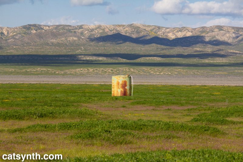
Carrizo Plain National Monument, California

We at CatSynth have been extraordinarily busy since the start of summer with work, music, and other obligations. As a result, our explorations of visual art have suffered a bit. But we start correcting that today with a report from the blockbuster René Magritte: The Fifth Season exhibition at SFMOMA. I’m glad I was able to get in to see it before it closes in two weeks!
The exhibition focuses on his later works, from World War II through the late 1960s. It is billed as “If you think you know Magritte (1898–1967), think again.” Yet, this period includes many of his most iconic works – other than perhaps his most famous La Trahison des images (aka “this is not a pipe”), including many of my favorites from the broader Magritte retrospective I had seen at SFMOMA in the early 2000s.
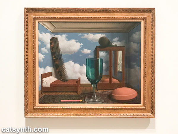
The work depicted above, Les valeurs personnelles, is perhaps my favorite of all. I find myself drawn to it not just because of the stark juxtaposition of larger-than-human-sized objects in a smaller-than-human-sized space, but for the various textures that defy painting. The objects themselves have the hyperrealistic sheen of graphics from the 1990s (we were all proud of our ability to render glass) with the more pedestrian room space and strangely realistic sky on the wall. These are the characteristics of many of Magritte’s pieces during his Hypertrophy period in the 1950s. It’s taken to an extreme in a piece that features one of his iconic green apples swelling to gargantuan proportions and pushing against the walls of a modest room.
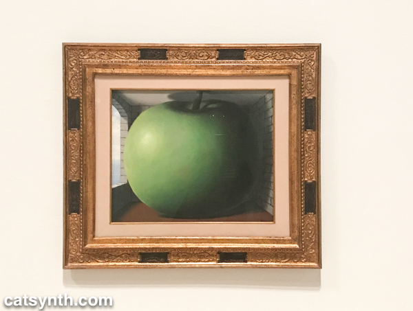
And of course, there were many bowler-hatted gentlemen, some with green apples, some without.
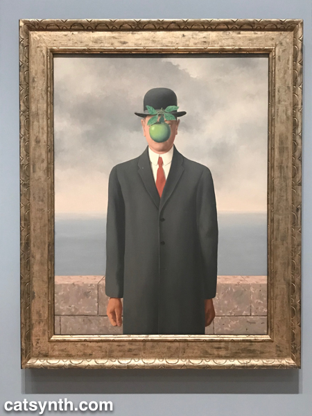
The image of the bowler hat and the bowler-hatted man has appeared throughout Magritte’s career, but it was more closely associated with the artist himself in his later works, a form of
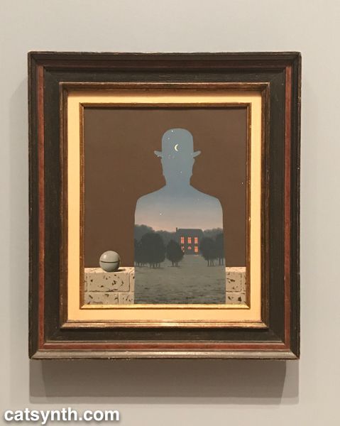
In addition to the green apple, we see many objects and concepts that appear in other works from this period applied to the bowler-hatted man, such as the small round stone, birds, and negative spaces.
In both sets of works, we see the discrete juxtaposition of elements that may or may not fit with real-life experience. I see this is as “quintessentially Magritte” and consistent throughout most of his career. In that sense, I disagree a bit with the thesis of the exhibition that this later period was a break with surrealism, but rather a reimagining of it with different subjects and techniques and without the heaviness of the
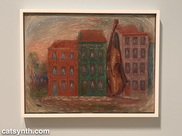
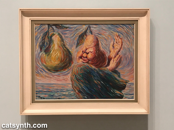
I would never have guessed these grotesque parodies of van-Gogh-style impressionism were his work if they were not presented and explained. At the same time, it is not surprising that the experience of the war (Magritte remained in his native Belgium during the Nazi occupation). It feels like his weakest and least memorable work, but one theory suggests that his retrograde style during this period helped avoid Nazi attention and persecution. We are certainly glad he returned to form in his later years.
One of late series, collectively called The Dominion of Light, brings together a nighttime city streetscape with a daytime sky.
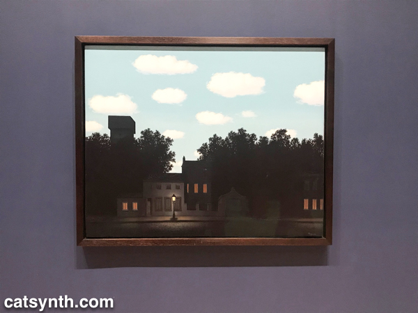
It takes a moment of adjustment to realize the confounding of night and day in the image, as our eyes are so used to assumptions about the passing of time and light. The series is at once playful, but also a bit melancholy, pointing to the later years of a life and life’s work. Fortunately, there was one more chapter to come that was both more curious and more
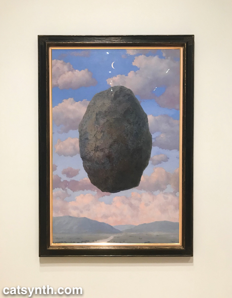
This bizarre series of boulders floating in space or sitting isolated on an apartment terrace is a return to form, but also an exploration of time and gravity and even more fundamental assumptions that we make in everyday life. Their lightness and starkness also make an interesting statement at the end of a career that spanned several decades and saw the massive changes of the 20th century. We should note that the bowler-hat portraits featured in this article were done during the same late period, and are stronger both as works in themselves and as a career-spanning statement.
The exhibit was overall a delight to experience. It was hung in a minimalist but also warm style without too much crowding or overwhelm, and it weaved a narrative even as I took in the works as individuals. It also marked a return a place of solace, the museum, after a long period of intensity and focus on other practices. I won’t stay away as long again.
If you are in San Francisco over the next couple of weeks, I strongly recommend checking this exhibition out before it closes on October 28. For more information, please visit https://www.sfmoma.org/exhibition/rene-magritte/.
There is always a lot to see at the Museum of Modern Art (MoMA) whenever I return to New York. This includes major exhibitions as well as smaller surprises tucked away in the labyrinth of galleries on the lower floors.
Of course, the most featured (and crowded) show was Magritte: The Mystery of the Ordinary, 1926–1938. The exhibition is not a retrospective, but rather concentrated on a period of about ten years during which Rene Magritte developed his surrealist language and techniques. There are the deceptively simple scenes of everyday objects with unexpected or even disturbing details, as well as the early conceptual works that demonstrated his thinking about art, including This Is Not a Pipe.

[René Magritte (Belgium, 1898-1967). La trahison des images (Ceci n’est pas une pipe) (The Treachery of Images [This is Not a Pipe]). 1929. Oil on canvas. 23 3/4 x 31 15/16 x 1 in. (60.33 x 81.12 x 2.54 cm). Los Angeles County Museum of Art, Los Angeles, California, U.S.A. © Charly Herscovici -– ADAGP – ARS, 2013. Photograph: Digital Image © 2013 Museum Associates/LACMA,Licensed by Art Resource, NY]

[René Magritte (Belgium, 1898-1967). Le portrait (The Portrait). 1935. Oil on canvas. 28 7/8 x 19 7/8″ (73.3 x 50.2 cm). Museum of Modern Art. Gift of Kay Sage Tanguy. © Charly Herscovici -– ADAGP – ARS, 2013]
While the exhibition doesn’t include some of his works with which I was most familiar (such as Les valeurs personelles), it was an opportunity to see early pieces I had never seen before. One can see in all of these the focus on out-of-cotext objects and repeated motifs such as bowler hats. The use of text and images disconnected from conventional meaning appears through many of the pieces as well. In addition to the paintings, which dominated the exhibition, were also collages and 3D objects from pre-existing elements, popular forms among Magritte’s contemporaries.
Located across the hall from Magritte, Isa Genzken’s large retrospective exhibition was quite a contrast in terms of its scope and style. Rather than focused on a period of the artist’s career, it covered almost four decades from the 1970s to the present, during which Genzken’s practice changed significantly. Her earliest pieces indirectly incorporated elements of sound, with sculptures representing waveforms linearly or in polar projection (e.g., “ellipsoids”), and photographs of 1970s stereo system advertisements. From there, she moved to themes representing modernism and urban landscape, including in a series of large works made of concrete or other building materials, displayed together in a large room. While the largest suggested modern architecture, some of the concrete pieces suggested urban ruins.

[Installation view of the exhibition Isa Genzken: Retrospective. November 23, 2013–March 10, 2014. © 2013 The Museum of Modern Art, New York. Photograph: Jonathan Muzikar]
From the very minimal and geometric, Genzken’s work seems to have taken a turn for the more playful, with a large variety of colorful mixed-media pieces. She also poked fun at artistic conventions with her Fuck the Bauhaus series of assemblages.

[Isa Genzken. Fuck the Bauhaus #4, 2000. Plywood, Plexiglas, plastic slinky, clipboards, aluminum light shade, flower petals, tape, printed paper, shells, and model tree. 88 3/16 x 30 5/16 x 24″ (224 x 77 x 61 cm). Private Collection, Turin. Courtesy AC Project Room, New York. © Isa Genzken]
There is a more serious tone, and one simultaneously hopeful and melancholy in her pieces made in response to the September 11, 2001 attacks in New York. The event affected her deeply, as it did many of us, and I found myself lingering with these last pieces to find the emotion along with the lines, shapes and colors.
It seems like every visit to MoMA includes some show that directly or indirectly includes John Cage. This time, there was a small exhibition There Will Never Be Silence: Scoring John Cage’s 4’33″ built around the museum’s original score of the piece (in proportional notation). Works from the disparate schools such as Fluxus and minimalism and spanning a wide range of artists including Robert Rauchenberg, Josef Albers, Yoko Ono and Dick Higgens are included, and each some way explores the concepts of silence and space exemplified by 4’33”.


[John Cage. 4′33″ (In Proportional Notation). 1952/1953. Ink on paper, each page: 11 x 8 1/2″ (27.9 x 21.6 cm). The Museum of Modern Art, New York. Acquired through the generosity of Henry Kravis in honor of Marie-Josée Kravis, 2012. © 2013 John Cage Trust]
[ Dick Higgins. Graphis No. 19 (Act One of Saint Joan at Beaurevoir). 1959. Felt-tip pen, ink, and pencil on paper, 14 x 16 7/8″ (35.6 x 42.8 cm). The Museum of Modern Art, New York. The Gilbert and Lila Silverman Fluxus Collection Gift, 2008. © 2013 Dick Higgins]
The minimal and conceptual is also at the heart of Dorothea Rockburne: Drawing Which Makes Itself. The exhibition, which has the same name as one of the artist’s early exhibitions in 1973, focuses on the use of carbon paper and basic drawing processes to realize large-scale works on paper and on the walls and floor. Some, like Triangle, Rectangle, Small Square were self contained and made the simple shapes and curves life-size, while pieces covering entire walls and floors gave the concept of drawing a larger-than-life but nonetheless inviting quality.

[Dorothea Rockburne. Triangle, Rectangle, Small Square. 1978. Colored pencil on transparentized paper on board. 33 x 43″ (83.8 x 109.2 cm). The Museum of Modern Art, New York. Gift of Sally and Wynn Kramarsky. © 2013 Dorothea Rockburne / Artists Rights Society (ARS), New York]
There was much more to be seen at MoMA, some of which like the recent photography acquisitions can be difficult to summarize in an article like this. Like many of the places I visit in New York, I really should be going more than once a year.
In addition to my adventures on the F train, I did have a small amount of time to enjoy art and music while was in New York for the Thanksgiving holiday.

One of the featured exhibitions at the Museum of Modern Art (MoMA) was Joan Miró: Painting and Anti-Painting 1927–1937. Miró often appears in my artistic travels – I have been to multiple retrospectives and visited the Miró Museum in Barcelona. This exhibition was more specific, focusing on a single decade of his career, during which he challenged the definition of “painting.” It opens with his declaration in 1927 “I want to assassinate painting” and features several examples of “non-painting”, including collages (such as Composition with Wire, shown to the right) and wooden sculptures. At the same time, however, many of the works are things we would consider paintings. Some of the canvases are unprimed, and several use new media such as masonite. But there are still primarily two-dimensional works involving paint on a surface. And most of the paintings and non-paintings include Miró’s signature elements in his more famous works such as bulbous abstract figures, curing shapes, stars, and scarabs. In addition to the theme of “anti-painting”, the exhibition follows the events in Europe, and particularly in Spain, in the late 1920s and 1930s, with the impending civil war and rise of Fascism. It ends with the Fascists coming to dominance in 1937 and the painting Still Life with Old Shoe that marks the end of Miró’s period of anti-painting.
The MoMA’s website includes a detailed online exhibition.
 A few of the smaller exhibits also caught my attention. Dreamland: Architectural Experiments since the 1970s featured experiments in architecture, primarily centered around New York, or the modernist urban ideal of New York, as seen be architects. Some of the ideas, such as those in Rem Koolhaas’s Delirious New York: A Retroactive Manifesto for Manhattan
, can be quite fantastic, such as an island oasis in a glass bubble atop a highway. Others were not only more realistic, but also realized, including some impressive homes in the country surrounding New York. It’s always great to see a celebration of modernism as it once was, before contemporary design and architecture took a turn away towards more mundane ideas.
Keeping with the idea of the 1960s and 1970s as particularly modern decades, the exhibit Looking at Music features visualizations of music from the era. This includes direction visualizations, such as the scores of John Cage, as well as early media works by Nam June Paik, Laurie Anderson, Steven Reich and others.
I did have a chance to hear some music as well. The weekend after Thanksgiving is often low on opportunities for new music (which is probably why I was able to book an NYC show without much difficulty after Thanksgiving in 2005). But the reliable Issue Project Room in Brooklyn hosted a show sponsored by the New York Theremin Society. The first set featured rather graphic stereo photos from World War I – still a horrific war when viewed a century later – with theremin accompaniment, presented by Robert Munn and Sara Cook. By Munn’s own admittance, this was not a performance for the faint of heart. The second set featured “Master Thereminist” Kip Rosser, who treated us to a series of jazz and pop standards that would be very much at home at a wedding or bar-mitzvah. It is interesting to think about a hybrid program featuring Rosser’s light jazz on theremin against Munn and Cook’s disturbing images from the Great War. But perhaps that would be a bit too ironic.
i]As described in Part 1 of this series, I had an opportunity to visit the San Francisco Museum of Modern Art (SFMOMA), and view two exhibits that were going to close shortly thereafter. The first of these was Picasso and American Art, in which the influence of Picasso on American artists of the 20th century by placing works side by side. For example, several of Picasso's iconic Cubist works were displayed alongside works of Max Weber that they inspired. My favorite of the Picasso works in the exhibition was The Studio (1928):

This work is considered an example of Synthetic Cubism. Compared to earlier Cubism, this style is typified by more abstract shapes and simple lines, along with brighter colors. Picasso's Synthetic Cubism had a strong influence on several prominent American artists, including tuart Davis, Willem de Kooning and Arshile Gorky. Below is Gorky's Organization (1933-1936), which is quite clearly influenced by (and indeed a response to) The Studio:
Artists such as de Kooning and Gorky were influential in creating the American art movement Abstract Expressionism, and their interest in Synthetic Cubism can be seen a direct predecessor along with other abstract styles. I also see works such as Organization as a bridge between Synthetic Cubism and the Surrealist work of Spanish (Catalonian) artist Joan Miro, and then through Surrealism back to Picasso's later work. Miro is among my favorite artists, and I did have an opportunity to visit the Joan Miro museum in Barcelona in 2005. I found many works with a similar (yet quite distinct) combination of sparse geometry and bright colors:

Actually, I had seen this same exhibition in New York last November at the Whitney Museum. It was interesting to see how the two museums presented the same exhibit. The main difference was the galleries themselves, SFMOMA was more light and open, while the setting at the Whitney was more intimate and somehow “quiet.” Additionally, the Whitney made the audio tour available at no additional charge. I usually don't do audio tours, but since it was “free” I decided I would sample specific parts and thus it influenced my visit.
Additionally, I found myself more drawn (during both visits) to the earlier works, mostly before 1960 (up through an including Jackson Pollock), and less interested in the pop art and 1980s styles in the last section. That being said, I do like many artists from the 1970s and later, and this is a good segue to the retrospective of Brice Marden. Marden began in the 1960s as Minimalist painter, and I think most viewers would agree with that characterization. His early work is primarily large monochromatic fields, often arranged in diptychs and triptychs, as in the Grove Series and D?après la Marquise de la Solana (1969):

The Guggenheim collection, which includes the above work, describes it as ” a response to Goya?s portrait of the Marquise, which Marden saw in the Louvre.” With that in mind, here is a computer-generated work in the spirit of Marden's early Minimalism using a photo of Luna as the source for a triptych of color fields:


 All fun aside, I did find the large monochromatic works interesting in the context of the full retrospective, especially when several large examples were placed around one of SFMOMA's spacious galleries. The retrospective also gave the opportunity to see Marden's remarkable transition in the late 1970s and early 1980s with his interest in Asian calligraphy and his adoption of more complex images filled with organic curves. He continus to use this style to this day, as in the recent 7 Red Rock 2 (2000-2002), shown to the right. He did have an interesting digression in his work into complex series of crossing lines, such as the 4 and 3 Drawing, shown below. This was probably my favorite from the exhibit:

I suppose I don't really have a “conclusion” to draw here, except that as usual I walk away both appreciative and a bit overwhelmed and bewildered by major exhibits, and always go back for more.
art cubism picasso gorky abstract surrealism miro brice marden minimalist
It has been a while since I have completed one of graphic-art images like the Green Kitties piece posted a while back.

If the previous one was “green”, this one is definitely “blue.” It is actually inspired by an evening on the Singapore waterfront several years ago, which including a sculpture/installation with blue spheres and illuminated pools.
This work was created using a combination of Poser and Bryce (in which the final render was done, along with everything except the figure).
It is interesting to compare how both works combine abstract geometric elements with “realistic” figures.