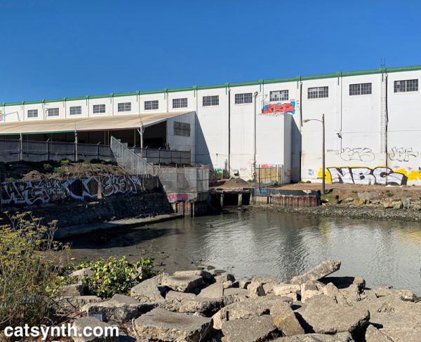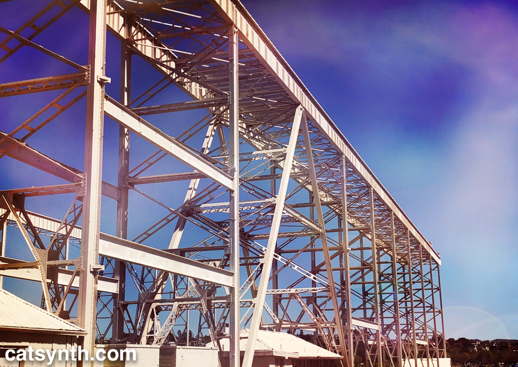
Mare Island shipyard, California.

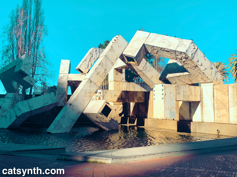
The Vaillancourt Fountain at Embarcadero Center. Another image from the same magical day in San Francisco as our previous two Wordless Wednesdays.

As we count down to the start of Passover, we look back at my visit to the Museum of Jewish Heritage in New York last November. The Garden of Stones is a living memorial to the holocaust, with an arrangement of trees and stones that complement and contrast the architecture of the building. From this perspective, they also frame 1 World Trade Center quite nicely.
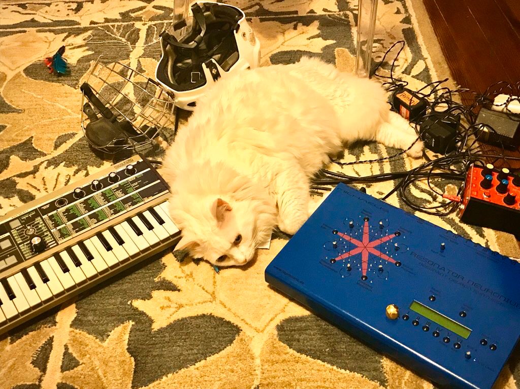
Our friend Merce joins us again, with the Jomox Resonator Neuronium along with the MicroKORG. He also shares this classic Fluxus piano piece by George Brecht.
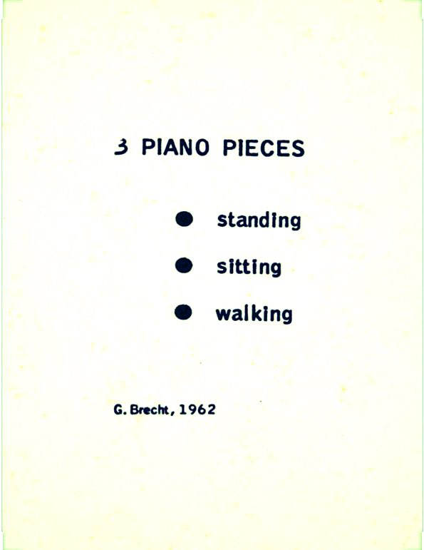
When you can’t even get a Fluxus piece right. George Brecht, “3 Piano Pieces,” from Water Yam, 1962
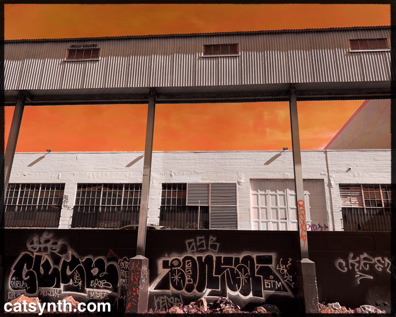
Even we at CatSynth sometimes find it hard to Fluxus right in these anxious times.