
Category: Modernism
-
New Topographics, SFMOMA
If one were to construct a photography exhibition for me to attend, it might look something like New Topographics at SFMOMA. Indeed, “construction” is an apt term, as most of the photos explore the human alterations to the natural landscape, particularly in the western United States but in other locations as well. Yet, the natural landscape does continue to play a central role in the environments and in the images. It shapes how the human-made structures are constructed and arranged, and how they decay. The exhibition was originally presented in at the Eastman House in Rochester, New York in 1975.
“A turning point in the history of photography, the 1975 exhibition New Topographics signaled a radical shift away from traditional depictions of landscape. Pictures of transcendent natural vistas gave way to unromanticized views of stark industrial landscapes, suburban sprawl, and everyday scenes not usually given a second glance. This restaging of the exhibition includes the work of all 10 photographers from the original show: Robert Adams, Lewis Baltz, Bernd and Hilla Becher, Joe Deal, Frank Gohlke, Nicholas Nixon, John Schott, Stephen Shore, and Henry Wessel.”
It is hard to imagine that such a portrayal of landscape was new to art photography at the time. The ideas and subjects in much of the contemporary photography that commands my attention, as well as my own photographs that often appear on this site for Wordless Wednesday. But it was certainly a sharp contrast to the traditional views of landscape in photographs, especially view of the American West, which tended to be not just natural but a romanticized form of nature. One only need step beyond the exhibition to SFMOMA’s main photography collection to see the changing views of landscape and romantic imagery.
The desert tends to be my favorite natural landscape (along with the coast), and is prominently featured in many of photographs. It has a stark beauty, but it also acts as a vessel for human artifacts. Set in the desert landscape, one can linger on the contrasts and similarities between artificial and natural. The straight lines and simple textures don’t get lost in the landscape, and are in fact amplified by it. In Joe Deal’s Untitled View (Boulder City), the roads, buildings and the trailer are partially obscured by natural elements. In a sense, they are distilled down to the lines , which are emphasized by the wires and shadows that traverse the image. At the same time, the natural landscape also seems to follow the straight lines, and in turn the soft undulations of the terrain and reflected in shallow peaks of the partially hidden houses.

[Joe Deal (American, b. 1947), Untitled View (Boulder City), 1974, George Eastman House collections. © Joe Deal.]
The lines (no pun intended) between the natural and artificial aspects of the landscape are further blurred in Frank Gohlke’s Irrigation Canal, Abuquerque, New Mexico. Here we see a completely artificial environment, the concrete-sided canal with vegetation establishing itself at the edges of the water.

[Frank Gohlke (American, b. 1942), Irrigation Canal, Albuquerque, New Mexico, 1974, George Eastman House collections. © Frank Gohlke.]
At first glance, the mud and vegetation seem to mar the otherwise smooth and clean surface of the canal. But in reality, they are part of the environment, and thus part of the image as well. One could say the same thing about the reverse situation in Deal’s photograph, where the human-made elements have become part of the natural landscape.
Lewis Baltz takes the theme of straight lines to its aesthetic extreme in both the artificial and natural aspects of the environment. His images feature perfectly rectangular buildings set against the flat landscape in Orange County, California.

[Lewis Baltz (American, b. 1945), Jamboree Road Between Beckman and Richter Avenues, Looking Northwest, George Eastman House collections. © Lewis Baltz.]
Some of Baltz’s other photographs feature facades of rectangular commercial buildings either straight on or at angles. Close-up and with less context from the landscape, they begin to feel more abstract. This is particularly true of East Wall, McGraw Laboratories with its extremely high contrast black and white rectangles. In South Wall, Mazda Motors, 2121 East Main Street, Irvine, the landscape is seen only in the reflection of a window, once again a rectangle inside another.
The sharp contrast and combination of architecture, landscape and abstraction made Baltz’s pieces among my favorite in the exhibition. Similarly, my attention was also drawn to the work of Bernd and Hilla Becher. Their photographs featured industrial and mining buildings in Pennsylvania. Some of the buildings were in states of disrepair, such as Loomis coal Breaker/Wiles Barre, Pennsylvania (1974), or even seemed on the verge of collapse as in the image below:
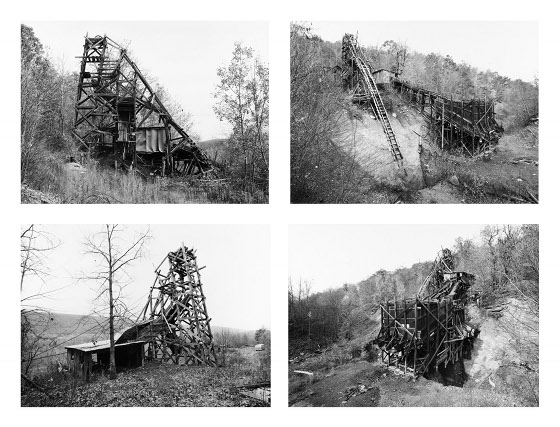
[Bernd and Hilla Becher (German, 1931-2007 and b. 1934), Pit Head, Bear Valley, Pennsylvania, 1974
© Hilla Becher, 2009.]The structure seems to melt back into the natural environment, and at the same time provides a series of straight (albeit somewhat distorted) lines and geometric shapes. Once again, the high contrast of the image allows one to focus on the abstract elements without completely losing the context that it is a building on a hillside. It would be easy to dismiss these photographs (and indeed many in the exhibition) as social commentary or socially-inspired art, but they have detached quality and the emphasis is on the visuals details – in particular those details that I look for in when viewing and evaluating modern art. The Bechers’ images in particular have a sculptural quality, something that comes out even more directly in their book Anonyme Sculpturen.

Nicholas Nixon (American, b. 1947), Buildings on Tremont Street, Boston, 1975; George Eastman House collections; © Nicholas Nixon Nicholas Nixon’s work stands apart from the others in the exhibition in that depicts urban landscapes from Boston and Cambridge. His Buildings on Tremont Street, Boston depicts a classic 20th century vertical city image of tall and densely packed but quite detailed buildings. Nixon’s image Boston City Hall, Covernment Center Square and Faneuil Hall provides another type of contrast in the landscape that is particular to cities, a tension between modern and traditional architecture. Set against a backdrop of larger buildings, one see a popular older landmark contrasted with the modernist and rather controversial Boston City Hall. It’s a building I actually quite like visually, and it brings us back the rectangular shapes in Baltz’s southern California images.
I conclude with this quote from the exhibition catalog – a rather extensive volume that includes not only the images but a detailed discussion as well as a reproduction of the original catalog – that I find illuminating in thinking about the work of these artists as well as my own photographic interests:
Photography based on attraction to, even love of, the subject while neither revealing that motivation nor imposing it on viewers – it may confuse viewers accustomed to being seduced or sermonized. Adding another degree of complexity is the likelihood that the attraction and love were likely not pure, but instead joined to anxiety and repulsion. Reconciling these opposing forces was an exercise undertaken by each of the New Topographics photographers in different ways.
[New Topographics, copublished by Steidl Publishers and Center for Creative Photography in cooperation with George Eastman House, page 18.]
The exhibition will be on display at SFMOMA through October 3.
[All images used in this article were provided courtesy of San Francisco Museum of Modern Art. Individual copyrights displayed in captions.]
-
Sonja Navin and Mike Kimball
I recently visited two openings for artists I met at Open Studios last fall and whose work reflects my interests in highways, architectural images and the urban landscape. The artists take very different approaches, and the shows were in very different parts of the city – but having both openings on the same night was a great opportunity to see them together and simultaneously reflect upon the city itself.
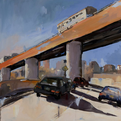
First, I stopped in the relatively quiet West Portal neighborhood for a show at the Greenhouse Cafe featuring Sonja Navin. Navin draws on her architectural background to capture familiar images of the city in her paintings. Perhaps the most “familiar” image was the King Street off-ramp from I-280 in her large painting entitled 280.

[Sonja Navin. 280. Photo courtesy of the artist. (click to enlarge)]
Navin experienced this interchange the way many of us do, i.e., being stuck in traffic, and thus had the opportunity to visualize it in detail. She also had a painting East on N which featured a familiar view along the N-Judah metro line in the Sunset district.
Although her subject matter is often architectural in nature, her painting style features large brush strokes and irregular areas of color rather than the straight lines and precision of architectural drawings. She also had several figurative paintings, and some such as In The Haight combine both character and street elements.
Navin’s exhibition, which also features artist Kacie Erin Smith, will be on display at The Greenhouse Cafe, 329 West Portal Avenue in San Francisco through April 30.
After brief ride over Twin Peaks, I found myself descending into the Mission district for an opening at City Art Gallery, where I was particularly interested to see new works by Mike Kimball.
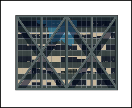
Like Navin, Kimball’s interpretation of the urban landscape distills it down to basic elements, but his prints and paintings feature very clean lines and simple geometric shapes. One example is his Maritime Plaza, which I immediately recognized (it is a favorite out lunch spot of mine).

[Mike Kimball. Maritime Plaza. Image courtesy of the artist. (click to enlarge.)]
Like the building it represents, the image is framed by the triangules and X-shapes of the seismic bracing. This was one of the first buildings to use this technique, which is now a familiar site on buildings in the Bay Area.
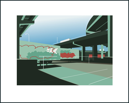
In Division Street, Kimball represents another familiar sight from daily life, the interchange of I-80 and US 101 that sits above Division Street in SOMA. The image is composed of very simple curves and lines and solid colors, from which one can distinguish the elevated structures of the highway and the shadows they cast, as well as details such as the markings (and probably graffiti) on the sides of the trailers.

[Mike Kimball. Division Street. Image courtesy of the artist. (click to enlarge.)]
Trucks and trailers also feature prominently in Kimball’s work. His “Truckograph” series features a similar graphic quality to Division Street. His larger work Meditations on a port looks at the stacks of trailers at the port as an abstract collection of boxes. Kimball bridges the industrial and abstract in this work – close up, one can see the writing and metal texture, but from a distance one simply sees the colored squares.
Kimball’s current exhibition will be on display at City Art Gallery, 828 Valencia Street, through March 28.
-
Art and music notes. Friday, December 18
Last Friday, I managed to visit four different art and music events in one evening. Below are some reflections from each.
 Our first stop was the offices of Kearny Street Workshop for their SF Thomassons Holiday Party. Readers may recall KSW’s APAture Festival and the Present Tense Biennial.
“Thomassons” are architectural elements that exist (or persist) outside of the original intended function, such as an inaccessible door leading out of an upper floor of a building, or a staircase leading to nowhere. The term was coined by Japanese conceptual artist and writer Akasegawa Genpei, and the Thomasson website allows people to upload examples from around the world. We at CatSynth have actually presented several Thomassons in our Wordless Wednesday photographic series, including these stairs leading into the San Francisco Bay. KSW’s “SF Thomassons” project involves photography and performance art centered around Thomasson sites in San Francisco. The party was a preview to coincide with Kaya Press’ publication of the first English translation of HYPERART: THOMASSON, and included a performance-art piece set at one of the largest sites in the city, an abandoned church at Howard and 10th streets that happens to be across the street from KSW’s offices.
After that, it was off to Gallery Six at 66 Sixth Street. The current exhibition, entitled “Every Single Where”, features new works by local artist Pakayla Biehn. The paintings each carried superimposed images that are similar but not identical, as if multiple exposures from a camera. According to the press release, Biehn has a congenital visual disability, and her paintings attempt to “give the viewer an understanding of her own optical condition.” Although they share the common theme, each work was stylistically quite different.
Actually, the work in the gallery that caught my attention was not in the featured exhibition, but on display in the back room from a previous exhibition, a small geometric print entitled “Bird’s Nest” from Charmaine Olivia’s Urban Managerie.
From Gallery Six, we then went to Gallery 16 for an exhibition celebrating the 25th anniversary of Emigre. Emigre was a combination digital type foundry and publisher founded by Rudy VanderLans and Zuzana Licko, and is known both for its typefaces and the design journal Emigre Magazine. The exhibition included examples from the magazine and other designs featuring Emigre fonts.
 The prints had a very clean quality, with bold colors, large shapes, and of course text. I particularly liked the works based on Licko’s abstract Puzzler font, with it’s arrangements of dots and other elements into larger complex patterns. One of the large prints (again combining text and geometric elements) also featured a large barcode with a valid ISBN number. Thinking myself quite clever, I performed a quick internet search to find out what it was – I suppose I should not have been surprised that it was issue #67 of Emigre Magazine, although the cover image from the magazine looks nothing like this print.
The final stop was Cafe du Nord for a party and concert celebrating the 50th anniversary of KFJC Radio. This was the last of several events marking the anniversary, including the concert at FLUX53 that I attended earlier in the week.
Because of the busy schedule for the evening, we only caught two of the many bands performing. First was the band al Qaeda (I am sure they were aware the name was already taken). Their music combined driving punk-style drum and guitar elements with experimental electronics elements and electrical noise.

Al Qaeda was followed Arrington de Dionyso. I had seen de Dionyso perform in a trio at FLUX53, but this time he was with his band. Once again, he performed a combination of bass clarinet with various vocal techniques, including throat singing, set against standard rock drum, bass and guitar sounds. On the screen behind the band, increasingly complex black-and-white drawings (or paintings) were being created live.
-
Lights on the 7 Subway Line

 Some lines in the New York City subway system use diamonds and circles to differentiate between express and local, respectively. This is the case on the 7 (Flushing) line as well. However, I while most trains simply carry the appropriate sign, the trains on this line used lights instead, creating a unique effect:
As far as I know, this is only line which features these lights. The picture above illustrates the green circle representing the local train. Below is a red diamond representing the express:

I was not particularly happy with the second photo, but it does illustrate both the red light and an interesting side-effect that I observed: the reflection of these bright colored geometric lights on the windows both from other trains and within the car itself. I found myself watching the colored shapes dance, and contrast with a few of the passengers sitting in the car or rushing along the platform. Not mesmerized per se, the way a cat reacts to a light pointer, but still focused. I don’t know if anything will come of it besides this brief post.
-
Performa 09: Composition for Cello and Brooklyn Queens Expressway
Another piece from Performa: A Ballad of Accounting 2009: Composition for Cello and Brooklyn Queens Expressway, a composition by Alex Waterman with a 16-millimeter film by Elizabeth Wendelbo. I was quite interested to see this piece, given that it combines experimental music, art and highways, three of our interests here at CatSynth!
 Waterman lived near the Brooklyn Queens Expressway, or BQE, and was inspired by the sounds of the highway as well as its history. It was part of Robert Moses’ master design for the city’s highways, and winds its way through a narrow corridor in densely packed areas of eastern Brooklyn and Queens. (See this article for more info.) Waterman often walked under the highway, listening to sounds and in particular the harmonics. The piece includes live cello performances near and under the highway, with microphones in the resonant chamber of the cello, as a way of modifying and eradicating the noise of the highway, as if “the cello was eating the highway.”
The video opens along the BQE, along the side, underneath, and riding on the surface, interspersed with images of Waterman carrying or playing his cello near the elevated structures. The music featured long notes set against filtered highway noises. There were lots of drones, often featuring noisy timbres or harmonics, but sometimes more familiar minor tonalities. The visuals included architectural close-ups of the elevated structures – hardly considered among the more picturesque in the city, but still quite interesting. I noticed exit signs for Metropolitan Avenue appearing a few times. One moment that particularly got my attention was a forlorn drainpipe. One could imagine the metallic resonances here, and indeed the sound became more electronic, reminding me a bit of early Xenakis. I also heard sounds that reminded me of more modern granular synthesis. There were also sharp departures from the drones, with very pointed “crackling sounds”, appropriate as the video began to feature rain and water dripping from the pipe.
There is a permanent installation of the piece near Calistoga, CA. I am curious to see it sometime after I return home.
-
Performa 09: In Order of Appearance
This past weekend, I attended several exhibits and performances from the Performa 09 biennial.
On Saturday evening, I saw the New York premier of In Order of Appearance by Youri Dirkx and Aurélien Froment. The piece began with a spare, white on white stage, which was gradually populated by Dirkx with various geometric objects.

I was quite taken with the silence, which in its way became musical (I have long had a musical appreciation of silence in art). It also allowed me to concentrate on the objects themselves, their shapes, colors and perspectives, and the dramatic gestures Dirkx used to manipulate them. The main objects were a cube, rectangular prism, ball (sphere) and cylinder, all in white to match the walls. Sometimes they were stacked, at other moments placed side by side. There were also miniature versions of these same objects, in a dark gray shade. Beyond these were a variety of shapes, clothing and architectural elements, some in bright primary colors, which gave the impression of a modernist/minimalist gallery in a museum.
I really liked seeing this work, with its minimal take on motion and geometry. The spare stage and the silence made it quite arresting to watch. And like a museum, I could switch my attention from one simple object to another on my own terms.
The piece ended with full complement of objects on stage:

I came to this performance without any context, so I pretty much experienced it as described above. It was only afterwards that I reviewed the notes, and found this excerpt quite matched my own perceptions:
“In Order of Appearance” questions ways of presenting an artwork. The presentation takes place amidst architecture made of paper, modelled on the white cube of the museum. This draft version of the gallery space is used here as an operating table, an abstract playground where objects and artworks are transformed in one way and then another, exploring their identity and functions. The piece explores the different viewpoints that one has of objects according to their context of exposition.