Programmed: Rules, Codes, and Choreographies in Art, Whitney Museum

We at CatSynth have long been interested in the intersection of art, technology and conceptual process.  Programmed: Rules, Codes, and Choreographies in Art, 1965–2018 surveys over 50 years of video, computational and conceptual art, cleverly weaving them together into a single narrative whole.  The three disciplines are united by the concept of a “program” or set of instructions through which the work of art unfolds, whether a computer program, instructions for a performance, or strict concept on a visual object.  Video and lights abound, but there is also painting, dance, and more.

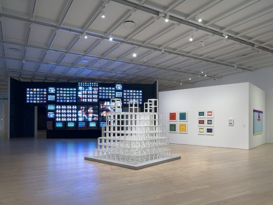
Installation view.   Photograph by Ron Amstutz.

One of the artists who embodies the range of works is Nam June Paik.  Immediately on entry to the gallery, we are bombarded with his massive installation Fin de Siècle II.  Originally made in 1989, it has been beautifully restored for this exhibition.  It contains numerous clips from broadcast video and art video taken out of context and turned into a moving collage on a grand scale.

https://www.instagram.com/p/BqYA_d3BGHz/

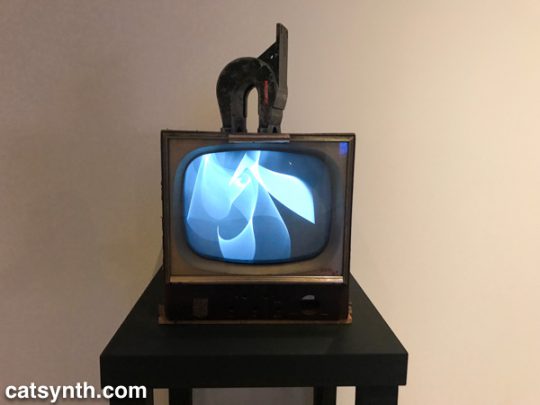
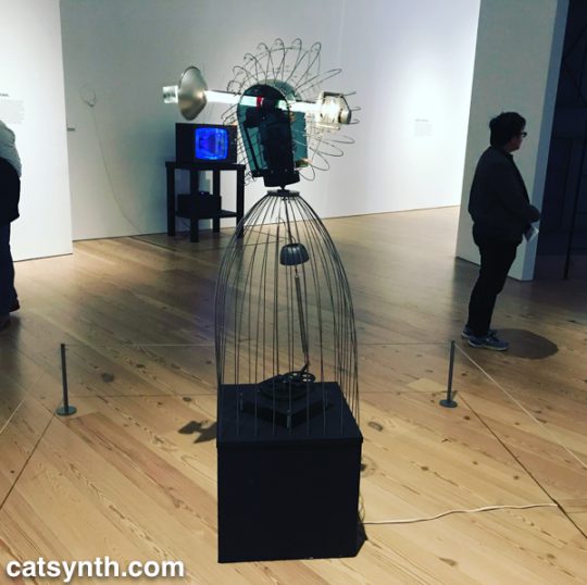
At the opposite end of the video spectrum is his 1965 piece Magnet TV.  A black-and-white CRT television set is disrupted by a large magnet, creating a unique but sometimes unpredictable pattern that is in its way rather spare and graceful.

Nam June Paik. Magnet TV, 1965. Modified black-and-white television with magnet.

In the first piece, the process is in the composition, arrangement, and looping of the various video clips.  In the latter, it is the physics of the magnet and the CRT.

Motion and experiments with electronics are also at the heart of James L. Seawright’s contemporaneous piece, Searcher, which features gradual motion and changes in light.  The shadows it casts are also part of the experience of the piece.

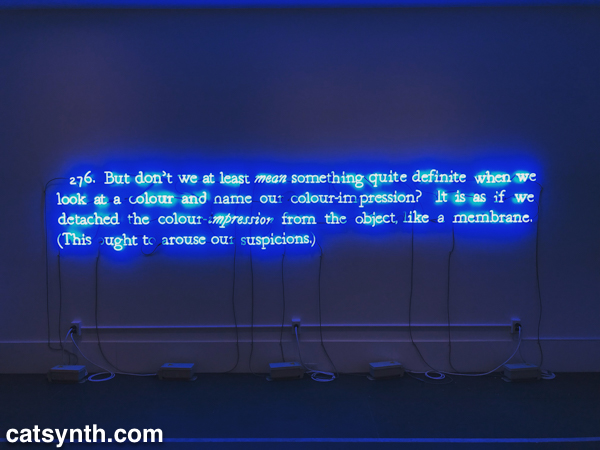
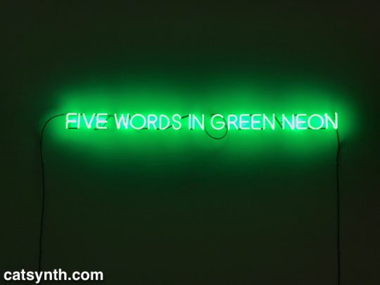
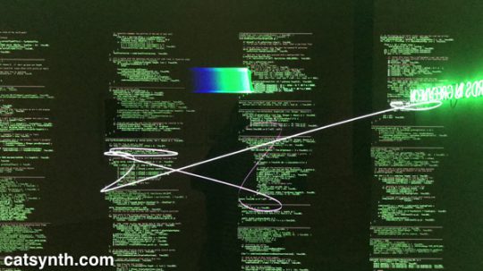
There is an interesting juxtaposition of one Joseph Kosuth’s classic neon text pieces, Five Words in Green Neon, and W. Bradford Paley’s Code Profiles, a Java program that generates images.  They bring together the concepts of “text as art” and “code as art” – the message is the medium.

Joseph Kosuth.  Five Words in Green Neon, 1965.  Neon
W. Bradford Paley.  Code Profiles, 2002 and 2018.  Java applet.

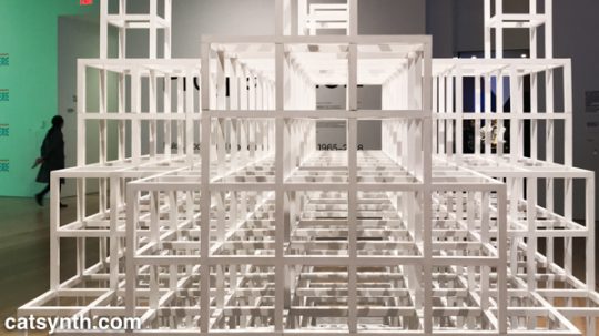
Paley’s code may be one of the most literal examples of the exhibition’s theme, but code need not be computer code as we think of it today.  Many works from earlier periods were based on a series of instructions, where the instructions are the work and the performance or visual object are the expressions of said work.  One such example is Sol Le Witt’s sculpture Five Towers.  The three-dimension grids are assembled by a program with various combinations into a simple but beautiful result.  I particularly enjoyed looking through it.

Sol LeWitt.  Five Towers, 1968.  Basswood with alkyd enamel paint.

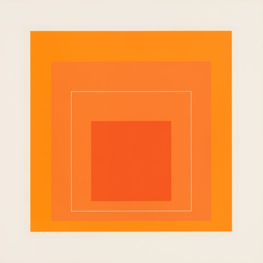
Josef Albers’ color-field rectangles can similarly be generated from a “program”.  Like Le Witt’s piece, one could conceive of doing something like this with a computer, but neither artist chose to do so, instead being themselves the interpreters for the code.

Josef Albers.  White Line Square VI, 1966. Screenprints on board

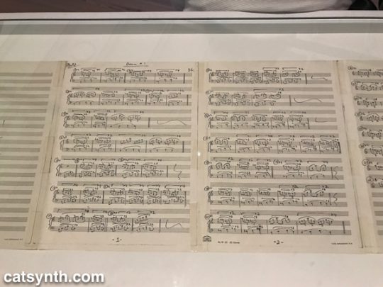
The performing arts have long been linked to programs, whether the traditional score or choreography, or more modern uses of algorithms or conceptual instructions.  Performance was most strongly represented in the exhibition by Lucinda Childs’ Dance, done in collaboration with Sol LeWitt and Philip Glass.  Childs, who is known for a precise and almost algorithmic approach to dance, choreographed a series of 5 pieces to a score by Glass.   She made drawings in different colors for the different movements and projected these onto the floor.  During the dance segments, the colors of her drawing were also used for the lighting.  Finally, LeWitt filmed the dancers, and the film was then projected behind live performers.  The documentation of this complex counterpoint was on display in the gallery, including the film, score, and drawings.

Philip Glass.  Score for Dance #1, 1979.  Photocopy with ballpoint pen.
https://www.instagram.com/p/BqX_IEFhkQC/

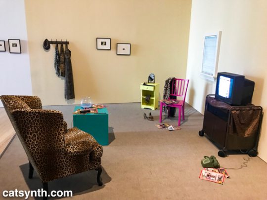
Program, object, video and performance also come together Lynn Hershman Leeson’s Lorna.  Lorna is an interactive video story on a laser disc (anyone else remember laser discs?).  Users can determine how the story unfolds through one of three endings via a remote control.  The screen and control are placed within a simulated apartment decked out entirely in leopard print, and the viewer is invited to sit in a comfy chair while the controlling the story.  This self-guided performance is at once programmed, but also immersive in that the viewer becomes part of the piece, both in space and in terms of control.

Lynn Hershman Leeson.  Lorna, 1979-84. Video, color, sound; with television, interactive laser disc shown as DVD, modified remote control, television cabinet, night table, end table, wood chair, upholstered chair, mirror, fishbowl with plastic goldfish, clothing, wallet, belt, shoes, watch, telephone, magazines, framed storyboards, and framed art

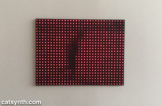
Video permeates the entire exhibition, popping up directly and indirectly in at least half of the pieces, or not more.  But video has many different aspects.  Is not a collection of discrete LEDs programmed to represent a moving image, as in Jim Campbell’s Ambiguous Icon #5 (Running, Falling), a video?  It is certainly a low resolution one, but this low resolution and discrete electronics allow us to see the individual elements that simulate movement in our perception.

Jim Campbell.  Ambiguous Icon #5 (Running, Falling), 2000.  LED lights and custom electronics.

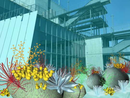
We conclude this survey with a new site-specific commission by Tamiko Thiel.  She created an augmented-reality mobile app (in collaboration with developer /p) that overlays organic forms on the angular, geometric space of the museum’s outdoor terrace.  

Thiel’s organic growths are beautiful and playful, but also have a darker aspect.  Some resemble plastic refuse, and others coral formations.  Both are emblematic of the crises facing our seas due to pollution and climate change.  At the same time, the algorithmic process she uses, a formal grammar developed in 1968 by the Hungarian biologist and botanist Aristid Lindenmayer, is fascinating.

Tamiko Thiel  (with /p),  Unexpected Growth, 2018. Augmented reality installation, healthy phase. Commissioned by the Whitney Museum of American Art

There were many more works in this exhibition that we can discuss in a single article.  Each one had something compelling and different about it.  For anyone interested in or curious about these forms of art, I highly recommend checking out this exhibit! 

Programmed: Rules, Codes, and Choreographies in Art, 1965–2018 will be on display at the Whitney Museum of American Art through April 14, 2019.

The Art of Paper at Sundaram Tagore Gallery

The Art of Paper is a multi-artist exhibition currently on display Sundaram Tagore Gallery at their Chelsea location.  The term “works on paper” often refers to drawing and print, but the medium and can be used in so many more ways.  Each of the artists in the show uses paper in a very different way, showcasing its breadth and versatility as a raw material for art.

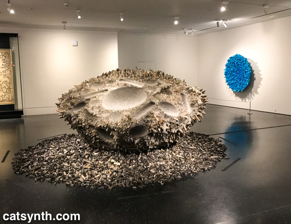
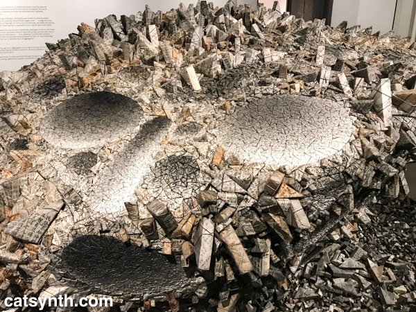
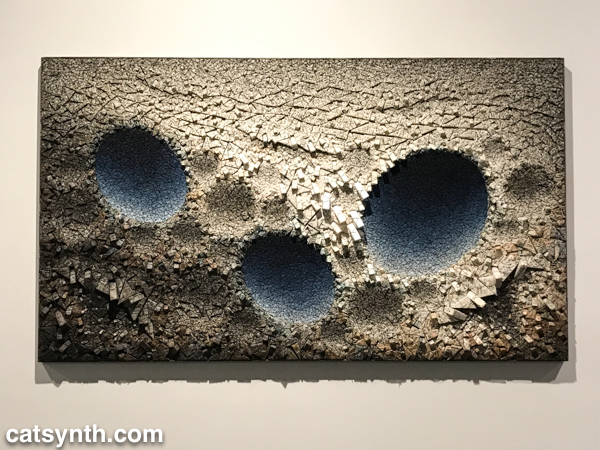
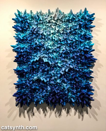
Korean artist Chun Kwang Young creates fantastic three-dimensional sculptures from mulberry paper.  This thin and delicate paper is prized as an artistic material, but also has mundane uses as wrappers.  Chun sources his paper from old books and wraps them into tight triangular forms that he then assembles into beautiful and complex forms he calls Aggregations.

Chun Kwang Young, “Aggregations” installation view

Some are flat and wall-mounted while others are freestanding.  But in all cases, they are three-dimensional full of complex depth and texture.

The jagged triangular elements seem sharp, even a bit dangerous up close.  But at the same time, they seem fragile, like delicate crystals that could fall apart among touch.  When viewing closer, they seem soft, especially as the details of the paper come into view, including the original printed text from the source material.  There is something almost science-fiction-y and other-worldly about the result that I find captivating.

Aggregation 17 – DE099​, 2017, mixed media with Korean mulberry paper, 59.4 x 59.4 inches/151 x 151 cm

Chun has a simultaneous solo exhibition from his Aggregations at the Brooklyn Museum, which we will be reviewing in a separate article.

The work of Anila Quayyum Agha also uses paper as a basis for sculpture with a very different set of styles, techniques, and sensibilities.  She is best known for her works featuring paper laser-cut into large intricate forms.  Many of the paper cuts are assembled into cubes placed in immersive spaces with light.

Shimmering Mirage, 2016, lacquered steel and halogen bulb, 36 x 36 x 36 inches/91.4 x 91.4 x 91.4 cm

Being in the space of this piece and viewing it from all angles was a captivating experience.  It doesn’t seem like paper, but rather intricately carved stone or metal.  Some of the same principles of light and the spaces in between the material are at play in Agha’s two-dimensional works. The designs of Agha’s laser-cuts are reminiscent of the intricate designs found in Islamic art and architecture, such as the mosques of her native Pakistan.  Growing up as a woman there, she often found herself excluded from such spaces, and this informs her art today.

In contrast to Agha’s highly intricate designs, Miya Ando’s work is more subtle and spare.  She is known for more abstract work in metal, but she brings that work to paper in her “moonlight” pieces for this show.

Miya Ando, Gekkou (August) Moonlight 2, 2018, silver leaf and pigment on Arches paper, 41 x 29 inches/104.1 x 73.7 cm

Paper is often white, but it can be many different whites and shades in between those gradations.  The subtle changes give the round form a very natural feel in contrast to the stark white background.

There are several more artists in this show, more than we at CatSynth are able to cover in this article.  For more information, please visit the gallery’s website.  They are located at 547 West 27th Street, and the exhibition will be on display through December 15, 2018.

Weekend Cat Blogging: Brooklyn Cat Cafe

We at CatSynth took a break from our busy schedule of art, friends, and family in New York to visit the Brooklyn Cat Cafe.  

The concept of the “cat cafe” originated in Japan, but has spread around the world, including at least three in New York.  Like Cat Town in Oakland, it is an all-volunteer effort focused on finding foster and forever homes for the cats in their care.  It is located in a small storefront on Atlantic Avenue in the shadow of the bridges and downtown Brooklyn, but a peek inside reveals a space covered in cats.

Many were napping, like the line above, but they are also quite playful and affectionate.  They are, of course, cats.

This sweet black kitty greeted me with a nose kisses.

Hilda was perhaps the most playful on this evening, looking visitors in the eyes as she played with various toys.  She especially liked this wires dangling from the main table.

Burton was a big fellow and quite a character.  A very friendly cat, he minded me a big of our friend Marlon, aka “the big merp” in Oakland, but with Sam Sam’s markings.

One of the hardest parts of traveling is leaving behind my cats.  So having cat cafes is in the cities I visit is most welcome.  The change to play with cats, cuddle them, and pet them can brighten the stormiest night.

The cats are clearly loved and well cared for, and there are rules for visitors that help ensure a safe and respectful space for them.  Most of these fall under the rubric of “don’t be a jerk”, but there are also reminders of the fact that each cat has a different level of comfort with human behavior.  If a cat is wary of being pet, respect their boundaries.  If a cat needs a break from human interaction and wants to hide (and I can certainly sympathize with that), let them.  And the result is a place filled with love among human and feline alike, and many cats have found their forever homes through visits to the cafe.

The Brooklyn Cat Cafe is run by the Brooklyn Bridge Animal Welfare Coalition, which is dedicated to finding homes for cats and other animals in their community.  They opened the cafe in 2016.

By our one-year anniversary in May of 2017, the cafe had welcomed over 35,000 visitors — an average of over 95 visitors cuddling with our cats per day — and placed over 250 cats in permanent adoptive homes.

To find out more about the cafe, including visiting, adopting cats, and how to donate or volunteer, please visit their website.

Mary Corse: A Survey in Light, Whitney Museum

We at CatSynth spent the better portion of a recent afternoon at the Whitney Museum of American Art, taking in the entire museum top to bottom.  In the first of our reports, we start at the top with a survey of the work of artist Mary Corse.

The exhibition – Corse’s first solo survey at a major institution – focuses on her work in the mid-to-late 1960s as part of the West Coast Light and Space movement.  Like many of her contemporaries, Corse was very interested in the use of light as a medium in itself, but her output of light works was almost entirely focused on flat art, i.e., the kind you can hang on walls.  This made her a bit of an outlier in the movement.

Installation view of Mary Corse: A Survey in Light (Whitney Museum of American Art, New York, June 8-November 25, 2018). From left to right: Untitled (Two Triangular Columns), 1965; Untitled (Space Plexi + Painted Wood), 1966; Untitled (Two Triangular Columns), 1965; Untitled (White Diamond, Negative Stripe), 1965; Untitled (Hexagonal White), 1965. © Mary Corse. Photograph by Ron Amstutz

At first glance, it might be tempting to dismiss her work as “another round of white-on-white paintings from the 1960s.”  But what makes it interesting is that light is at the center, rather than texture or pigment; and that she delved into emerging technologies and media to move beyond painting.

The most intriguing pieces in the exhibition were those that used plexiglass and lighting technologies.  Corse studied physics and engineering in preparation for this body of work.  We see this in her series where custom Plexiglass elements of different depths are juxtaposed next to one another allowing different amounts of light to pass through. 

Untitled (Space Plexi + Painted Wood), 1966.  Series of 3. Plexiglass and acrylic on composition board.  24 5/16 x 24 5/16 x 2 5/8 in. (61 x 61 x 6.4 cm). Collection of Andrea Nasher

It is a subtle but fascinating set, and I found myself moving back and forth and looking from either side in my own exploration.

Corse also made her own light elements with a variety of technologies, including this piece from 1968 which employed an argon light and frequency generator, once again with her own custom plexiglass. I would have loved to have seen it in action, but it was unfortunately broken at the time – Tesla coils are notoriously temperamental.  But they did have a video guide on hand with a video to let us experience the work.

Untitled (Space + Electric Light), 1968. Argon light, plexiglass ,and high-frequency generator, 45 1/4 x 45 1/4 x 4 3/4 in.(114.9 x 114.9 x 12.1 cm). Museum of Contemporary Art SanDiego; museum purchase with funds from the Annenberg Foundation.Photograph by Philipp Scholz Rittermann

Looking at the bands within the light, I immediately found myself thinking of the amplitudes in a time-varying sound wave, or perhaps a frequency-domain spectrum.   It would have been quite interesting to “hear” it.

The final set of work in the exhibition takes an abrupt turn, making the end of this period in Corse’s career.  In 1970, she moved from Los Angeles to Topanga Canyon and embarked on her Black Earth Series of paintings.

Untitled (Black Light Painting), 1975. Acrylic squares, glass microspheres, and acrylic on
canvas. 108 x 108 in. (274.3 x 274.3 cm). Collection of Sangbeom Kim and Sunjung Kim

Beyond the obvious switch from white to black, there is a break from technology and a return to working with more traditional materials and textures.  The “black” in the Black Earth Series are ceramics made in her own kilns.  The glossy material is reflective, but also thick and covered in bumps and curves.  This is in stark contrast to the plexiglass surfaces of her earlier work and makes a fitting bookend for the survey.

Unfortunately, the exhibition is closing this weekend, but if you happen to be in New York I recommend checking it out.  It makes a fine escape from the overwhelm and sensory overload of holiday season.

A Perfectly Clear Day 2018

Once again, it’s a perfectly clear day this year. Maybe a little haze, but otherwise a blue sky in San Francisco. But the sounds of the city are a bit sharper today, the foot traffic, the construction equipment, the screeching of the commuter rail and light rails pulling into their stations. And there is a bit of wistfulness, a bit of nostalgia in the most classical sense of the word.

A few things have brought 9-11 back to the fore the anniversary. First, there was the opening of the Cortland Street subway station which serves the 1 IRT line and which was pretty much destroyed in the attack. It’s the last major piece of the puzzle in the rebuilding of the neighborhood, which is a thriving and vital space that includes the transit center, the 9/11 Memorial, and of course 1WTC which has taken its proper place in the skyline.


[Photo by CatSynth]


[Joe Mabel (CC BY-SA 2.0 ), via Wikimedia Commons]

Let’s take a moment to emphasize that the building is called 1WTC! It never was, and never will be, the so-called “Freedom Tower”, a name that was obnoxious, jingoistic, and rather gauche. Same thing for the attempts to call the date “Patriot Day”. I always detested that.

The other time bringing today into focus wasn’t 17 years ago, but last year. I was back in New York by coincidence, and the Towers of Light memorial loomed over us in both Manhattan and Brooklyn as we went about simply enjoying being in New York. I posted this picture at the time.

If there is a dominant feeling at the moment, it is more one of homesickness for my home city, the one that will always be The City. And that trip one year ago truly emphasized all its aspect. A wedding on Governors Island with both lower Manhattan and Brooklyn waterfront surrounding us. I rode a record number of subway lines (yes, I’m a total transit nerd). We wandered in Borough Park as well as my usual haunts in Downtown Brooklyn, Chelsea, the West Village, and the Bronx.

17 years ago, the dominant feelings were grief, anger, and (I’m not afraid to admit it) a desire for revenge. That revenge never came – it was twisted by the rest of the country into a nationalistic (and often tacky) morass that turned into multiple wars that left us and the world poorer. The rest of the country rattles its swords, waves its flags, and the great cities suffer. I do hope one day the radical fundamentalism and radical nationalism that grip so many places in the world, including our own country in this moment, will dissipate. And I hope to return home again.