
Today we look at the ongoing International Orange exhibition here in San Francisco. As part of the celebrations for the 75th Anniversary of the Golden Gate Bridge, sixteen artists were invited to create new works in response to the bridge. The results ranged from very concrete interpretations to more conceptual, and focused a variety of aspects from the iconic color to the architecture to the surrounding environment. All of the works were brought together at Fort Point in the shadow of the bridge for the show.

The bridge itself is a work of art on display at Fort Point, with unique views of the architectural detail that one does not see in the standard postcard shots.

The first formal piece to catch my attention was the sound-and-video installation by renowned multimedia artist Bill Fontana. It was in a dark alcove off the main courtyard of the fort, and focused primarily on sound derived from sensors and microphones that Fontana placed at various points on the bridge and Fort Point along with a live video of the underside of an expansion joint of the bridge. The result was an immersive aural experience anchored by the percussive rhythm of traffic over the expansion joins, the bridge’s cables and the waves at the shore. These elements worked together into a polyrhythmic “composition”, while the video helped orient the listener to the context of the bridge. I found Fontana’s piece to be both technically impressive (e.g., microphones on the bridge) and a captivating listening experience.

Several of the artists made literal use of the international orange color. Artist Stephanie Syjuco‘s installation simulates the typical souvenir store with mass-produced objects in that color, arranged in displays on tables and shelves.

The objects appear as those one might expect in the souvenir shop of an art museum (or next to the Golden Gate Bridge, for that matter), but the uniform color and lack of labeling gives it a strange quality, reminding the viewer that this is not an ordinary shop. It leaves space for the viewer to question the role of shops and commoditization in art without participating in it. Nothing was for sale – though visitors were encouraged to take a free postcard, which showed a solid international orange color field.
Anandamayi Arnold created seven paper dresses in the style of the Fiesta Queens from the original 1937 opening of the bridge – while most of them had the traditional colors and patterns associated with the style, the most striking one was entirely colored in international orange.

I am pretty sure the life-size dresses were in fact wearable, as I saw Arnold wearing either the piece shown above or one like it at ArtMRKT a few weeks before the opening of the exhibition.
Another project that directly featured the international orange color covered the railings overlooking the inner courtyard with swags of orange bunting that were created by female veterans in collaboration with artist Allison Smith. Orange textiles were also a part of Pae White’s “digitally woven tapestries” based on photographs of the fog that is more often than not part of the environment in and around the bridge.
The environment was a major theme of several other projects as well, as artists turned their attention away from the bridge itself to the surrounding water, air and land. Photographer David Liittschwager created an installation that examined the life within one cubic foot sections of water below the bridge. The result is a series of detailed images of life large and small mounted on cubes.

The images themselves could have easily been at home in a science museum rather than an art exhibit, but it is the way the dark pedestals are arranged and their contrast with the brick hallway that makes it art.
Camille Utterback presented an ambitious piece that used digital displays and custom software to create dynamic visual models of the patterns of water flow in the San Francisco Bay. Like Fontana’s work, it was presented in a dark alcove where the displays shown brightly with undulating patterns, but small portals in the wall allowed the viewer to contrast the actual flow of water under the bridge with the historical model. Abelardo Morell explored light and shadow with his camera-obscura installation. A pinhole is used to expand light from outside the fort in a large but grainy image characteristic of this old form of photography.
Other projects were more conceptual, drawing inspiration and organization from history and social context surrounding the bridge and the surrounding area. Cornelia Parker’s sculpture Reveille featured two bugles, one flattened and no longer playable. The piece is a a comment on Fort Point’s history – it was never called into action. Rather than hearing the sound of the bugles, we hear the acoustics of the vault with the wind and echoes of other visitors. The light also plays off the shapes creating more flattened copies of the instruments.

“Artist, historian, and urban strategist” Jeannene Przyblyski produced a virtual radio station K-BRIDGE that presents numerous stories, ideas and sound experiences suggested by the bridge, some of which are factual and some of which are not. The station is broadcast acoustically from a live installation as well as over WiFi to mobile devices and streaming on the internet. You can read and listen to samples here.

The installation is an interesting blend of old an new, with vintage “On Air” sign and wooden details as well as modern electronics for digital storage and wireless networking.
There are more pieces in the show that are not covered by this article. Overall, I am glad I was able to experience this artistic part of the 75th anniversary celebration, and in particular getting to see the pieces within the immediate environment of the bridge itself. The exhibition continues through October, so there is still plenty of time to see it.
Today we review The Fashion World of John Paul Gaultier: From the Sidewalk to the Catwalk currently on display at the de Young Museum. This is currently one of the more celebrated exhibitions happening in San Francisco, and one that seems to suit the city well and capture its attention. As such, there has already been a lot written about it. In this article, I aim to provide a more personal view through my focus on geometry, architecture and the urban environment while still presenting the major themes of fashion, gender and playfulness from the show.
The exhibition is not a typical fashion retrospective, but rather a unified multimedia art installation and a creative work in its own right. As such, it is even “signed” by Gaultier.

The signature sets the tone for the playfulness and whimsy that permeates Gaultier’s designs and the overall exhibition. There is also a quality of otherworldliness to the pieces and the installation, nowhere more apparent than in the opening room, where beneath blue light the dressed mannequins are animated with eerily realistic video faces that talk and sing.

Simplicity does not seem to be part of Gaultier’s vocabulary. His creations are, to say the least, complex and intricate, even a bit overwhelming at first. But there are still things for those of us who focus on patterns and geometric forms in art, such as the simple flowing lines in the dresses in the image above, or his repeated use of the blue-and-white-striped sailor shirt in different guises.

[Photo by Maw Shein Win.]
The use of the traditionally masculine sailor theme in the above dress-and-hood combination is just one of the many examples throughout the exhibition where Gaultier plays with gender expectations. There are examples of traditionally feminine dress forms that have been recast for male bodies and somehow take on a masculine quality. Conversely, the stereotypical appearance of Hassidic men has been recast into a garment for women. In other cases, gender was more ambiguous. Even the piece that opens the show has an androgynous quality, at once graceful but also very slim and strong.

As in the above example, there was a very architectural quality to many of the pieces, with the interior girder structure visible. This was most apparent in a risqué garment composed of straps that included a long train as well as a geometric headdress. Technological and architectural inspiration was also apparent in some of his film-costume designs.

[Photo by Maw Shein Win.]

The city and the urban environment were major themes of the exhibition with one room titled “Urban Jungle” and arrayed with variety of haute couture in different styles and materials, set against a night-time skyline of San Francisco. My favorite, not surprisingly, was this cat-themed piece:

On closer inspection, one can see that the “cat print” is actually composed of countless beads, making it an incredible work of craftsmanship as well as a fun design.

The urban environment was also explored in a section that contrasted sleek and modern styles one might see in a high-end city boutique with fashion inspired by street art and the London punk scene.


The two fashions depicted above might seem far apart socially, but to me they work together. I could see the punk-inpired gold dress in a high-end store wonder, and would love to see the red-and-block outfit posed in front of graffiti.
One item that stood quite apart from the rest of the show, but was quite endearing and memorable, was the inclusion of Gaultier’s childhood teddy bear, perhaps his first model.

Overall it was a fun and well-executed exhibition, and quite creatively inspiring. Fashion has long been on the periphery of my artistic vision, but seeing it like this is in invitation to bring it more front and center.

[Photo by Maw Shein Win.]
The show will be on display at the de Young in San Francisco through August 19. I recommend checking it out if you can.

My first article for
Stretcher is an online publication that “encourages dialog about contemporary art and visual culture in the San Francisco Bay Area.” It was a great experience writing this article with them, and I hope it’s the first of many.
You can read the full article here.
(Failure in Concrete)
September 10, 2003
In my failure at something complex I have failed at something simple.
The sound of a trumpet pours out of a blue on blue on gray.
It scales the concrete wall and curves ninety degrees back to the original side, Meandering between the sound of two freeways that were never built
Their traffic filling the space between the mist.
From cracks in the wall grow weeds
Resplendent in their perfect arrangements of red and green
A single tree rises above from the other side of the wall
Casting its shadow in the shadow under the shadow
North of the tree
Towards the park
A woman in red not red but red slightly pink
I know that she is British
Yet I have no way of knowing that from just an image
I think this is odd
Incongruous
And then she is gone
(Another victim of the tireless work of the censor)
Two blocks south of the wall
Away from the park
Is another wall
It is not concrete
It cannot be seen
But it cannot be crossed
I can see through it
The houses on the other side are the same as the houses on this side
The cars a similar mix of late 1990’s models
Parked halfway on the curb as is the custom of this land
I see what I must do on the other side
But I cannot go through the wall
I do not have the energy to walk around it
It must stretch from highway to the ocean
They play what I write
Not what I hear
Sometimes I hear nothing
© 2003 Amar Chaudhary

Today we look at STILL, a solo exhibition of video and animation works by Pia Maria Martin at The McLoughlin Gallery in San Francisco. It is the first US solo media exhibition for Martin, who hails from Stuttgart, Germany. Martin’s work involves elaborate stop-motion films assembled meticulously from countless photographs. Stop-motion animation assembled from photographs is currently a strong interest of mine and an art-form that I have been exploring in my own recent work with silent video and live music, so I was quite excited to see this show and meet the artist. Upon entering the gallery, one is greeted by a large triptych featuring a procession of plastic red chairs.
The piece, entitled Zum Appell!, can be a little jarring with its inanimate objects marching in lock stop, but it is also playful for the exact same reason. I also like the mid-century modern chairs against the weathered concrete interior. The surreal animation of the chairs and design elements are both enhanced by the nearly life-size presentation.


[Pia Maria Martin, Zum Appell! Image courtesy of The McLoughlin Gallery.]
The elements of both play and unexpected animation are apparent in many of the other pieces as well. Für Olga tends towards the more abstract with mechanical and industrial elements that defy gravity, as do her most recent pieces such as Scherzo with brightly colored ribbons curling and “dancing” in a stark white industrial space.

[Pia Maria Martin, Scherzo. Image courtesy of The McLoughlin Gallery.]
Kalekeitos takes the animation of fish in a more playful (albeit morbid) direction.

[Pia Maria Martin, Kalekeitos. Image courtesy of The McLoughlin Gallery.]
As someone who tends to anthropomorphize animals, I found the dancing fish in Kalekeitos quite endearing. But of course the fish (which are in fact already dead) are ultimately dancing towards their destruction as part of a soup or stew. Death and decay appear as subjects in several of Martin’s animations, with natural elements falling apart or becoming reanimated. It also plays into her piece XI which features a house demolition in progress. The simple geometry and gray quality made it more captivating than a simple chronicle of demolition and gave it the more abstract quality found in some of the other pieces such as Scherzo. This particular work was also great example of pairing music with the silent animation. Music plays an important role in Martin’s work, not only as an accompaniment to the visuals but as an organizing principal. XI featured Arnold Schoenberg’s Die Jakabsleiter performed by Pierre Boulez and the BBC Orchestra and Singers, which reflected the geometric nature of the visuals. In Scherzo, the second movement of Anton Bruckner’s Symphony No. 9 is used as a “non-audible score”, although the actual music is performed by the artist friends (as described here). Once again, my own artistic interest in the silent-animation medium intercedes as I would love to do a live musical performance to one of her films someday.
Pia Maria Martin was able to be in San Francisco for the opening. In addition to introducing her work, she participated in a more general discussion of video and animation.

The lively and far-ranging discussion included the artist’s techniques and inspiration, as well as more general topics such as what it means to “collect video art” in this day and age. On a practical level, the pieces in this and other video shows are authoritative limited editions, much like photographic prints. Some of them are also objects that include the means of display (e.g., a flat panel screen and DVD player). But for a local art collecting community that tends to be a bit more conservative in its acquisitions, the idea of an art piece to be displayed on a TV screen or projected onto a wall and which requires media intervention to perceive is a new one. But we hope video art continues to make its way into collections.
The exhibition will remain on display at The McLoughlin Gallery through May 30.
Today we look at the show Broadside Attractions | Vanquished Terrains which is currently on display at Intersection for the Arts.

[Photo by Scott Chernis. Courtesy of Intersection for the Arts.]
This large and ambitious show, curated by Maw Shein Win and Megan Wilson with Kevin Chen of Intersection for the Arts, brings together twelve pairs of visual artists and writers to produce collaborative work centered around the historical broadside medium. A broadside is generally defined as a large sheet of paper printed on one side and designed to be plastered onto walls in public areas. They were historically used to announce events, proclamations or news in a very concise and public manner before the advent of the internet, broadcasting, or even printed newspapers. Like many media that have outlived their original practical purpose, the broadside continues on in more rarified form for artistic exploration, this show being one such example. For this exhibition, the teams followed a very specific process. First, each visual artist provided his or her collaborating writer with three data points based on the theme of “vanquished terrains”: a piece of music, a movie and a location. The writer then created a short piece that was then given back to the artist to create a small visual work in response to the writing. These were combined to form the historic broadsides, which consisted of the visual piece as a black-and-white printed graphic, followed by the text of written piece.

[Photo by Scott Chernis. Courtesy of Intersection for the Arts.]
Finally, each artist-and-writer pair created another piece that embodied the same ideas and concepts as the historic broadside but using any form or media. The final pieces were quite varied, united only by the connections to their respective broadsides and the process of collaboration. Some were very direct reinterpretations, while others were quite distant from a recognizable broadside. The majority were somewhere in between, with flat media of either physical and or digital varieties.

[Photo by Scott Chernis. Courtesy of Intersection for the Arts.]
The above piece, a collaboration of artist Matthew Rogers and writer Maw Shein Win, is typical of the experimentations with media to augment the traditional broadside concept. The piece is primarily a flat panel of mixed media on paper, with a segment of the space presenting a video, in this case an animation by Rogers with music and bits of a reading of the written piece. The overall feel of the both the visual piece and the poem had a very bleak quality. The prompt location was the Inland Empire, with its combination of stark desert landscape and overdevelopment. The latter is apparent in the poem, while the desert is more present in the visual media, with the video bridging the two with rather dystopian imagery.
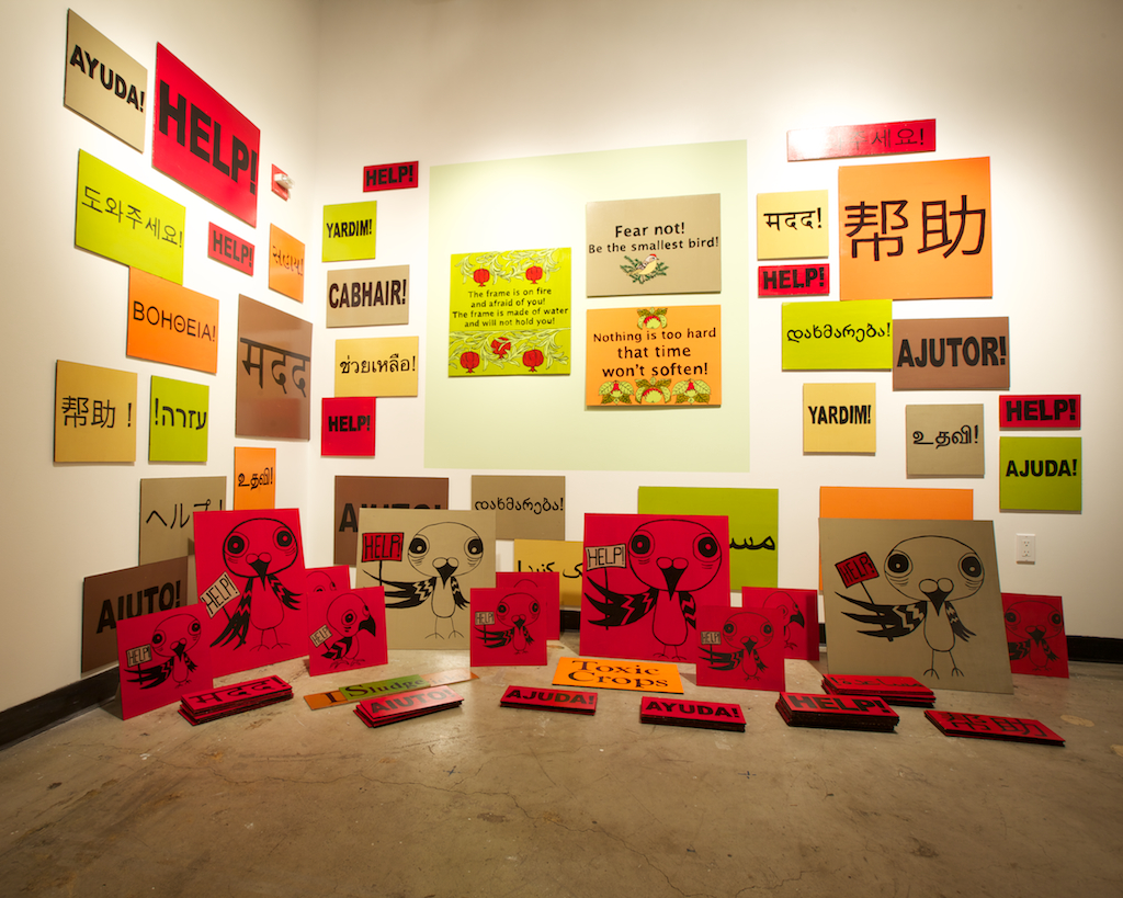
Some pieces derived more directly from the original broadside concept. Indeed, one of the media that most captures the original intent in our particular time and place is the protest sign. In their collaborative piece, Megan Wilson interprets the central figure of Hugh Behm-Steinberg’s poem Ruby-Crowned Kinglets as part of a crowd of protest signs.

[Photo by Scott Chernis. Courtesy of Intersection for the Arts.]
The bright solid colors and simple text and graphics makes this piece stand out, even when just wandering by. At the same time, the image of the cartoon bird crying “Help!” has a fun quality to it. It was interesting way to bridge the contrast between protest art and more personal and descriptive nature of Behm-Steinberg’s poem. During the opening, visitors were invited to take one of the textual protest signs on the floor (but not to take any of the birds).
Video was a frequently used element to bring the broadside concept into the contemporary sphere. One of the most creative uses was by Eliza Barrios with writer Myron Michael. Several asynchronous video streams were projected onto a corner window, transforming the rectangular images into more angular shapes that were aligned perfectly to create the illusion that they were coming out of the window. In the center, a changing set of single words were projected. In watching this piece, I was trying to figure out how the words may relate to the images on either side.

[Installation view with Inaoko/Cortez second to left and Barrios/Michael on the right. Photo by Scott Chernis. Courtesy of Intersection for the Arts.]
Other interesting video pieces included artist Misako Inaoko with writer Jaime Cortez. Their stop-motion animation piece, which included text along with what appeared be live photographic images taken with an app like Instagram or Hipstamatic, created a low-fidelity loop of activity. The piece by Keiko Ishihara and Chaim Bertman revealed the frenetic pace of activity in Tokyo’s complex transit system. It seemed a world away from the location prompt of the South Pole, but quite related to the musical prompt, Brian Eno’s Music for Airports.
At the other end of the spectrum, there were several fully three-dimensional installations. The largest and most dramatic was a two-story installation by artist Karrie Hovey and writer Elise Ficarra that covered the spiral staircase of the gallery in felt representations of deer with stylized antlers and legs. Ascending the staircase to the upper level reveals a dark painted sky with floating text and butterflies. Deer may at first seem an odd choice for a piece whose text and imagery is about the plight of human intervention in nature – having grown up north of New York City, I can attest that deer are doing quite well for themselves – but the message in this piece relates specifically to the controversial killings of deer in Point Reyes national seashore.

[Photo by Scott Chernis. Courtesy of Intersection for the Arts.]
As a bonus, this piece also featured sound art via the work of composer Evelyn Ficarra. The generated sounds were diffused via numerous speakers embedded throughout the installation. The was the only piece to use sound design as an independent element (i.e., not part of a video), and of course I had to try and figure out more about it. The sounds appeared to be manipulated and processed from natural sources which was consistent with the theme. I think they were also multiple streams for the different speakers.

Another interesting large installation was the piece by artist Nathaniel Parsons and writer Ly Nguyen. I have seen several of Parson’s installations before, and this one had a similar home-made construction feel to it. But it was a bit more subtle, with a small hole in the side of the coarse wooden surface to reveal a “piece within a piece” inside.

[Photo by Scott Chernis. Courtesy of Intersection for the Arts.]
So how do pieces like these related at all to the original broadsides? They are still in very concise language “shouting” their point like a Tweet in their own varied proportions and media. And in this sense they retain the “broadside” spirit.
Perhaps the most conceptual take on the theme was Tea + Dialogues presented by writer Jenny Bitner and artist Liz Worthy. They constructed a “tea room” where visitors could sit down, enjoy a cup of tea and participate in dialogues with other visitors. The tea was served in custom ceramics created for the installation, and the walls were decorated with text.

[Photo by Scott Chernis. Courtesy of Intersection for the Arts.]
Visitors choose dialogues from a preselected list, many of which were quite humorous and at least one referenced the installation itself. In additional, visitors were offered a fortune cookie that contained a “miniature broadside.” The dialogues, fortune cookies, and embedded text on the walls all related back to the historic broadside but brought it into a more ubiquitous and interactive realm.

I did participate in a dialogue with another visitor whom I had not previously. It was fun to read, and had the minimalist awkward quality of mid-century experimental theater piece.
In addition to the printed broadside and installation, each piece included links to the source prompts, with QR codes that allowed visitors to access the source music and movies via their mobile devices while exploring the exhibition.
As one can tell from this review, the visual art and installations tended to overpower the written work, especially for those like me who tend to be more visually oriented. To help balance this out, the show included to readings where the writers were front and center, presenting their work in the show as well as related readings of their choice. As with the installations, there was a great variety of work, from short song-like poems to surreal fiction to personal recollections.
The show will remain at Intersection for Arts in San Francisco through May 26.


