A week ago I attended a performance of The Book, a monthlong project by Avy-K Productions at SOMArts as part of their Commons Curatorial Residency prorgram. Avy-K, founded by long-time collaborators Erika Tsimbrovsky (choreographer/performer) and Vadim Puyandaev (visual artist/performer), specializes in multidisciplinary pieces combining contemporary dance, live music, live painting and evolving installations. The Book used these elements to present a framework for audience interaction and narrative.

From the online program notes:
The Book is an installation-performance series accompanying an ongoing exhibition based in experimental non-theater dance. Each performance is a random page from The Book, and each invites a different guest artist to enter the structure, created by Avy K Productions and collaborators, in order to destroy it and give it new life.

The performance featured live improvised music by Matt Ingalls and Ken Ueno. I have of seen both of them perform in a variety of venues on numerous occasions, but never together as duo until now. There were many moments where Ingalls’ wind instruments and Ueno’s extended vocal work matched perfectly. In fact, the timbres of the voice and instruments were close enough to seem indistinguishable at times. Both performances held single pitched tones, with only slight variations the led to pronounced beating effects. At other moments, clarinet multiphonics were set against low intense growling, or Central Asian (i.e., Tuvan) throad singing. There were also percussive notes passed back and forth between the performers in sparse rhythmic patterns – something that worked well with the movement of the dancers. I was interested in some of the more unusual uses of instruments, such as Ueno’s combining of a clarinet bell and snare drum with vocalizations or Ingalls’ decomposition of the clarinet into subsections.
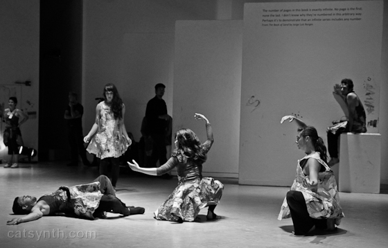
The dancers costumes featured “dresses” made of black-and-white patchworks that seemed to resemble newsprint on top of black – this costuming was used by both the male and female dancers. It matched the starkness of the room and the displays, which were mostly white with black text or markings. The music, dance movements and costumes provided plenty of empty space, which seemed in keeping with the stated mission of The Book for “artists and audience members [to] allow their personal stories to enter the performance space, creating a collective public diary.” The main source of bright colors were large paintings at various places on the wall – their significance would become apparent as the performance unfolded.
The dance began very subtly and quietly, with long pauses and brief motions that matched the soft percussive sounds from the voice and clarinet. The motion focused on dancers interacting in pairs or individual dancers interacting with the large white panels set up throughout the room, the floor, or their costumes.

As the dance continued, Vadim Puyandaev emerged in all black and began live-painting a new large-scale mural on one wall of the gallery. The painting used vibrant colors and it became clear that the colorful paintings I noticed earlier must have been the result of previous performances. As the painting progressed, the dancers gradually set down in close formation facing Puyandaev, as if in prayer or meditation. The music appropriately moved to a long clarinet drone and throat singing.

[Photo by Elena Zhukova, reprinted courtesy of SOMArts.]
As the next section of the performance began, the audience was invited to gather around one particular set of curtains. The shadowy figures of two dancers could be seen through the curtain, with the outline of their bodies coming in and out of focus. They emerged very gradually from underneath the curtain, first a foot poking out, then a head and neck, squeezing out like a caterpillar, As they fully emerged, the two dancers came together in slow, undulating and curving motions. This part of the performance was, to say the least, rather sexually charged. After continuing for a period of time, the dancers separated and retreated behind the curtain.

The final section of the performance was more heterogenous in terms of content, with a greater variety of motions and interactions with the space. Large rolls of paper were spread out on the floor – a dancer proceeded roll himself up in one of these. Square holes were cut in some of the white curtains to create windows that performers peeked through. A large circle was created which some dancers followed as if on a monorail. Over time, the dancers one by one exchanged their costumes for “street clothing” – basically, the sort of things one might wear when to attend a serious art performance like this but remain casual. Were it not for the deliberate nature of their motion, they would have been indistinguishable from the audience. It was clear that it was coming to an end as the all gathered in one spot and the music went silent.

[Photo by Elena Zhukova, reprinted courtesy of SOMArts.]
So the question is how how successful the piece was at allowing audience members to enter their own stories? For me, I found myself focused on the literal elements of the visual design, music and movement. Even as the piece evolved over time, I was drawn the elements as abstractions – perhaps not surprising for someone who gravitates towards abstract music and art. Particularly through the costumes and overall shapes of the installation, I could also connect to the urban landscape.
The Book continues at SOMArts with additional performances, including a free closing event on July 29 where one will be able to see how the gallery space was altered over the course of the series.


 ]Some people seemed more drawn to the aesthetics of individual pieces rather than the subject or context – like me, the focused on lines and textures. Among these viewers, 7059 (Blue) got the most attention. A few viewers did try to look for “musical” elements within my work after learning that music was my primary art form – they noticed repeated patterns and motives in the lines.


