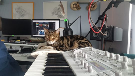
This cat a nice cushy napping spot next to an Access Virus TI Polar or WhiteOut Edition. Submitted by Vahakn Ma via our Facebook page.
Just a regular synthcat….
Well, every “regular
You can hear Ma’s music as Harky DJ here.


This cat a nice cushy napping spot next to an Access Virus TI Polar or WhiteOut Edition. Submitted by Vahakn Ma via our Facebook page.
Just a regular synthcat….
Well, every “regular
You can hear Ma’s music as Harky DJ here.
We at CatSynth spent the better portion of a recent afternoon at the Whitney Museum of American Art, taking in the entire museum top to bottom. In the first of our reports, we start at the top with a survey of the work of artist Mary Corse.
The exhibition – Corse’s first solo survey at a major institution – focuses on her work in the mid-to-late 1960s as part of the West Coast Light and Space movement. Like many of her contemporaries, Corse was very interested in the use of light as a medium in itself, but her output of light works was almost entirely focused on flat art, i.e., the kind you can hang on walls. This made her a bit of an outlier in the movement.
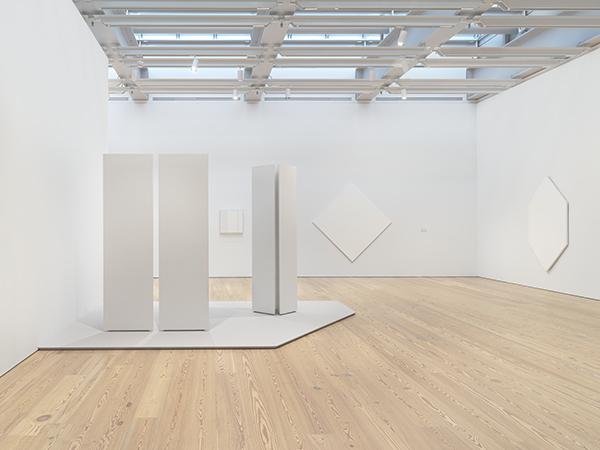
At first glance, it might be tempting to dismiss her work as “another round of white-on-white paintings from the 1960s.” But what makes it interesting is that light is at the center, rather than texture or pigment; and that she delved into emerging technologies and media to move beyond painting.
The most intriguing pieces in the exhibition were those that used plexiglass and lighting technologies. Corse studied physics and engineering in preparation for this body of work. We see this in her series where custom Plexiglass elements of different depths are juxtaposed next to one another allowing different amounts of light to pass through.
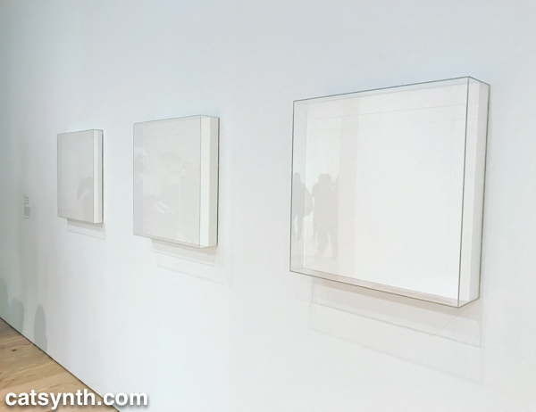
It is a subtle but fascinating set, and I found myself moving back and forth and looking from either side in my own exploration.
Corse also made her own light elements with a variety of technologies, including this piece from 1968 which employed an argon light and frequency generator, once again with her own custom plexiglass. I would have loved to have seen it in
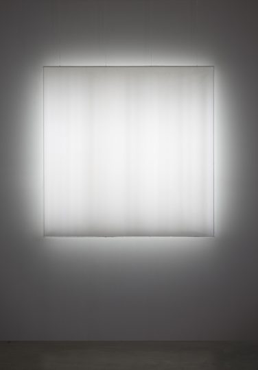
Looking at the bands within the light, I immediately found myself thinking of the amplitudes in a time-varying sound wave, or perhaps a frequency-domain spectrum. It would have been quite interesting to “hear” it.
The final set of work in the exhibition takes an abrupt turn, making the end of this period in Corse’s career. In 1970, she moved from Los Angeles to Topanga Canyon and embarked on her Black Earth Series of paintings.
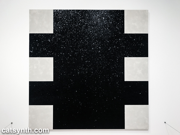
Beyond the obvious switch from white to black, there is a break from technology and a return to working with more traditional materials and textures. The “black” in the Black Earth Series are ceramics made in her own kilns. The glossy material is reflective, but also thick and covered in bumps and curves. This is in stark contrast to the plexiglass surfaces of her earlier work and makes a fitting bookend for the survey.
Unfortunately, the exhibition is closing this weekend, but if you happen to be in New York I recommend checking it out. It makes a fine escape from the overwhelm and sensory overload of holiday season.
As Pitta of the Mind prepares for our upcoming show next week, we look back at our last show in February at Outsound’s periodic Soundspeak series featuring experimental music and poetry groups.
For our set we performed several new pieces on the theme of film, with several poems evoking treatments and plots for possible (or impossible) films. The music featured a mixture of piano, Moog Theremini, modular synth and DSI Prophet 12, which made for quite an impressive setup.

As with most Pitta of the Mind shows, we had a color/pattern theme. On this evening the theme was white.


[Photos by Annabelle Port. Click to enlarge.]
The performance overall went quite well. You can here some audio excerpts below.
We were proceeded that evening by a trio featuring Nick Obando with Rob Pumpelly and Eli Wallace. The group performed several extended-length jazz pieces layered with Obando’s hip-hop-infused poetry.

I have to admit I do not recall much of the words/poetry, but the instrumental performance was quite memorable. I am a fan of Eli Wallace’s keyboard performance style, and Pumpelly and Obando brought their own strong technical skills to the mix. I particularly liked one piece that featured a funk rhythm with complex solos and patterns on top. The rhythm cut out in a few spots for freeform improvisation that was just long enough before returning to the funk pattern.
Overall, it was a good show, though a quiet night – possibly a combination of other performances happening that evening and the fact that the Luggage Store Gallery is at a temporary location while the main building is being renovated. But we certainly look forward to performing again, and hearing more music in the meantime.
A week ago I saw the exhibition 0-Viewpoint by Stella Zhang at the Chinese Culture Center here in San Francisco. Zhang is the 2010 featured artist in the CCC’s Xian Rui (”Fresh & Sharp”) series, which showcases “the work of an incredibly talented but under-represented Chinese artist in America.” This year’s exhibition also had a goal of pushing the boundaries of what is considered “Chinese art” and challenging more traditional viewers’ expectations. Zhang was schooled in classical Chinese art techniques, but the contemporary mixed-media installation eschews cultural tradition (except perhaps in some more subtle ways) and challenges the expectations many viewers might have of art and an artist identified as “Chinese.”. 0-viewpoint is also a deeply personal exhibition, in which Zhang “explores the constantly shifting inner landscapes of self and femininity.” Similar to heritage, gender comes with expectations. Confronting traditional expectations of both gender and heritage are topics of personal interest to me, which makes this an appealing exhibition to both see and reflect upon.
The main corridor is covered by a long undulating white canvas, which sets the overall tone for the entire installation: curving forms of white fabric. Indeed, the gallery and all the pieces were almost entirely white. The white seemed to cast a silence over everything, which is both simultaneously meditative and a bit “anxious”. Although the color was uniform, the textures and shapes were quite complex, and in a way the use of white helps focus one on these dimensions instead of on color. It also made it possible to detach from the question of challenging tradition and allow it to fade into the background while focusing on the pieces themselves.
[Stella Zhang, 0-Viewpoint, installation view. Photo courtesy of the artist. (click to enlarge)]
The installation in the first room is a collection of tall rather phallic sculptures. They were slightly higher than human size, and one could walk amongst the irregular arrangement of columns. The irregular shapes suggested something organic, like a forest or sea creatures. But the metal structure underneath the cloth also gave them an architectural feel.
[Stella Zhang, 0-Viewpoint, installation view. Photo courtesy of the artist. (click to enlarge)]
The second room contains an array of small cushion like objects suspended on wires from the ceiling but nearly touching the ground. The forms, which are again made of fabric, are soft and curving and body-like, but are covered in spines made from toothpicks. The combination suggests sea urchins or single-cell organisms. But the shape and texture also seems to play on and challenge stereotypical associations with feminine, e.g., soft curving shapes but then pierced by something more angry and aggressive. Along the edges of the room are small seats, again made from soft fabric but also covered in spines. (I would not be tempted to try and sit on one.)
[Stella Zhang, 0-Viewpoint, installation view. Photo courtesy of the artist. (click to enlarge)]
Towards the end of the gallery, the long canvas that covers the corridor descends to the floor and then comes back on the floor ending in a somewhat mysterious hole big enough to crawl through. Nearby, a video was projected onto the ground showing an image of swirling smoke or vapor with ethereal dreamlike music. The music was mostly in a minor mode, but with slightly unsettling tones in the middle section.
Arranged along the corridor were a series of twelve panels suggesting the twelve signs of the zodiac (one of the few overt nods to Chinese tradition). Each of the white panels had a shape made of sand. Although the material was different the shapes seemed related to other parts of the installation: round curving but somewhat elongated with irregular holes.
[Stella Zhang, 0-Viewpoint, installation view. Photo courtesy of the artist. (click to enlarge)]
The afternoon included a dialog with the artist, in which we learned a bit about her journey that included growing up in Beijing in a family that encouraged her to pursue art; the culture shock and growth of her time studying and working in Japan; and then settling in the United States. I also had a chance to view the documentary on the making of the exhibition, which was presented as part of a dialog and discussion with the artist. An excerpt of the documentary is online, and presented below:
Stella Zhang, 0-Viewpoint from Jim Choi on Vimeo.
It was interesting to see the physical process that goes into making the work, welding metal frames, gluing fabric and manually inserting the skewers into cloth. The full documentary also explores the tensions of the work, such as there was between Zhang and curator Abby Chen around the piece with the suspended cushions and wooden skewers. There was also a phrase that Zhang applied to herself, “trapped in a box”, that a viewer in the video later ascribed to Chinese art and culture as a whole. This phrase intrigued me, but there wasn’t a chance to follow up further.
0-Viewpoint will be on display at the Chinese Culture Center through September 5.