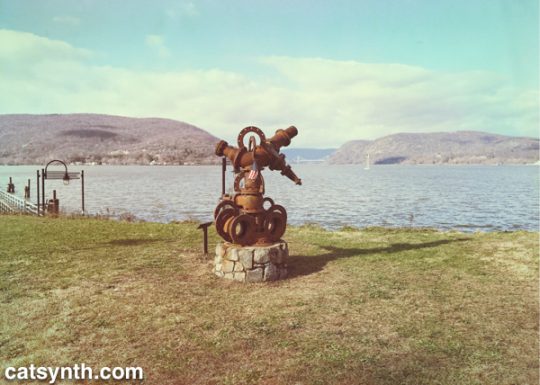
Sculpture at Fleishmann Pier in Peekskill, NY. We see the Hudson River and the Bear Mountain Bridge in the distance.
Last week’s Wordless Wednesday was also taken in Westchester County along the Hudson River.


Sculpture at Fleishmann Pier in Peekskill, NY. We see the Hudson River and the Bear Mountain Bridge in the distance.
Last week’s Wordless Wednesday was also taken in Westchester County along the Hudson River.
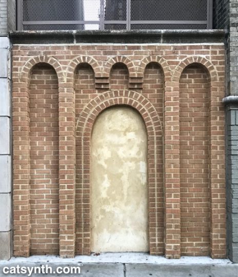
A stylized brick entryway, now sealed and fronting a space between two buildings on the Grand Concourse in the Bronx.
This is an example of a Thomasson.
The end-of-year colage has become a long-standing tradition here at CatSynth, and one that I particularly enjoy. It was a complex year, and the images reflect that. Our cats Sam Sam and “Big Merp” (who has pretty much become an indoor-outdoor cat at his new home in Oakland), some great shows including outstanding performances with CDP and Vacuum Tree Head, a wonderful and restorative visit back to New York. It was also dark and fiery at times, as when the Camp Fire leveled the town of Paradise and bathed our sky in smoke and ash – beautiful and tragic all at once.
Another New Year tradition at CatSynth is to share some stats from the past year. First, the basics:
Our top posts for the year, using the somewhat shaky measurements of Google Analytics:
It was heartening to see such a diverse set of posts top the list. However, this belies the fact that blog readership is way down, and eclipsed by Facebook and YouTube / CatSynth TV. Most of our referrals to the blog come from these two sources; but most activity stays on Facebook and YouTube. On the plus side, CatSynth TV viewership has grown significantly. Here are the top videos for the year.
Clearly, the NAMM reviews and synth demos dominate the channel, though I am proud of the diversity of art, music, and culture topics shared there as well. Overall, we at CatSynth do see the writing on the wall, and the efforts in 2019 will probably accelerate the shift from blog to video in terms of time, energy and investment.
On a more personal and introspective note, 2018 was a year we accomplished a lot. At the same time, it ends feeling like I both did too much and didn’t do enough. There are still so many things going on, even as we tried to consolidate and focus. One of the challenges going into 2019 will be looking at how to stay organized and even more focused, without giving up on all that we do. Also, like birthdays, a new year is a reminder that time is passing, and we are getting a bit older. Taking care of myself will also be a priority.
Thank you all as always for sharing this past year with us, and wish wish everyone a Happy New Year!
After seeing Kwang Young Chun’s Aggregations at Sundaram Tagore Gallery (read our review of that show), I knew I needed to check out his solo exhibition at the Brooklyn Museum. I expected more of the same style of abstract triangulated paper constructions, but on a larger scale. And I was not disappointed.
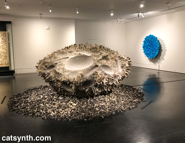
These large other-worldly constructions are formed from small tightly folded prisms of mulberry paper. This thin and delicate paper is prized as an artistic material but also has mundane uses as wrappers. Chun primarily sources his paper from old books.
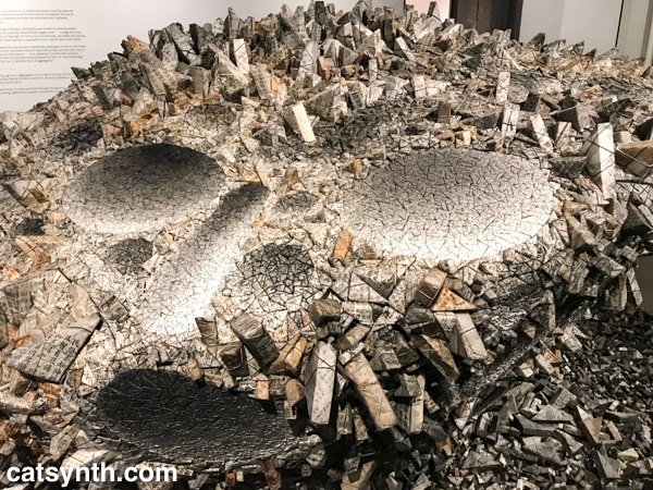
The freestanding central piece, which I believe was Aggregation 15-JL038 (his titles all rather cryptic alphanumeric combinations), was particularly intense and seemed like a cratered surface of a large asteroid. The remaining pieces were wall-mounted, but still combined light and shadow, roughness and smoothness, in a similar way.
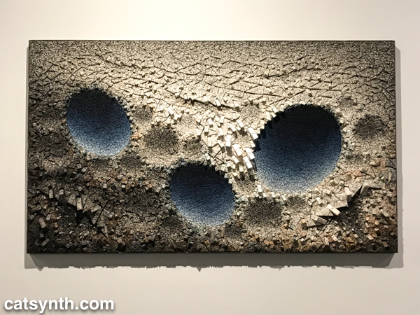
There is something I find deeply captivating about Chun’s sculptures. They seem like something I might have generated on the computer, but they are made of paper. They seem solid and heavy, but fragile at the same time. I also liked the juxtaposition of blue with the otherwise grayscale elements. I found myself sitting in the middle of the gallery and contemplating each of them for a long time, longer than I usually sit with individual pieces on a whirlwind trip through a museum.
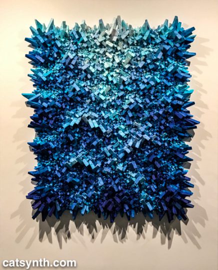
Blue seemed to be the color of the day. Even before reaching Kwang Young Chun’s exhibition, I was greeted by Infinite Blue, a survey of art and design objects from the museum’s collection.
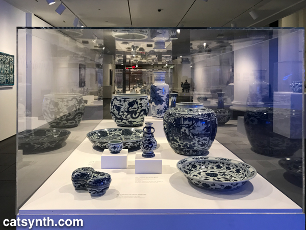
I have long been drawn to blue – along with purple, it is a color I welcome into my own art and design, and one of the few colors that I wear. It’s also historically a rarer color and one that is not often found in nature (other than the blue tint of the sky and water). The exhibition goes through different places and periods of art and craft incorporating blue, often juxtaposing traditional objects with contemporary art. For example, the Chinese porcelain in the image above was paired with contemporary paintings by Chinese artist Su Xiaobai.
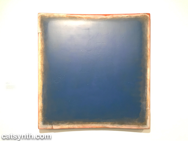
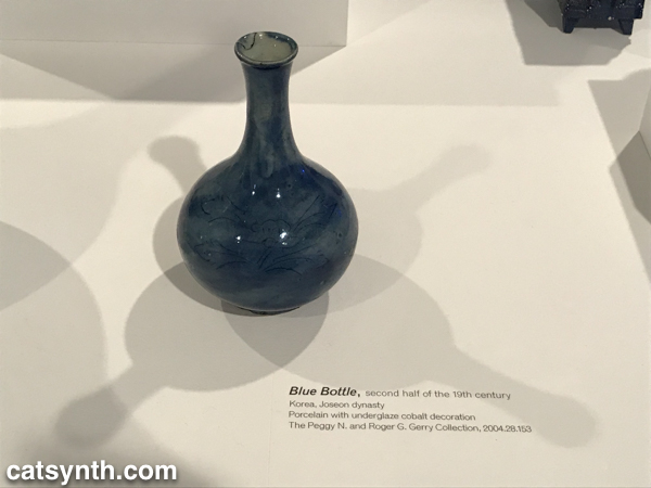
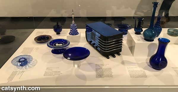
I tend to be most drawn to objects that are more abstract and geometric. As such, the section featuring 19th-century American decorative arts did nothing for me. By contrast, I enjoyed seeing a Korean 19th-century porcelain bottle with 20th-century American designs in blue glass.
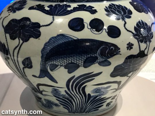
I do, however, have a soft spot for fish.
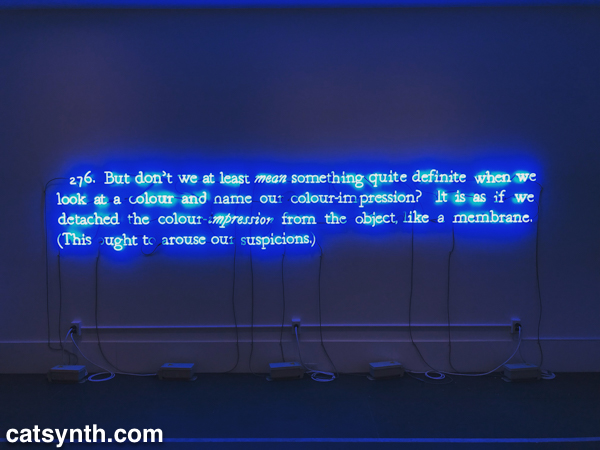
The most powerful element tying the entire exhibition together was the opening piece, one of Joseph Kosuth’s neon text works 276 (On Color Blue).
And this is perhaps a fitting way to close this article. There was more to see and share from this visit to the Brooklyn Museum, but we shall save that for a subsequent article.

Our final Wordless Wednesday of 2018 takes us back to New York and a view looking west from Manhattan towards Jersey City during a winter sunset.
Please also check out our latest video: Episode 99.
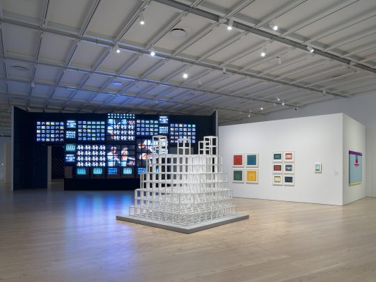
We at CatSynth have long been interested in the intersection of art, technology and conceptual process. Programmed: Rules, Codes, and Choreographies in Art, 1965–2018 surveys over 50 years of video, computational and conceptual art, cleverly weaving them together into a single narrative whole. The three disciplines are united by the concept of a “program” or set of instructions through which the work of art unfolds, whether a computer program, instructions for a performance, or strict concept on a visual object. Video and lights abound, but there is also painting, dance, and more.
One of the artists who
At the opposite end of the video spectrum is his 1965 piece Magnet TV. A black-and-white CRT television set is disrupted by a large magnet, creating a unique but sometimes unpredictable pattern that is in its way rather spare and graceful.
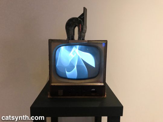
In the first piece, the process is in the composition, arrangement, and looping of the various video clips. In the latter, it is the physics of the magnet and the CRT.
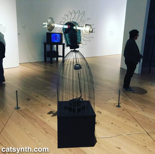
Motion and experiments with electronics are also at the heart of James L. Seawright’s contemporaneous piece, Searcher, which features gradual motion and changes in light. The shadows it casts are also part of the experience of the piece.
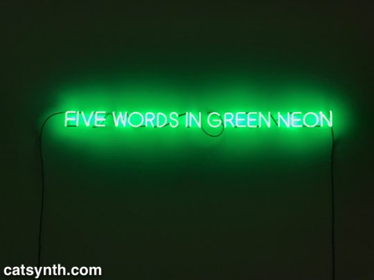
There is an interesting juxtaposition of one Joseph Kosuth’s classic neon text pieces, Five Words in Green Neon, and W. Bradford Paley’s Code Profiles, a Java program that generates images. They bring together the concepts of “text as art” and “code as art” – the message is the medium.
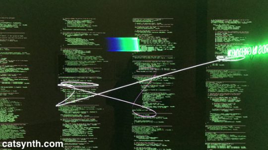
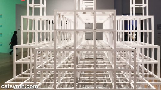
Paley’s code may be one of the most literal examples of the exhibition’s theme, but code need not be computer code as we think of it today. Many works from earlier periods were based on a series of instructions, where the instructions are the work and the performance or visual object are the expressions of said work. One such example is Sol Le Witt’s sculpture Five Towers. The three-dimension grids are assembled by a program with various combinations into a simple but beautiful result. I particularly enjoyed looking through it.
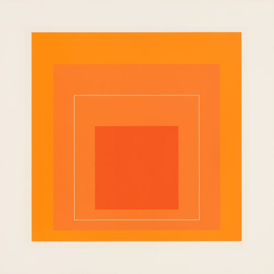
Josef Albers’ color-field rectangles can similarly be generated from a “program”. Like Le Witt’s piece, one could conceive of doing something like this with a computer, but neither artist chose to do so, instead being themselves the interpreters for the code.
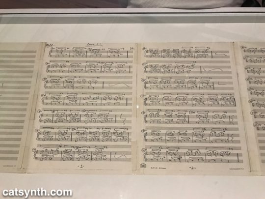
The performing arts have long been linked to programs, whether the traditional score or choreography, or more modern uses of algorithms or conceptual instructions.
Program, object, video and performance also come together Lynn Hershman Leeson’s Lorna. Lorna is an interactive video story on a laser disc (anyone else remember laser discs?). Users can determine how the story unfolds through one of three endings via a remote control. The screen and control are placed within a simulated apartment decked out entirely in leopard print, and the viewer is invited to sit in a comfy chair while the controlling the story. This self-guided performance is at once programmed, but also immersive in that the viewer becomes part of the piece, both in space and in terms of control.
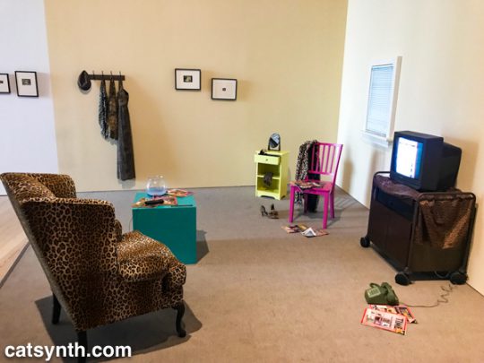
Video permeates the entire exhibition, popping up directly and indirectly in at least half of the pieces, or not more. But
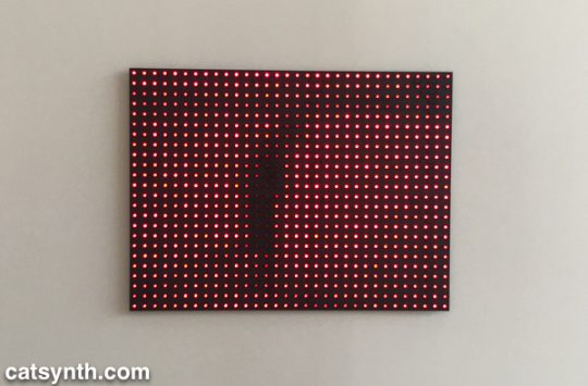
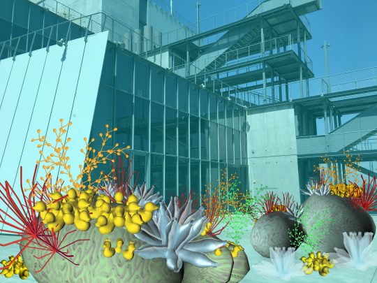
We conclude this survey with a new site-specific commission by Tamiko Thiel. She created an augmented-reality mobile app (in collaboration with developer /p) that overlays organic forms on the angular, geometric space of the museum’s outdoor terrace.
Thiel’s organic growths are beautiful and playful, but also have a darker aspect. Some resemble plastic refuse, and others coral formations. Both are emblematic of the crises facing our seas due to pollution and climate change. At the same time, the algorithmic process she uses, a formal grammar developed in 1968 by the Hungarian biologist and botanist Aristid Lindenmayer, is fascinating.
There were many more works in this exhibition that we can discuss in a single article. Each one had something compelling and different about it. For anyone interested in or curious about these forms of art, I highly recommend checking out this exhibit!
Programmed: Rules, Codes, and Choreographies in Art, 1965–2018 will be on display at the Whitney Museum of American Art through April 14, 2019.
We at CatSynth are admirers of brutalism, as anyone who follows us on Twitter can attest. We love the geometric forms, how it screams “modern”, and how it makes such an intense break with tradition. And I will admit, I also have a little fun using it to poke fun at the architectural conservatism prevalent in places like San Francisco. But above all, it provides a singular beauty to built spaces.
Brutalism perhaps reached its zenith in the former Yugoslavia during the period between the end of World War II and 1980, a period that is highlighted in a current exhibition at the MoMA, Toward a Concrete Utopia: Architecture in Yugoslavia, 1948–1980. It highlights the work of several Yugoslavian architects in the period and pieces ranging from prosaic apartments to public arenas to monuments. The buildings themselves are, of course, not on display in the museum, but their stories are told through models, photographs, and examples of interior objects.
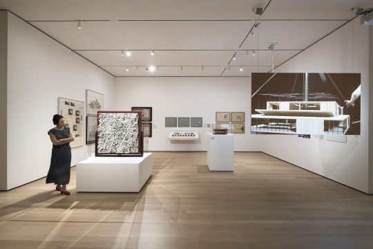
A convergence of factors came together which allowed these modernist experiments to flourish. Yugoslavia broke away from the Soviet bloc in 1948 and began to forge its own socialist path and identity. It constituted itself as six republics in a federation in which traditional regional identities were subordinate to a new and modern whole. At the same time, the country was devastated by World War II and needed massive rebuilding. Finally, new ideas in architecture were emerging along with new materials, notably advances in concrete, steel, and glass allowed a new built environment to take shape.
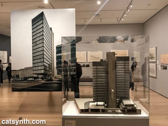
The simple forms and surfaces were used for everyday buildings, such as apartment complexes, schools, and medical facilities. But rather than just one-offs, they become part of a unified cityscape, a grand plan. This was perhaps no more so than in Skopje, the capital of Macedonia, which was devasted by an earthquake in 1963 and largely rebuild using modernist design and principals.
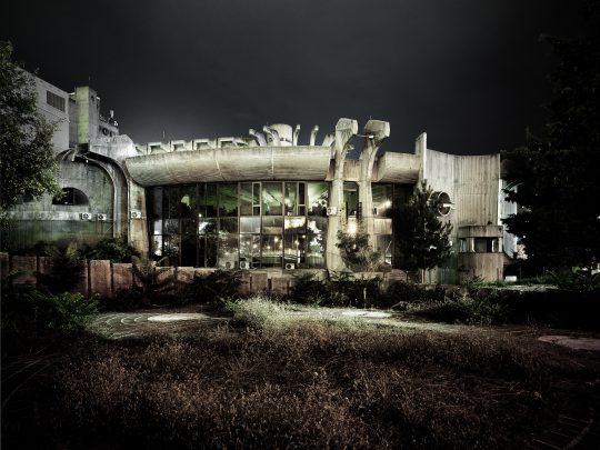
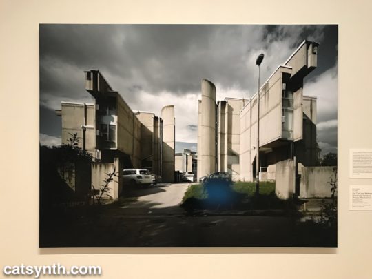
There are, of course, numerous rectilinear designs, sometimes in steel and glass, and sometimes dominated by concrete. But concrete also allowed for the exploration of curved structures and organic shapes. We see this in many of the large civic arenas, but also in the brutalist monuments built in the post-war period. This “cell-like” structure in Macedonia takes it to the extreme, looking at once like an organic organism and a spaceship.
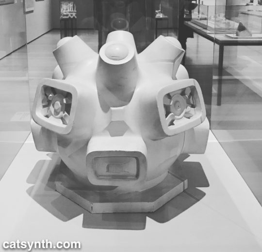
Wandering through the exhibition, one cannot help but imagine being the real spaces. For me, the modernist, severe style brings a sense of calm and welcome that more traditional styles don’t always provide.
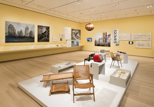
Sadly, the Yugoslavian experiment ultimately failed, with country breaking apart and the entire region plunging into extreme nationalism and devastating wars in the 1990s. This is a cautionary tale as we watch the plague of nationalism rising around the world, including in the United States. Many of the architectural works in this exhibition did survive the wars. But they do face continued challenges to their survival, including maintenance and a push to return to more “traditional” forms. The “Skopje 2014” initiative, for example, is both farcical and tragic. Despite these challenges, I hope the countries of the region will recognize and preserve the legacy of their modernist period for years to come.
This article only scratches the rough, hardened surface of the wealth in this exhibition. It was truly a wonderful experience, even if so much was in my imagination through the artifacts. Toward a Concrete Utopia: Architecture in Yugoslavia, 1948–1980 will be on display at the Museum of Modern Art in New York through January 13, 2019.