Looking up from street level at the Broadway Junction subway station in Brooklyn, New York. The J train is passing through.
Looking up from street level at the Broadway Junction subway station in Brooklyn, New York. The J train is passing through.
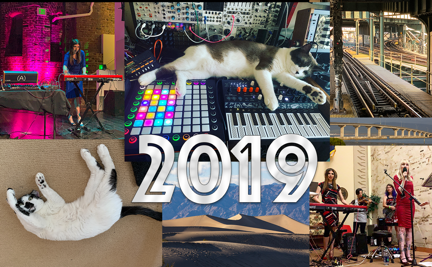
Our year-end collage is a long-standing tradition at CatSynth. And we had a lot of fun making this year’s edition, so many wonderful images to choose from. One of my best solo performances to date took place at the Compton’s Cafeteria series at the Center for New Music. Big Merp came to live with has at CatSynth HQ. And our adventures took us from the halls of NAMM to the bottom of Death Valley to the subways of New York.
As we mentioned at the end of last year, most of the energy has moved to CatSynth TV and our social media platforms (especially our Facebook page). The blog is mostly our core cat-and-synth pics these days, although I do enjoy sharing long-form articles now and then. And In 2020, I do plan to revive the “primary highways” series from eight years ago.
On the video side, things have been going very well. Here are the top videos for 2019:
By early autumn, I was also thinking about this year as a “tipping point.” The transition from the blog to the video channel is the most obvious, but it also applies also on the personal side. The arrival of Big Merp was one of the big stories, and it’s been a tough integration getting both cats to coexist, but things have been trending well in the past few months, with Sam Sam regaining her confidence and HQ becoming a more harmonious place again. Musically, I have moved in a direction that is perhaps closer to my roots in jazz, fusion, funk while maintaining the experimental electronic aspects. I have also moved to a point where studio work is how I spend most of my musical time, between the videos and other projects. Finally, I am getting older, as we all are, and that adds both perspective and a need to focus on health and wellbeing. In 2020, I may “do fewer things” than in the past, but I hope the things I choose to do make an impact both personally and beyond.
There is a lot to look forward to in the coming days: NAMM 2020 is around the corner, I have a full queue of demos to share, and I am laying the foundations for some major musical projects. And of course, we will continue to post cats and synths.
We pick up our report from our recent visit to the Museum of Modern in Art where we left off after Part 1. Working my way gradually downstairs, I came to the special exhibition Sur moderno: Journeys of Abstraction―The Patricia Phelps de Cisneros Gift. This is a major exhibition that fills several galleries with modernist works by South American artists through the 20th century.
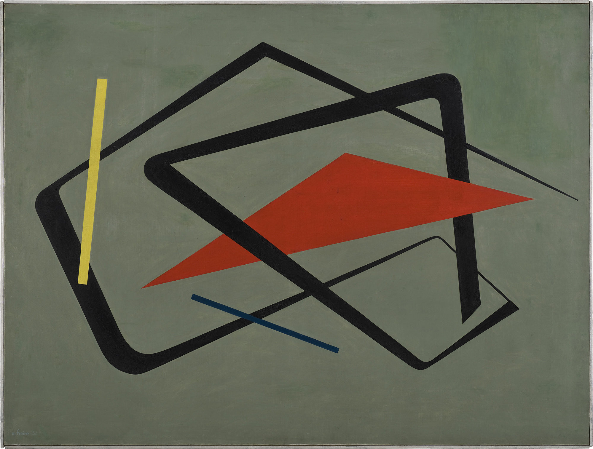
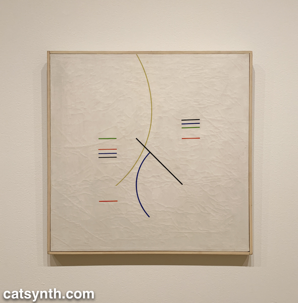
As in other parts of the world, South American artists embraced abstraction in the decades following World War II, with lines shapes of minimal color palettes. In his aptly named Curves and Straight Series, Argentine artist Alfredo Hlito takes this to an extreme with thin lines and curves against an off-white background, while Uruguayan artist María Friere used bolder lines and colors in her Untitled.
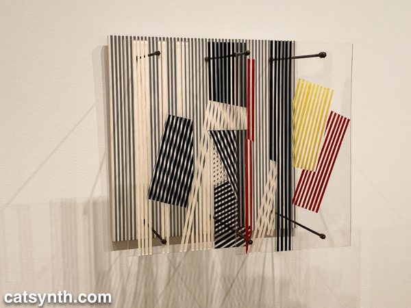
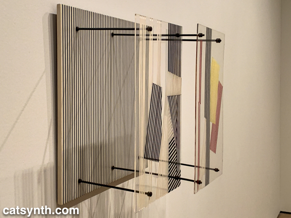
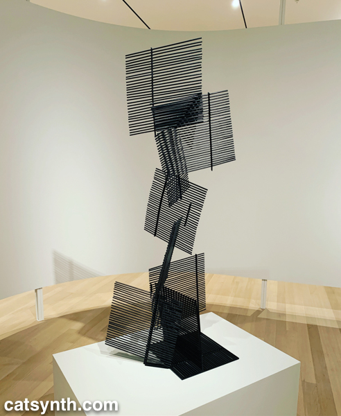
Both of these pieces feel like they could have been three-dimensional pieces of design, and in fact, the exhibition does include several striking three-dimensional works. When seen head-on, Jesús Rafael Soto’s Double Transparency appears to be a plat painting or print, but from the side the depth becomes apparent.
The lines-in-space motif is also used in Ocho cuadrados (Eight Squares) by Gertrud Goldschmidt, also known as Gego.
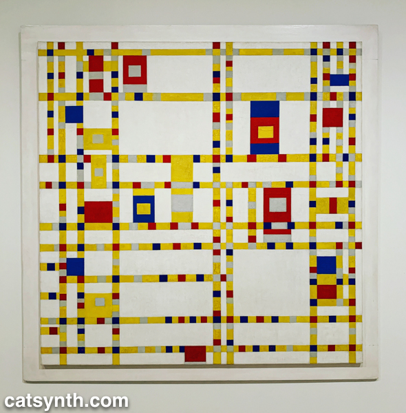
The recurring motifs in many of the works show the influence of Piet Mondrian, not just the most familiar neoplastic pieces but his earlier and later work as well. Indeed, I was happy to find Broadway Boogie Woogie hanging in this exhibition after not seeing it in the main collection display. As much as any work in MoMA’s permanent collection, I have a regard for this painting as if it were a friend and not just a work of art.
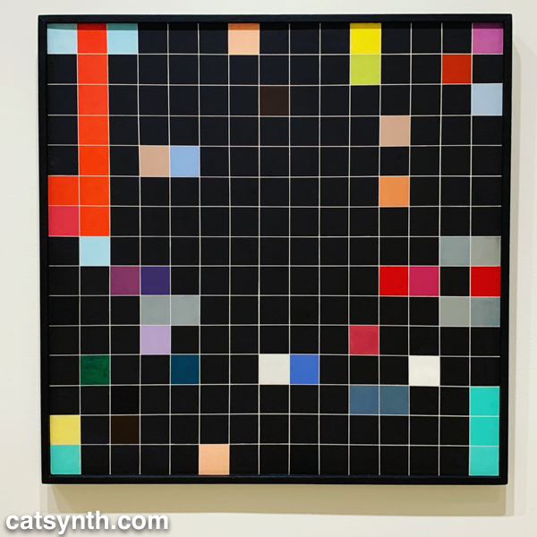
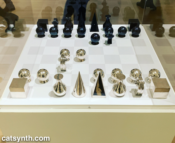
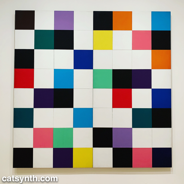
But perhaps the most extreme interpretation of the grid was found in Antonieta Sosa’s Visual Chess.
As part of its expansion, MoMA launched a new gallery space called the Marie-Josée and Henry Kravis Studio, or simply “the Studio”, a space dedicated for live, interactive, and multimedia art. The inaugural exhibit was Rainforest V, an evolution of David Tudor’s Rainforest. Originally a score for a collaboration with Merce Cunningham, it evolved into a performance installation. The latest version, realized by Composers Inside Electronics (CIE), is controlled by computer rather than live performers, as visitors wander through the space.
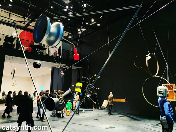
The installation is constructed from everyday objects, such as a metal barrel, a vintage computer hard disc, plastic tubing, wood crates, and more. The objects and materials are fitted with a vast array of speakers and become resonators that shape and amplify the sound.
The best moments are getting close to an object, such as the barrel or balsa-wood box with simulated earphones, and standing for a moment then walking around. I regret that an iPhone in a crowded gallery is not the best way to record and share it with readers – it really music be seen in person.
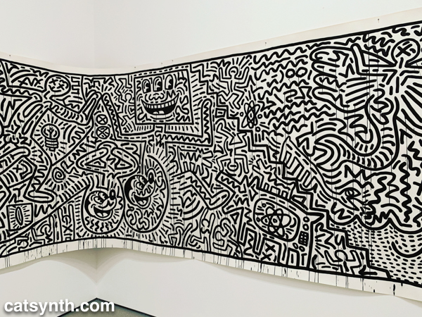
There was still more to see, including the newly expanded second-floor gallery for contemporary (1980s-present) works. This period has traditionally been a more mixed one for me, but there are gems and inspirations to be found. There was a large gallery-spanning work by Keith Haring.
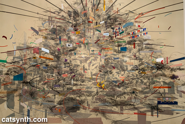
An equally monumental piece by Julie Mehretu called Empirical Construction: Istanbul a fantastic futuristic cityscape radiating in multiple dimensions.
On the opposite scale is Eduardo Kac’s Reabracadabra, a video piece realized as graphics inside a vintage Minitel terminal.
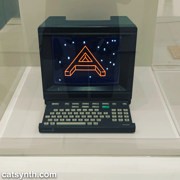
Kac’s piece reminded me of my interest in vintage electronics finding new life as dynamic art pieces.
We end with one panel from a larger work by the artist Zarina, Home Is A Foreign Place.
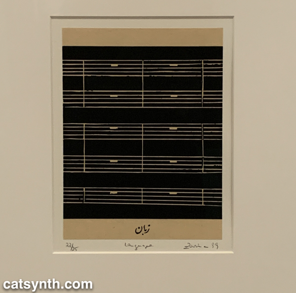
There is something bleak about an entire musical score made of rests, but also intriguing, and even curious. It is perhaps a reminder that exploring a museum top to bottom invites one to escape one’s comfort zones even at the same time as seeking comfort and solace. I’m glad this visit afforded opportunities for both.
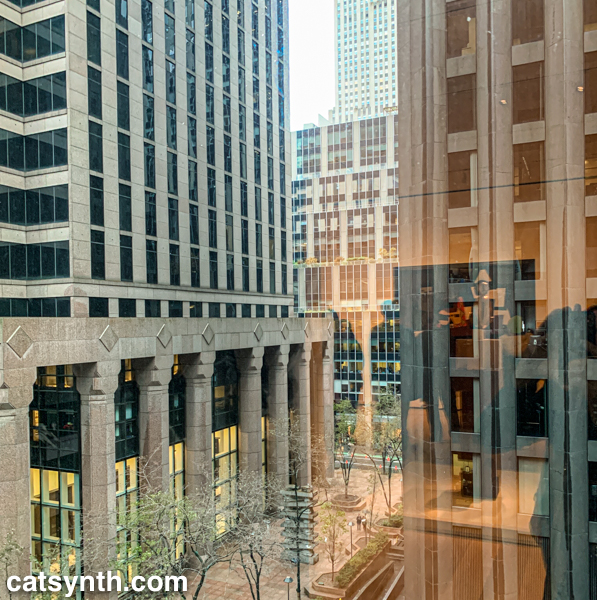
Through this window at the Museum of Modern Art in New York, the city itself becomes a work of art. The partial reflections add texture.
If you haven’t already done so, please check out Part 1 of our report from the newly renovated MoMA.
Most visits to New York include a stop at the temple of modernism, the Museum of Modern Art (MoMA). But this was my first visit since the massive multi-year expansion and renovation was completed. In some ways, it seems that not much has changed, but in other ways it has changed considerably, starting the members-only entranceway leading to a larger and more open lobby.
The second=floor atrium remains very much the same as it has been since the expansion in the early 2000s, a cavernous space looking up to all exhibition floors of the museum. It often is used to display monumental pieces or immersive performance works. Handles, a performance and sculptural piece by Haegue Yang combined both.
The name refers to the handles on all of the sculptural elements that allowed them to be slowly moved around the space by the performers. In between these motions, the performers gathered for vocal chanting that brought to mind the work of Pauline Oliveros. The sculptures and wall and floor elements had a simple geometric quality that reminded me of children’s building blocks. They also had bells and other sound elements mounted, again something that brought to mind Oliveros.
From the atrium, I always head immediately to the sixth floor and gradually work my way back down. The top floor featured Surrounds, an exhibition of large-scale installations by a diverse collection of contemporary artists. Some, like Mark Manders‘ Room with Chairs and Factory, were large singular pieces, with a gallery-sized replica of a factory. Others were large compositions of smaller elements. For example, Dayanita Singh‘s Museum of Chance was composed of numerous photograph prints made by the artist, assembled into large modular panels that could be easily rearranged in any number of configurations.
In his installation Architecture Is Everywhere, Sou Fujimoto challenges us to see the “architecture” in everyday objects. His installation is a field of small objects ranging from colored geometric design elements to potato chips placed on an array of pedestals.
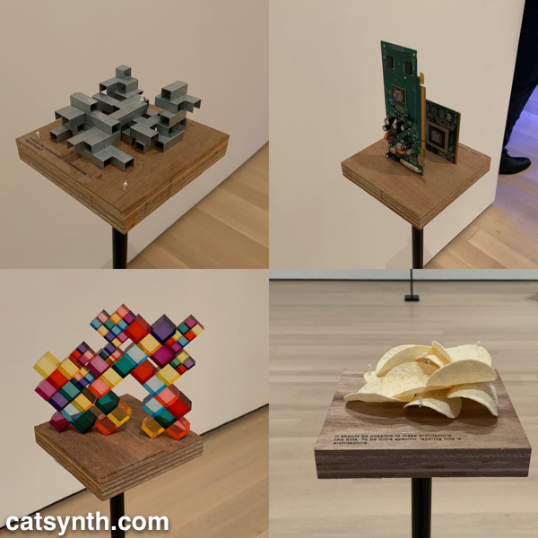
The “architecture” in each object is readily apparent when one is invited to see it. Even the potato chips are curvilinear forms that might be at home in a 1960s futurist public space.
Perhaps the most of fun of all the installations was Sarah Sze’s Triple Point (Pendulum). A colorful collection of everyday objects are arranged, somewhat precariously, around a circle as a pendulum swings freely above, threatening mayhem of destruction. However, that never happens and instead, we end up with an intricate but chaotic dance.
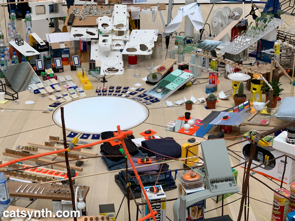
The name of the piece, which derives from the “triple point” where water can exist simultaneously as ice, liquid, and vapor, illustrates the sense mix of chaotic and coexistence in the installation.
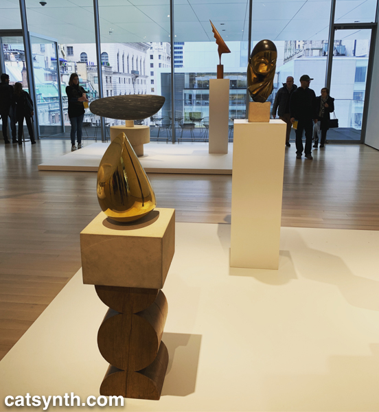
Descending to the fifth floor, some of the changes to the museum became more apparent. The terrace cafe overlooking the sculpture garden had been removed (actually, moved to a new location on the sixth floor), and replaced by an open gallery space showing various sculptures by Constantin Brancusi.
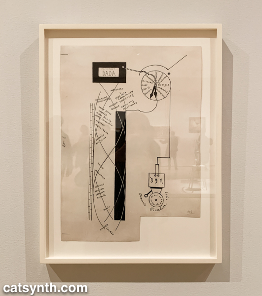
The remainder of the fifth floor and the entirety of the fourth floor housed an expanded and increasingly labyrinthine set of galleries for the permanent collection. The first gallery, which featured the oldest and most traditional works such as Van Gogh and Matisse, was by far the most crowded space in the entire museum. I quickly left to find some more open spaces and truly modern works, which began to appear in the 1910s and 1920s. In addition to Dada favorites, there were works celebrating machines, industry and the break with traditional forms of painting. Francis Picabia’s Dada Movement and Man Ray’s chess set are exemplars of these directions.
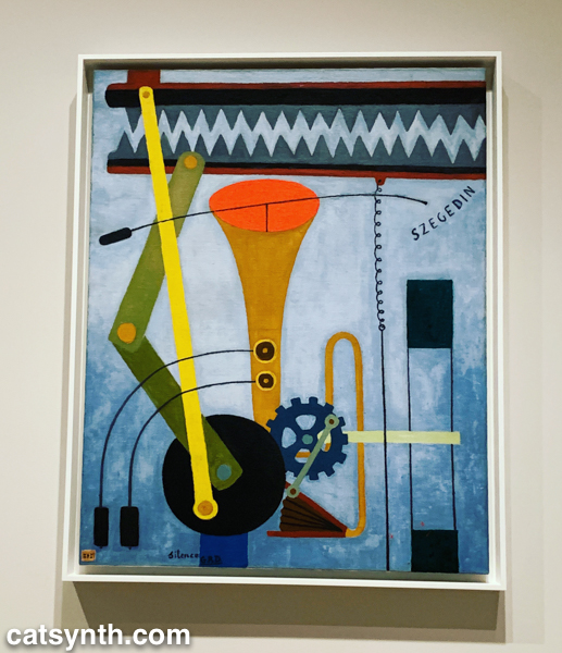
Georges Ribemont-Dessaignes‘ Silence depicts a musical instrument attached to machinery, perhaps speaking to the contradictory nature of music made by machines.
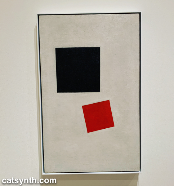
There was also a lively world of modernism and abstraction in Russia before the 1917 revolution, as exemplified by Kazimir Malevich’s minimalist Supremacist Composition: Airplane Flying.
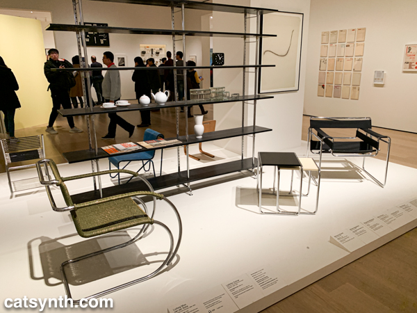
The expanded galleries included a room of design pieces from the interwar period (these were previously displayed in the separate design gallery on a rotating basis).
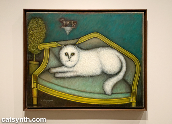
There was also a new space devoted to so-called “outsider artists” of the period, including Morris Hirshfield. I was particularly drawn to his portrait of a white cat titled Angora Cat.
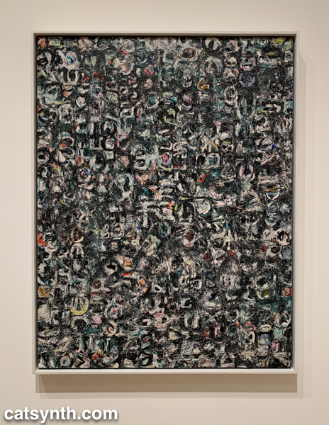
The collection continued on the fourth floor with the period between the end of World War II and the 1970s. This is usually my favorite section to linger in, with many iconic works of the 20th century. The Jackson Pollock’s are of course back on full display, but so is Lee Krasner, who is finally getting her due as a leading abstract expressionist painter.
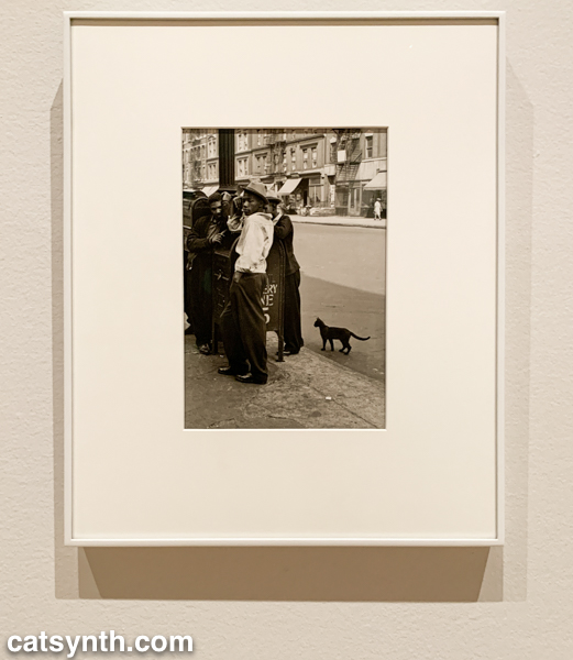
The expanded galleries have given more room for women and other underrepresented artists. The photography of Helen Levitt was featured in a room that also included artists depicting life in Harlem in the 1950s. I particularly liked this photograph of hers with a black cat.
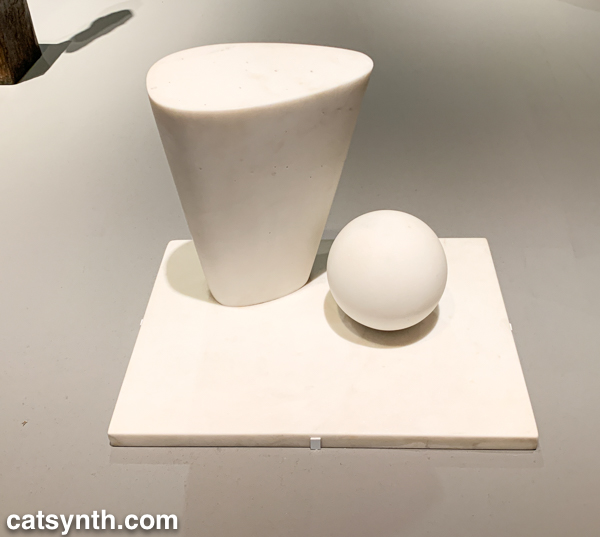
This sculpture by Barbara Hepworth is quite minimal, with the perfection of the sphere balancing with the “squishier” curves of the taller element.
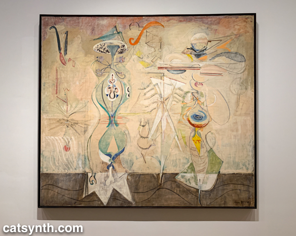
There were also pieces that showed the works of artists beyond their most well-known. I would not have guessed this painting with other-worldly plant-like creatures as the work of Mark Rothko were it not for the title card.
There were of course pieces that did exemplify artists as we know them. Ellsworth Kelly had large geometric blocks of color, as one would expect.
I looked around these galleries in vain for perhaps my favorite work in the collection, Piet Mondrian’s Broadway Boogie Woogie – it’s like visiting an old friend when I see it – but it was nowhere to be found. [Spoiler alert: I did eventually find it and it will be featured in Part 2 of this series.]
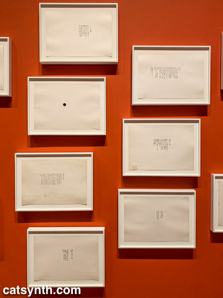
As we move into the late 1950s and the 1960s, abstract expressionism gives way to more conceptual art and works in different media. This was the beginning of Fluxus, with its instructional pieces, happenings, and ephemeral works on cheap materials. There was an entire wall of “scores” for performance works by Yoko Ono. These are always fun – most have clear instructions that one could use to perform them today, though I wonder what was expected from the large black dot.
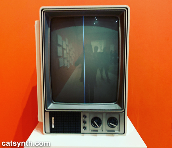
This is also the era of Nam Jun Paik’s experiments with analog video. Zen for Television takes video art to its most minimal, with a single line of a continuous signal on the screen. However, the vintage television set itself becomes a specific idea when viewed in the 21st century.
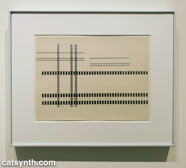
Abstract designs persist in this period, but also take on an industrial and repetitive nature. Sol Lewitt takes this to the extreme, but others Geraldo de Barros left room for variation, and perhaps to the works on paper from Fluxus.
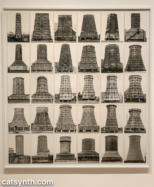
Among my favorite photographers of this period are Hilla and Bernd Becher. There work depicting old industrial buildings and placing them into artistic compositions has been a huge influence on my own photography.
Even after this whirlwind through three floors, seven decades, and multiple exhibits, there was still much of the museum to cover; and I was determined to cover the entirety in one day. In the end, I succeeded, and the remainder of the visit will be covered soon in Part 2 of this series.
It’s one of those serendipitous moments that happen in New York. At the end of last week’s Ambient Chaos show, I received an invitation from Neb Ula the Velvet Queen to come to LadyJams is a monthly get-together where women get together and perform in randomly selected groups. I loved the idea, and especially the coincidence of this meeting; so on Friday I grabbed my trusty Arturia MicroFreak and headed out on the L train to Bushwick.
The festivities took place at Synesthesia, a gallery and art space in the apartment of Mio Nakai. Amidst objects and curios from the turn of the 20th century – and an old-fashioned bar to match – was an exhibition of sculptures that evoked both a delicate graceful quality and a confounding misplacement of human forms. It was in the midst of this milieu that Ladyjams unfolded.
I made some more new friends that evening, including Laura Feathers, Teena Mayzing, and Yana Davydova, who performed on electronics, voice, and guitar, respectively. I performed with them and others over the course of the evening in several miniature improvised sets. You can hear an example in this video.
This truly spur-of-the-moment music, as I had never performed with any of these artists before. The MicroFreak was definitely the right choice of instrument, given its versatility and immediacy (as well as being extremely light). I had some light melodic spacey touches, as well as deep bass pedal tones and various sound effects. I particularly enjoyed a call-and-response with Yana Davydova on guitar – we both were able to match one another’s melodic fragments and respond with variations that moved the performance forward. I also tried to choose sounds and notes to complement the words of Teena Mayzing and others during vocal sections.
Neb Ula and I also had a chance to perform together, as seen in the photo above and following video clip.
Although New York – and perhaps Brooklyn in particular – is an exceptionally fertile place for an event like this, I am left wondering why not try to do something similar in San Francisco? I certainly know enough women and non-binary performers to make it a possibility, so perhaps it will happen.
It is that time of year when I invariably return home to New York for a visit. And this time it began in dramatic fashion with a return to the Ambient Chaos music series at Spectrum. Perhaps not quite a return, as Spectrum as since moved to a new location on the waterfront in Brooklyn. But it was still the same concept, hosted by Robert L. Pepper of Pas Musique, with a variety of local and visiting musicians performing adventurous electronic music.
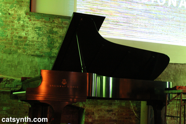
The evening opened with a duo featuring Public Speaking (aka Jason Anthony Harris) and pianist Gabriel Zucker.
The unfolded in with sparse but structured piano set against electronic sounds evoking metal machinery. Both elements started out slow and quiet with lots of empty space but increasingly got more dense and urgent. After a brief interlude, a new phase of the music began with vocals set against fast piano runs. The vocals began very expressive and plaintive but soon morphed into a complex electronic sound under vocal control. Underneath this, an incessant thudding drum emerged.
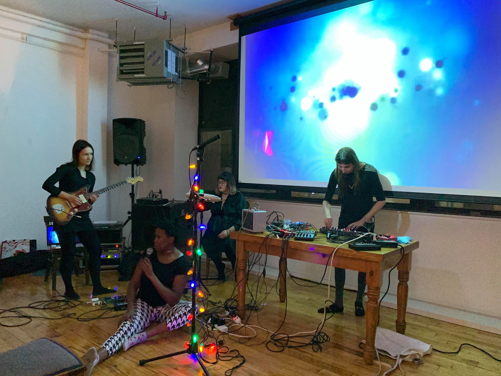
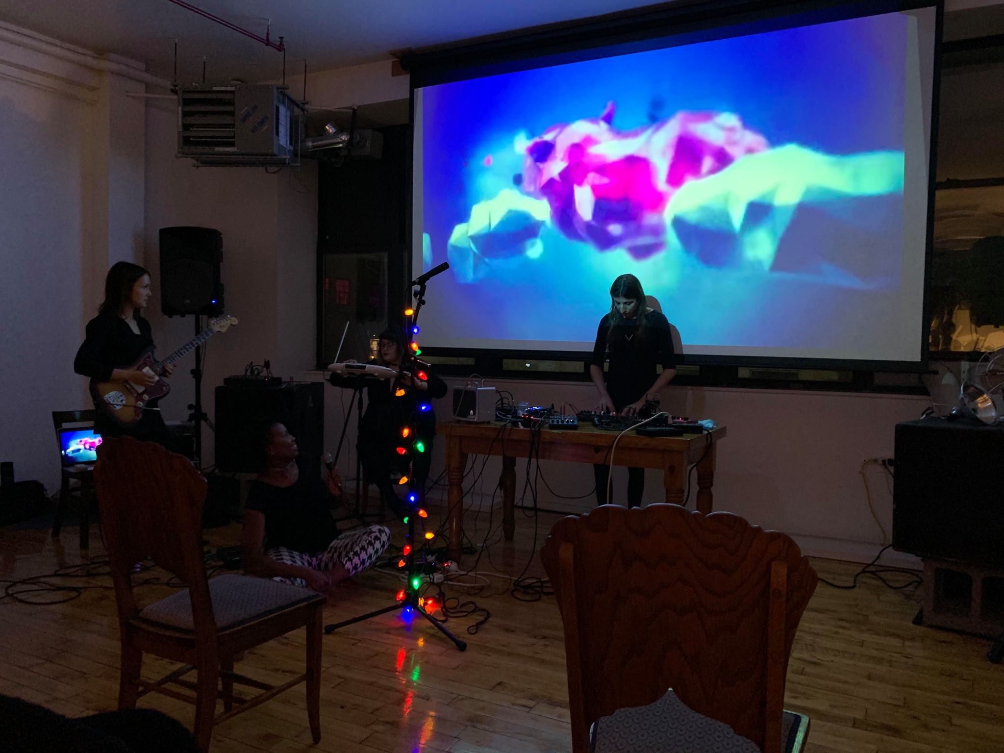
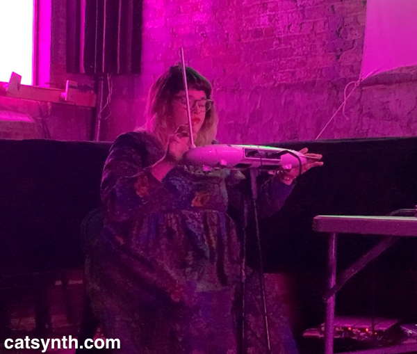
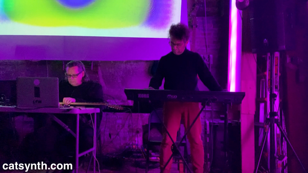
Next up was The Tony Curtis Experience, a trio led by Damien Olsen on keyboard and electronics, Jeremy Slater on guitar and electronics, and Neb Ula the Velvet Queen on theremin – specifically, a Moog Theremini with which we at CatSynth are quite familiar.
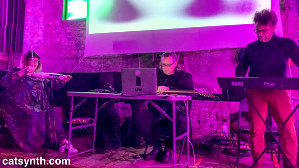
Their performance mixed long tones on theremin, slide guitar + electronics, and synthesizer pads with loud percussive moments. The early portion of the set evoked some fantastic futuristic nightclub with crystalline hits and pedal tones. But Olsen’s keyboard brought it back to the present and near past with melodic and harmonic playing reminiscent of mid-20th century cabaret as well as synth-pop of the 1980s. The theremin, acting as both sound source and controller, provided antiphonal counter-subjects to these familiar sounds; and the guitar drones glued everything together. It was a fun set, especially with Olsen’s playful performance and his use of familiar idioms.
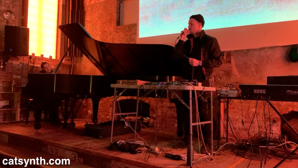
Then it was my turn to take the stage. And I compacted the setup for travel, with the Arturia MicroFreak, laptop, Novation LaunchPad Pro, tiny modular with Qu-bit Prism and Strymon Magneto, a new handmade touch synthesizer, and Crank Sturgeon Pocket Gamelan.
I planned a slimmed-down version of my solo set from the Compton’s Cafeteria Series show in August, including White Wine and an evolving improvisation over an 11/8 groove.
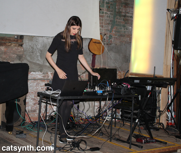
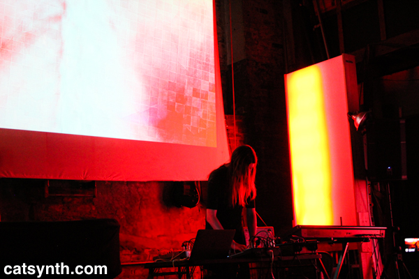
Overall, the set went well – a highly dynamic performance with a lot of melodic elements, jazz riffs, and noise solos layered over rhythms. A few items misfired, but all recoverable. I particularly enjoyed the sections of melody and jazz improvisation where I floated back to the sounds of the 1970s; it seemed the audience appreciated that, too. Finally, it was also just fun to be playing in New York again after an extended break. Watching the video of the set (which will be shared soon as an episode of CatSynth TV), I particularly thought this noisier and more “electronic” version of the 2019 set worked well in Spectrum and especially with the every-changing “spectrum” of light from yellow to violet and everything in between.
The final set of the evening featured 4 Airports, a duo of guitarist Craig Chin and synthesist Nathan Yeager. Chin performed with guitar and an array of pedals, while Yeager brought a large synthesizer setup complete with a modular system.
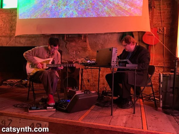
Perhaps more than the preceding sets, they lived up to the “ambient” in Ambient Chaos. Chin’s guitar gestures were subtle as he guided the sound into the electronic arena of the pedals, and Yeager’s synthesizer sounds were complex but still lending themselves to long ideas even when the tones and timbres moved between quick and slow. From the chaotic undertones and singular and dreamy landscape emerged, with occasional ebbs and flows and punctuations.
Overall, it was a wonderful night of music in this corner of the Brooklyn waterfront, with an intimate crowd in the cavernous but cozy space. I would also be remiss if I did not give a shout out to Sofy Yuditskaya for her video projections that reflected the music on stage. I certainly hope the gap until my next performance here is much shorter than the last.
[Photos by Banvir Chaudhary and Amanda Chaudhary]
[Full video coming soon. Please subscribe to CatSynth TV to be noticed when it is available.]

The West Village is an odd place. Streets cross one another at odd angles, leading to situations where numbered streets intersect, and small triangular slivers of park space emerge. One such location is the park where Christopher Street, Grove Street, West 4th, and 7th Avenue all meet.
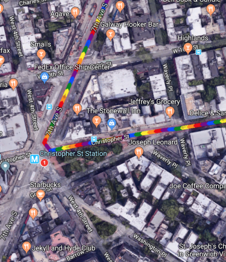
It’s a sliver of a park, but it includes the Christopher Street subway stop for the 1 IRT, a stop I have found most useful in recent years. And this angular collision of roads also has another significance.
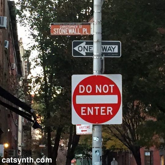
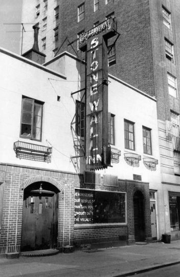
On the northern side of Christopher Street is the Stonewall Inn. The riots 50 years ago turned from a notorious Mafia-run bar for the most outcast members of the queer community to perhaps the sacred site in the world for the LGBTQ community and members of sexual minorities.
As people converge on lower Manhattan for New York Pride and World Pride – and we gather ourselves here in San Francisco, it’s worth looking back at what happened 50 years ago.
The age of the clientele ranged between the upper teens and early thirties, and the racial mix was evenly distributed among white, black, and Hispanic patrons.[57][59] Because of its even mix of people, its location, and the attraction of dancing, the Stonewall Inn was known by many as “the gay bar in the city”.[60] Police raids on gay bars were frequent—occurring on average once a month for each bar. Many bars kept extra liquor in a secret panel behind the bar, or in a car down the block, to facilitate resuming business as quickly as possible if alcohol was seized.[8][10] Bar management usually knew about raids beforehand due to police tip-offs, and raids occurred early enough in the evening that business could commence after the police had finished.[61] During a typical raid, the lights were turned on, and customers were lined up and their identification cards checked. Those without identification or dressed in full drag were arrested; others were allowed to leave. Some of the men, including those in drag, used their draft cards as identification. Women were required to wear three pieces of feminine clothing, and would be arrested if found not wearing them. Employees and management of the bars were also typically arrested.[61] The period immediately before June 28, 1969, was marked by frequent raids of local bars—including a raid at the Stonewall Inn on the Tuesday before the riots[62]—and the closing of the Checkerboard, the Tele-Star, and two other clubs in Greenwich Village.[63][64]
https://en.wikipedia.org/wiki/Stonewall_riots#Stonewall_Inn
What is notable is what the offenses were. The issues were not so much sexual practices as traditional gender norms. Women without at least three pieces of feminine clothing, men in drag were the targets. And khas vishalom they might even be dancing! It was all about control and conformity. I look back at it with a mixture of bewilderment, pity, disgust, and even contempt for people who were frightened and upset by these behaviors that they would criminalize it violently. And lest we get too smug, violence continues to this date in the United States, most notably the murders transgender women of color. And the attack on conformity is something to be celebrated rather than resisted – indeed that was part of what attracted to this world decades before I knew that I myself was a member of its motley lot.
Many are using the occasion of the 50th anniversary to remind everyone that Stonewall was a riot, a moment of fighting back, rather than simply a large parade. But the parades and celebrations are great, too, as a reminder of what has changed. Indeed, one of the most criticized elements of Pride in this decade of the 21st century is just how commercial and “corporate” it has become. Sure, it’s tacky at times and easy to be cynical about some corporations’ motives. But the point is that mainstream businesses want to be seen as being on the side of the LGBTQ community, the “right” side, and the “profitable” side. One day it will be those who were so frightened by and bothered by these expressions of love and individual identity that they must respond with violence and law who will be pushed to the margins. And push them we shall, but it a way that still preserves their dignity and individuality, lest we end up making similar mistakes.