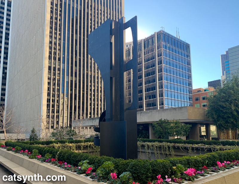
From the desert we return to one of my favorite spots in San Francisco, Embarcadero Center.
An office building plaza where I used to enjoy stopping and sitting. It felt so…urban. It was good to visit again recently after a long hiatus.
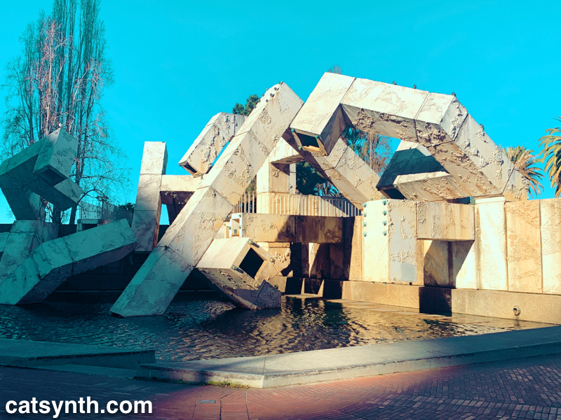
The Vaillancourt Fountain at Embarcadero Center. Another image from the same magical day in San Francisco as our previous two Wordless Wednesdays.

As we count down to the start of Passover, we look back at my visit to the Museum of Jewish Heritage in New York last November. The Garden of Stones is a living memorial to the holocaust, with an arrangement of trees and stones that complement and contrast the architecture of the building. From this perspective, they also frame 1 World Trade Center quite nicely.