Fun with Highways: Christopher Street, New York

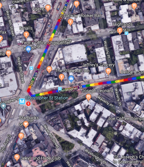
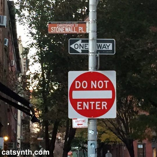
The West Village is an odd place. Streets cross one another at odd angles, leading to situations where numbered streets intersect, and small triangular slivers of park space emerge. One such location is the park where Christopher Street, Grove Street, West 4th, and 7th Avenue all meet.

It’s a sliver of a park, but it includes the Christopher Street subway stop for the 1 IRT, a stop I have found most useful in recent years. And this angular collision of roads also has another significance.

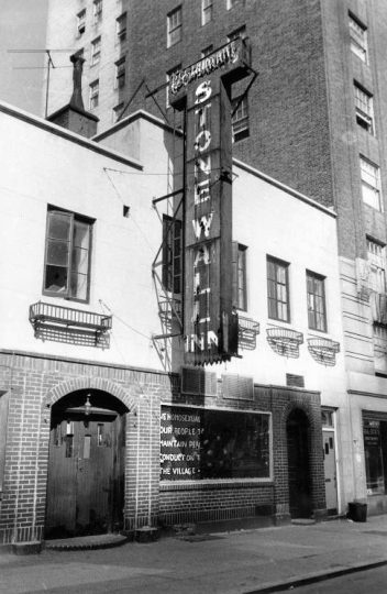
On the northern side of Christopher Street is the Stonewall Inn. The riots 50 years ago turned from a notorious Mafia-run bar for the most outcast members of the queer community to perhaps the sacred site in the world for the LGBTQ community and members of sexual minorities.


Stonewall Inn
, site of the 1969 Stonewall riots, New York City, USA On the Window: „We homosexuals plead with our people to please help maintain peaceful and quiet conduct on the streets of the Village—Mattachine“ (Source: David Carter: Stonewall: The Riots that Sparked the Gay Revolution, St. Martin’s Press, 2004, ISBN 0-312-34269-1, S. 143)

As people converge on lower Manhattan for New York Pride and World Pride – and we gather ourselves here in San Francisco, it’s worth looking back at what happened 50 years ago.

The age of the clientele ranged between the upper teens and early thirties, and the racial mix was evenly distributed among white, black, and Hispanic patrons.[57][59] Because of its even mix of people, its location, and the attraction of dancing, the Stonewall Inn was known by many as “the gay bar in the city”.[60] Police raids on gay bars were frequent—occurring on average once a month for each bar. Many bars kept extra liquor in a secret panel behind the bar, or in a car down the block, to facilitate resuming business as quickly as possible if alcohol was seized.[8][10] Bar management usually knew about raids beforehand due to police tip-offs, and raids occurred early enough in the evening that business could commence after the police had finished.[61] During a typical raid, the lights were turned on, and customers were lined up and their identification cards checked. Those without identification or dressed in full drag were arrested; others were allowed to leave. Some of the men, including those in drag, used their draft cards as identification. Women were required to wear three pieces of feminine clothing, and would be arrested if found not wearing them. Employees and management of the bars were also typically arrested.[61] The period immediately before June 28, 1969, was marked by frequent raids of local bars—including a raid at the Stonewall Inn on the Tuesday before the riots[62]—and the closing of the Checkerboard, the Tele-Star, and two other clubs in Greenwich Village.[63][64]

https://en.wikipedia.org/wiki/Stonewall_riots#Stonewall_Inn

What is notable is what the offenses were. The issues were not so much sexual practices as traditional gender norms. Women without at least three pieces of feminine clothing, men in drag were the targets. And khas vishalom they might even be dancing! It was all about control and conformity. I look back at it with a mixture of bewilderment, pity, disgust, and even contempt for people who were frightened and upset by these behaviors that they would criminalize it violently. And lest we get too smug, violence continues to this date in the United States, most notably the murders transgender women of color. And the attack on conformity is something to be celebrated rather than resisted – indeed that was part of what attracted to this world decades before I knew that I myself was a member of its motley lot.

Many are using the occasion of the 50th anniversary to remind everyone that Stonewall was a riot, a moment of fighting back, rather than simply a large parade. But the parades and celebrations are great, too, as a reminder of what has changed. Indeed, one of the most criticized elements of Pride in this decade of the 21st century is just how commercial and “corporate” it has become. Sure, it’s tacky at times and easy to be cynical about some corporations’ motives. But the point is that mainstream businesses want to be seen as being on the side of the LGBTQ community, the “right” side, and the “profitable” side. One day it will be those who were so frightened by and bothered by these expressions of love and individual identity that they must respond with violence and law who will be pushed to the margins. And push them we shall, but it a way that still preserves their dignity and individuality, lest we end up making similar mistakes.

I.M. Pei in Suzhou and Beyond

The second of our remembrances focuses on the architect I.M. Pei, who passed away this week. A true champion of modernism worldwide, I have admired his work both from afar and close up.

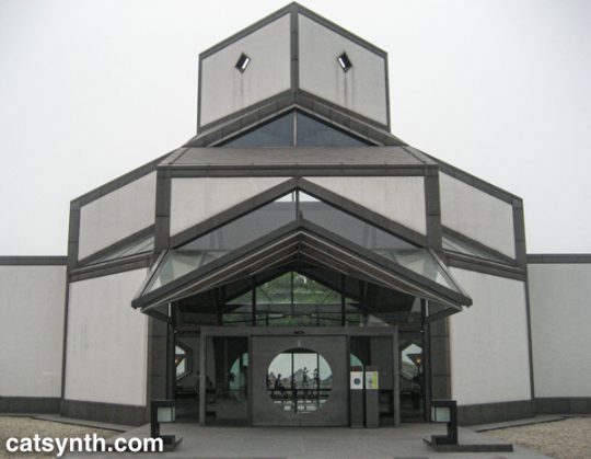
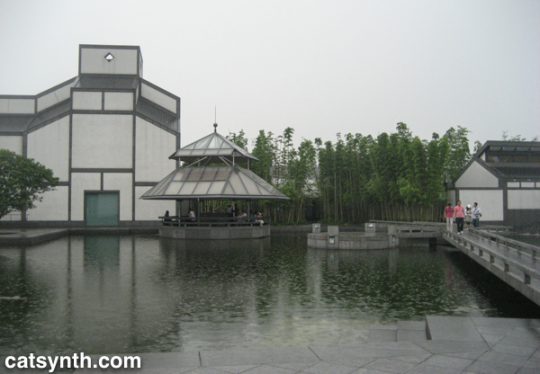
Perhaps the most vivid memory with his work was from the Suzhou Museum in Suzhou, China. It may not be his best known work, but it is a masterpiece in itself and a love letter to his hometown.

The exterior facade combines Pei’s trademark geometry and minimalism with more the more traditional designs and tropes of an adjacent palace and Suzhou’s famous gardens. It also makes extensive use of water as an architectural element both inside and outside the building.

The simple geometric shapes, as well as the use of water, stone, and glass, gave the entire complex a very warm and welcoming feeling, even as the rain came down around me. Inside, the simplicity of the galleries left ample mental space to enjoy the exhibits and artifacts, while the atrium was a work of art itself.

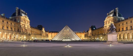
I admire the way he often brought modernist aesthetics and principles to traditional spaces. This is perhaps most dramatically seen in his glass pyramid that anchors the Louvre Museum in Paris.

Napoleon courtyard of the Louvre museum at night time, with Ieoh Ming Pei’s pyramid in the middle. Benh LIEU SONG [CC BY-SA 3.0], via Wikimedia Commons

The pyramid is perfect, a stark contrast to the severe facades around it, and perfectly balanced in size and space. While I know many traditionalists have hated on this addition over the years, I for one love it. I am an unapologetic modernist and often find myself sparring with traditionalists even here in San Francisco.

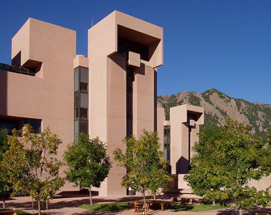
Pei’s modernism was intended to integrate with its surroundings, even as it stood in contrast to it. For example, he wanted his stark geometric design for the Mesa Laboratory at the National Center for Atmospheric Research (U.S.A.) to look “as if it were carved out of the mountain”.

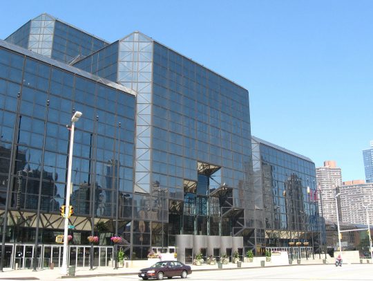
Until reading others’ tributes and remembrances, I had forgotten about his role in the Javits Center in New York, a building I am quite familiar with both inside and out. It is a massive and imposing structure but crisscrossed with triangular details that remind me of the Suzhou Museum (built 20 years later). The project was plagued by challenges and controversies, and “during the inauguration ceremonies, however, neither [James] Freed nor Pei was recognized for their role in the project.” [source]

Jim.henderson [Public domain], via Wikimedia Commons

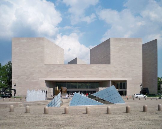
Triangles do seem to be a major recurring theme in his work, and perhaps part of why it appeals to me even within the scope of other modernists. Triangles are powerful and strong, and the often stand out in Western spaces dominated by rectangles. These elements also played a role East Building for the National Gallery in Washington, D.C., a project is loved by many, but similar to the Louvre, criticized by some traditionalists.

The building is a masterpiece of minimalism. Even some of those traditionalist critics have grown to love it in the years since it opened in 1978. And it serves its purpose, both as a home to art and a work of art itself.

The growing popularity of art museums presented unique challenges to the architecture. Mellon and Pei both expected large crowds of people to visit the new building, and they planned accordingly. To this end, he designed a large lobby roofed with enormous skylights. Individual galleries are located along the periphery, allowing visitors to return after viewing each exhibit to the spacious main room. A large mobile sculpture by American artist Alexander Calder was later added to the lobby.[93] Pei hoped the lobby would be exciting to the public in the same way as the central room of the Guggenheim Museum in New York. The modern museum, he said later, “must pay greater attention to its educational responsibility, especially to the young.”[94]

https://en.wikipedia.org/wiki/I._M._Pei#National_Gallery_East_Building,_Washington,_DC

Defending modernism, even after a century, remains a tireless job. As we lose champions like I.M. Pei, it falls to those of us in later generations to make sure this beauty is preserved and celebrated.

Kwang Young Chun Aggregations and Infinite Blue, Brooklyn Museum

After seeing Kwang Young Chun’s Aggregations at Sundaram Tagore Gallery (read our review of that show), I knew I needed to check out his solo exhibition at the Brooklyn Museum. I expected more of the same style of abstract triangulated paper constructions, but on a larger scale. And I was not disappointed.

Kwang Young Chun: Aggregations. Installation view.

These large other-worldly constructions are formed from small tightly folded prisms of mulberry paper.  This thin and delicate paper is prized as an artistic material but also has mundane uses as wrappers.  Chun primarily sources his paper from old books.

Close-up of Aggregation 15-JL038 . Kwang Young Chun

The freestanding central piece, which I believe was Aggregation 15-JL038 (his titles all rather cryptic alphanumeric combinations), was particularly intense and seemed like a cratered surface of a large asteroid. The remaining pieces were wall-mounted, but still combined light and shadow, roughness and smoothness, in a similar way.

Aggregation 09-D071, Blue (2009)

There is something I find deeply captivating about Chun’s sculptures. They seem like something I might have generated on the computer, but they are made of paper. They seem solid and heavy, but fragile at the same time. I also liked the juxtaposition of blue with the otherwise grayscale elements. I found myself sitting in the middle of the gallery and contemplating each of them for a long time, longer than I usually sit with individual pieces on a whirlwind trip through a museum.

Aggregation 17-NV089 (2017)

Blue seemed to be the color of the day. Even before reaching Kwang Young Chun’s exhibition, I was greeted by Infinite Blue, a survey of art and design objects from the museum’s collection.

Installation view

I have long been drawn to blue – along with purple, it is a color I welcome into my own art and design, and one of the few colors that I wear. It’s also historically a rarer color and one that is not often found in nature (other than the blue tint of the sky and water). The exhibition goes through different places and periods of art and craft incorporating blue, often juxtaposing traditional objects with contemporary art. For example, the Chinese porcelain in the image above was paired with contemporary paintings by Chinese artist Su Xiaobai.

Su Xiaobai. Moonlight Halo, 2013.

I tend to be most drawn to objects that are more abstract and geometric. As such, the section featuring 19th-century American decorative arts did nothing for me. By contrast, I enjoyed seeing a Korean 19th-century porcelain bottle with 20th-century American designs in blue glass.

Installation views

I do, however, have a soft spot for fish.

The most powerful element tying the entire exhibition together was the opening piece, one of Joseph Kosuth’s neon text works 276 (On Color Blue).

Joseph Kosuth. 276 (On Color Blue), 1993.
And this is perhaps a fitting way to close this article. There was more to see and share from this visit to the Brooklyn Museum, but we shall save that for a subsequent article.

Toward a Concrete Utopia: Yugoslavian Brutalism at MoMA

We at CatSynth are admirers of brutalism, as anyone who follows us on Twitter can attest.  We love the geometric forms, how it screams “modern”, and how it makes such an intense break with tradition.  And I will admit, I also have a little fun using it to poke fun at the architectural conservatism prevalent in places like San Francisco.  But above all, it provides a singular beauty to built spaces.

Brutalism perhaps reached its zenith in the former Yugoslavia during the period between the end of World War II and 1980, a period that is highlighted in a current exhibition at the MoMA, Toward a Concrete Utopia: Architecture in Yugoslavia, 1948–1980.  It highlights the work of several Yugoslavian architects in the period and pieces ranging from prosaic apartments to public arenas to monuments.  The buildings themselves are, of course, not on display in the museum, but their stories are told through models, photographs, and examples of interior objects.


Installation view of Toward a Concrete Utopia: Architecture in Yugoslavia, 1948–1980, The Museum of Modern Art, New York, July 15, 2018–January 13, 2019. © 2018 The Museum of Modern Art. Photo: Martin Seck

A convergence of factors came together which allowed these modernist experiments to flourish.  Yugoslavia broke away from the Soviet bloc in 1948 and began to forge its own socialist path and identity.  It constituted itself as six republics in a federation in which traditional regional identities were subordinate to a new and modern whole.  At the same time, the country was devastated by World War II and needed massive rebuilding.  Finally, new ideas in architecture were emerging along with new materials, notably advances in concrete, steel, and glass allowed a new built environment to take shape.
The simple forms and surfaces were used for everyday buildings, such as apartment complexes, schools, and medical facilities.  But rather than just one-offs, they become part of a unified cityscape, a grand plan.  This was perhaps no more so than in Skopje, the capital of Macedonia, which was devasted by an earthquake in 1963 and largely rebuild using modernist design and principals.

Janko Konstantinov. Telecommunications Center. 1968–81. Skopje, Macedonia. View of the Southwestern Block façade. Photo: Valentin Jeck, commissioned by The Museum of Modern Art, 2016
MARKO MUŠIČ.  Photograph by VALENTIN JECK
Ss. Cyril and Methodius University Campus, Skopje, Macedonia 1967–1974.  (Gotta love an architect named “Music”)

There are, of course, numerous rectilinear designs, sometimes in steel and glass, and sometimes dominated by concrete.  But concrete also allowed for the exploration of curved structures and organic shapes.  We see this in many of the large civic arenas, but also in the brutalist monuments built in the post-war period.  This “cell-like” structure in Macedonia takes it to the extreme, looking at once like an organic organism and a spaceship.

Wandering through the exhibition, one cannot help but imagine being the real spaces.  For me, the modernist, severe style brings a sense of calm and welcome that more traditional styles don’t always provide.  Ornament can be beautiful, but it is rarely ever calming in the way that simple texture and geometry is.  The calming nature of simple forms can extend to the interior spaces as well as the exterior, and the exhibition includes examples of everyday objects and furnishings.

Installation view of Toward a Concrete Utopia: Architecture in Yugoslavia, 1948–1980, The Museum of Modern Art, New York, July 15, 2018–January 13, 2019. © 2018 The Museum of Modern Art. Photo: Martin Seck

Sadly, the Yugoslavian experiment ultimately failed, with country breaking apart and the entire region plunging into extreme nationalism and devastating wars in the 1990s.  This is a cautionary tale as we watch the plague of nationalism rising around the world, including in the United States.  Many of the architectural works in this exhibition did survive the wars.  But they do face continued challenges to their survival, including maintenance and a push to return to more “traditional” forms.  The “Skopje 2014” initiative, for example, is both farcical and tragic.  Despite these challenges, I hope the countries of the region will recognize and preserve the legacy of their modernist period for years to come.

This article only scratches the rough, hardened surface of the wealth in this exhibition.  It was truly a wonderful experience, even if so much was in my imagination through the artifacts.  Toward a Concrete Utopia: Architecture in Yugoslavia, 1948–1980 will be on display at the Museum of Modern Art in New York through January 13, 2019.