In August I had the opportunity to take a private curator-led tour of the Present Tense Biennial exhibition at the Chinese Culture Center here in San Francisco before it closed on August 23. The exhibition was a joint project of the Chinese Cultural Center and the Kearny Street Workshop and included 31 artists with works that interpreted contemporary Chinese culture. There was no single direction or theme to these interpretations. There were plays on Chinese language, heritage, stereotypes, geography, artistic techniques, history and iconic objects.

[Nostalgia No 24
by Maleonn. Image courtesy of the CCC online gallery. Click image to enlarge.]
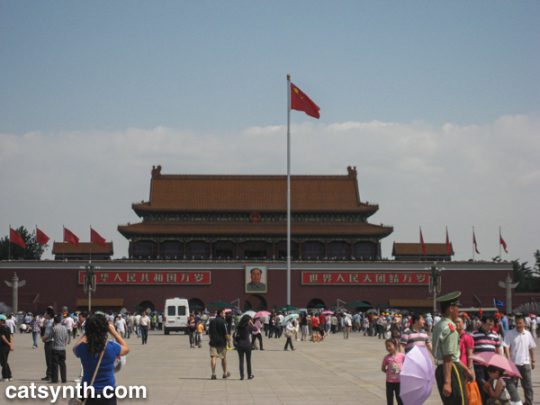
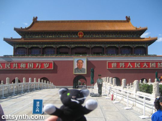
The above image, featured on the posters for the exhibition, is a photograph entitled Nostalgia No. 24 by Chinese artist Maleonn. It features a young man looking at a miniature model of the Tiananmen Gate in Beijing.

[Manuscript of Nature V
by Cui Fei. Courtesy of CCC online gallery. Click image to enlarge.]
In keeping with the exhibition title of “Chinese Character”, several works dealt with plays on language. For example, the New-York-based artist Cui Fei’s Manuscript of Nature V was a large wall installation composed of plant tendrils resembling Chinese calligraphy. It was immediately reminiscent of handwritten Chinese characters (as I had seen many times in my recent visits); however, this was an entirely made-up character set.
Tamara Albaitis presented an audio and sculptural installation, with two planar arrays of speakers. Each speaker played a human voice uttering sounds (not strictly phonemes, but vowels, consonants, diphthongs, etc.) from various languages. On one side were sounds from languages arranged strictly horizontally (e.g., English and other Indo-European languages) while on the other were languages that could be written vertically, such as several East Asian languages. One could walk through the middle of the installation, with each bank as a “wall” of linguistic sounds, or around the outside. Out of context, it was not easy to distinguish the sounds from one language or another. One could use directional cues to determine whether a language was “horizontal” or “vertical”, but that served more to demonstrate similarities or “confusion” among languages.
In addition to the plays on language, these pieces were in the minority that I would consider to be “modern art” (rather than more loosely defined “contemporary art”). Another was Larry Lee’s Endless column takes a simple and familiar object, the traditional porcelain rice bowl,and arranges them in an “endless column” of spheres that extend from the base to the ceiling of the gallery. From a distance, it appears as a large piece of modernist abstract art, and the rice bowls are purely there for their shape and texture, rather than their function. However, the detail and functional context of the bowls are an interesting contrast to some of Lee’s other abstract sculptures (some of which can be seen at the CCC online gallery) with the simple geometry and solid colors that are the norm for abstract art.
Among my favorite photographs in the exhibition were Thomas Chang’s images of a Chinese-government-sponsored project in the United States that did not go so well. Spendid China was a theme park in Orlando, Florida (where else could it be?) that featured to-scale models of great Chinese monuments, including the Great Wall and others. The park closed in 2003, after which it became a frequent target of vandalism and fell into disrepair. Chang’s photographs document the ruins. I have a long-standing interest in ruined buildings, particularly as they appear in the context of a modern city, so I was intrigued by these photos even without knowing the full context. I think it would actually be interesting to visit this park in its current state.

[
Thomas Chang. Great Wall
. Splendid China Theme Park, Orlando, Florida.
Image courtesy of the CCC online gallery. Click image to enlarge.]
Other photograph sets explored the concept of “Chinese identity” as well as the intersection with American identity. Whitespace by David Yun presents portraits of an extended Chinese-American family (presumably taken around Christmas time). There are individuals we conventionally think of as “Asian”, a young blonde girl, and others who look vaguely Latino or Mediteranean, yet these are all blood relatives in the same family. I can certainly identify with a family whose composition defies traditional expectations, with relatives who appear to be from different parts of the world. Yet both my own family and the family presented in Whitespace are quintessentially American, i.e., this is what many American families look like when you get everyone together. Another take on family is presented in Sean Marc Lee’s portraits of his father. We see the typical “American Dad” in the Los Angeles area. But we also a man who seemed to have an exceptionally fun and playful attitude towards life even while raising children; and someone who knew how to “ham it up” for the camera. We see him blowing out candles with his children, posing like a TV still in a 1970s leisure suit in front of a sports car, going for a swim in a mountain lake. We also see him later in life, aging, resting, and receiving medical treatment. There are similarly familiar and intimate portraits of Lee’s father on his flickr site.
Kenneth Lo combines commentary on Asian identity in the United States with a lifelong dream to be a basketball star, in one of the shows more entertaining pieces Happy Feet Lucky Shoes. This conceptual work centers around a new brand of athletic shoes marketed as the AZN INVZN (i.e., the “Asian Invasion”) with their own superstar “K Lo.” There was a commercial, in which a young man is getting crushed on a basketball court. But once he receives the “magic touch” from K Lo along with a pair of “Yellow Fever” shoes, he magically acquires unstoppable basketball prowess (along with straight black hair), overpowering his opponents and winning the admiration of attractive cheongsam-clad young women. In addition to the video, and themed t-shirts for sale, the piece also included a Chinatown storefront made into a shoe store that specialized in the AZN INVZN, and even actual reviews on Yelp.


[Kenneth Lo Happy Feet Luck Shoes storefront. Photos by CatSynth. Click to enlarge images.]
This was one of several installations scattered in the nearby blocks of Chinatown, beyond the boundaries of the standard gallery. Another was Imin Yeh’s storefront of household objects wrapped in the Chinese patterned fabric often used for gift boxes. Among the wrapped objects were dolls, fans, TVs, even an Apple Macbook:

[Imin Yeh. 710 Kearny Street. Photo by CatSynth. Click image to enlarge.]
Charlene Tan’s The Good Life incorporating “wrappings” of a very different sort. The piece was entirely made of photocopied fast-food wrappers from various locations in Asia. Several were clearly recognizable as McDonald’s wrappers, but for unfamiliar items. There was one that caught my in particular. It featured an Asian cartoon cat making the universal facial expression for “yummy!” surrounded by fish, and was presumably a wrapper for a fish sandwich or snack. I wish I could find a picture of that wrapper somewhere online.
We close with another of the neighborhood storefronts, a text-based work by Tucker Nichols in the Chinese for Affirmative Action window, declaring “YES WE ARE”, a riff of Barack Obama’s “Yes we can!” slogan. It faces inward, as if for the occupants of the office to affirm themselves while looking out at the world.

[Window installation by Tucker Nichols. Photo from the Kearny Street Workshop blog.]
A special thanks to Ellen Oh, Executive Director of the Kearny Street Workshop and co-curator of the exhibition, for hosting our tour.
The Kearny Street Workshop will be hosting their annual APAture festival, showcasing Asian Pacific American art. We at CatSynth look forward to attending at least a few of the events.


