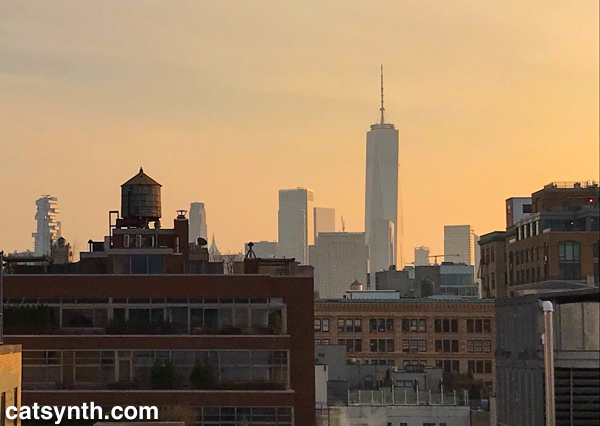
The 96th Street station on the new 2nd Avenue Subway line in New York’s Upper East Side.
NYC
Farewell to 2017
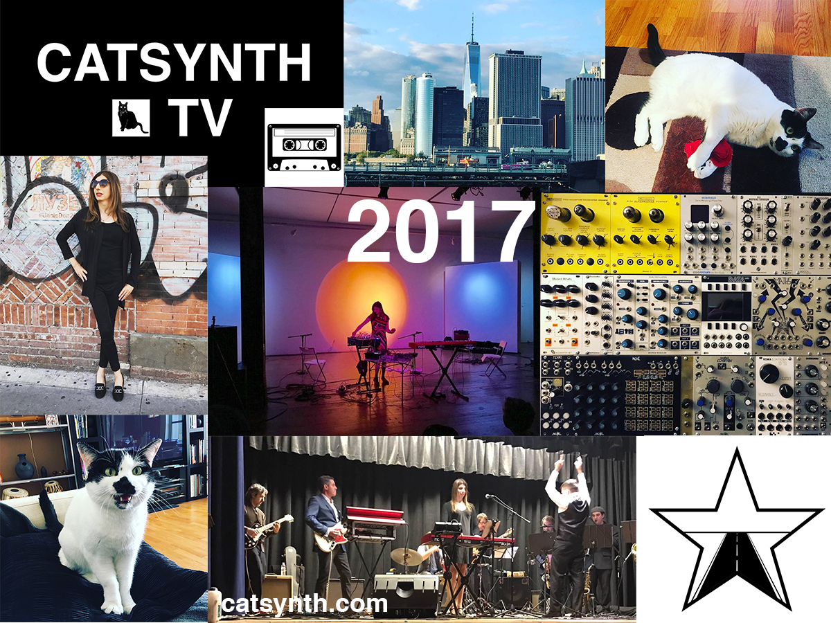
Once again, it is time for our end-of-year collage and review. So many images to choose from in such a busy 2017 that took us in so many directions at once, both outward and inward.
At the end of 2016, I was still reeling from the loss of Luna and the election. But I did welcome Sam Sam into my life and also promised myself that I would prosper and thrive in the new terrifying Trump era. And we did, focusing on moving forward with the things from 2016 that did go well. Lots of new music as a solo performer, with my new band CDP, and with Vacuum Tree Head. There are now three CatSynth-branded apps for both iOS and Android, and a fourth on the way. We launched CatSynth TV, with 22 videos under our belt since October. And Sam Sam has blossomed into a sassy and thoroughly spoiled cat whom we love dearly.
If there is a word of caution on the personal and professional fronts, it is perhaps that 2017 was too much. After a strong first half of the year through July, I scaled back on live performance to focus on other priorities. I regret that, but it was also the reality of the many things going on. I wish the apps, blog, and video channels were progressing faster, but it’s as fast as we can go with our myriad other responsibilities. The last couple months, while still rich with experience, have been an exercise in paring back and trying to focus on the highest priorities; and also focus on health, self-care, and well being. These are all very challenging, but I’m grateful to have the help of loved ones.
We cannot ignore the fact that our rebound in 2017 after two difficult years took place amidst a dark pall over the country and world. Many friends have suffered amidst the monumental forces of hurricanes, flooding, fires, and human foolishness. The latter is most visible in the face of the current regime that continues to embarrass and threaten us. These are things we have to be vigilant about as we move in 2018. I do feel personally in the cross-hairs on multiple fronts, so I hope we can continue to survive and prosper as well as we did in 2017, and maybe at the end of 2018 we will look back and saw how the world became at least a slightly better place.
It is also interesting to look back to our end-of-year post from 2007, ten years ago. It was a dark, cold time amidst major life changes – I couldn’t have imagined then what life would be like now. Will we feel the same way in 2027? And will there still be a CatSynth then? Only time will tell…
Wordless Wednesday: Bronx County Courthouse
Bronx Museum of the Arts: Gordon Matta-Clark, Susannah Ray, Angel Otero
I make a point of dropping in the Bronx Museum of the Arts when I’m back in New York. This most recent visit did not disappoint, with three strong exhibitions of arts with connections to the borough and New York City at large.
Gordon Matta-Clark: Anarchitect turns familiar notions of architecture upside-down with many projects featuring cuts, holes, and other modifications to derelict and abandoned buildings in New York and beyond. The Bronx of the 1970s was one of his main canvases and the point of departure for his practice. His series featuring the iconic graffiti of the borough’s subway trains and facades leads the exploration, with Matta-Clark observing the built environment as it is.
The next level of his work modifies the built environment by adding his own elements, or rather removing parts of existing architecture. In his Bronx Floor series, Matta-Clark removes a section of the floor of an abandoned building on Boston Road. This serves as a setting for installations and photography.
[Gordon Matta-Clark. Bronx Floor]
Like Matta-Clark, I find these spaces of the Bronx of the 1970s quite inspiring on an aesthetic level. My enjoyment of this often overlooked aesthetic is a bit tempered by the notion that these buildings ended up this way through a variety of bad circumstances: neglect (sometimes deliberate), poor city planning, rising inequality, etc.
From the foment of the South Bronx, Matta-Clark took his concept to Manhattan. In his 1975 project Day’s End, he cut large holes into the abandoned Pier 52 along the Hudson River (I remember the derelict piers that used to line the lower West Side all to well from the 1970s and 1980s).
[Gordon Matta-Clark. Day’s End (Pier 52 in Manhattan)]
This served both as a sculpture and installation in its own right, but also as a performance an exhibition space. Interestingly, the authorities did not notice the initial work cutting out a piece of the building, but they did find out about the performances and happenings, and were none too pleased by this. Eventually, the city dropped charges while he was working on a project in Paris.
[Gordon Matta-Clark. Conical Intersection (Paris)]
Conical Intersect cuts out a section of a partially demolished mansion in the Les Halles district, adjacent to the still-under-construction Centre Georges Pompidou. This was the setting for film and still photography projects, as well as performances and happenings (including “including roasting 750 pounds of beef for passersby on the Pompidou plaza” [
[Susannah Ray. Hutchison River and Co-Op City, 2015.]
Seeing Ray and Matta-Clarks photographs in the same visit shows the evolution of the Bronx, and in particular how the natural spaces have improved since their nadirs in the early 1980s. The lower Bronx River was once a disaster but is returning to new natural-urban balance in recent years.
[Susannah Ray. Canoes, The Bronx River, 2013]
You can read more about the revitalization of the lower Bronx River in this 2016 article. Again, we find beauty in these spaces and admire the work that Ray and others are doing to share it.
The final exhibition takes a decidedly inward turn compared to the explorations of Ray and Matta-Clark. In Elegies, artist Angel Otero explores the long history of painting. His large “deconstructed” paintings bring together traditional practice, abstraction, and collage.
[Angel Otero. The Day We Became People, 2017]
The exhibition is organized in relation to Robert Motherwell’s Elegy to the Spanish Republic series and includes stark black-and-white pieces from Motherwell, sometimes with statements on art and painting.
[Robert Motherwell]
Otero’s work stands apart from Motherwell’s in its vibrant colors and relation to space, as well as its unique use of material. Although titled Elegies, the paintings are not really elegies at all – or at least not in the typical sense. There is an optimism in his work.
The paintings were all created specifically for this Bronx Museum exhibition.
Our visit to the Bronx Museum was also the subject of a recent CatSynth TV episode, which also took us a little further south to visit our friends at the Bronx Brewery in Port Morris.
Wordless Wednesday: Flushing Meadows Corona Park
Ruins of the 1968 Worlds Fair in Flushing Meaders Corona Park in Queens, New York.
Our recent trek to see all of Ai Weiwei’s installations brought us here for the first time in a long time. You can read and see more in our review our video.
MoMA Part 2: Stephen Shore, Thinking Machines, Max Ernst, Is Fashion Modern
Our initial report from MoMA focused on the current exhibition of print and 2D works by Louise Bourgeois. But in November, the entire museum was a trove of intriguing exhibitions – even with the current construction – and today we look at four more of them.
We begin with Max Ernst: Beyond Painting, a survey exhibition built around the celebrated Dada and Surrealist artist’s frequent description of his own practice as “beyond painting.” It does actually include paintings, but also is many early drawings and works on paper as well as his sculptures and early conceptual work.
Ernst first came to prominence as the founder of the Cologne branch of Dada after World War I (in which he served in the German army). Like other in the Dada movement, much of his work was deliberately provocative and low-fi and went outside of traditional artistic practice. One of the seminal works from this early period was the portfolio Let There Be Fashion, Down with Art, which mixes technological drawings, equations and other elements in absurd and non-sensical ways. Despite the tone and organizing concept, some of the individual illustrations are quite beautiful.
In the above page, we see a feminine figure juxtaposed with geometric and architectural elements. It could have easily been one of Louise Bourgeois’ drawings from three decades later! It also reminded me of the composition in some of my photography.
“Beyond Painting” did include paintings, particularly from Ernst’s surrealist period after relocating from Cologne to Paris.
[Max Ernst. The Nymph Echo (La Nymph Écho). 1936. Oil on canvas.]
The hard-edged lines have given way to the dreamy organic shapes frequently employed in surrealism. But Ernst’s renderings have more of a biological feel – there is abundant vegetation, and some elements appear as microscopic life forms but on a human scale.
Despite his reputation as a provocateur within the often dark worlds of Dada and surrealism, Ernst’s work often has a very playful quality, even endearing at times. That comes out most in his sculptures, some of which can even be described as “adorable”
[Max Ernst. An Anxious Friend (Un ami empressé). 1944 (cast 1973)]
This one, in particular, is worth walking around, as there is another figure on the back side.
The exhibition culminates with 65 Maximiliana, an illustrated book co-created with book-designer Iliazd.
[Max Ernst. Folio 10 from 65 Maximiliana or the Illegal Exercise of Astronomy (65 Maximiliana ou l’exercice illégal de l’astronomie). 1964. Illustrated book with twenty‑eight etchings (nine with aquatint) and six aquatints by Ernst and letterpress typographic designs by Ilia Zdanevich (Iliazd). Page: 16 1/16 × 12 1/16″ (40.8 × 30.7 cm). Publisher: Le Degré 41 (Iliazd), Paris. Printer: Georges Visat. Edition: 65. The Museum of Modern Art, New York. Gift of David S. Orentreich, MD, 2015. Photo: Peter Butler. © 2017 Artists Rights Society (ARS), New York / ADAGP, Paris.]
In addition to Ernst’s aquatint illustrations and Iliazd’s fanciful typography, the book also features a completely invented hieroglyphic script by Ernst. It brings his career full circle to those early Dada books from Cologne.
As described above, beauty and artistic interest often originate outside traditional artistic practices. The exhibition Thinking Machines explores the artistic ideas that emerged alongside early computer technologies as well as the beauty of the devices themselves.
It is easy in the age of ubiquitous, distributed, and often invisible computing that the most powerful computers were singular and central elements of many workplaces and institutions. The Thinking Machines CM-2, made in 1987, both fits in the emerging dystopian future imaged in the era but also collapses complexity to beautiful patterns in the red LEDs against the black cubic casing. Apple has always been known for their design, and some of their early offerings were featured, including the Macintosh XL (successor to the infamous Lisa).
While the machines themselves were works of art, artists immediately saw their potential for exploring new ways of creating – we can only imagine what Max Ernst might have done with these technologies! But we don’t have to imagine with others, such as John Cage. Here we see both the score and record for HPSCHD, his collaboration with Lejaren Hiller that featured computed chance elements and computer-generated sounds on tape alongside live harpsichords.
The intersection of music and technology is at the core of what we do at CatSynth, but we have also long been interested in technology in other arts. The exhibition included samples of sonakinatography, a system of notation for motion and sound developed by Channa Horwitz.
The notation system uses numbers and colors arranged in eight-by-eight squares and can be used to represent music, dance, lighting, or other interpretations of motion over time. The notation and a proposed work were submitted by Horwitz for 1971 Art and Technology exhibit at LACMA – although the proposal for the piece with eight beams of light was included in the catalog, it was never fabricated. Horwitz work was buried beneath the work of male artists and she was not invited to speak or meet with industry representatives collaborating on the exhibition. This led to an outcry about the exhibition’s lack of women, a problem that echoes to this day in the world of art and technology. Fortunately, women were recognized in this MoMA exhibition of early technology in art. In addition to Horwitz, we saw work by Vera Molnár, a pioneer of computer art. In the print below, she digitally riffs on a drawing by Paul Klee.
Surprisingly, MoMA has rarely delved deeply into fashion in its exhibitions. For a long time, the biggest major exhibition the museum held for this medium was Bernard Rudofsky’s 1944 exhibition Are Clothes Modern?. But the museum is revisiting the topic in a major way with the current Items: Is Fashion Modern? a deliberate play on Rudofsky’s original title. The exhibition includes 111 garments and accessories and places them in both conceptual and chronological organizations. There are of course mainstays of fashion such as the “little black dress.”
It is hard to look at a fashion exhibition without thinking “Would I or would I not wear this?” In the above example, the dress on the left is something I would wear, while the one on the right is something I would not (except perhaps as a costume for a film, etc.). But side by side they show a range of tastes and styles and how they shape and reflect our images of our own bodies. The most intriguing design in the “I would wear this” category was this dress from Pierre Cardin’s “Cosmos Collection”. Even if this was intended to represent “the future”, I could see it easily working in the present, whether the present is 1967 or 2017.
[Cardin. COSMOS]
The exhibition did also touch on new technologies and innovations, such as with this dress that uses 3D printing technology.
[Jessica Rosenkrantz and Jesse Louise-Rosenberg. Kinematics Dress. 2013. Laser-sintered nylon.]
Of course, not all fashion is “high fashion”, and the exhibit deliberately covered both. There were the ionic baseball caps of the New York Yankees and their evolution over the years (someone had to design each one of them). And even a display of Jewish kippas, ranging from the simple to the whimsical.
I was particularly amused to see the Yankees-themed kippa. It was two “religions” colliding.
Our final exhibition is the MoMA’s large and comprehensive retrospective of works by photographer Stephen Shore. I have to admit, I was not particularly acquainted with Shore’s work, and after touring the exhibition I realize I should have been. In many ways, Shore’s work is photography writ small, often employing simple camera technologies, including a novelty Disney toy camera from the 1970s and Instagram on an iPhone in his current work. And his subjects range from the foment of 1960s New York and Andy Warhol’s Factory to stark rural landscapes.
[Stephen Shore. New York, New York. 1964. Gelatin silver print, 9 1/8 × 13 1/2″ (23.2 × 34.3 cm). © 2017 Stephen Shore, courtesy 303 Gallery]
[Stephen Shore. U.S. 93, Wikieup, Arizona, December 14, 1976. 1976. Chromogenic color print, printed 2013, 17 × 21 3/4″ (43.2 × 55.2 cm). The Museum of Modern Art, New York. Acquired through the generosity of Thomas and Susan Dunn. © 2017 Stephen Shore]
I particularly like the “ordinary” nature of some of the settings, main streets, highways, abandoned booths. The juxtaposition of New York against the small town and rural landscapes feels quintessentially American. Shore was also known for working in color, especially after leaving New York – this was something that wasn’t done so much in the world of art photography at the time. He also deliberately subverted the idea of art photography at times, including in his 1971 exhibition All the Meat You Can Eat, which was composed mostly of found imagery (commercials, postcards, snapshots) in dissonant arrangements that were more theatrical than anthropological.
Shore also did commission work. A few of these took him abroad, including to Israel, where he combined his interests in photography and archaeology. His most recent work fully embraces the modern technology of Instagram sharing – you can follow Shore’s Instagram account – and on-demand printing. The subject matter is varied, often focusing on small-scale or interesting framing of everyday items, but there are also occasional snaps that wouldn’t appear out of place on a tasteful personal account.
It’s not uncommon for me to be inspired to pursue my own work after an exhibition. This was certainly an example, as Shore’s photography mirrors many of own work in the medium, particularly focusing on place and texture, as well as traveling the country to pursue one’s art. Indeed, the inspiration was a bit more poignant because wondering the images I felt that this was exactly what I should be doing. It perhaps that realization that led me to tear up a bit as I left.
Ai Weiwei: Good Fences Make Good Neighbors, New York
This fall and winter in New York featured an ambitious citywide art project by Ai Weiwei called Good Fences Make Good Neighbors. Through fences, cages, netting and other forms of “barrier”, Ai Weiwei well-known landmarks as well as quintessentially “New York” locations into expressions of global migration – a complex phenomenon that includes refugee crises around the world as well as the fights for and against immigration in our own country. While the large installations at Washington Square and Central Park perhaps get the most attention, they are also scattered in smaller locations that are part of daily life in the city. We at CatSynth attempted to track down all the major installations and compiled our experiences into this video.
The large sculptural pieces in Washington Square Park and Grand Army Plaza at the corner of Central Park were the most impressive as iconic.
[Grand Army Plaza / Central Park]
The cage at Grand Army Plaza is quite literal, an easily identified barrier between those in the cage and the rest of the city going about its business outside. Of course, one can freely enter and exit this cage at will. The mirrored piece that fills the Washington Square Arch is more abstract, with the silhouettes of human figures forming a welcoming portal in the midst of an imposing fence. This one was the most aesthetically beautiful for me, with its play on reflections and light from the surrounding city.
[Washington Square Arch]
Many smaller installations were scattered around the Lower East Side of Manhattan, a neighborhood long associated with immigration and new arrivals to the United States. Indeed, the European Jewish side of my family settled in this neighborhood in the early 20th century, so it holds particular significance.
[Chrystie Street]
One could be forgiven for overlooking some of these (though the Essex Street Market installation is quite large). In fact, one at East 7th Street was just a narrow fence in the space between two apartment buildings. It took me a couple of minutes to locate it. And business at the boutiques and cafes at ground level went ahead seemingly oblivious.
We also made it to some of the installations in other boroughs, including the one surrounding the Unisphere in Flushing Meadows Corona Park in Queens.
[Unisphere – Flushing Meadows Corona Park, Queens]
The Unisphere is one of the remaining ruins from the 1968 Worlds Fair and with its positive (albeit cynical) message of global and international solidarity, its an apt setting for reflecting on the current migration crises and increasing nationalism worldwide. The borough of Queens has also involved since 1968 to become one of the most diverse places in the world.
And no artistic journey through the would be complete without Brooklyn. Fulton Mall – a section of Fulton Street closed to form a pedestrian mall and bus corridor – was the site of a series of installations adding fencing to some of the bus stops.
[Fulton Mall, Brooklyn]
Downtown Brooklyn has become an important part of my own experience of New York in the past decade, and it seems fitting to end here, where older discount stores and new high-rise condo buildings collide. We will have to see how this ultimately plays out…
We end in the Bronx, where this billboard on the Deegan Expressway may not be part of the official presentation, but it made for a fitting conclusion.
[Deegan Expressway (I-87), The Bronx]
Ai Weiwei: Good Fences Make Good Neighbors will be on display through February 18, 2018. You can read more about the project and its many locations here.